

SABAI is positioned as more than just another lemonade. It is a small, portable way to unwind. A “lemonade portal” that captures the atmosphere of a lively Asian summer market through taste, form, and visual language.
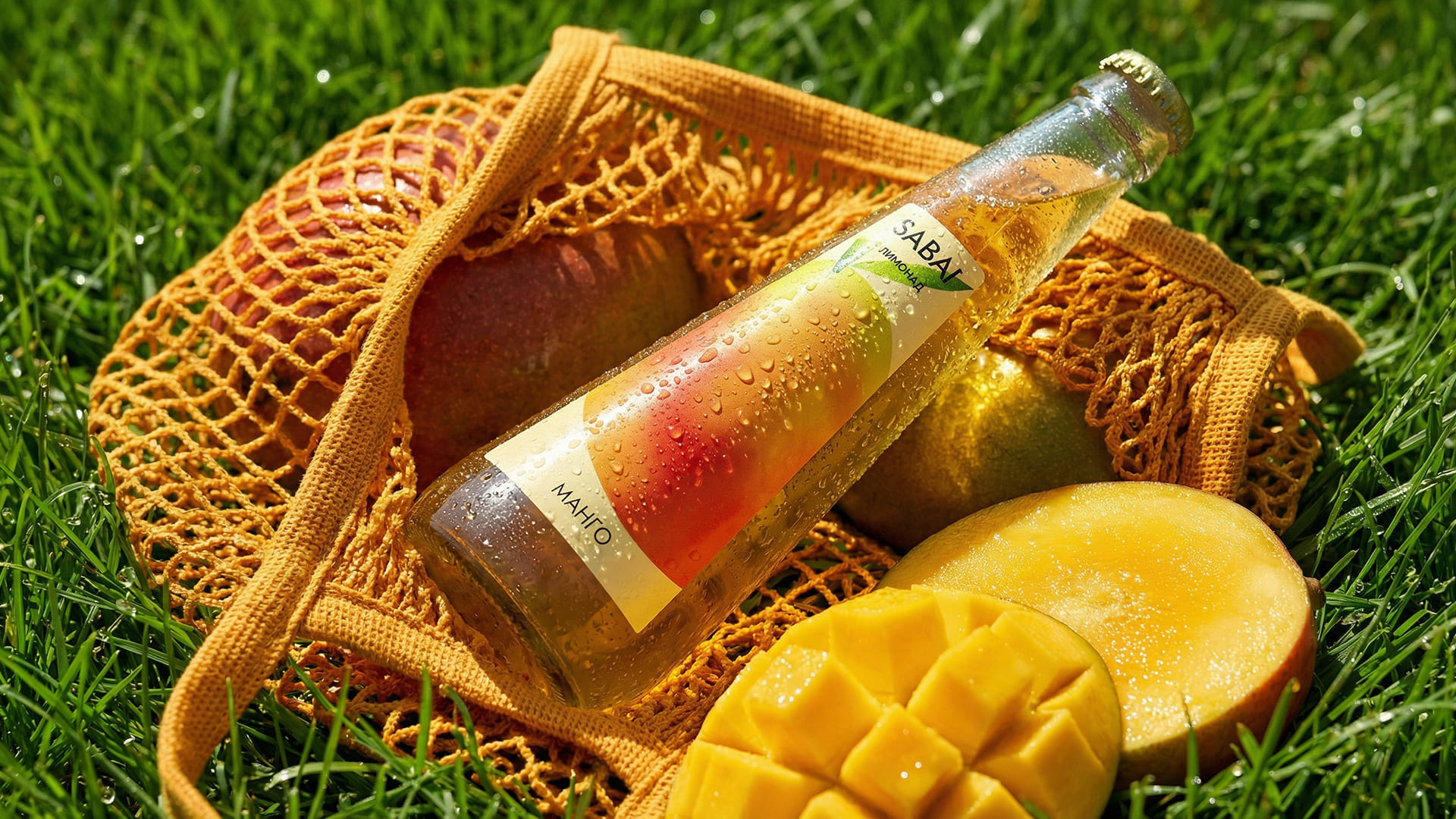
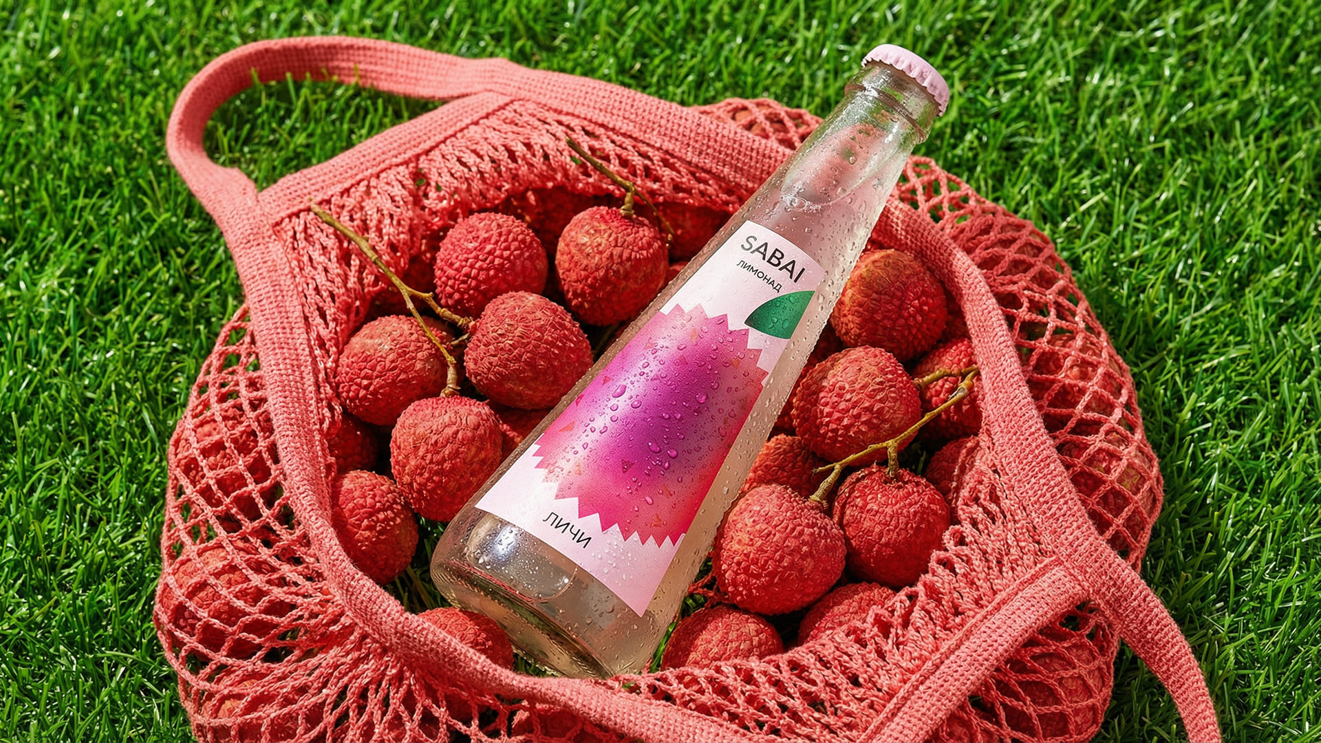
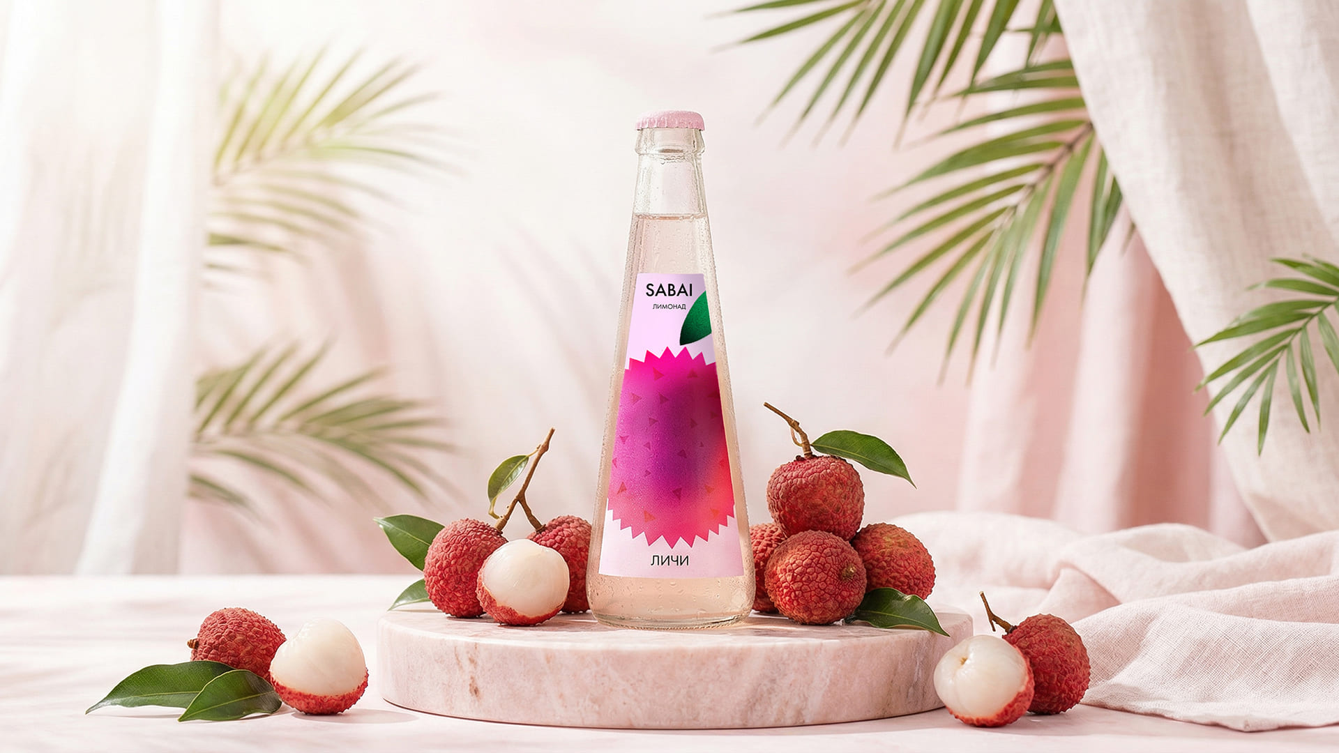
The first thing that stands out is the bottle itself. Its conical glass silhouette immediately departs from the standard perception of soft drinks. It feels more like an object you stumbled upon than something picked off a shelf. This shift is important, as the packaging does not simply contain the drink, it defines the entire experience.
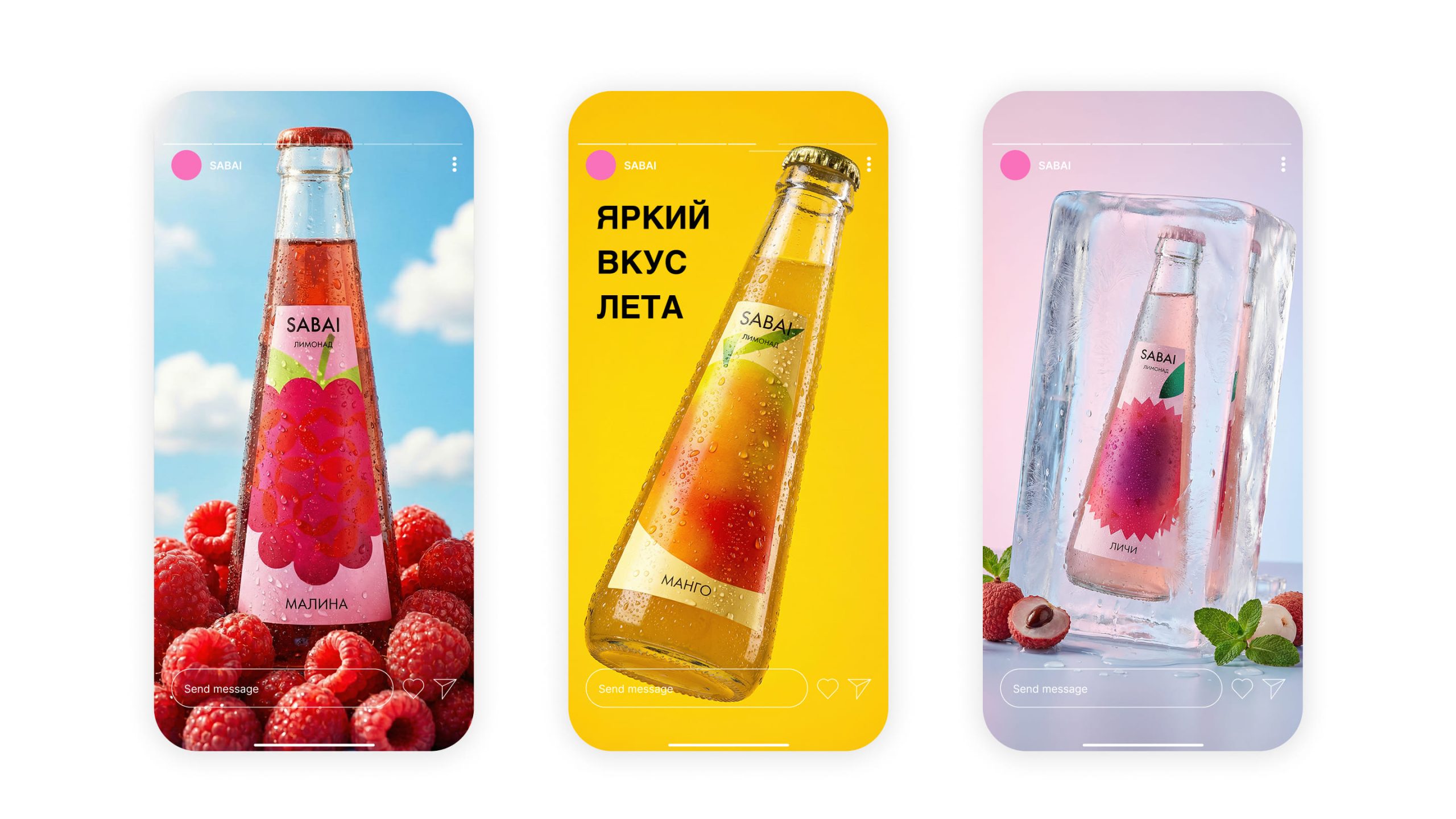
The label acts as an entry point into each flavor. Instead of traditional fruit imagery, the illustrations translate taste into mood, presenting chaotic, vibrant, almost sensory fragments of market life. Color, composition, and density vary across each variant, turning every bottle into a collectible piece rather than a repeatable unit.
The brand behaves in a contemporary way. It avoids over-explaining itself. The tone is simple, friendly, with a touch of irony. It invites interaction rather than imposing meaning. This makes it especially relevant to a younger audience that engages with products through sharing and visual storytelling.
Ergonomics also plays an important role. The tapered shape sits comfortably in the hand, reinforcing the idea of “grab and go,” something spontaneous and unplanned.
Ultimately, SABAI exists between product and experience. It is not just about quenching thirst, but about creating a brief moment of immersion. A pause, a shift in environment, a small escape from routine.
Available variants:
- Raspberry
- Lychee
- Mango







 Eclectic M
 Katya Slobodskaia
 Евгения Береснева
 CreativeWise
 宏洛图品牌设计HONGLT
 erandy
 Abbas Sayyed
 Ollie
Ollie Moço Wine Branding
 khadijaaljifri
 Abdulrahman Taha
 Juana Sarabia
 Modern Theory
 Mohammed Nasr Sharfi
 Oksana
 Minim Brand Design
 Asmaa Mohamed
 Aidearte
 Navy Creative
 GIRAFA STUDIO
 Tia Nguyen
 Logoclub99