Curator's PicksSubmit a projectShare your work

Explore by Country

AfghanistanAfricaAlbaniaAlgeriaAmerican SamoaAndorraAngolaAnguillaAntarcticaArgentinaArmeniaAsiaAustraliaAustriaAzerbaijanBahamasBahrainBangladeshBarbadosBelarusBelgiumBeninBoliviaBosnia and HerzegovinaBotswanaBrazilBritish Indian Ocean TerritoryBrunei DarussalamBulgariaCambodiaCameroonCanadaChileChinaChristmas IslandColombiaCosta RicaCote D'ivoireCroatiaCubaCyprusCzech RepublicDemocratic People's Republic of KoreaDenmarkDominican RepublicEcuadorEgyptEl SalvadorEstoniaEthiopiaEuropeFijiFinlandFranceFrench GuianaFrench Southern TerritoriesGeorgiaGermanyGhanaGlobalGreeceGuadeloupeGuatemalaGuyanaHaitiHondurasHong KongHungaryIcelandIndiaIndonesiaIranIraqIrelandIsraelItalyJamaicaJapanJordanKazakhstanKenyaKuwaitKyrgyzstanLatviaLebanonLibyaLithuaniaLuxembourgMacedoniaMadagascarMalaysiaMaldivesMaliMaltaMarshall IslandsMauritiusMexicoMoldovaMonacoMongoliaMontenegroMoroccoMyanmarNepalNetherlandsNew CaledoniaNew ZealandNicaraguaNigeriaNorth AmericaNorwayOceaniaOmanPakistanPalestiniaPanamaPapua New GuineaParaguayPeruPhilippinesPolandPortugalPuerto RicoQatarRepublic of KoreaRepublic of KosovoRomaniaRussian FederationSan MarinoSao Tome and PrincipeSaudi ArabiaSenegalSerbiaSeychellesSingaporeSlovakiaSloveniaSomaliaSouth AfricaSouth AmericaSpainSri LankaSudanSwazilandSwedenSwitzerlandSyrian Arab RepublicTaiwanTajikistanThailandTrinidad and TobagoTunisiaTurkeyTurkmenistanUgandaUkraineUnited Arab EmiratesUnited KingdomUnited StatesUnited States Minor Outlying IslandsUruguayUzbekistanVanuatuVenezuelaViet NamVirgin Islands, U.S.YemenZambiaZimbabwe

Materials

Browse all

Bria Ice Cream

Contrast isn’t a stylistic choice. It’s a strategy.

The ice cream category runs on an unspoken rule: bold colors, rich graphics, maximum
appetite appeal. The shelf is overloaded — every brand is shouting.

Repeating the category’s visual language in that environment doesn’t help you stand out. It makes you disappear. A new product dissolves into the competition and, worse, strengthens the leader: it looks like the original, while everyone else reads as a variation.

That’s why my first question to a client isn’t
“what style?” — it’s “what does the shelf look like?”

The analysis revealed that every player was operating in the same visual register: light, bright, loud. Which meant the point of entry wasn’t amplifying the signal — it was cutting it entirely.

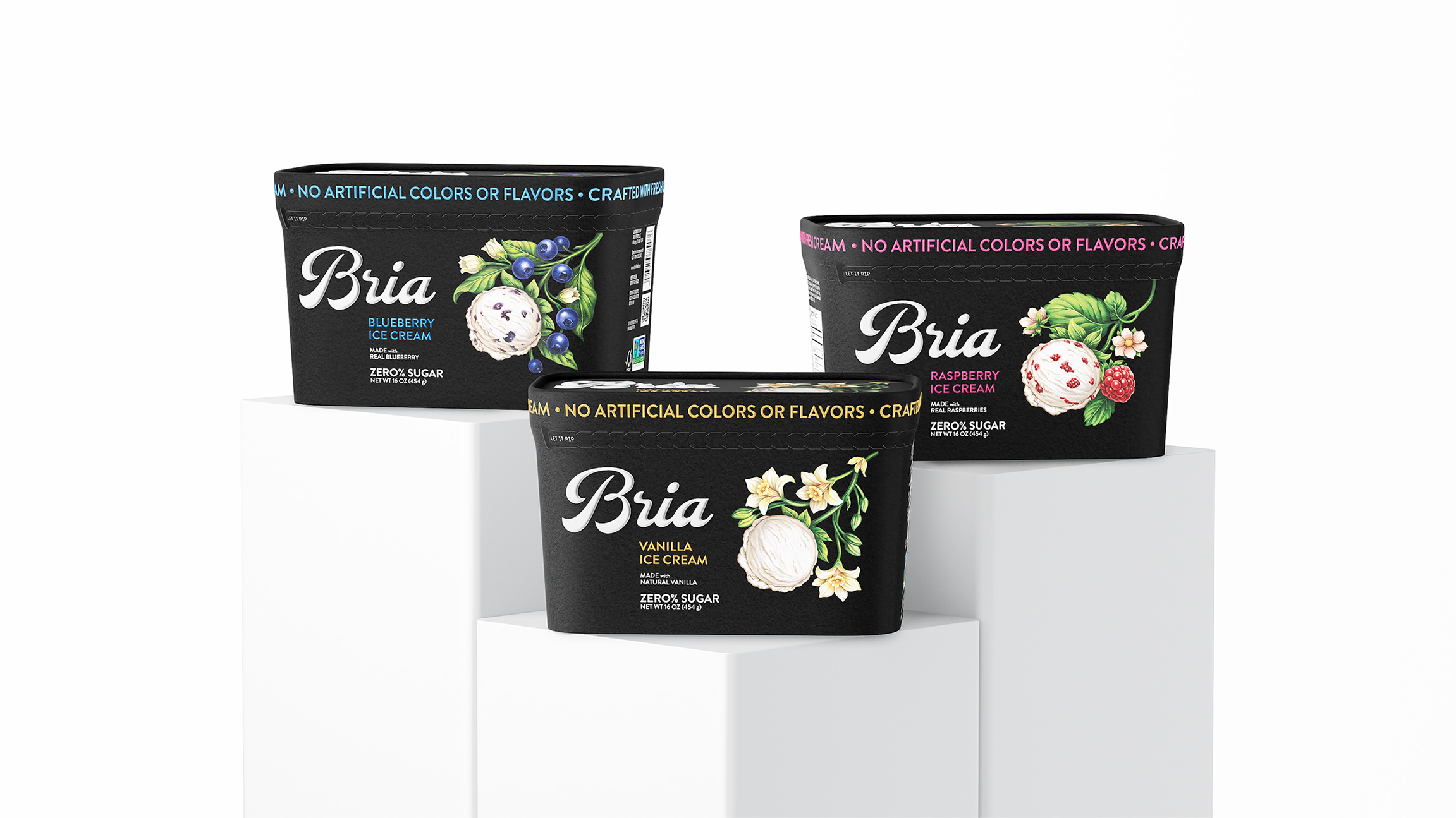
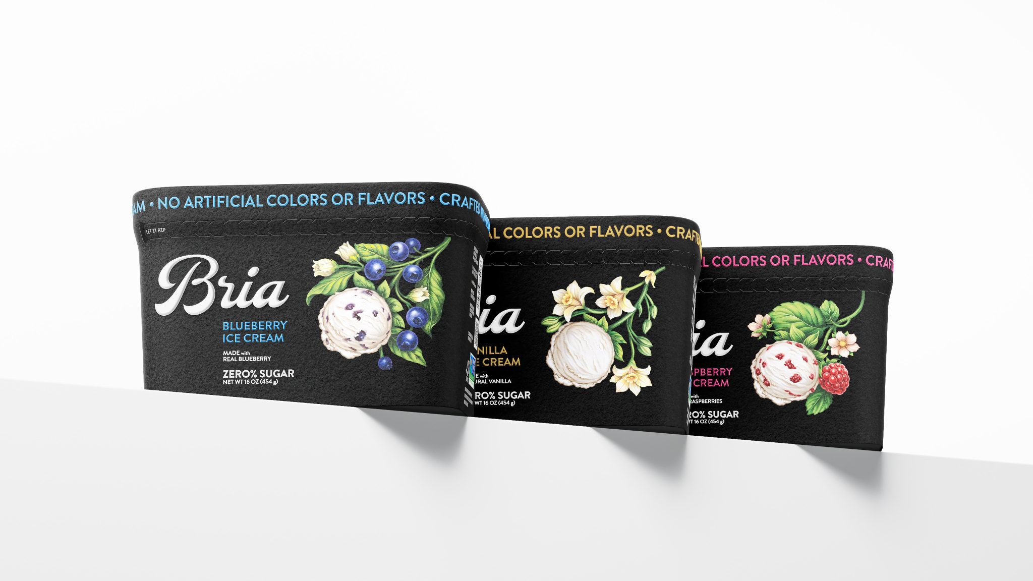
The solution: BLACK PACKAGING.

It’s a risk. Black doesn’t “sell flavor” in any direct sense. But it does something more important — it creates a break. On an overcrowded shelf, it functions like silence in noise. The eye, conditioned to keep scanning, stops. And that moment of pause is exactly where a choice begins.

From there, the packaging has to hold attention: precise ingredient illustration, clean typography, restrained color navigation across flavors.
Not noise — control. Not a promise — confidence.

That shift repositions the product: from mass-market dessert to a considered purchase.
Contrast doesn’t work on its own. It only works within a system: the shelf,
the competition, the buyer’s behavior.
Context isn’t the backdrop. It’s the tool.


Video

Bria Ice Cream, ice cream packaging design by Demirqaya, United States. Image 1 of 5.Bria Ice Cream, ice cream packaging design by Demirqaya, United States. Image 2 of 5.Bria Ice Cream, ice cream packaging design by Demirqaya, United States. Image 3 of 5.Bria Ice Cream, ice cream packaging design by Demirqaya, United States. Image 4 of 5.Bria Ice Cream, ice cream packaging design by Demirqaya, United States. Image 5 of 5.

Comments

0 comments