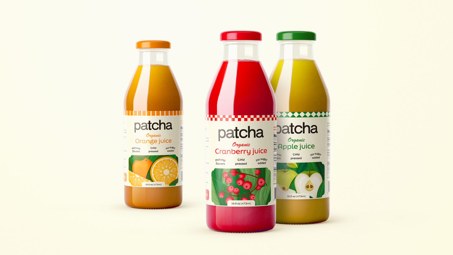

Patcha is an organic juice brand built around a simple idea: choosing something natural should not have to feel like a lifestyle statement. Within a category that often leans heavily into wellness, fitness, and health-focused communication, Patcha takes a more everyday approach. The product is natural, organic, cold pressed, and made to fit easily into people’s routines.
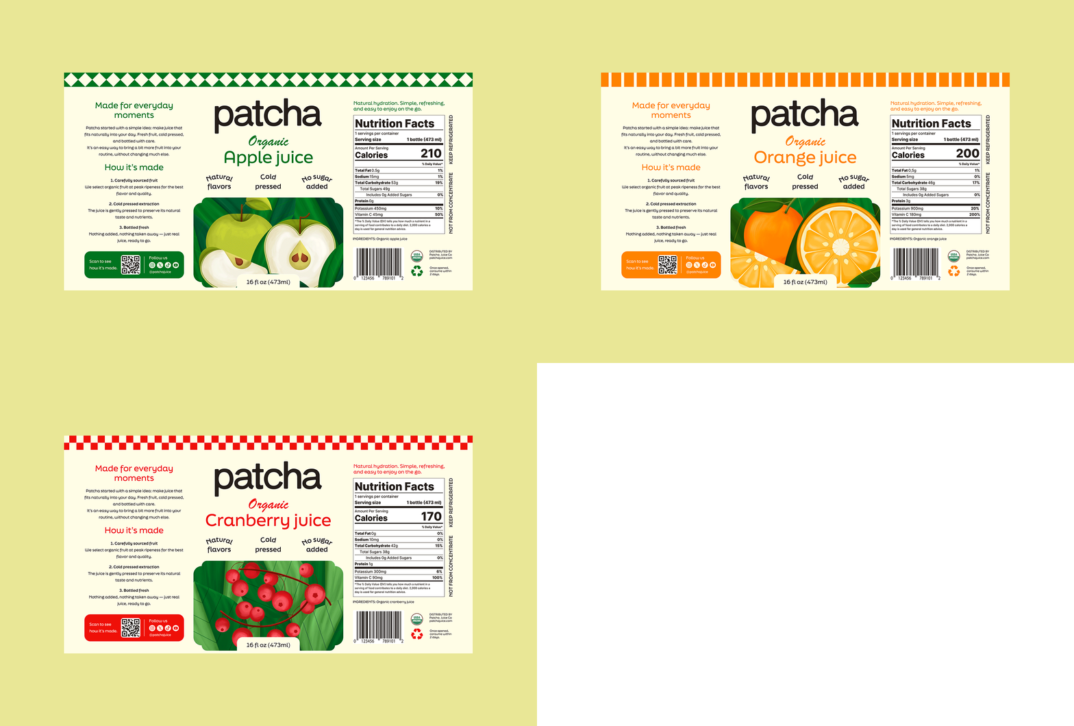
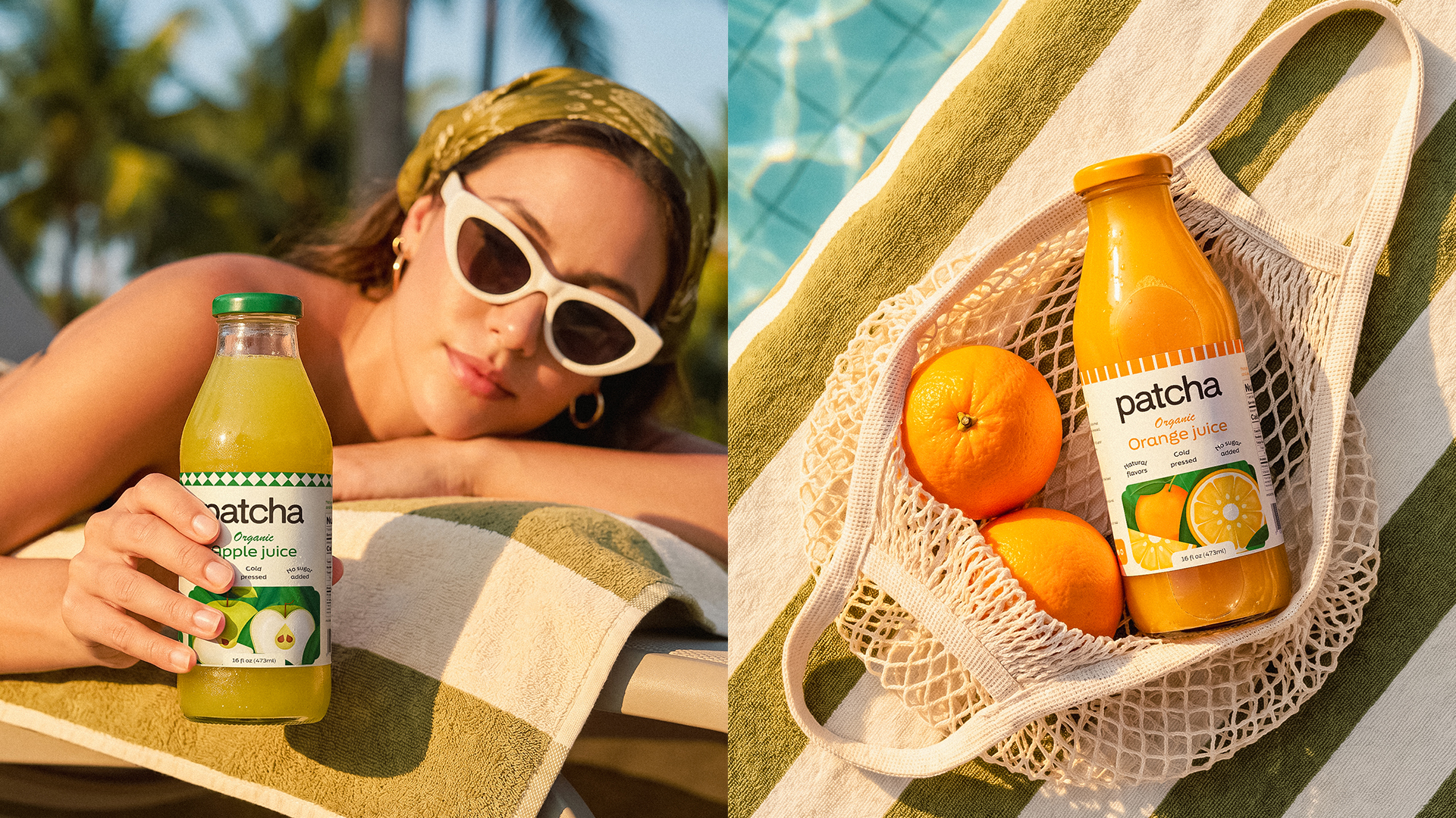
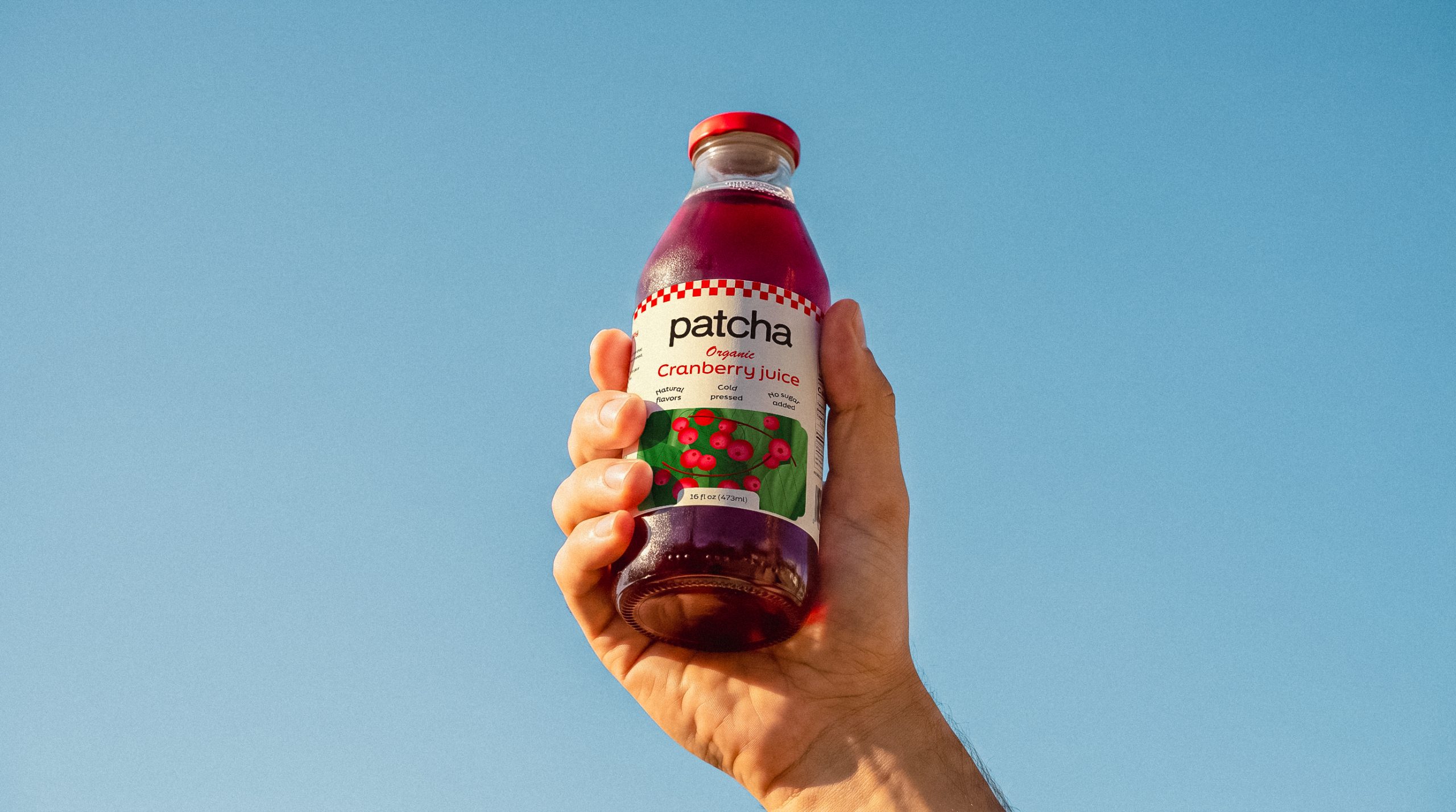
That positioning shaped the visual direction from the start. Instead of following the usual codes of the category, I brought in subtle retro references to give the brand a more familiar and approachable character. The visual language was built around vibrant colors, clean typography, and textured illustrations that make each flavor easy to recognize at a glance.
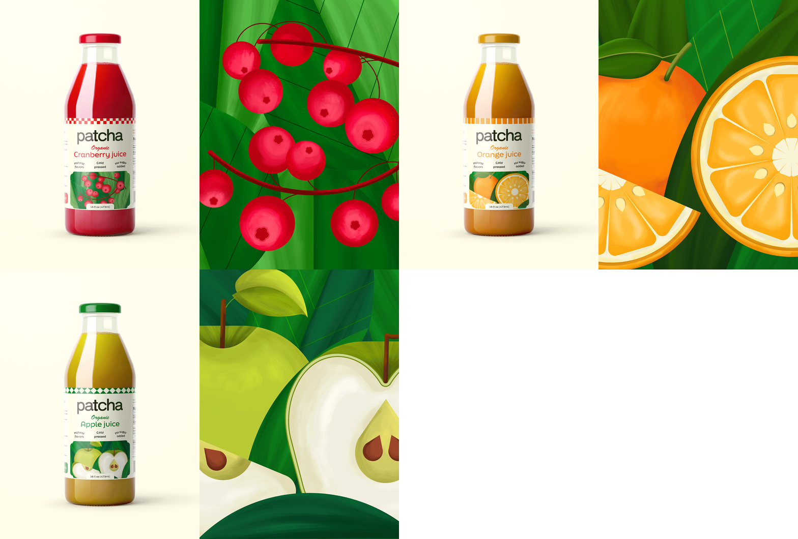
The illustrations became an important part of the packaging system. Each one was developed around the fruit itself, giving Orange, Green Apple, and Cranberry their own visual personality while keeping the three bottles connected as a collection.
The goal was to make Patcha stand out on the shelf without making it feel overly polished or overly playful. The result is a visual identity that feels fresh, confident, and easy to connect with, while staying true to what the product actually is. A natural juice brand that does not need to overstate its values because they are already built into the product.
Curator’s Insight
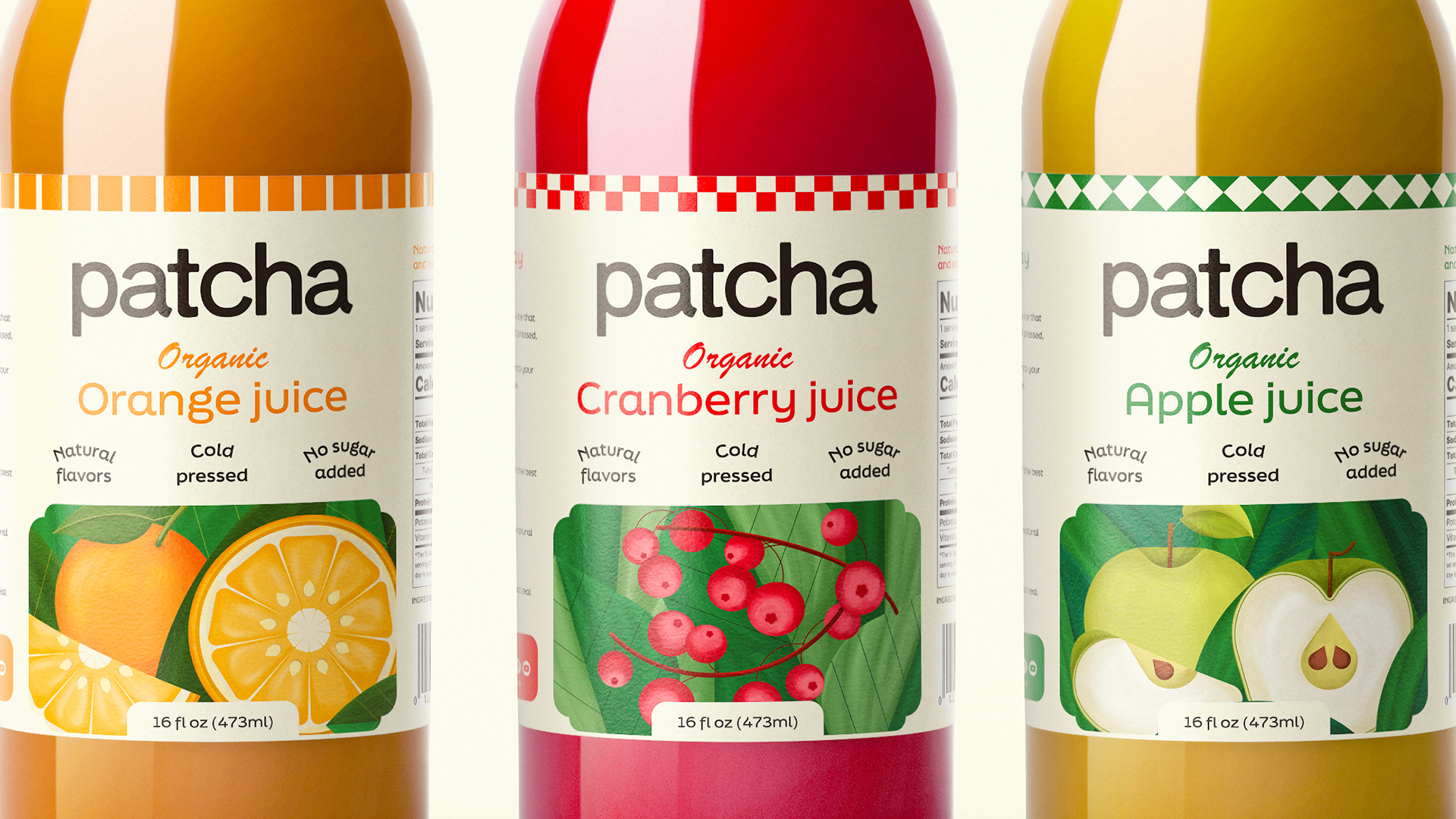
Most cold-pressed juice packaging borrows its visual vocabulary from the gym, not the kitchen. Sans-serifs that feel clinical, palettes that lean green and sterile, a general insistence that drinking juice is an act of self-improvement. Patcha’s label system pulls in a different direction entirely, and the choice is telling.
The checkerboard and diamond trims running along each cap are doing more work than they first appear to. They’re a small, deliberate nod to market stall textiles and roadside stand signage, the kind of pattern that reads as familiar rather than engineered. Paired against the wordmark’s soft, rounded lowercase letterforms, the label lands somewhere between nostalgic and current, never tipping fully into pastiche.
The fruit illustrations carry the real differentiation. Rather than rely on photographic fruit or generic iconography, each flavor gets a bespoke botanical study, cross-sections and stems intact, illustrated with enough individual character that the three could function as standalone artwork. That’s a harder brief than it looks: the illustrations need to be distinct enough to signal flavor instantly on a crowded shelf, while sharing enough DNA in line weight and color saturation to read as one family.
 lunapanda
 Tridimage
 Analoguecreative
 lettera7
 alchimistestudioParis
 Lana B
 Colossal
 Pivot Studio
 M&A CREATIVE AGENCY
 monther al omari
 Anastasia Cherepanova | xtramez
 Hollóka Grafikai Műhely / Graphic Design Studio
 BOLD branding
 Antonia Skaraki
 Pâmella Lorrany
 Z9BKAdsgn
 Francesco Paternoster
 b1studio.ro
 Chris Creative Works
 Boordon
 Dmitriy Kuzovlev
 Brand Society
 yasharpic