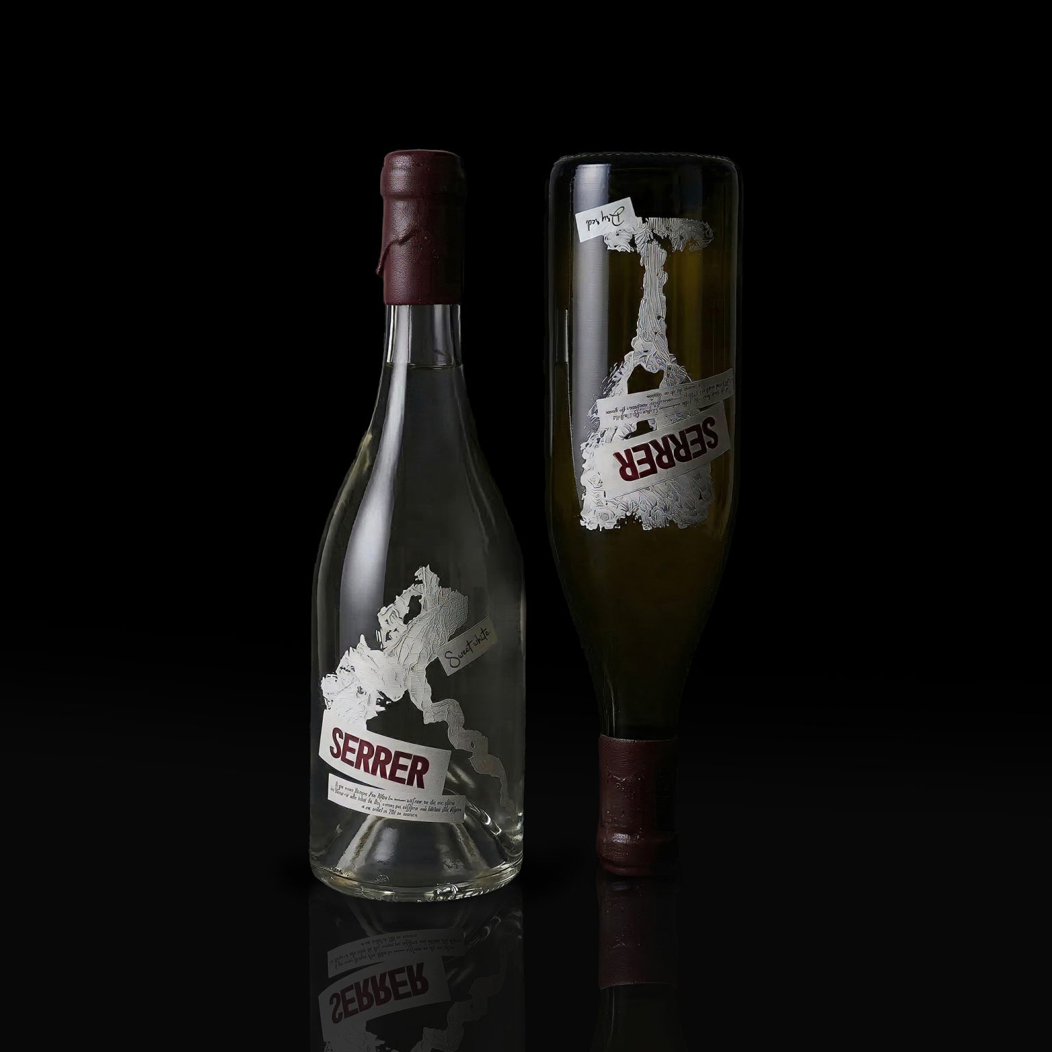

When analyzing the wine market, its visual predictability becomes obvious. Most solutions are based on stable clichés – vines, coat of arms elements, classical typography. Such language forms a sense of tradition, but at the same time reduces expressiveness, which is why brands are lost in the general mass.
The “SERRER” project offers a rethinking of this approach, shifting the emphasis from formal aesthetics to sensory perception. This is a French wine produced in Armenia, combining two cultural traditions. The name reflects this connection: Armenian “ser” – “love”, French “serer” – “to hug”. Their combination creates an image of closeness and tactile contact.
The visual concept is based on the manual technique of the potato stamp. Each form leaves a vivid imprint, where a trace of gesture and material is visible, and it is this trace that becomes the center of visual language.
The sign system includes a glass, a corkscrey and a grape leaf, but their meaning goes beyond the usual symbolism. The leaf reflects the touch of nature, primary and still untouched; the corkscreey is the touch of a person, the moment of invasion and discovery; the glass is the final form of contact when it becomes personal and sensual.
All three elements are made in the stamp technique and are perceived as prints, not images. They fix not objects, but the very fact of contact – pressure, gesture, trace – turning the idea of “hugging” into a tangible action.
Against the background of a standardized visual environment, “SERRER” stands out with the integrity of the concept and expressive language, forming not only the image of the product, but also an emotional connection with it.


 Stefano Bracci
 Backbar Studios
 Leyma Design
 AUN BRANDS
 Melo Studio
 Agniya Karelskaya
 monther al omari
 Blend Strategy Company
 宏洛图品牌设计HONGLT
 M.I.L.K.
 madns
madns Oksana
 EvaArias
 Sara Trefz
 Heramb Arora
 Carreto Concepts Design Studio
 Modern Theory
 DESIGN CONCEPTS
 Andrea Del Prete
 Le Studio G
 Julia M.
 eliza
eliza B&WGraphicLab