

Design by: Leong Anson
Location: Malaysia
Project Type: Student Project
School: Dasein Academy of Art
Course: Diploma in Graphic Design
Tutor: Ms. Low Poh Li
Packaging Contents: Tualang Honey
Packaging Substrate / Materials: Wood
Printing Process: Digital Printing
Tualang honey, sourced from the rainforests of Southeast Asia, is known for its rich flavor and health benefits. This natural honey supports immunity, offers antioxidants, and promotes overall well-being.
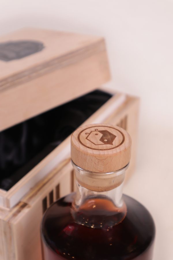
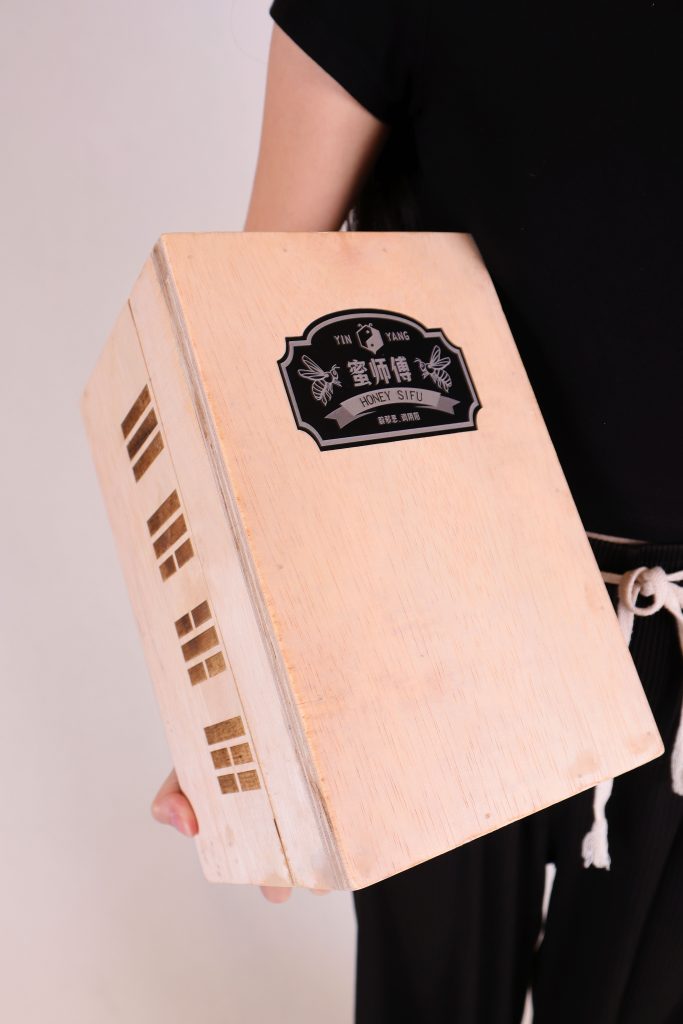
The “Honey Sifu” packaging integrates the concept of Yin and Yang, symbolizing balance and harmony. The logo, designed as a bee in the shape of the Yin and Yang symbol, represents the honey’s ability to balance the body’s health, much like the ancient philosophy of Yin and Yang balances opposites in nature.
The wooden box features eight Yin and Yang symbols on its sides, highlighting the harmony Tualang honey brings to life. This design showcases “Honey Sifu’s” commitment to quality and natural health.



 Hi estudio
 43oz
43oz monther al omari
 Rosario Lo Iacono
 alchimistestudioParis
 Ebbi
Ebbi Maruf Nishat
 Mind Brand
 宏洛图品牌设计HONGLT
 Iyioluwanbelarami
 sahildoesartt
 Denis Ulianov
 Garry Veda
 arutza
 Lucid mk2
 MaheswariMadhu
 sanjnasnair
 POSH FMCG BRANDING
 Modern Theory
 Shubhashish Roy
 Affogato Brand Design
 Backbar Studios
 hello ocean
 Luciana Gutierrez
 Valérie Colace