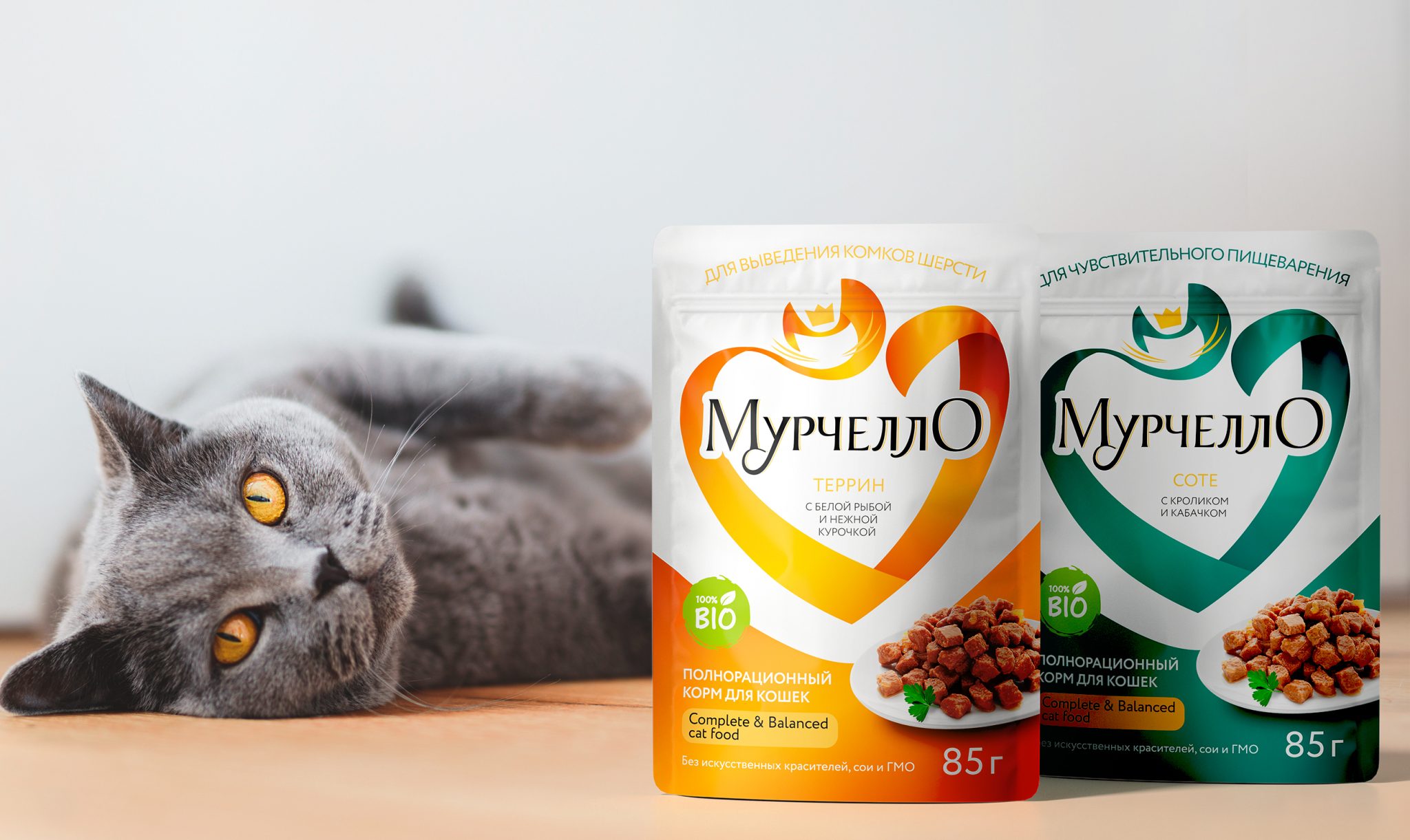

Murchello — Packaging Differentiation System
The pet food market is an actively growing category, with ready-made pet food continuing to gain popularity among consumers. Murchello, a premium cat food brand made without chemicals or preservatives, operates within this dynamic market.
The brand’s positioning is built around the metaphor of “food for people” — reflected not only in the product quality, but also in the names of its recipes, inspired by familiar dishes from human cuisine.
As the brand continued to develop, the Clever Branding team was tasked with creating a clear and cohesive system for differentiating Murchello packaging across its SKUs.
A key part of the project was refining the logo block to improve its readability, particularly at smaller packaging sizes. We adjusted the proportions and typography, slightly reducing the scale of the wordmark so it would no longer visually divide the heart-shaped graphic into two parts.
We also introduced a more sophisticated color palette and simplified the differentiation within the logo block, making the overall system cleaner and easier to read.
Based on our extensive experience with retail shelves and consumer behavior, we carefully established the relationship between the brand shape and the logo. The logo needed to remain sufficiently prominent to be recognizable at shelf, while preserving the integrity and visual balance of the overall logo block.
The updated system was developed across six SKUs, each built around a familiar dish-inspired recipe:
- Fricassee with Turkey & Fish in White Sauce
- Sauté with Rabbit & Zucchini
- Terrine with White Fish & Tender Chicken
- Beef Stroganoff in Creamy Sauce
- Stuffed Turkey with Cranberries
- Blanquette with Poultry & Cranberries
And yes — as you may have noticed, the recipes are named just like dishes you might find on a human menu.


 Affogato Brand Design
 Backbar Studios
 hello ocean
 POSH FMCG BRANDING
 Luciana
 Valérie Colace
 marjusguza
 Z9BKAdsgn
 Lilith Sivolenko
 Daria Levina
 Masha Kulichkova
 monther al omari
 Yana Chernova
 Atiq Alam
 ezgidesignstudio
 Pips Marin
 Antonia Skaraki
 Ezi Brand Design
 Kanishka Chhajer
 Zachary Kent
 SOT B&D
 Normal studio
 Garry Veda