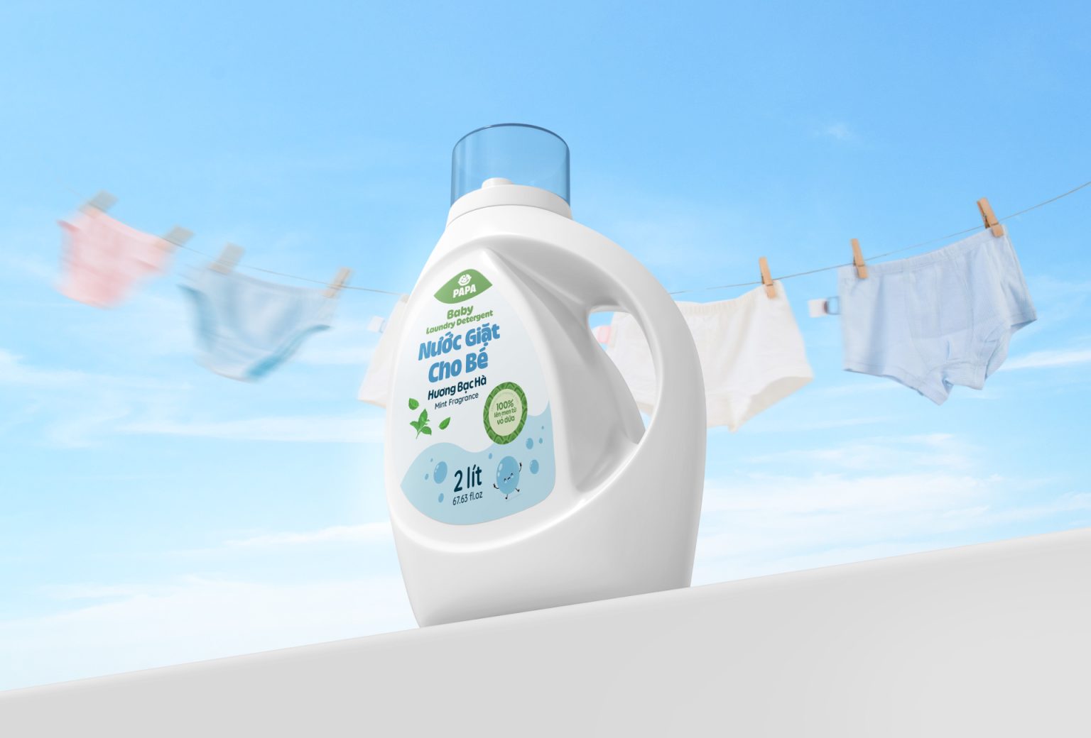

Laundry Detergent Label Design for Babies
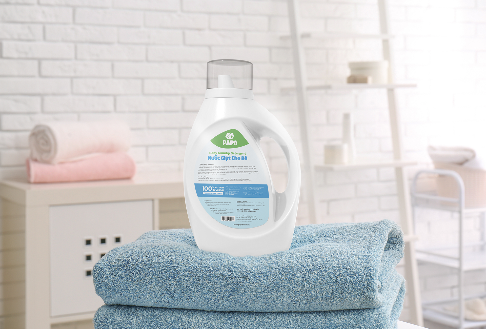
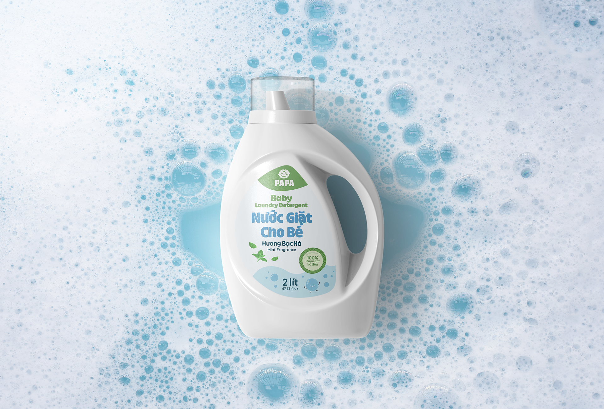
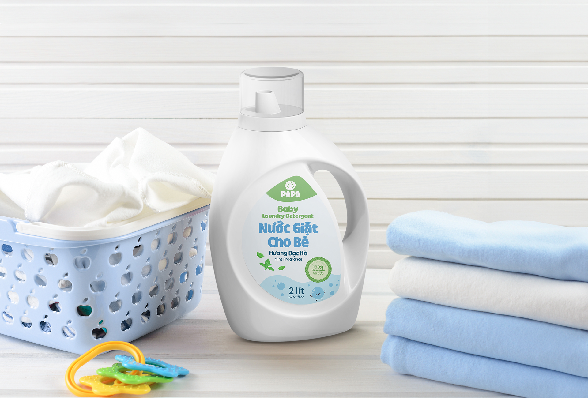
For the packaging design of baby laundry detergent, we selected a color palette combining ocean blue and green to evoke the gentle freshness of mint, while also conveying a sense of cleanliness, safety, and natural care. This color combination creates a soft and friendly impression, making the product visually appealing to both children and parents.
The overall design uses soft and soothing tones to enhance a sense of comfort and approachability. In addition, all typography on the packaging—from the brand name to the supporting text—features rounded fonts, reinforcing the feeling of softness and safety. Every design element is thoughtfully crafted to reflect the nature of the product: gentle, pure, and trustworthy for a baby’s sensitive skin.
 Lizaveta Kharitonyuk
 Bonsanco Creative Studio
 DesignRepublic
 GIRAFA STUDIO
 PiotrWisniewski
 Sophiagdotcom
 monther al omari
 CreativeWise
 Modern Theory
 SoreThumbStudio®
 Modern World Studio
 Palashcc
 Valérie Colace
 andreamarinnn
 Chochoi Creative
 Hi estudio
 bachir bachchar
 Aferdini
 AUN BRANDS
 vitoramockup
 InterWish
 ash123456
 Studiotaketwo