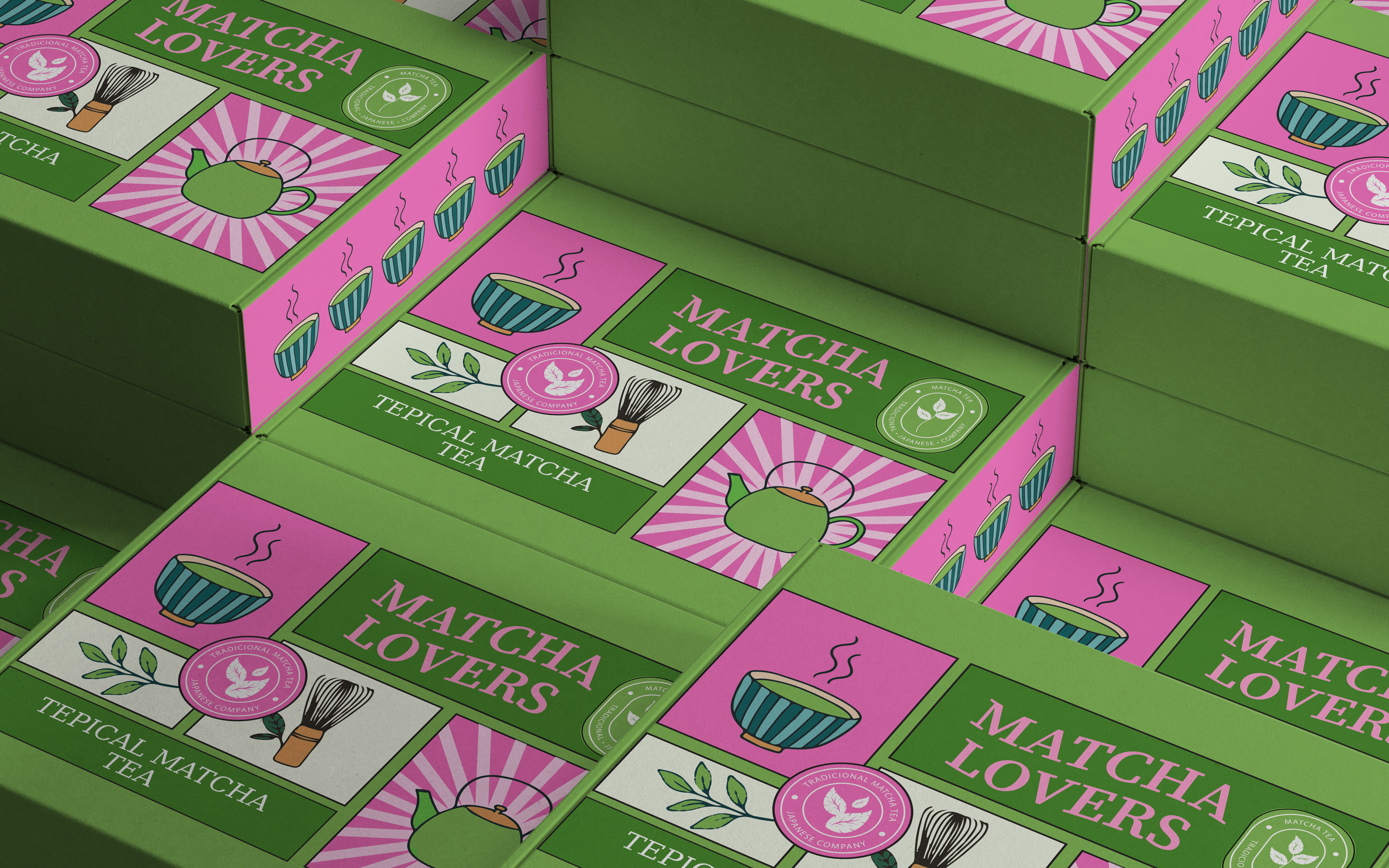

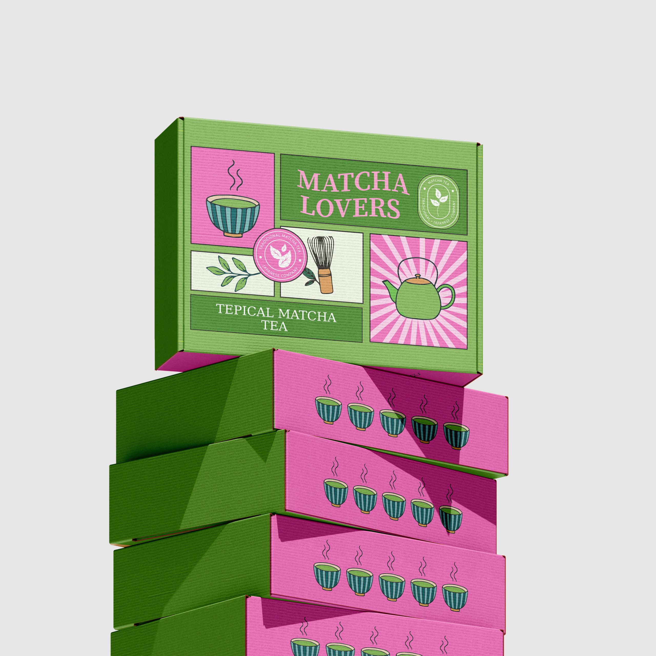
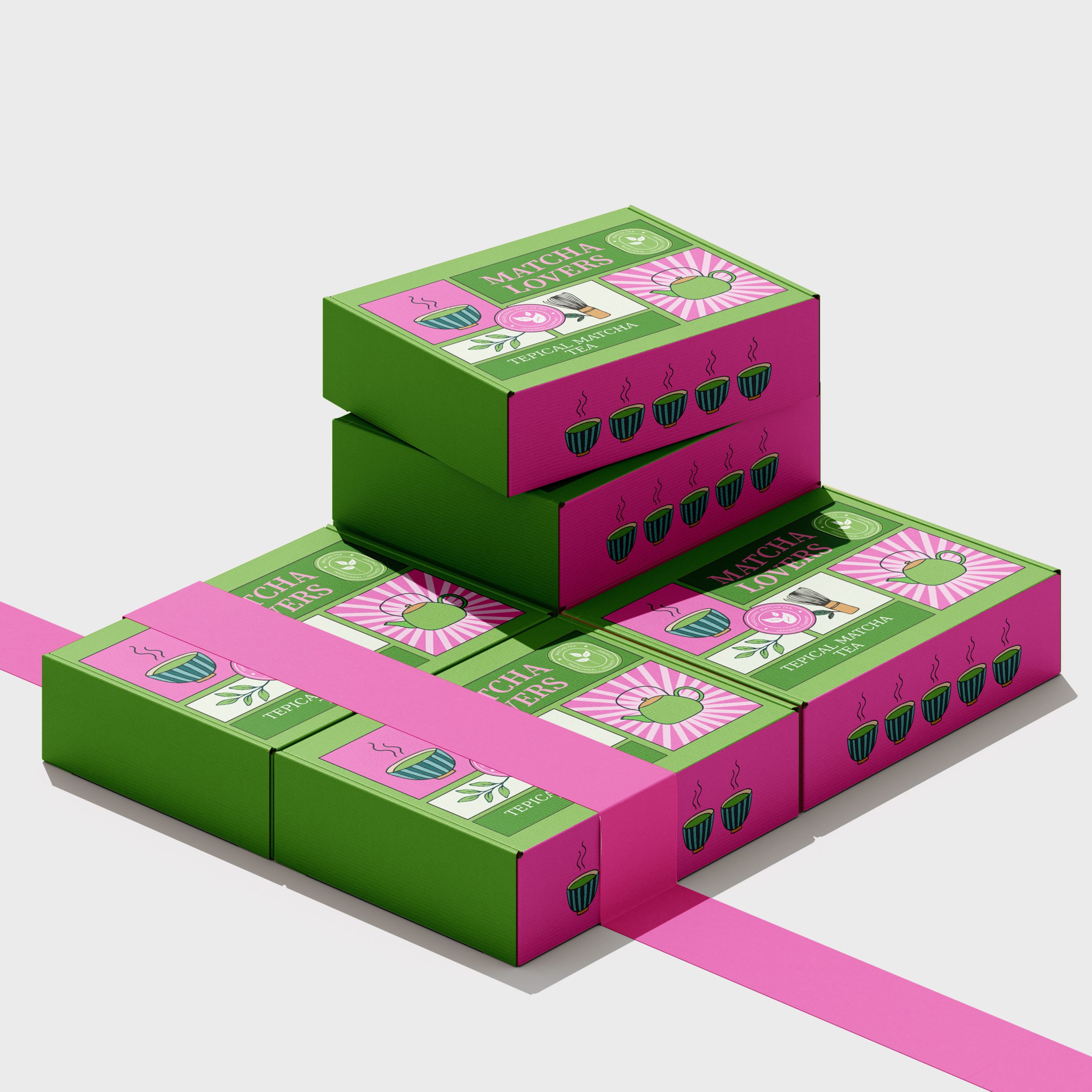
This packaging design was developed for “Tepical Matcha Tea,” a brand dedicated to high-quality matcha for enthusiasts. The goal was to create packaging that is visually appealing, clearly communicates the product, and resonates with a target audience that appreciates both the tradition and the modern enjoyment of matcha. The design incorporates a vibrant color palette and illustrative elements to create a fresh and inviting aesthetic.
Key Design Elements:
Color Palette: The packaging utilizes a striking combination of a solid, earthy green as the primary base color, contrasted with vibrant pink and clean white accents. This palette aims to feel both natural and energetic, reflecting the essence of matcha and its invigorating properties. Illustrative Style: Playful and stylized illustrations are a central feature of the design. These include: A classic green teapot: Symbolizing the traditional preparation of tea and conveying warmth and ritual. A steaming matcha bowl: Representing the final product, ready to be enjoyed, with delicate steam lines adding a sense of freshness. A traditional bamboo whisk (chasen): Highlighting the authentic preparation method of matcha and appealing to purists. Stylized matcha powder: Abstract wavy lines in pink suggest the fine, powdered nature of the tea.

 Lisa Pokrovskaya
 Simple Studio
 Studio Unbound
 David Byerlee
 M&A CREATIVE AGENCY
 alchimistestudioParis
 monther al omari
 Studio Be Design
 LogoSayLove
 agenciabud
 Shustova p
 mutta
 @Allenarts13
 Sirka Agency
 Atiq Alam
 Dozen Agency
 j.substance
 SCD
 Cristian Lepore | crilep Copia
 Chris Creative Works