
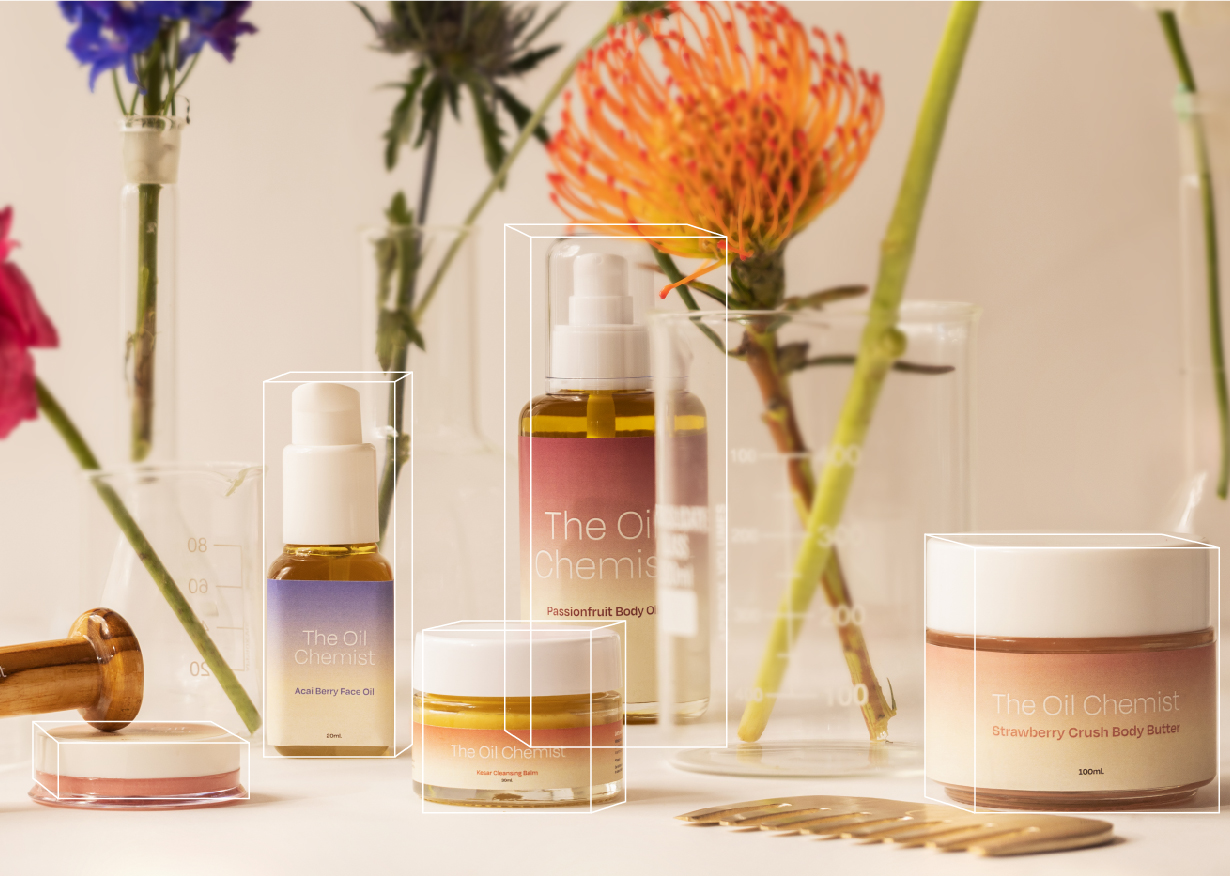
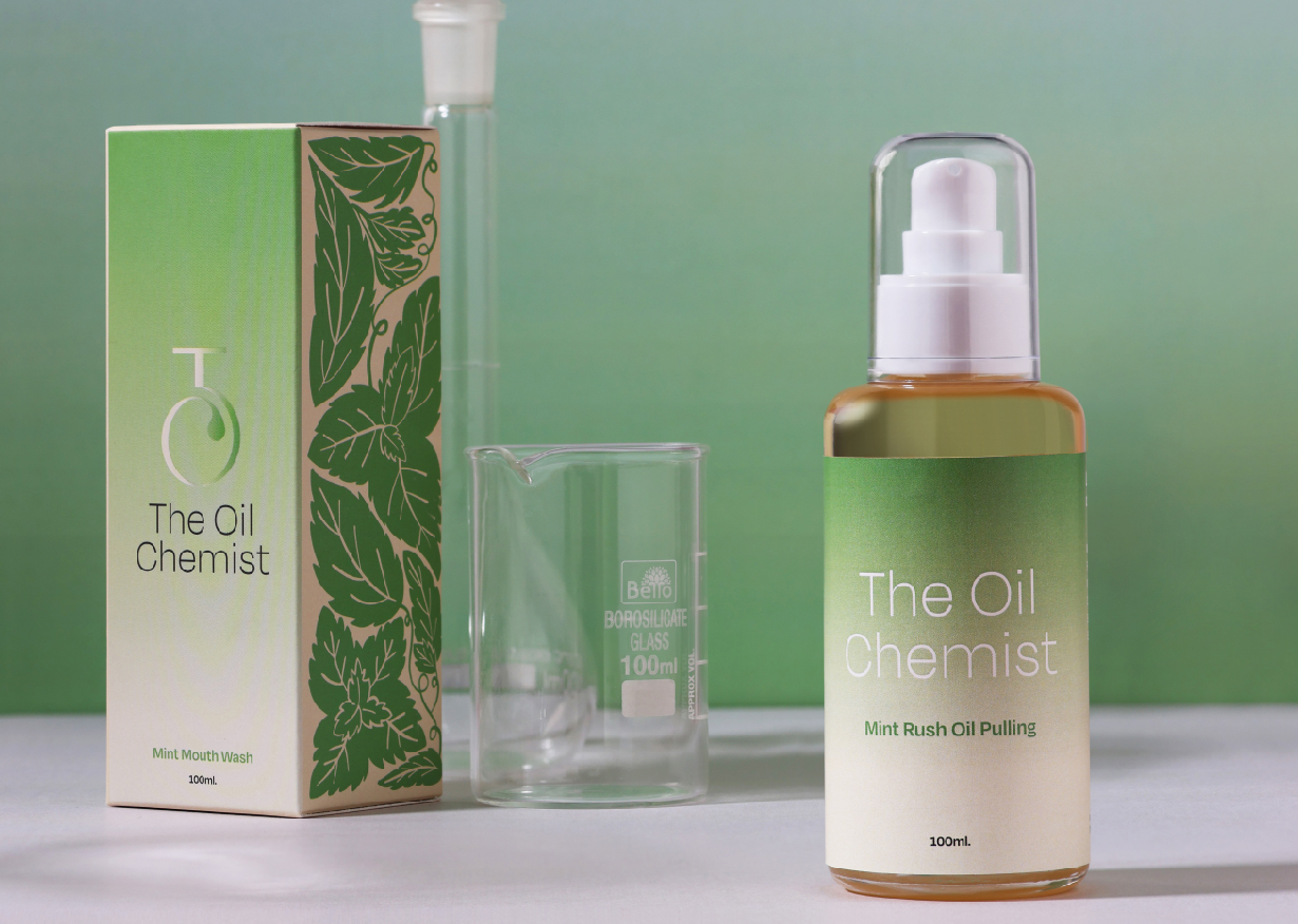
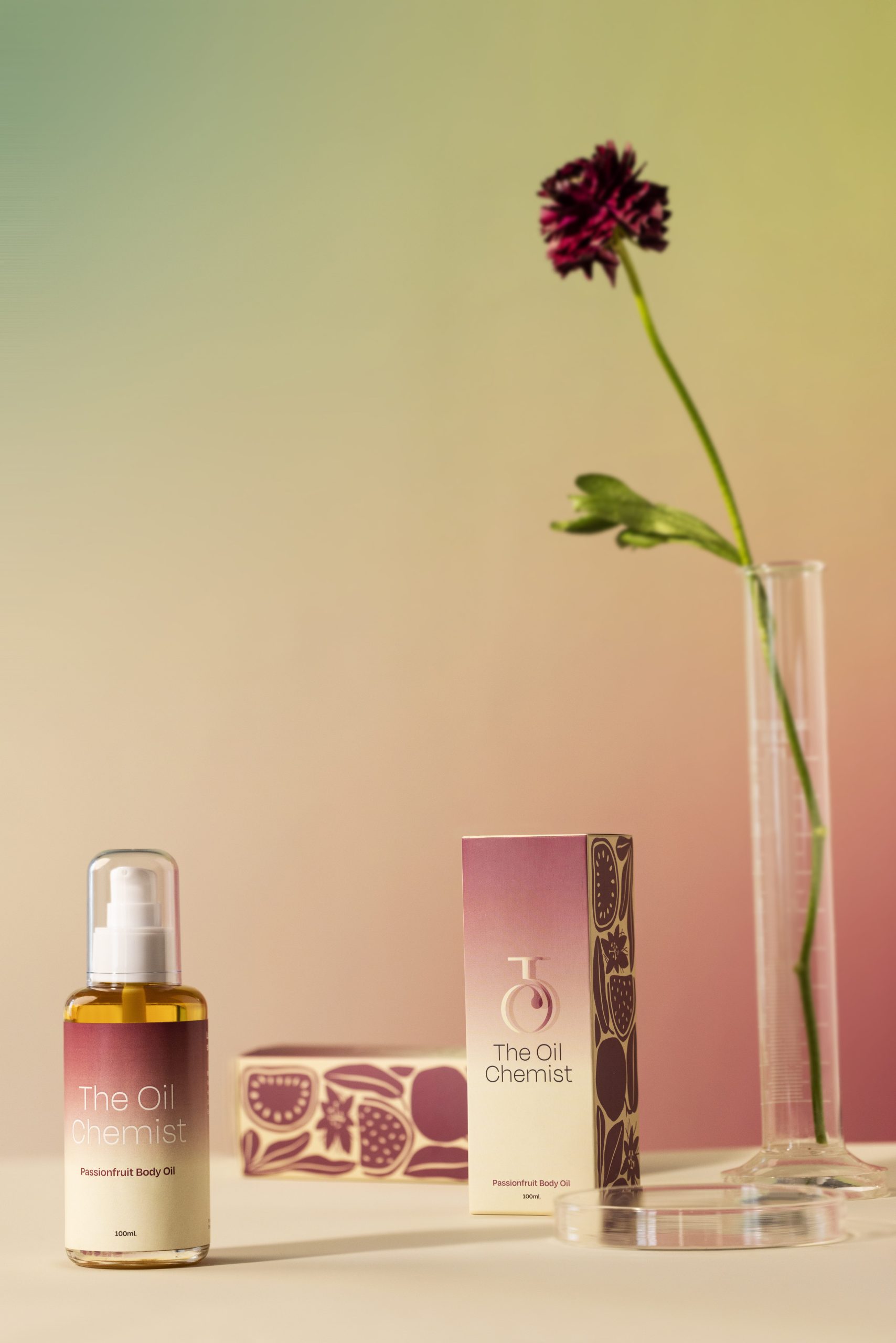
Uniformity was maintained in the visual language and layout across both inner and outer packaging. The outer packaging needed to be eye catching which was achieved through a balance of illustrations and gradients. Our illustrations of whimsical creepers and half-split fruits, inspired by the works of Henri Matisse, were featured on either side of the outer boxes. The brand and product name were kept in focus at the front against simple pastel gradient backgrounds and hues were changed according to the product.
The inner packaging aimed to fit well and be easily identifiable in the consumer’s vanity shelf. We kept the product name in the center and paired our gradients in unique colours with a minimal design.



 Derrick Lin
 salutifg
 ADStudio
 WeAreDepot
 Manuvila
 Yellow Umbrella Creative
 Toka
Toka Studio Zak
 Atiq Alam
 monther al omari
 Modern Theory
 Sirka Agency
 DESIGN CONCEPTS
 Eva Chistyakova
 Puigdemont Roca
 marianaaworks
 bloomburo
 andreamarinnn
 Alina
Alina Saadmost
 Bruhken
 Maruf Nishat
 Richest Branding Pvt. Ltd.
 Sophiagdotcom
 saifullahmaslool
 Up-Brands