

Hana Khanom is a brand specializing in the production of a wide range of handmade and homemade breads and pastries — evoking the nostalgic taste of our grandmothers’ kitchens. For this reason, instead of designing the logo myself, I handed over a pen and an inkwell to the brand manager and asked them to personally write the name Hana Khanom for me. This gesture created a deep emotional connection between the brand manager and the brand’s visual identity.
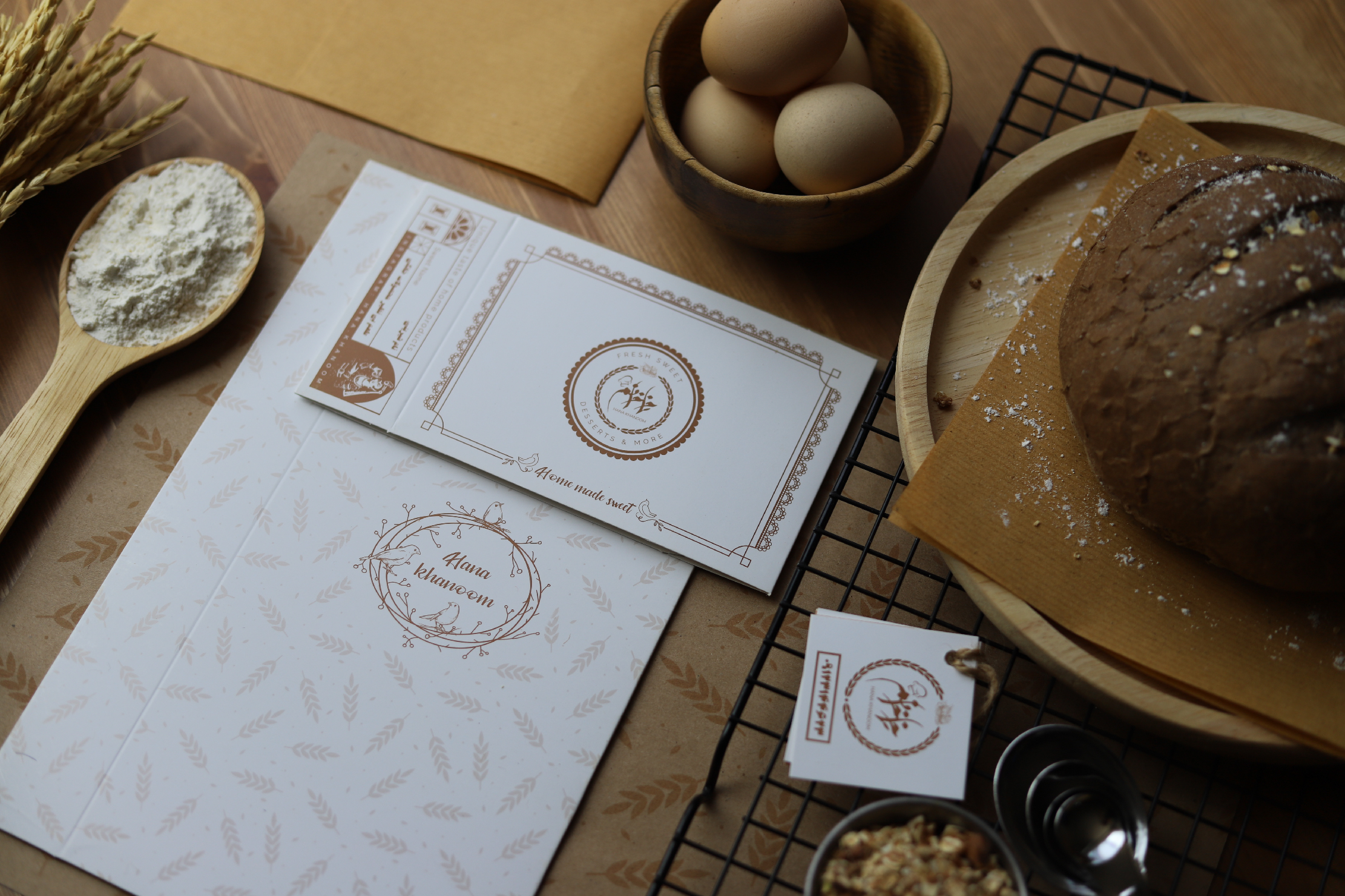
I then digitized the handwritten text using Adobe Illustrator and transformed it into a vector. To complete the brand identity, I incorporated elements like wheat and symbolic shapes of bread and pastries.
One of the most popular product lines of Hana Khanom is its traditional sweets made specifically for Nowruz (Persian New Year), which receive overwhelming demand every year during the end-of-year season.
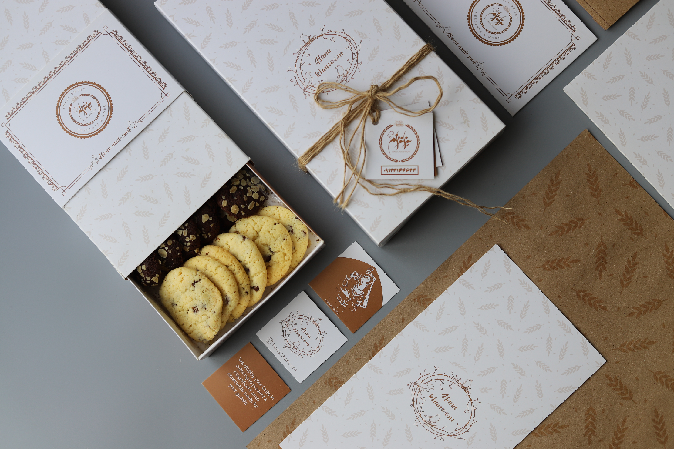
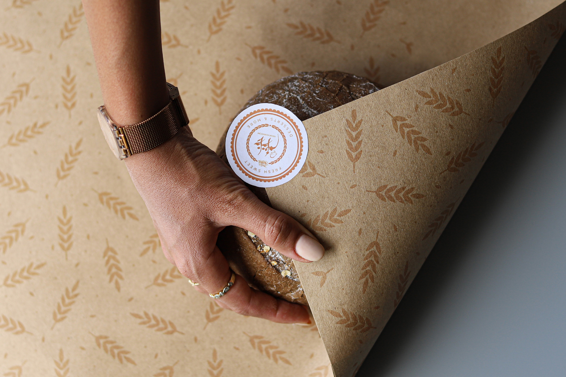
Beyond basic branding materials like business cards, product labels, letterheads, and pastry bags, we needed to design a structural packaging box. It had to be suitable for Nowruz celebrations — presentable enough to be placed directly on customers’ festive tables without needing to be unpacked or transferred into another container.
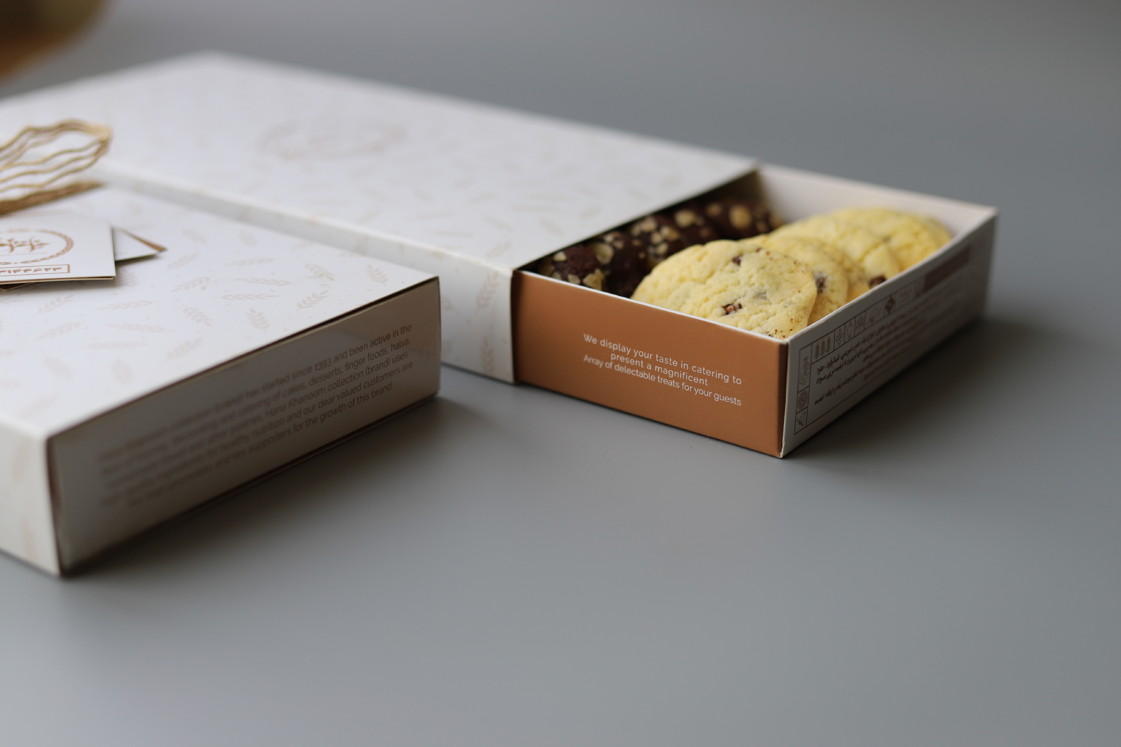
To achieve this, we designed a sliding (matchbox-style) box that is user-friendly, elegant, and capable of conveying the handmade and homely nature of the product. Experience shows that sliding boxes tend to encourage customers to keep the packaging until the last bite, enhancing the overall experience.
To further emphasize the product’s essence, we added an additional outer sleeve over the sliding box to increase durability. This ensured the sweets remained well-preserved over time — whether ordered from afar or intended as gifts — while maintaining the structural integrity of the packaging.
From the beginning, I chose a custom ink blend combining gold and copper tones for the color palette. This warm color not only conveys the homemade and wholesome feel from a distance, but also creates a distinctive visual identity. While warm tones are commonly used in bakery products, I aimed to differentiate the brand by crafting a unique warm gold hue, which we successfully developed at the print shop to enhance the sense of exclusivity.
Given that the sweets were created for Nowruz — a deeply rooted celebration in ancient Iranian culture — the product’s graphic design was guided by traditional Persian motifs and elements.
Today, five years after the original launch, the packaging has been reprinted twice due to continued customer demand and remains a beloved part of the Hana Khanom brand experience.


 monther al omari
 Ximena Ureta Design Studio.
 vitoramockup
 Up-Brands
 Sophiagdotcom
 Peter said
 ayeidadezigns
 Tancybox
 宏洛图品牌设计HONGLT
 Modern Theory
 Dozen Agency
 Atiq Alam
 Olio Studio
 Ruchi S. Joshi
 mmdesign
 awaiskhadim
 Octasoft
 United Creatives Studio
 Kingdom & Sparrow
 Anastasia Bakhmatskaya
 CreativeWise
 Great and Golden