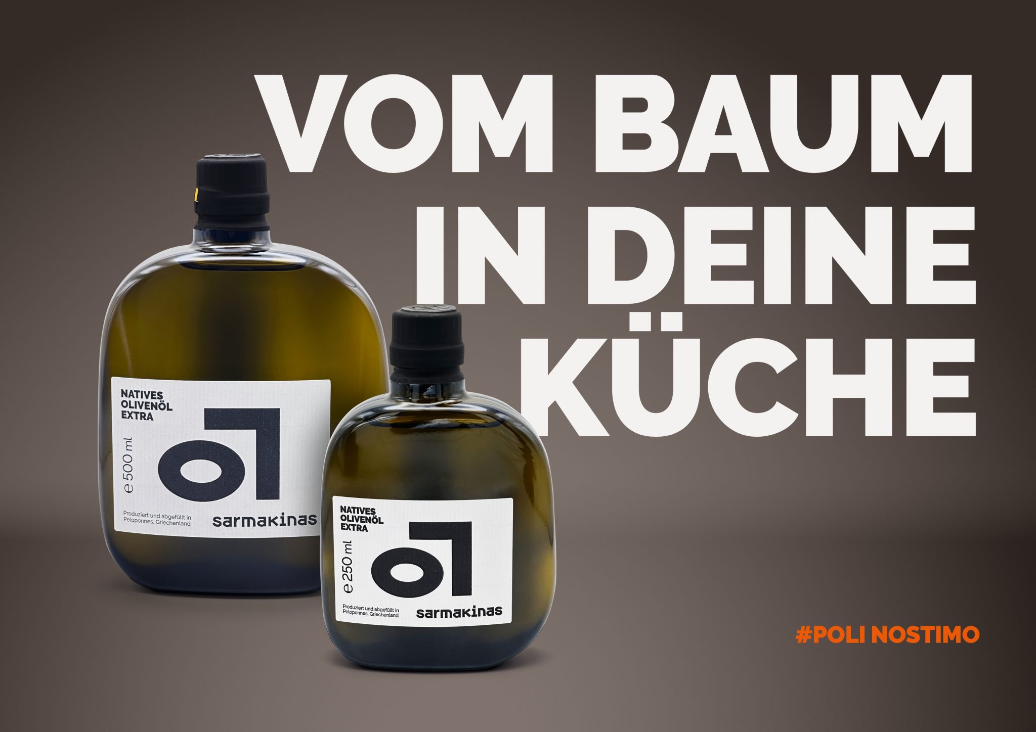

Sarmakinas – Character in Every Bottle
At Sarmakinas, packaging is an extension of attitude. The brand doesn’t tell stories – it stands for something. That same stance is embodied by the bottle itself.
The design is radically reduced: two sculptural glass bottles, a square label, and dominant typography. Nothing ornamental. Every line, every contrast is intentional. The visual system follows a strict logic: structure, proportion, restraint. The only color accent is a clean, warm tone – precise and understated. It doesn’t shout. It holds still. This is not emotional packaging. It’s deliberate, quiet, and uncompromising. A bottle that doesn’t decorate the product – it defines it.
Designed in collaboration with Maximilian Nothas.


 Derrick Lin
 43oz
43oz vitoramockup
 Oksana
 KOS
KOS Hui Hua
 Rana Elkady
 Modern Theory
 Eclectic M
 Katya Slobodskaia
 Evgenia Beresneva
 CreativeWise
 宏洛图品牌设计HONGLT
 erandy
 Abbas Sayyed
 Ollie
Ollie Moço Wine Branding
 khadijaaljifri
 Abdulrahman Taha
 Juana Sarabia
 Mohammed Nasr Sharfi