

TOA, short for Taste of Awesomeness, is a functional drink brand built on a simple promise: to push flavour boundaries while using only natural ingredients. The packaging was designed to reflect the brand’s bold yet refined identity, with each label celebrating the unique colour, tone and texture of the hero ingredient. Inspired by a mix of scientific precision and playful energy, the concept aimed to elevate TOA beyond the typical beverage aesthetic.
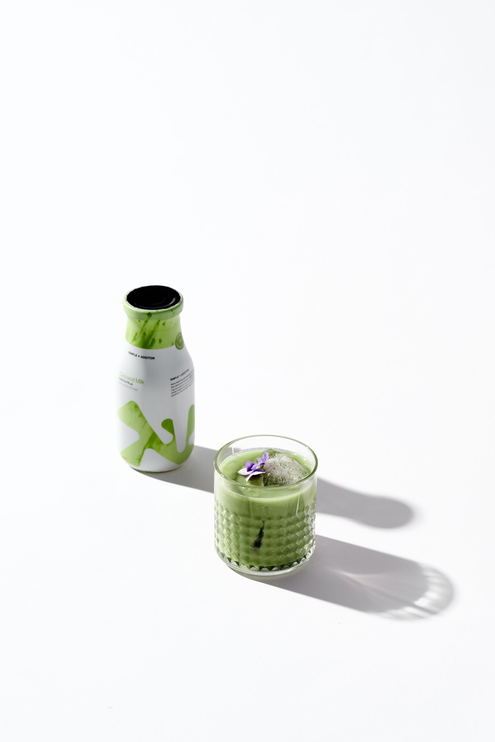
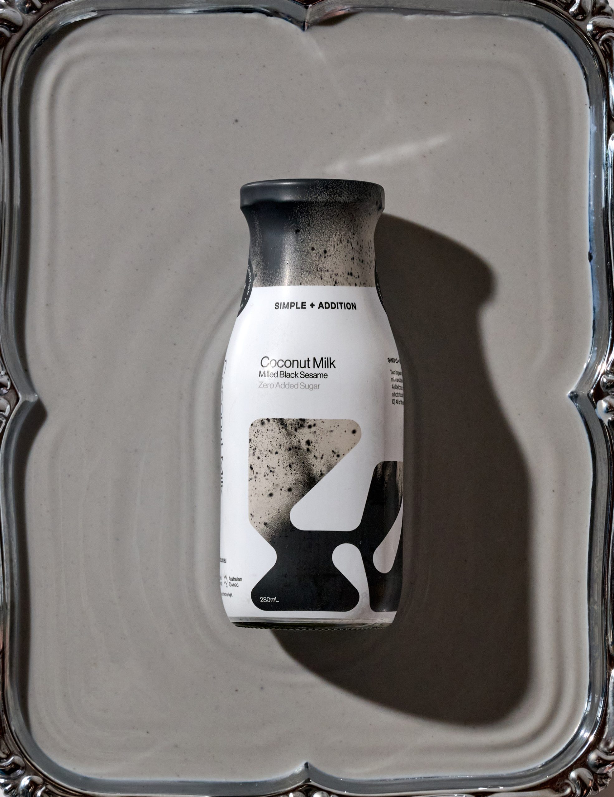
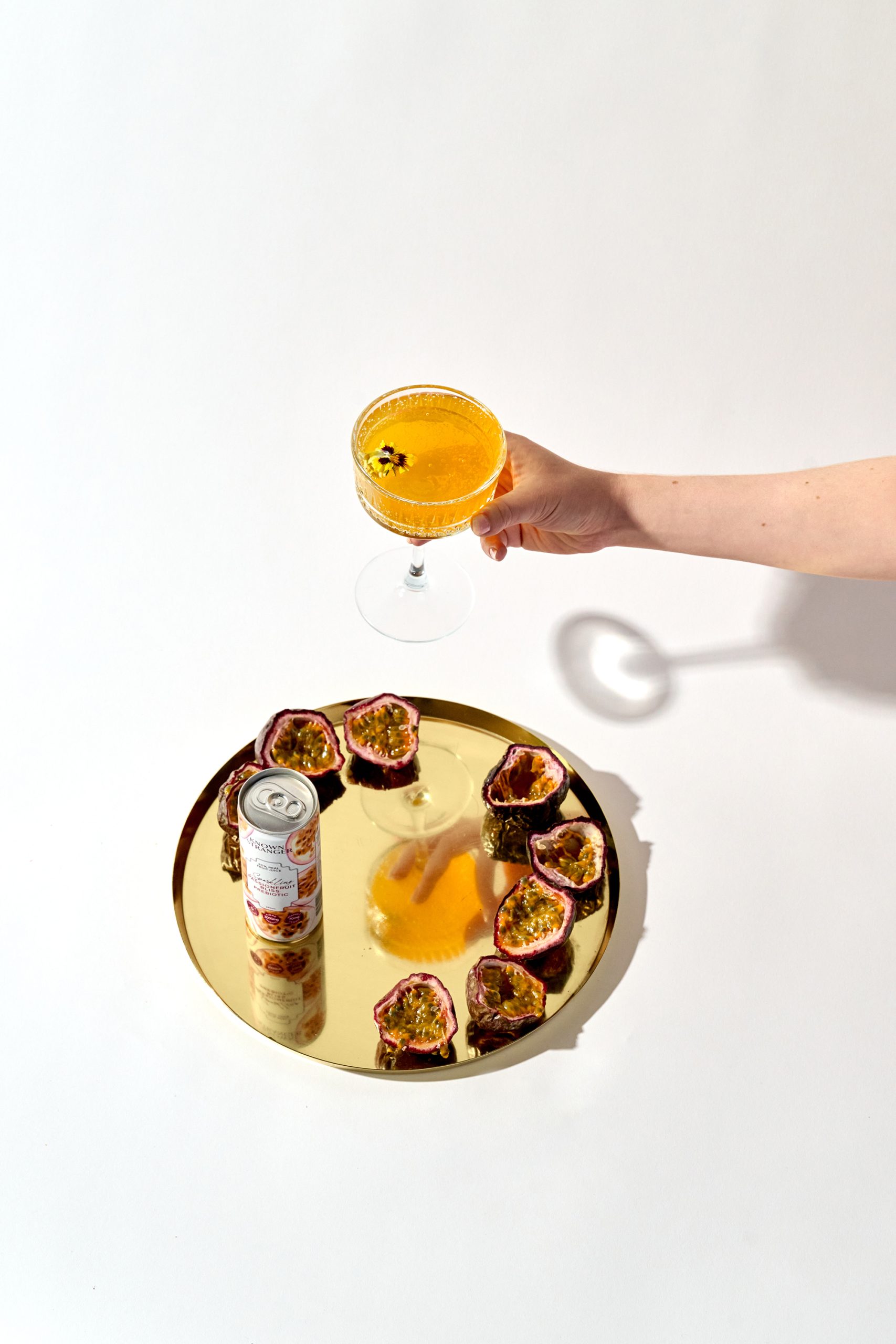
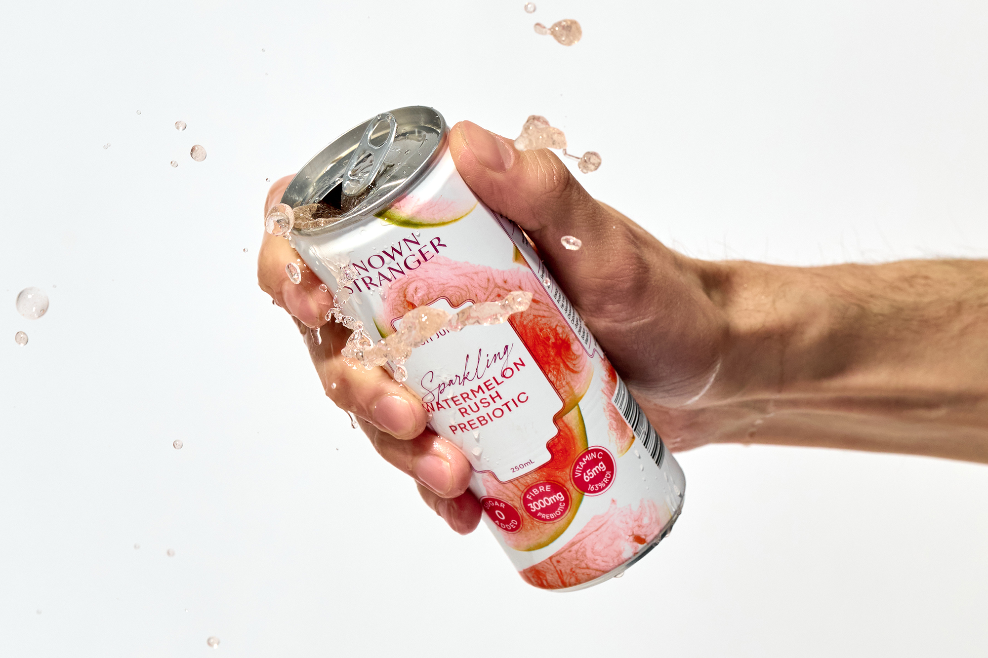
Our solution was to let the drinks speak visually. We paired minimalist layouts with curated styling to spotlight the freshness and quality behind every bottle and can. The photography focused on clean light, vivid ingredients and sculptural presentation, allowing each product to stand on its own while still feeling cohesive as a brand family.
The packaging design is unique in its ability to feel premium without losing its sense of fun. From concept to execution, every decision was made with intention. The final result is a visual language that captures TOA’s essence: bold, natural and uncompromising. A drink that looks as good as it tastes.






 Derrick Lin
 Biaa
Biaa Petitmoulin Studio
 White Bear Studio
 Eva Chistyakova
 monther al omari
 Atipus
 alchimistestudioParis
 oneandother
 bloomburo
 helocrene
 Shapers Studio
 Denver Design
 Aidearte
 andrew.huerta
 softmachine
 airobtq
 Buzz & Co.
 Ruby
Ruby themythographer
 IDNB Inc.
 viktorflr
 Zenpack