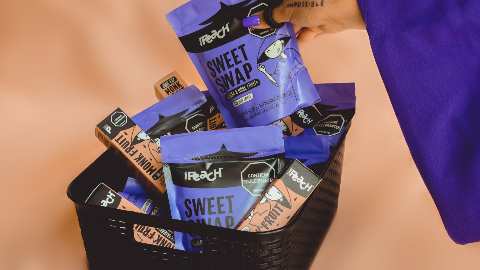

Huula Peach returned to the studio with two exciting new products and a crystal-clear mission: stand out visually and break away from the conventional wellness clichés dominating today’s market.
Our approach:
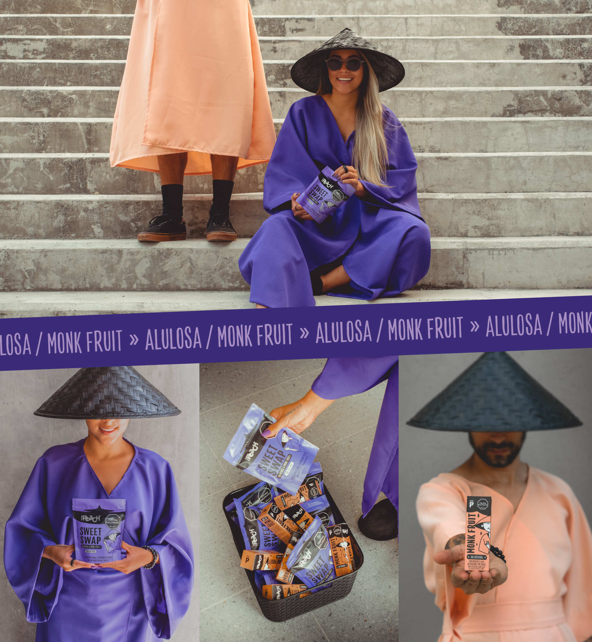
During a creative season in Thailand, one of the historic birthplaces of monk fruit, we immersed ourselves in its origins, health benefits, traditional uses, and cultural significance. More importantly, we searched for fresh, meaningful visual inspiration. This journey gave life to Inva Joy — a bold, vibrant, and playful brand concept brimming with characters, emotions, and a spark of irreverence. From it emerged Mon, the cheerful and charismatic main character inspired by the joyful simplicity, bright colors, and serene spirit of Buddhist monks.
The solution:
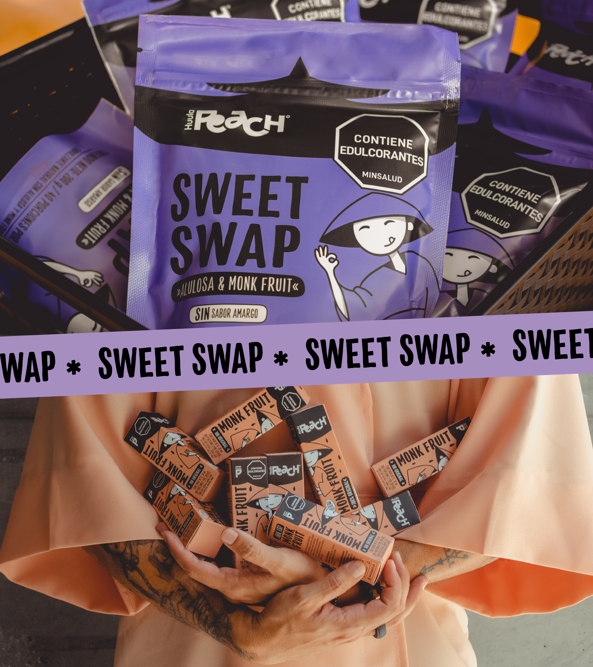
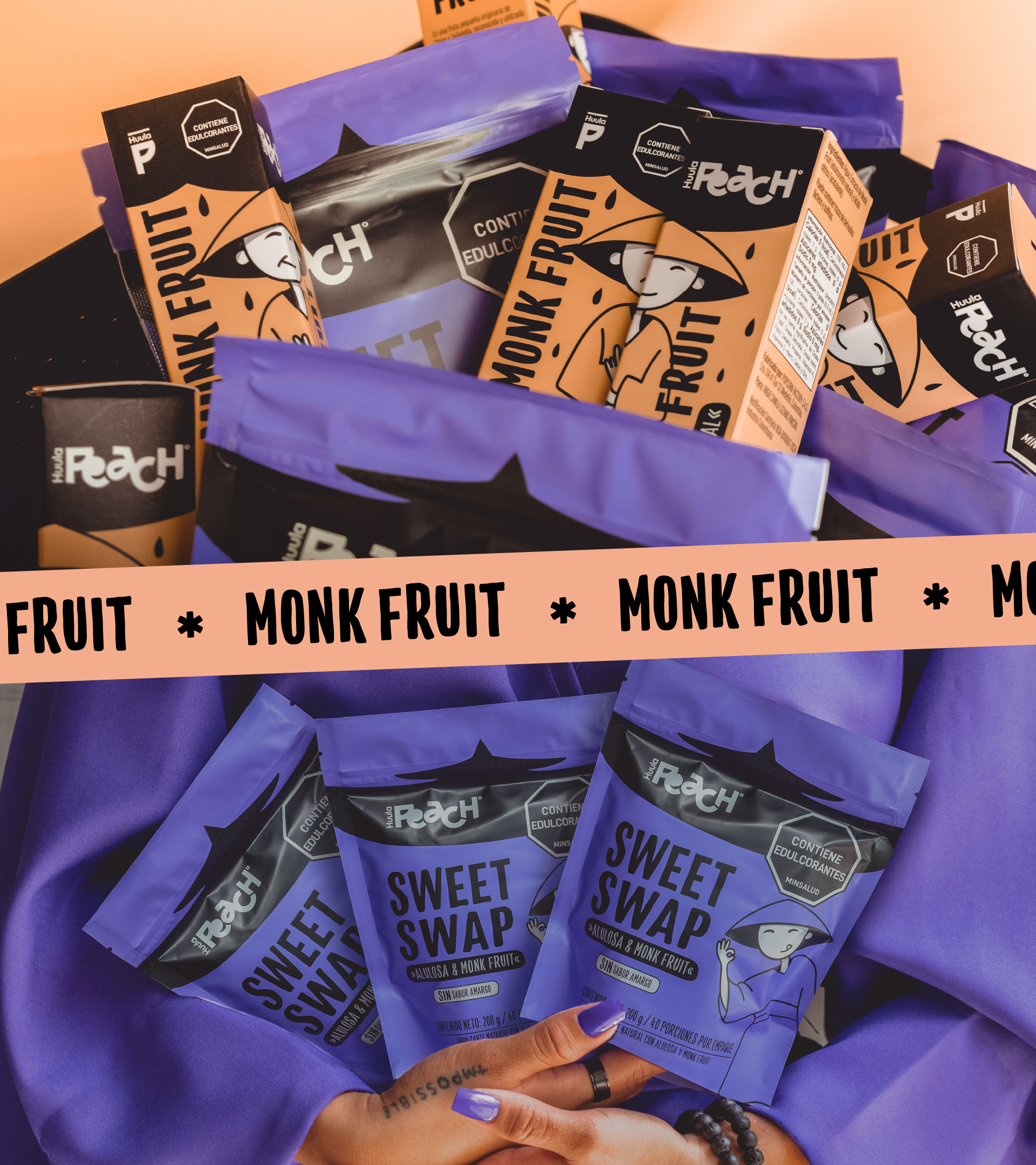
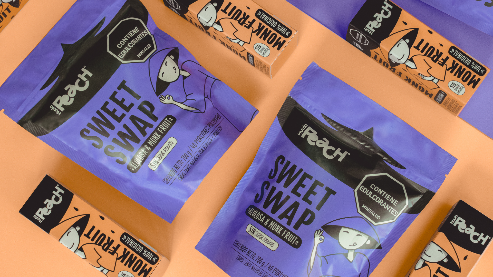
We shaped Mon’s story, personality, and distinctive visual identity through expressive yet minimal strokes, paired with a color palette that is both refined and playfully inviting. We carefully adapted Mon to the doypack packaging format, ensuring his personality, charm, and shelf impact remained strong. Typography and product claims reinforced the brand’s warmth, authenticity, and consumer trust, while a sleek black upper section integrated mandatory legal stamps without interrupting Mon’s visual universe.
The result:
The brand has been warmly welcomed in local health food stores, standing out on shelves not only as an innovative, better-for-you product but also for its bold, memorable, and unconventional design. Now, Huula Peach is confidently preparing to debut in the country’s major retail chains later this year, marking an exciting new chapter in its growth.

 NEV
NEV Stefano Bracci
 Alina
Alina monther al omari
 Lizakjx
 JOAOMARCOSDESIGN
 alchimistestudioParis
 Harriet Neild
 octavio rojo
 宏洛图品牌设计HONGLT
 DESIGN CONCEPTS
 Alexander Skurihin
 Studio K95
 ARMBRAND
 Richa Rai
 houseoferas by Miti
 Agence des Coteaux
 Kushi Eaknath
 Ann Treasa
 Xiao Ning
 krrrrrllii
 babyage
 Deep
Deep