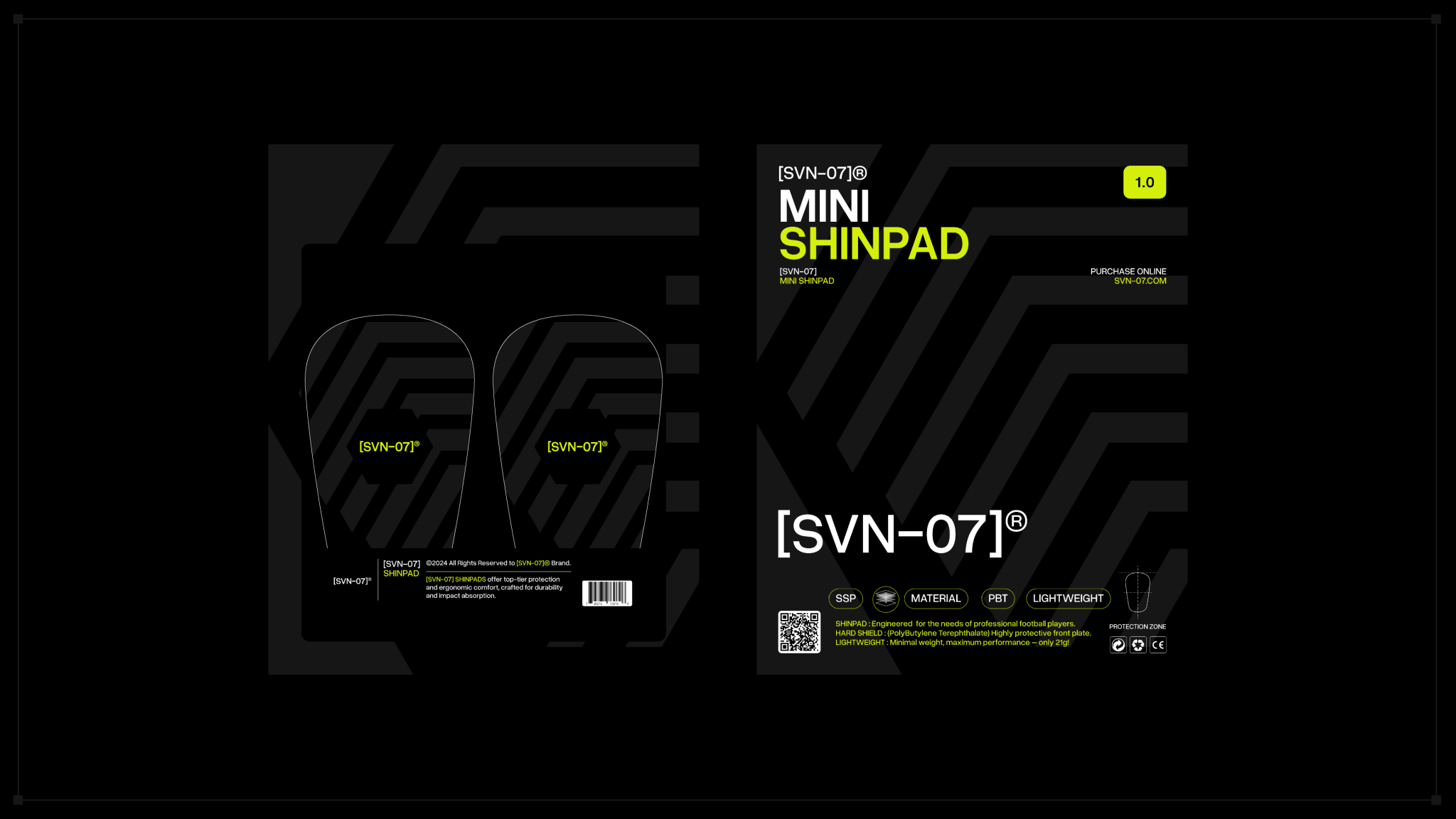

Brand Overview:
[SVN-07] is a brand dedicated to crafting high-performance sports apparel and athletic gear that empowers athletes to reach their peak performance.
Scope & Process:
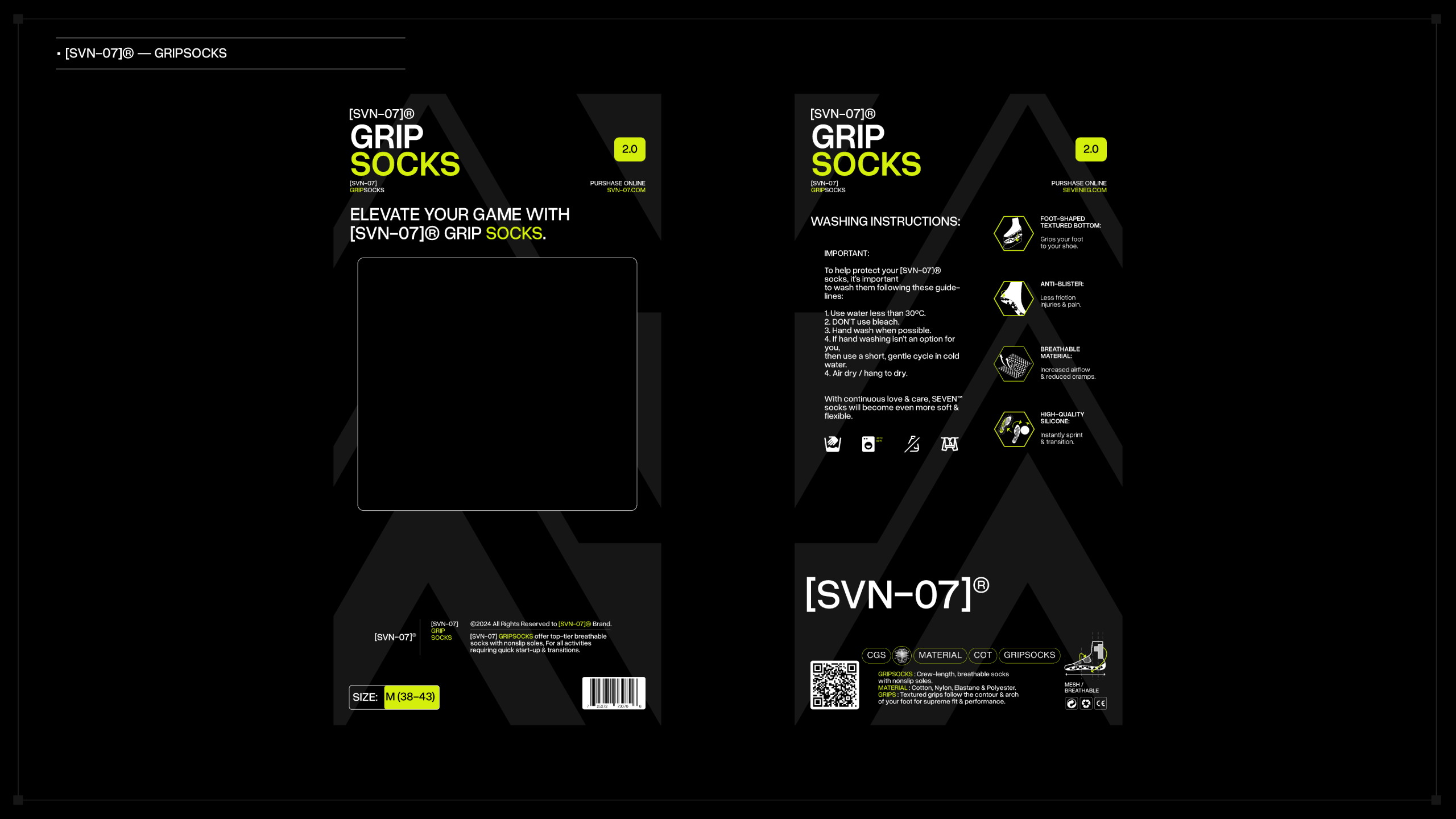
My role involved the full development of the visual identity system, including:
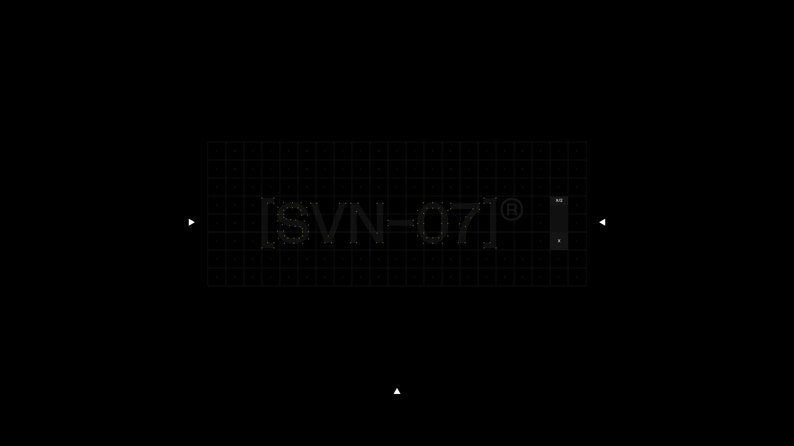
• Logotype design
• Typographic system
• Color palette
• Imagery direction
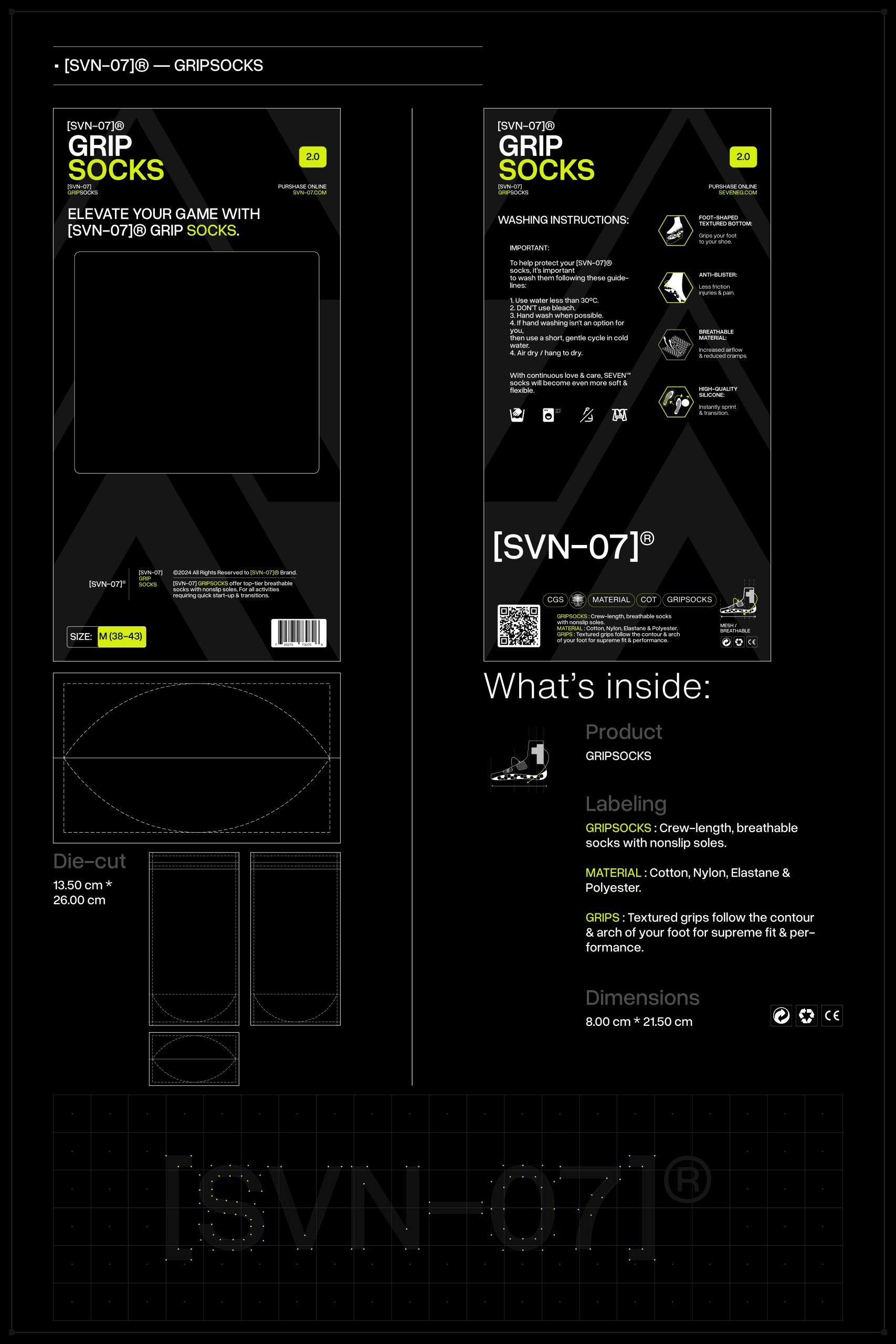
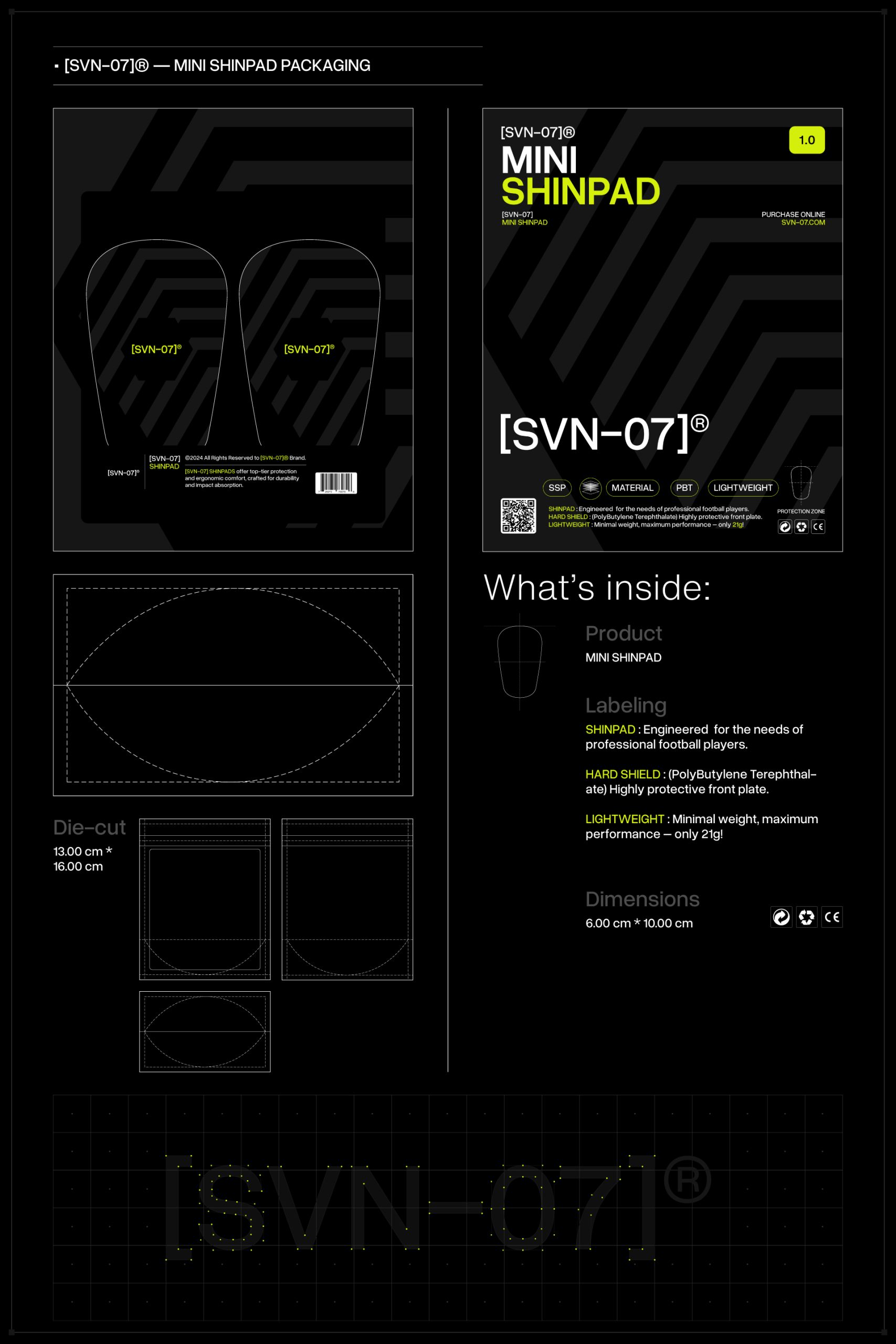
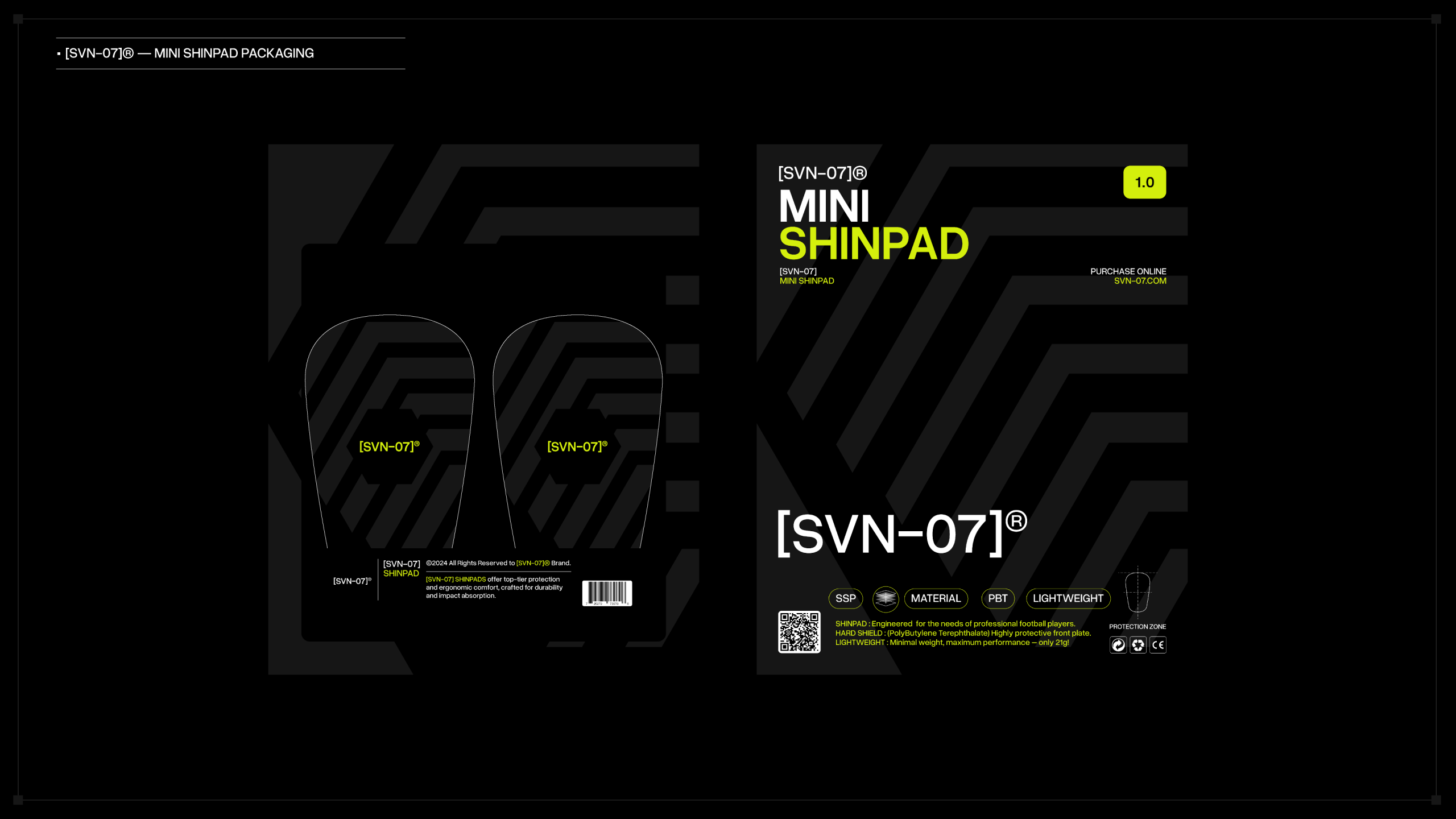
• Iconography &label system
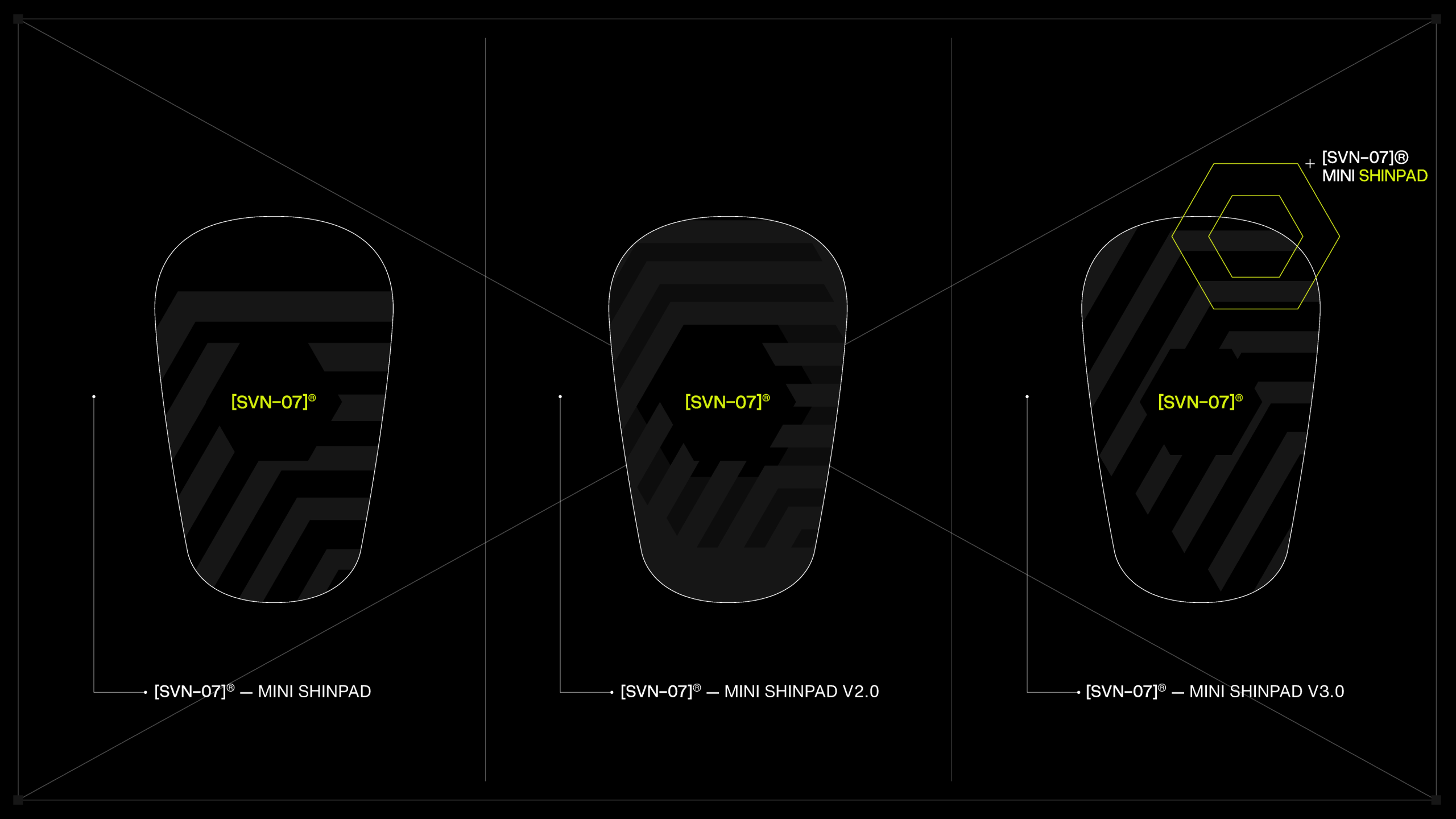
• Linework & shapes
Throughout the design process, I explored multiple visual style directions and product prototype applications, all working toward establishing a cohesive and futuristic visual language.
Creative Direction:
The overarching aesthetic of the brand draws heavy inspiration from futuristic, sci-fi, and tech-driven visual languages. These influences guided every design decision—from the color palette and imagery treatment to the creation of linework, label system, and visual elements as an overlays that interact dynamically with text and photography, resulting in the end to create visual compositions that drive these feelings to the consumer.
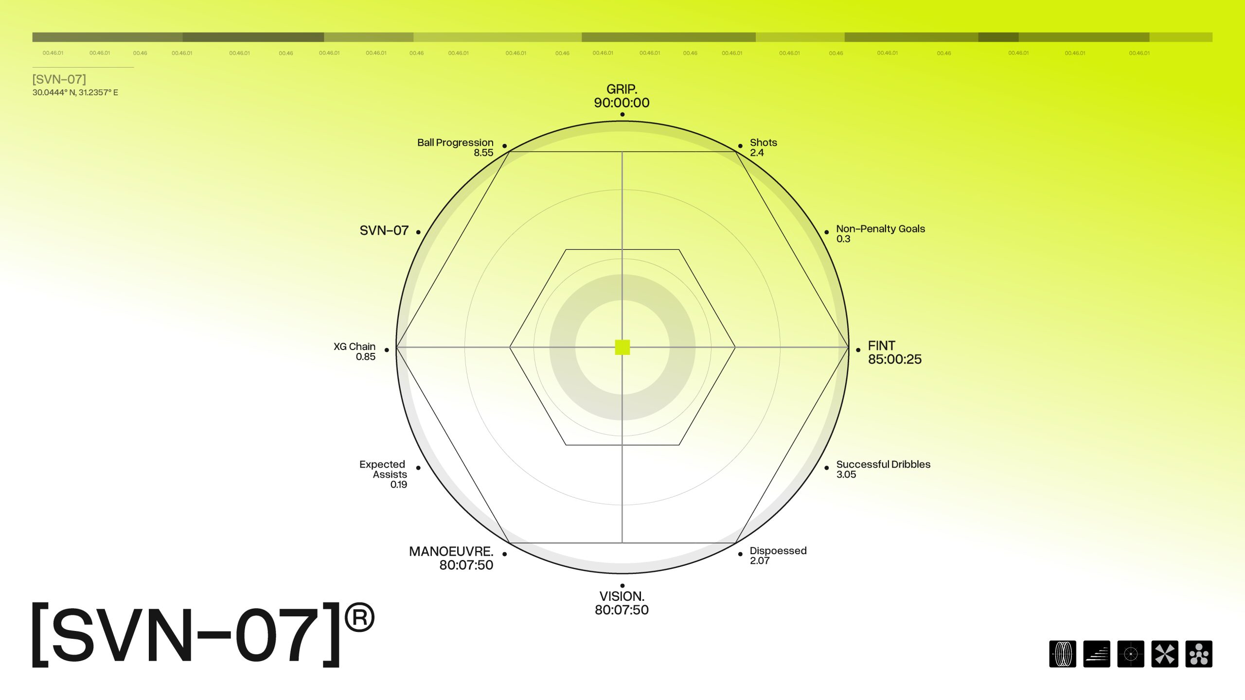
In techwear and sports fashion, the hexagon is an emblem of strength, precision, and innovation. Drawing inspiration from nature—such as in honeycombs—the hexagon embodies efficiency and stability in structure, and it is therefore an appropriate form for high-performance design. It also conveys a sense of engineering and technical precision, which accords with the high-technology, utility-driven characteristics of contemporary sports equipment. The way hexagons nest into each other symbolizes modularity and connectivity, just as techwear will often utilize layers and pieces that can be mixed together to collaborate. Hexagons also visually convey movement, dynamism, and forwardness, so it is ideal for brands who want to express performance, newness, and advanced design.
Color Palette:
The primary brand color is Sulphur Spring Green—a vibrant, energetic hue symbolizing vitality, renewal, and athleticism. This color was chosen to represent the physical energy and momentum associated with modern sports and fitness culture. The supporting palette complements this tone with colors that enhance contrast, motion, and clarity across physical and digital mediums.
Imagery & Moodboard Direction:
The imagery system was developed around core themes such as:
• Motion
• Athletic performance
• High shutter speed / freeze-frame photography
• Futurism
• Black & white contrast
• Technology
These concepts were distilled into a curated moodboard that formed the foundation for photography style, visual compositions, and brand art direction. The aim was to visually capture motion, intensity, and forward-thinking energy—reinforcing the brand’s athletic and tech-forward DNA.
Typography:
The typographic system is built around the concept of movement, momentum, and modernity.
• Primary Typeface: Overused Grotesk – a clean, sleek, and versatile sans-serif typeface, used in Regular, Medium, and Semibold weights. It supports a wide range of applications including packaging, product labeling, and digital content.
• Secondary Typeface: Mango Grotesque – selected for its bold and condensed form, ideal for headlines, banners, and social media visuals. Its compact style provides strong visual impact while conserving space and adding variation across the brand’s visual outputs.
The final visual identity positions [SVN-07] as a future-oriented brand—one that embraces innovation, precision, and performance. The system is designed to resonate with modern athletes and sportswear consumers by visually communicating speed, strength, and the pursuit of excellence. The visual language serves not only as a brand expression but also as a symbol of forward motion in the evolving world of athletic gear and performance wear.

 Derrick Lin
 VincoStudio
 lisakaplina
 CreativeWise
 alchimistestudioParis
 Adriana Adamo
 tauqueer
 MAISON D'IDÉE Prague
 Pixels Studio
 Atchayaa
 DESIGN CONCEPTS
 hello ocean
 monther al omari
 the Labelmaker
 alamgirbrands
 kat bres
 Vantablack Studio
 GruppoSaida
 studiorevv
 grafisercreative
 Kate Reichel
 UPRISE