

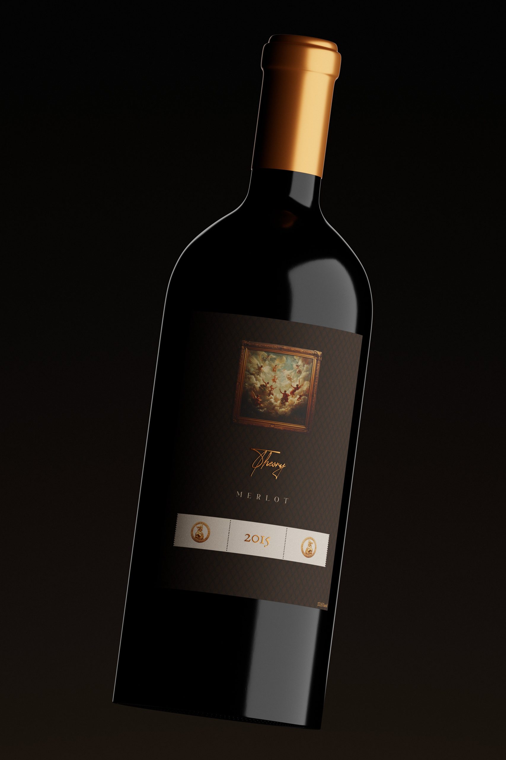
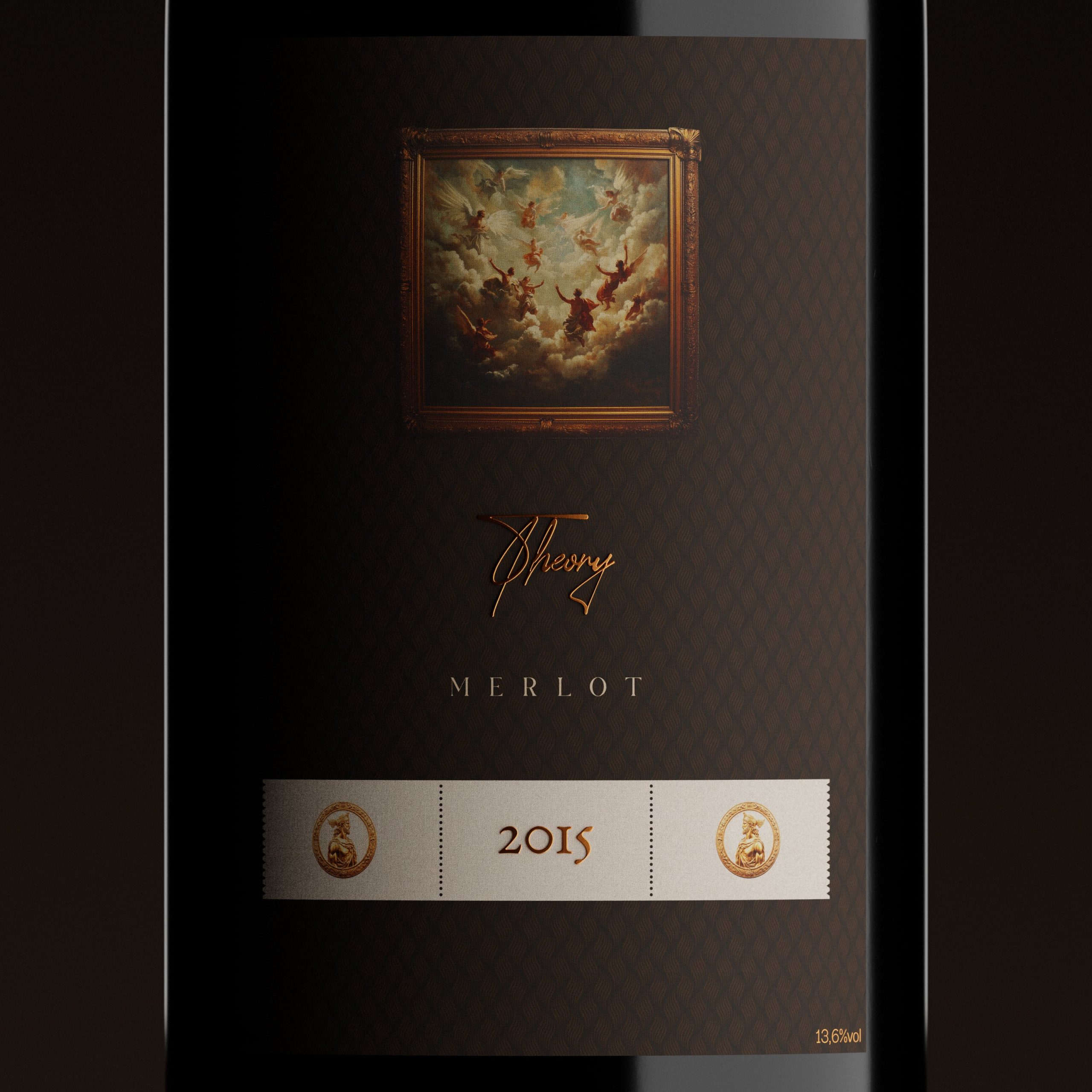
It started with the concept of making a classical painting—the “godly” scene—the core of the label. I wanted the wine to feel like a work of art, so I built everything around this central framed image. I experimented with layouts that would let the painting command attention while still keeping the overall design minimal and elegant.
From there, I chose a subtle, patterned background with deep, muted colors to create a sense of rich texture and timelessness, ensuring the artwork remained the hero. I incorporated gold foil accents for the vintage year, the name, and key details to give the label depth and a premium, tactile edge.
My goal throughout was to strike a balance between modern restraint and classic luxury, making the bottle feel elevated, collectible, and visually intriguing even before the cork is pulled.



 lunapanda
 Tridimage
 Analoguecreative
 lettera7
 alchimistestudioParis
 Lana B
 Colossal
 Pivot Studio
 M&A CREATIVE AGENCY
 monther al omari
 Anastasia Cherepanova | xtramez
 Hollóka Grafikai Műhely / Graphic Design Studio
 BOLD branding
 Antonia Skaraki
 Pâmella Lorrany
 Z9BKAdsgn
 Francesco Paternoster
 b1studio.ro
 Chris Creative Works
 Boordon
 Dmitriy Kuzovlev
 Brand Society
 yasharpic