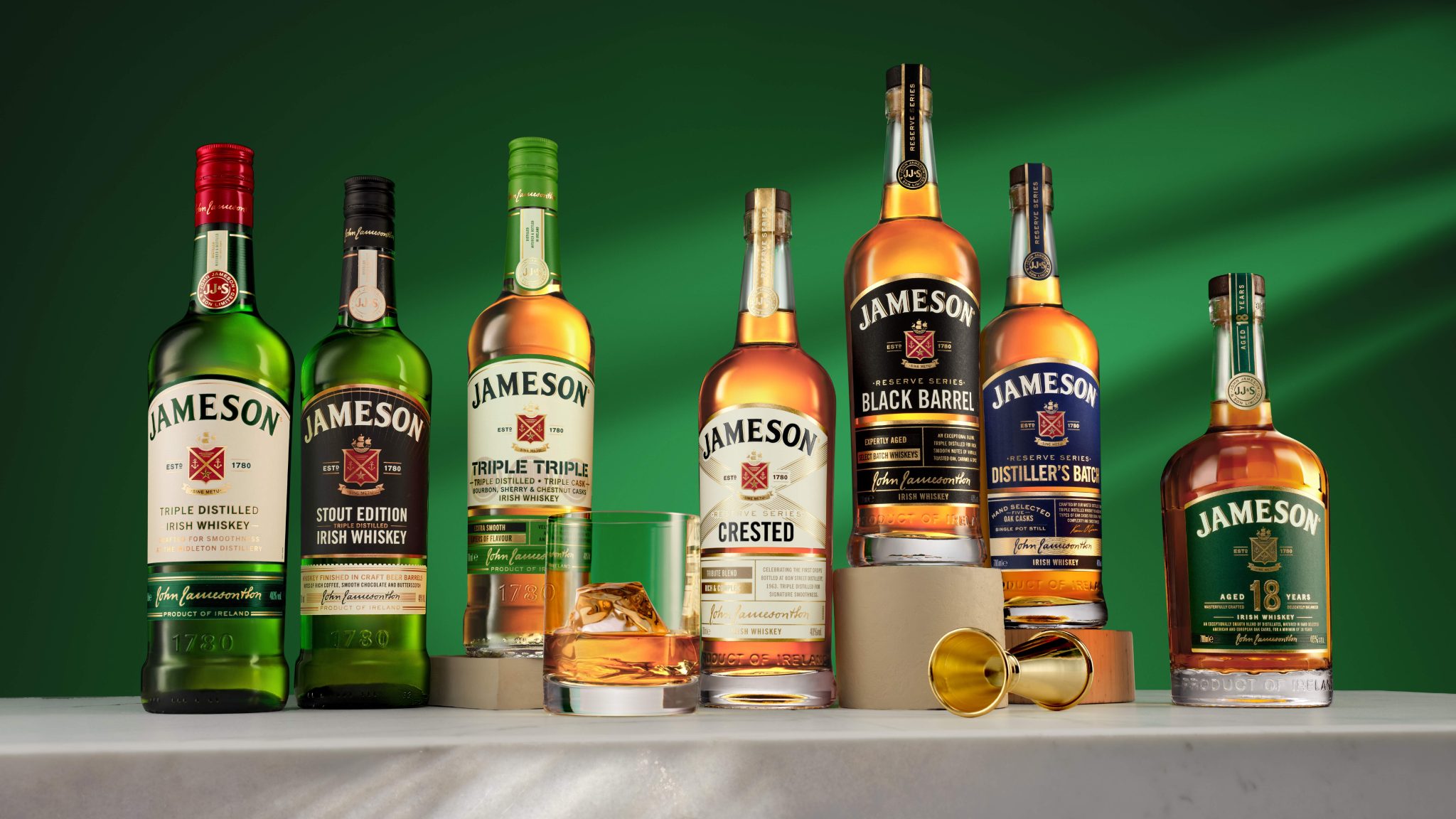

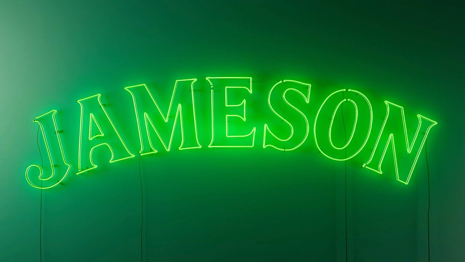
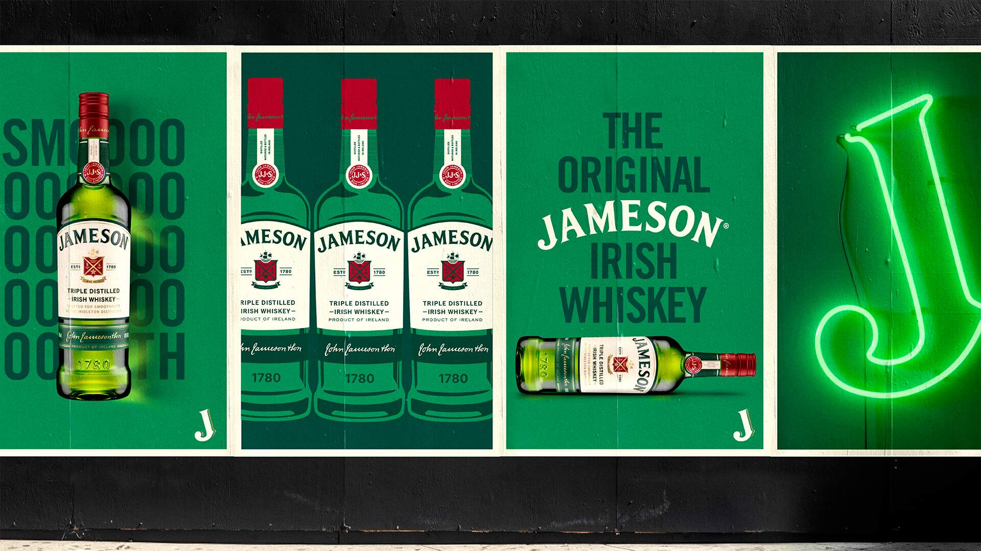
Jameson has always been more than whiskey. It is a global icon with a story that’s been shared for generations. Now the world’s best-selling Irish whiskey is stepping into its next chapter with a complete redesign by independent brand and design agency JDO. The new identity evolves, unites, and elevates the portfolio while staying true to Jameson’s warmth, wit, and unmistakable Irish spirit.
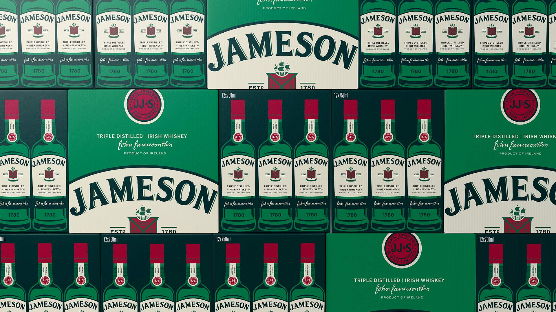
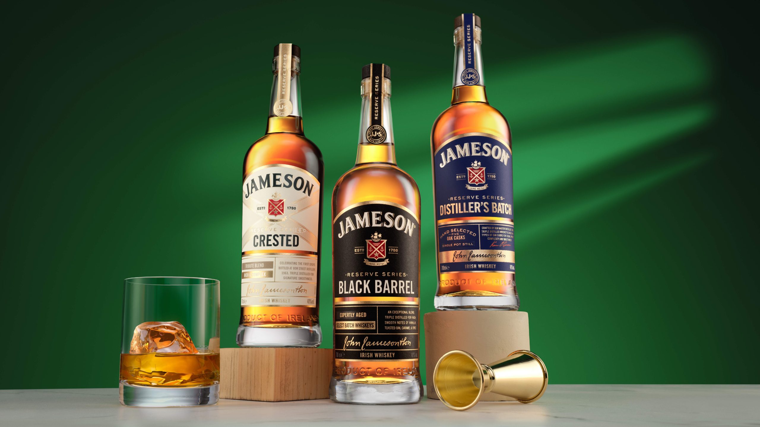
While Jameson Original is beloved worldwide, the brand’s wider portfolio of high-quality crafted whiskeys was ready for the spotlight. The brand, owned by Irish Distillers, a Pernod Ricard company, tasked JDO with creating a unified identity that would bring its family of whiskeys together, strengthen its premium credentials, and increase shelf presence – all without losing Jameson’s approachable personality as ‘the serious whiskey that does not take itself too seriously.’
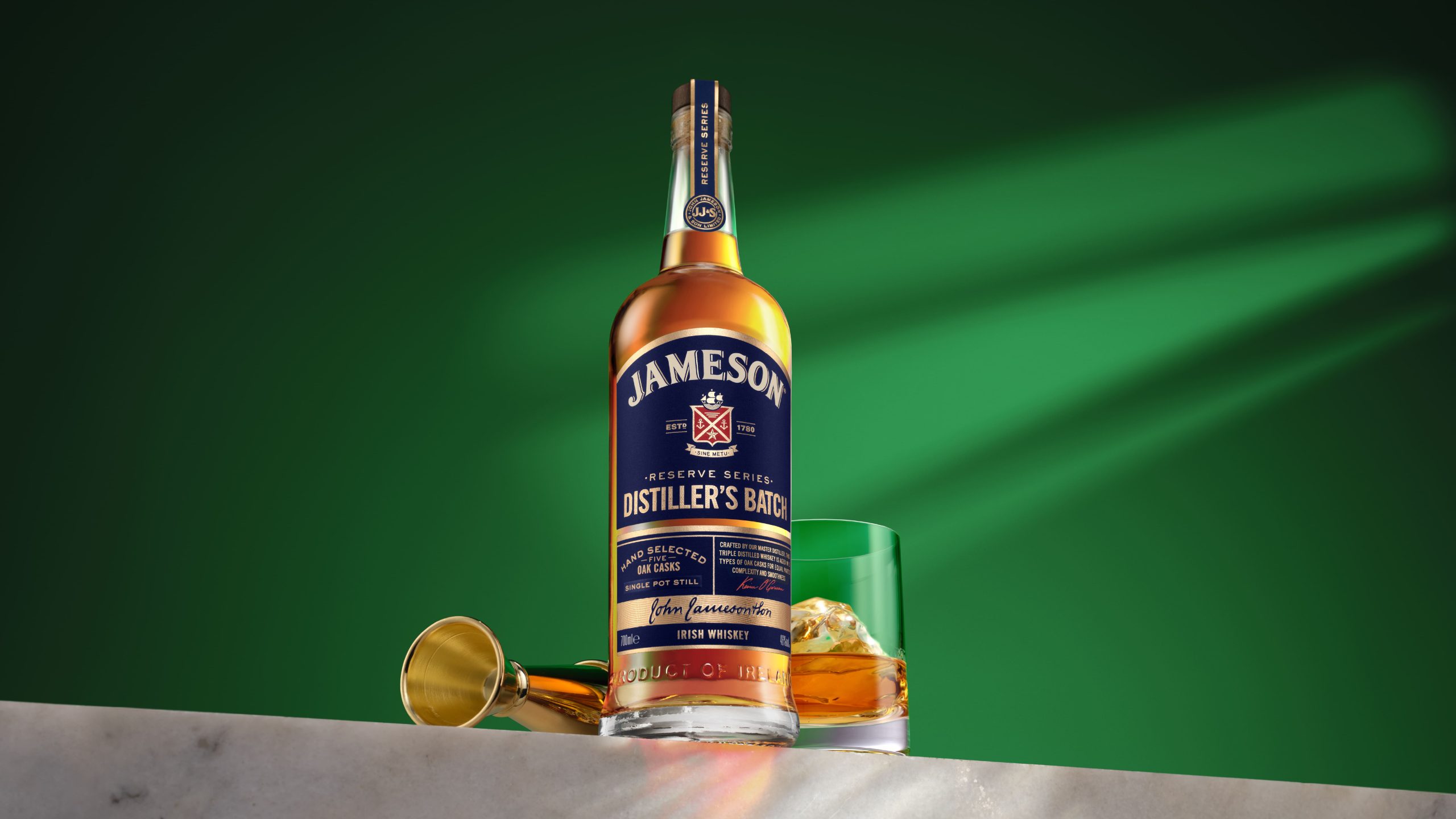
JDO answered with a strategy that drew Jameson’s most iconic elements into sharper focus, giving them stronger meaning across the range. The new portfolio structure encourages loyal fans to explore and trade up, while new recruits are welcomed into a world that feels both familiar and fresh.
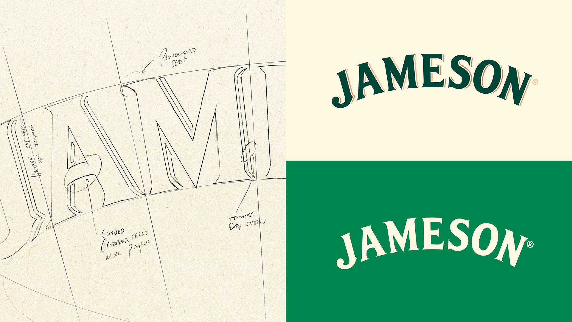
“When you are redesigning a brand as iconic as Jameson you must handle it with respect and care,” says Ben Ridley, Creative Director at JDO NY. “The task is not to reinvent but to reimagine. You look at the elements people love the most and amplify them with meaning. Our goal was to make every detail feel sharper, prouder, and more expressive, so the design remains rooted in heritage yet looks confidently to the future. That balance of credibility and playfulness, that Irish wink, is what makes Jameson so special.”
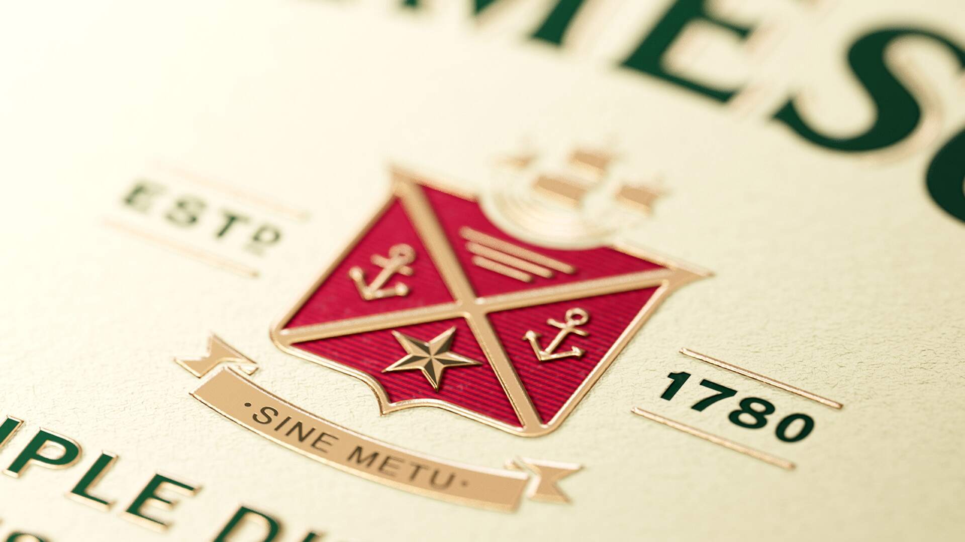
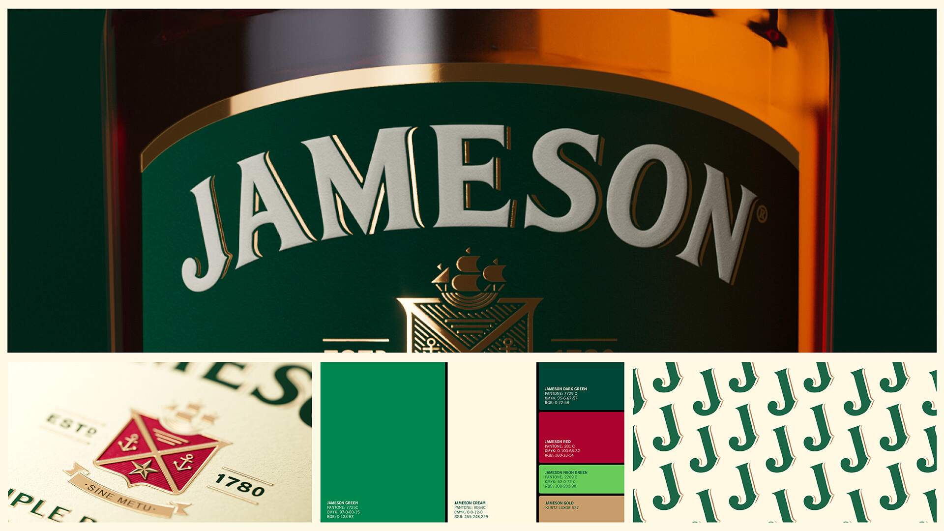
The redesign introduces a refined typography, a harmonized color palette and a clearer hierarchy across labels, bringing clarity and coherence while giving each expression space to stand on its own. Subtle foils, premium materials, and tactile finishes add sophistication without losing accessibility.
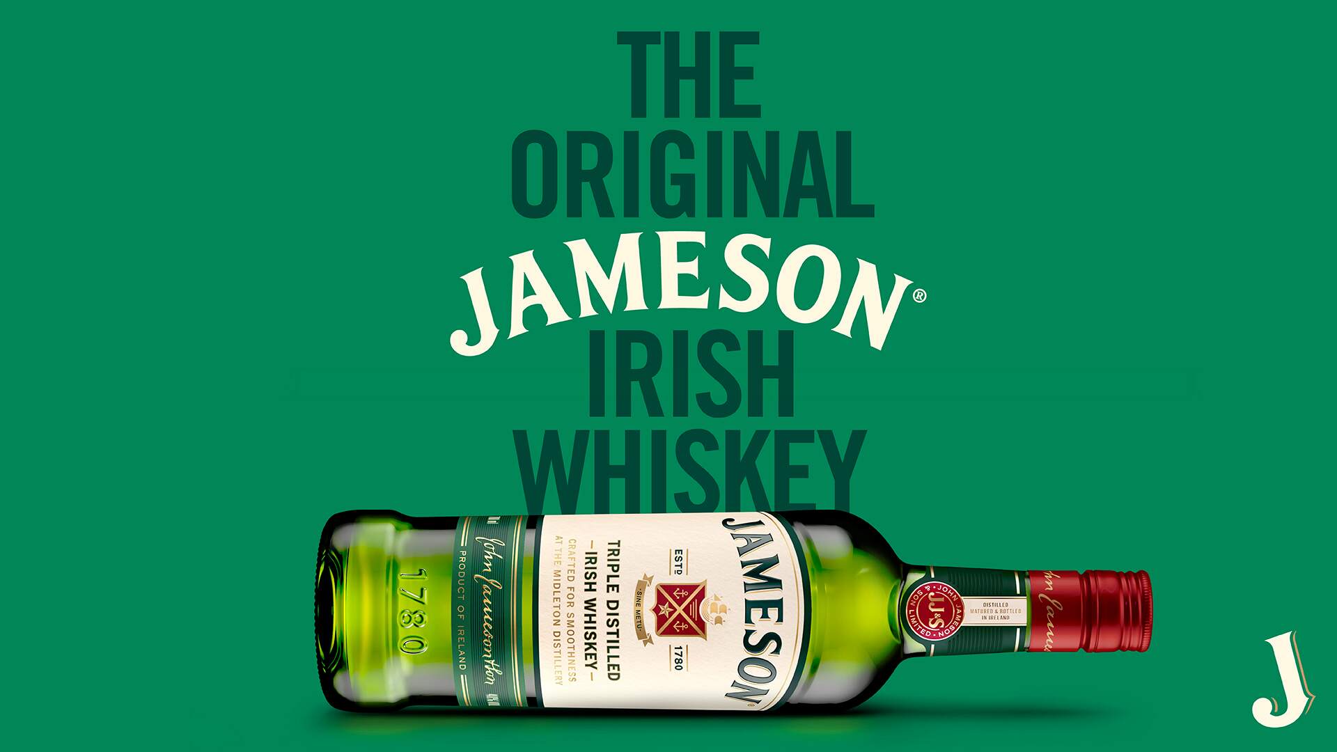
One of the most striking evolutions is the structure of the new Proud Bottle. A modern reinterpretation of Jameson’s classic green glass, its sculpted shoulders, simplified embossing, and elevated wordmark enhance shelf presence and recognizability while signalling premium quality. Confident and contemporary, it carries the unmistakable Irish character Jameson is known for.
“This redesign gives the Jameson Family of products a new kind of confidence,” says Anna Kelly, Global Head of Marketing at Irish Distillers. “JDO helped us bring the family together in a way that feels proud and premium, providing an opportunity to spotlight these rarer and older whiskeys from Midleton Distillery and from the Jameson family. It is Jameson through and through, but with a fresh look and perspective that invites new friends in and inspires our loyal fans to raise another glass.”
 Lizaveta Kharitonyuk
 Bonsanco Creative Studio
 DesignRepublic
 GIRAFA STUDIO
 PiotrWisniewski
 Sophiagdotcom
 monther al omari
 CreativeWise
 Modern Theory
 SoreThumbStudio®
 Modern World Studio
 Palashcc
 Valérie Colace
 andreamarinnn
 Chochoi Creative
 Hi estudio
 bachir bachchar
 Aferdini
 AUN BRANDS
 vitoramockup
 InterWish
 ash123456
 Studiotaketwo