

Regina Pasta is one of Egypt’s oldest and most familiar pasta brands, but its current packaging faces several challenges that reduce its market competitiveness and consumer appeal:
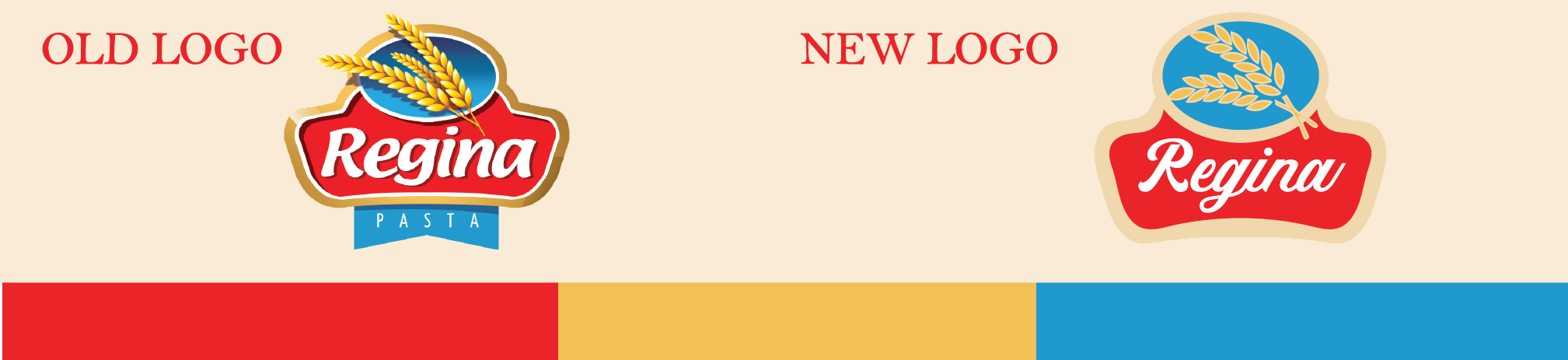
Outdated Design Aesthetic
The visual design feels traditional and static, with limited use of modern color palettes, typography, or hierar-chy. It doesn’t stand out against international competitors like Barilla or local newcomers that use more contemporary design systems.
Weak Shelf Visibility
The color palette and logo placement blend with other products on supermarket shelves. There’s no strong focal point that grabs attention quickly or differentiates between pasta types at a glance.
Lack of Emotional or Appetite Appeal
The current design doesn’t convey the warmth, creativity, or taste of pasta dishes it feels more industrial than inviting. There are no visual cues connecting the product to delicious recipes or homemade moments.
Inconsistent Branding Across Variants
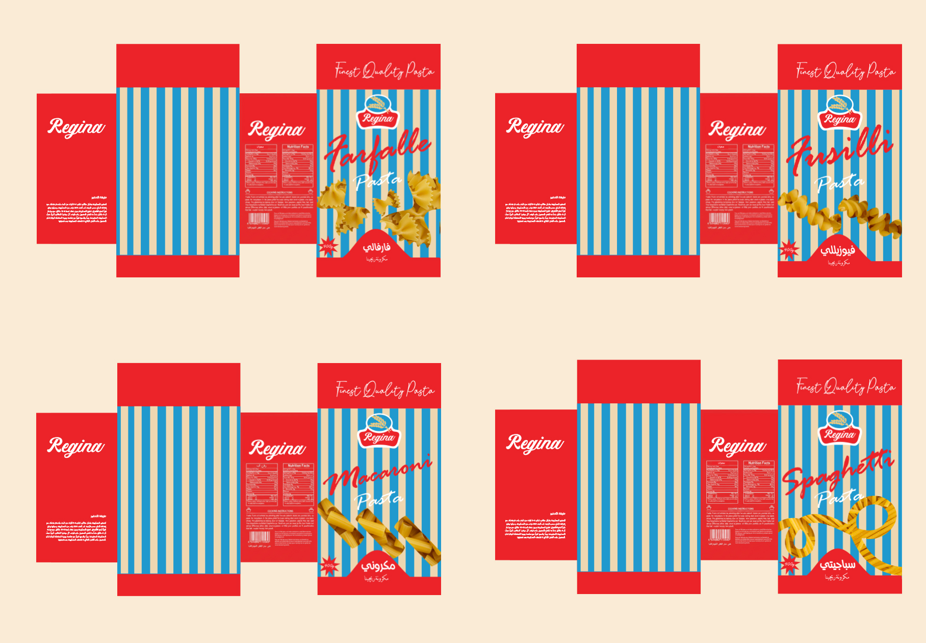
The brand lacks a clear visual system to differentiate pasta types (penne, fusilli, spaghetti, etc.), which causes confusion and limits brand recognition consistency.
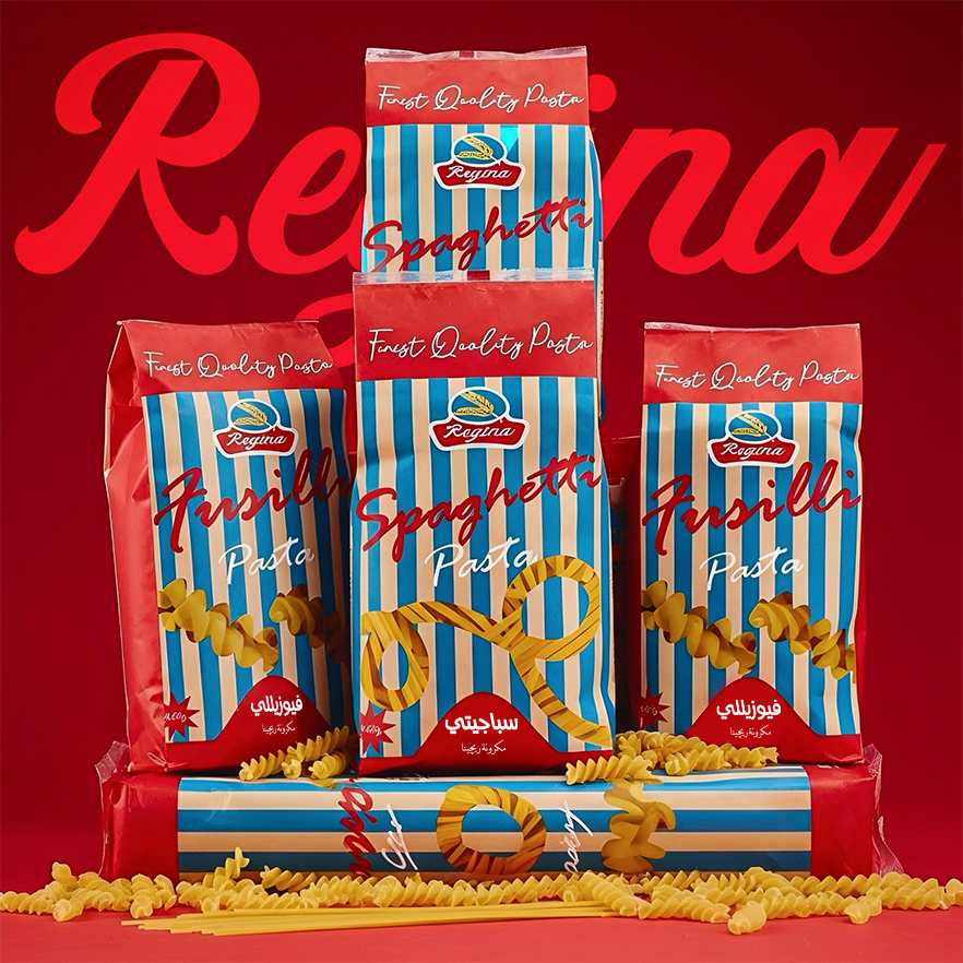
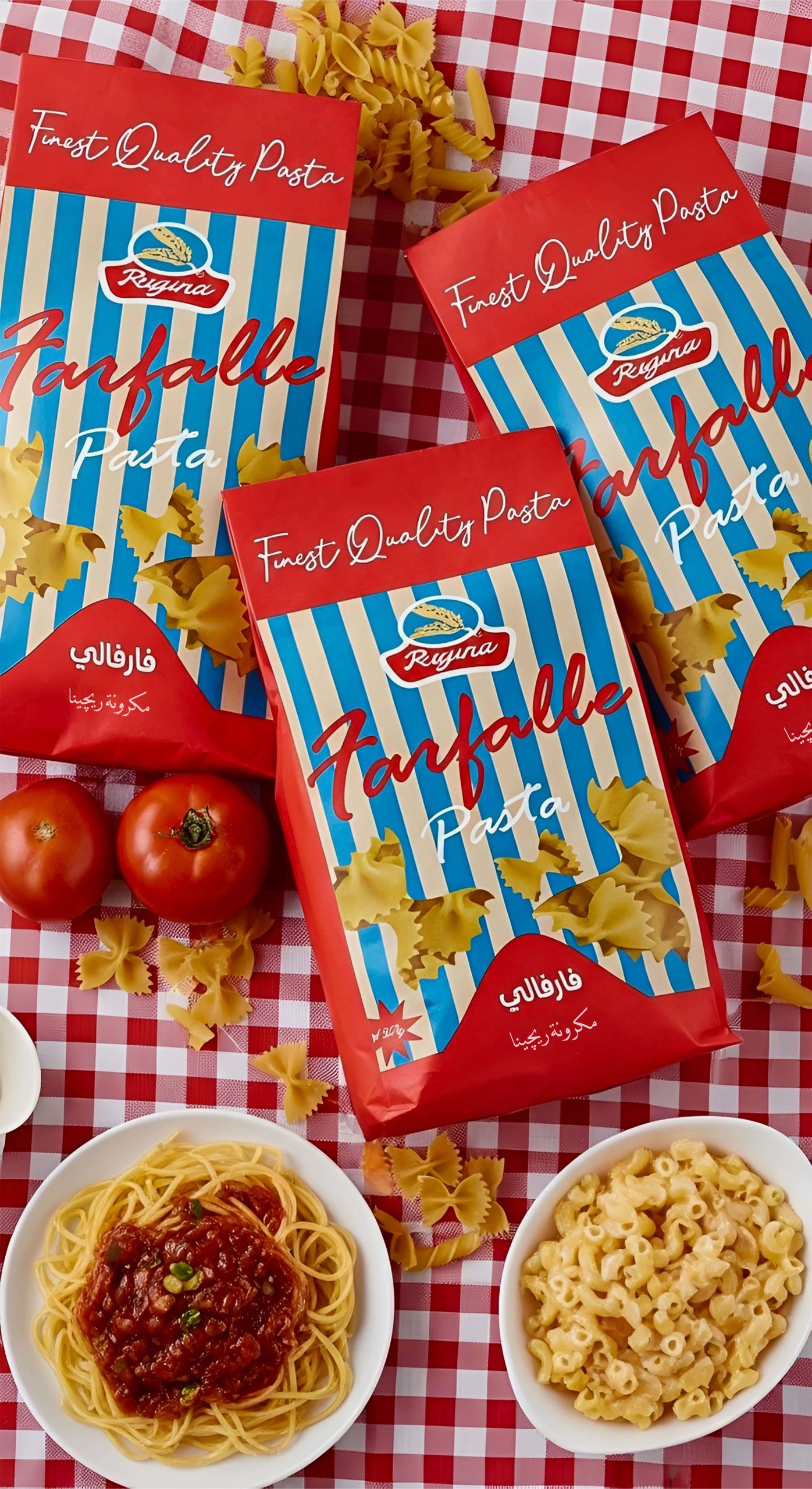
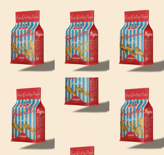
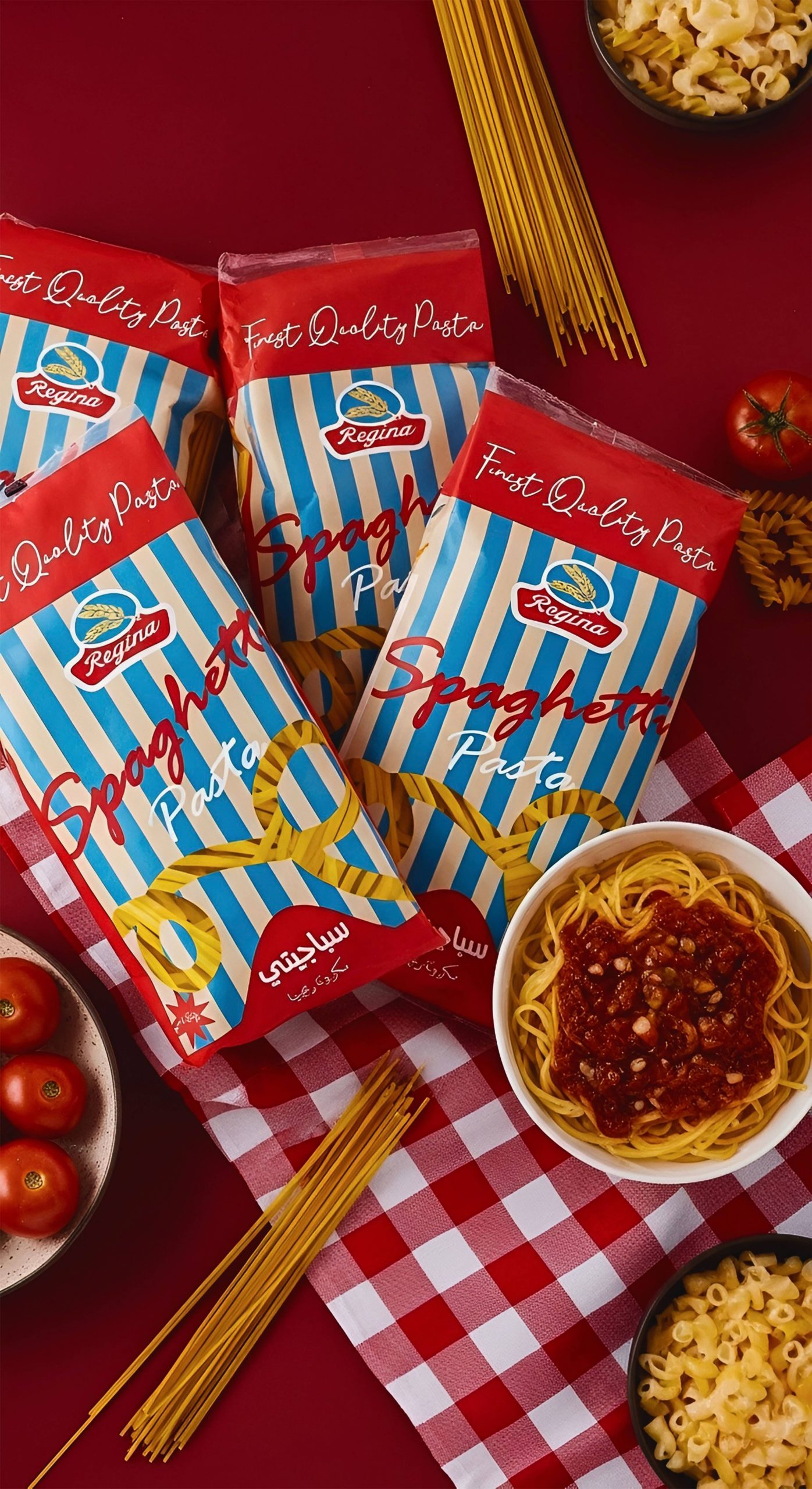
The purpose of this project is to redesign Regina Pasta’s packaging in a way that reflects freshness, quality, and modern appeal while maintaining familiarity for Egyptian consumers. The goal was to create packaging that enhances shelf visibility, communicates flavor and texture, and makes handling easier, all while keeping production cost-effective and realistic for mass retail.
Objectives:
- Improves structure usability and sustainability
- Improve Functional Usability
- Highlights each pasta shape and variant through clear cut in the packaging
- Modernize the Brand Image
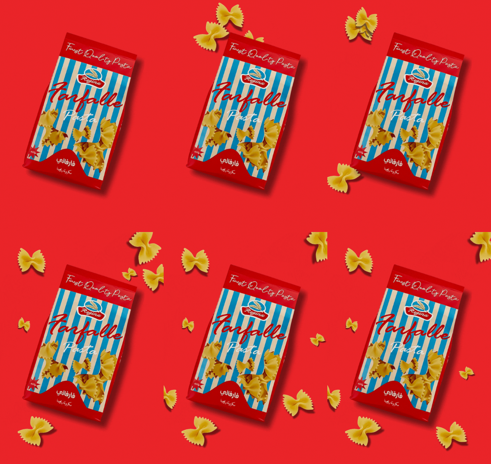
- Enhance Shelf Presence
Key Improvements:
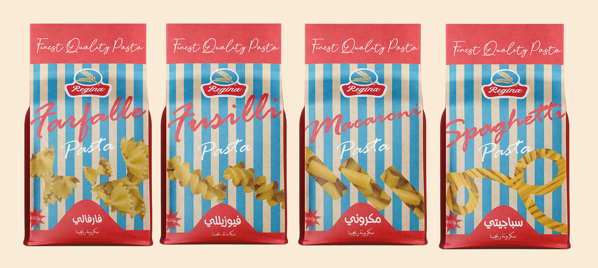
- Clearer variant differentiation.
- Better storage and resealing.
- Modern, attractive shelf impact.
- Stronger emotional and aesthetic appeal.
- Cost-efficient and environmentally conscious design.
The new Regina Pasta packaging blends the warmth of matte paper with the practicality of plastic protection. A transparent window showcases the pasta inside, building trust and enhancing shelf appeal. The thin polypropylene inner layer ensures freshness and moisture resistance, while the paper exterior delivers a clean, modern look. This hybrid structure achieves a perfect balance of functionality, sustainability, and visual impact.



 Derrick Lin
 Biaa
Biaa Petitmoulin Studio
 White Bear Studio
 Eva Chistyakova
 monther al omari
 Atipus
 alchimistestudioParis
 oneandother
 bloomburo
 helocrene
 Shapers Studio
 Denver Design
 Aidearte
 andrew.huerta
 softmachine
 airobtq
 Buzz & Co.
 Ruby
Ruby themythographer
 IDNB Inc.
 viktorflr
 Zenpack