

THE CHALLENGE
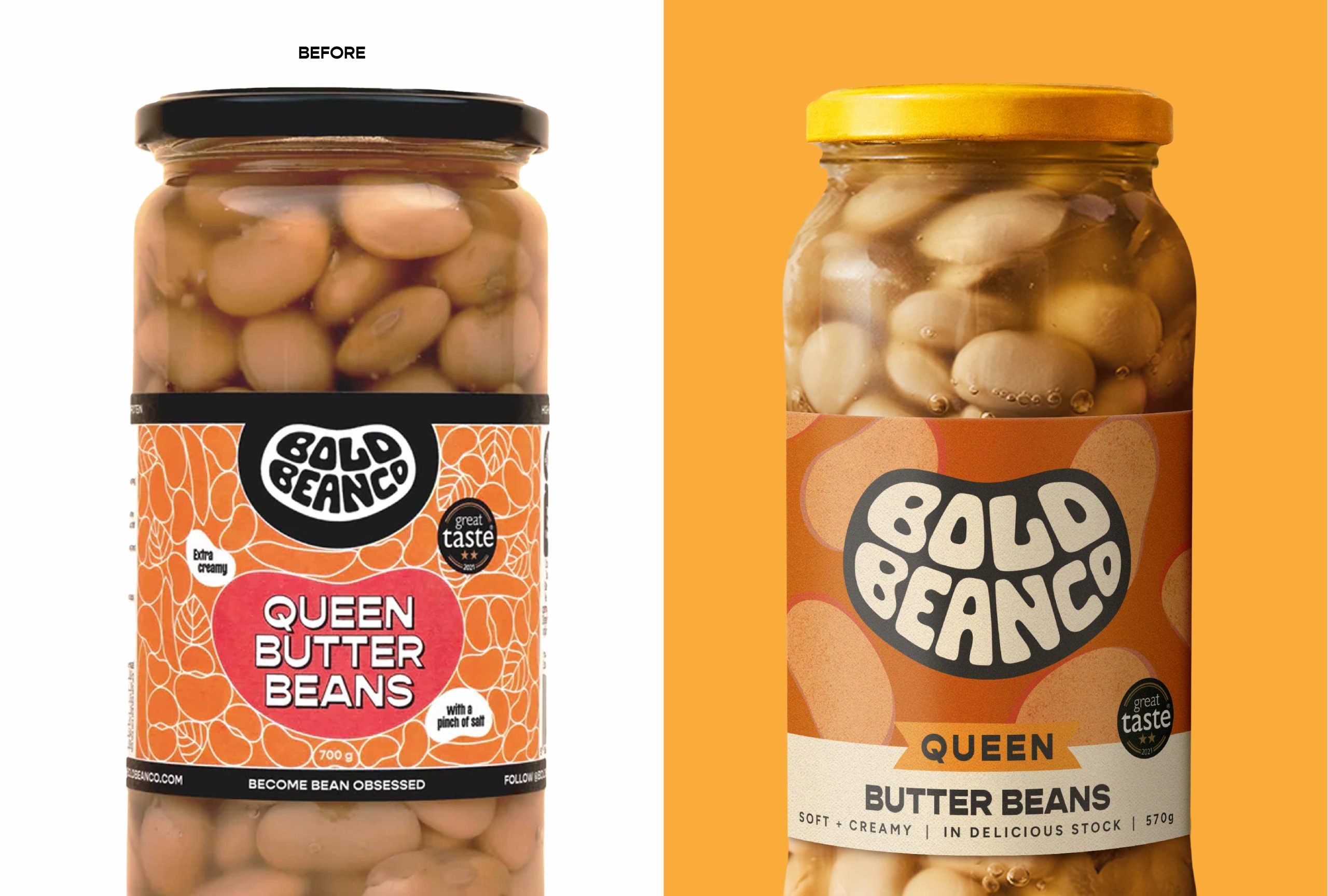
Bold Bean had strong brand love, a vibrant community, and rising awareness. But the identity lacked a consistent, scalable system to connect packaging, communications, and digital touchpoints. Shoppers and retailers struggled to distinguish between SKUs, and range navigation lacked a clear, consistent structure. Brand execution was fragmented across channels.
The task was to make the brand look as premium and distinct as its ingredients while keeping its grassroots credibility intact, turning a much-loved product brand into a scale-ready category disruptor.
THE SOLUTION
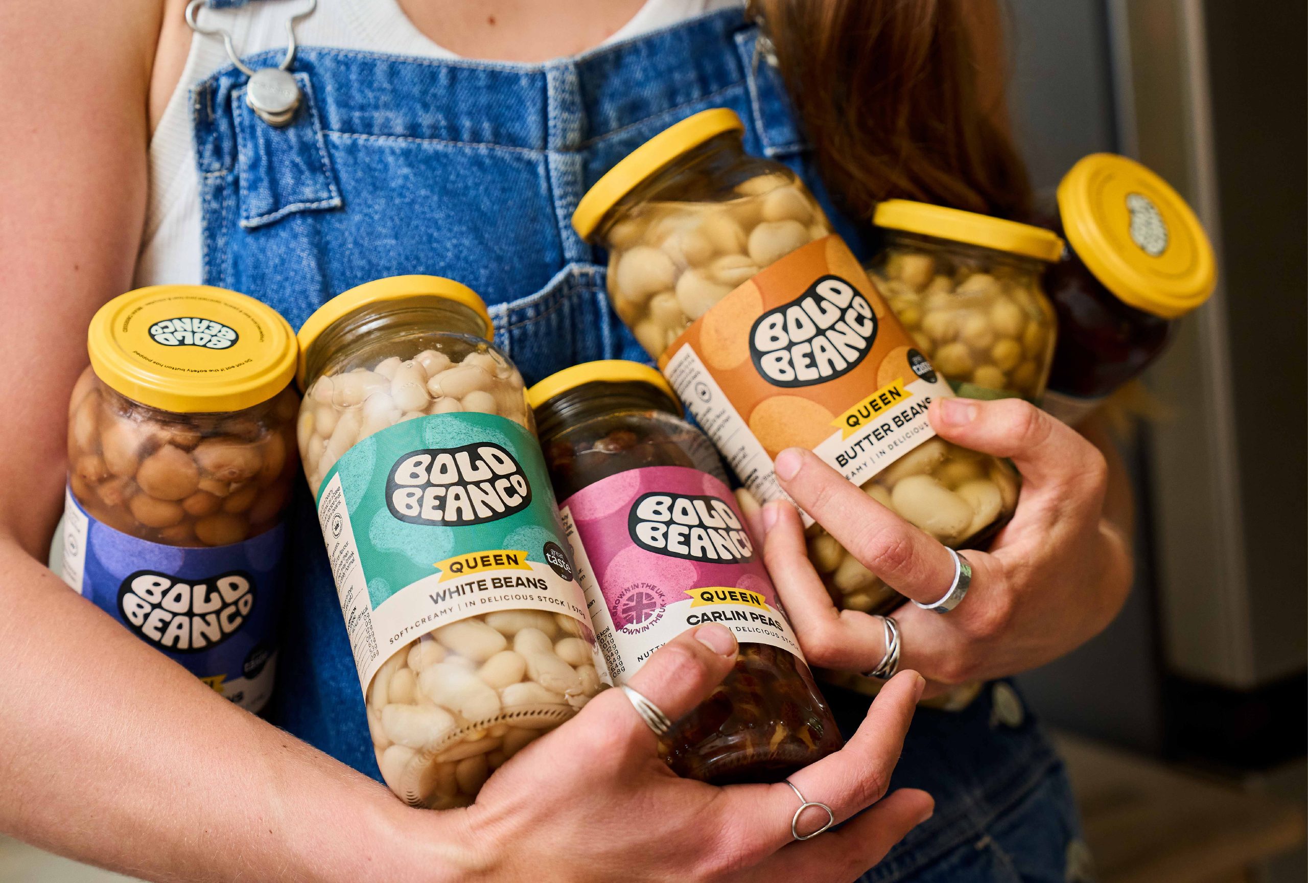
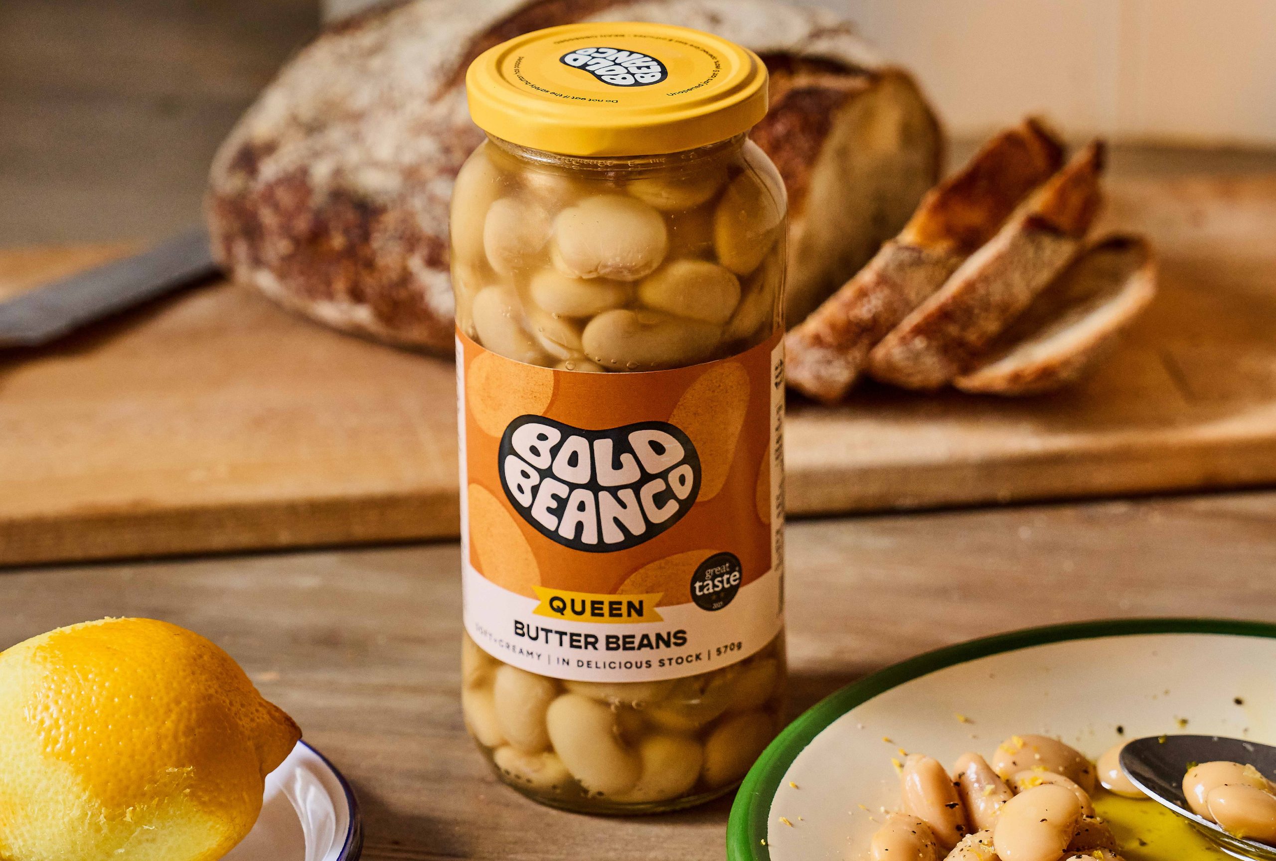
Following the mantra “Simplify to Amplify,” we built a brand world with distinctiveness at its core. The logo was dialled up for stronger recognition and paired with a signature yellow that now runs through both the lid and wider identity. Bespoke illustrations and bean patterns brought ownability to the pack, while a bold visual system ensures the brand flexes seamlessly across retail, communications, cookbooks, and digital.
THE RESULT
The result is a distinctive, scale-ready identity that delivers standout, clarity, and consistency everywhere. An identity for scale, standout, and omni-channel execution, underpinning their premium positioning and setting them up to move from cult favourite to mainstream choice.




 Derrick Lin
 Biaa
Biaa Petitmoulin Studio
 White Bear Studio
 Eva Chistyakova
 monther al omari
 Atipus
 alchimistestudioParis
 oneandother
 bloomburo
 helocrene
 Shapers Studio
 Denver Design
 Aidearte
 andrew.huerta
 softmachine
 airobtq
 Buzz & Co.
 Ruby
Ruby themythographer
 IDNB Inc.
 viktorflr
 Zenpack