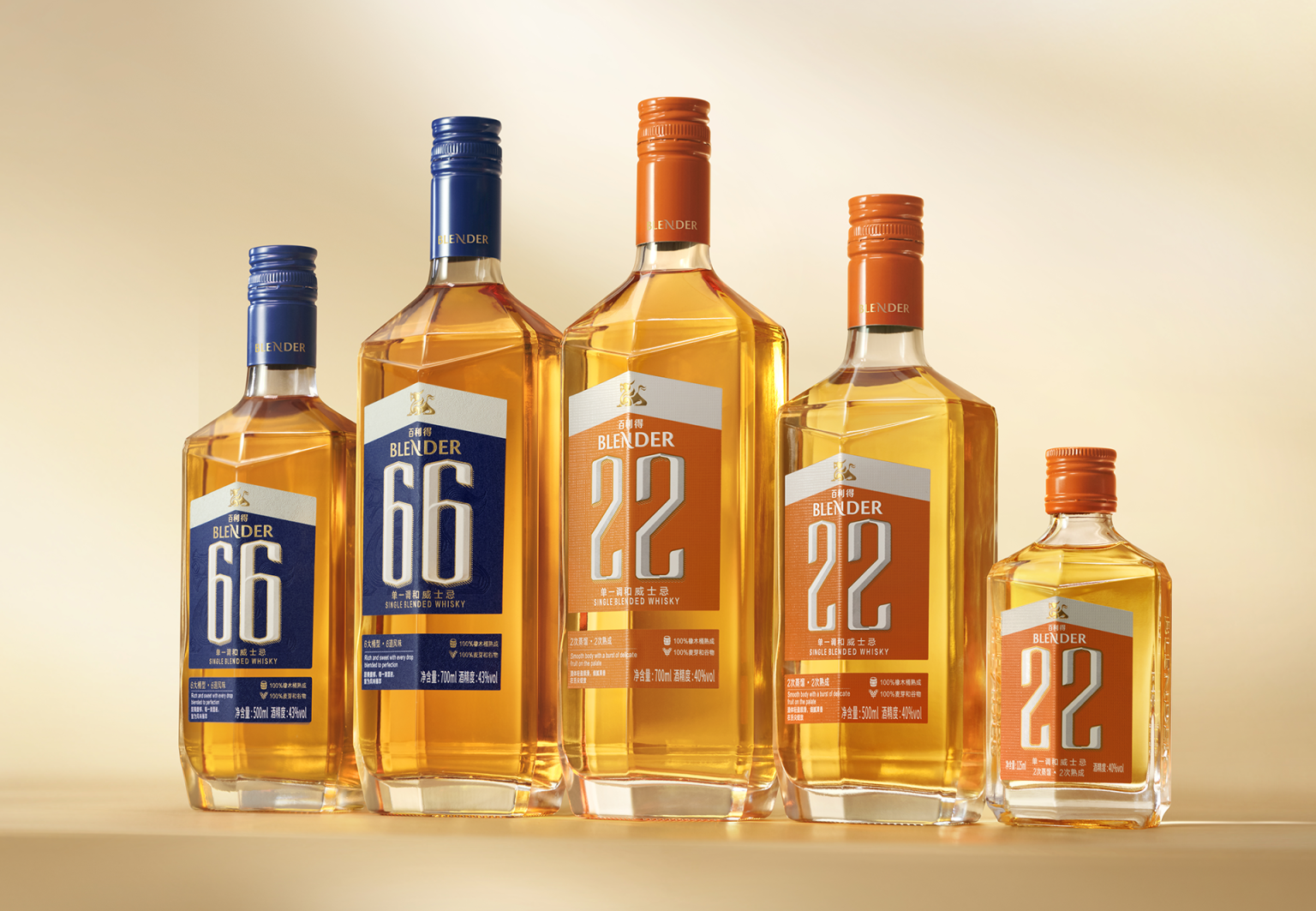

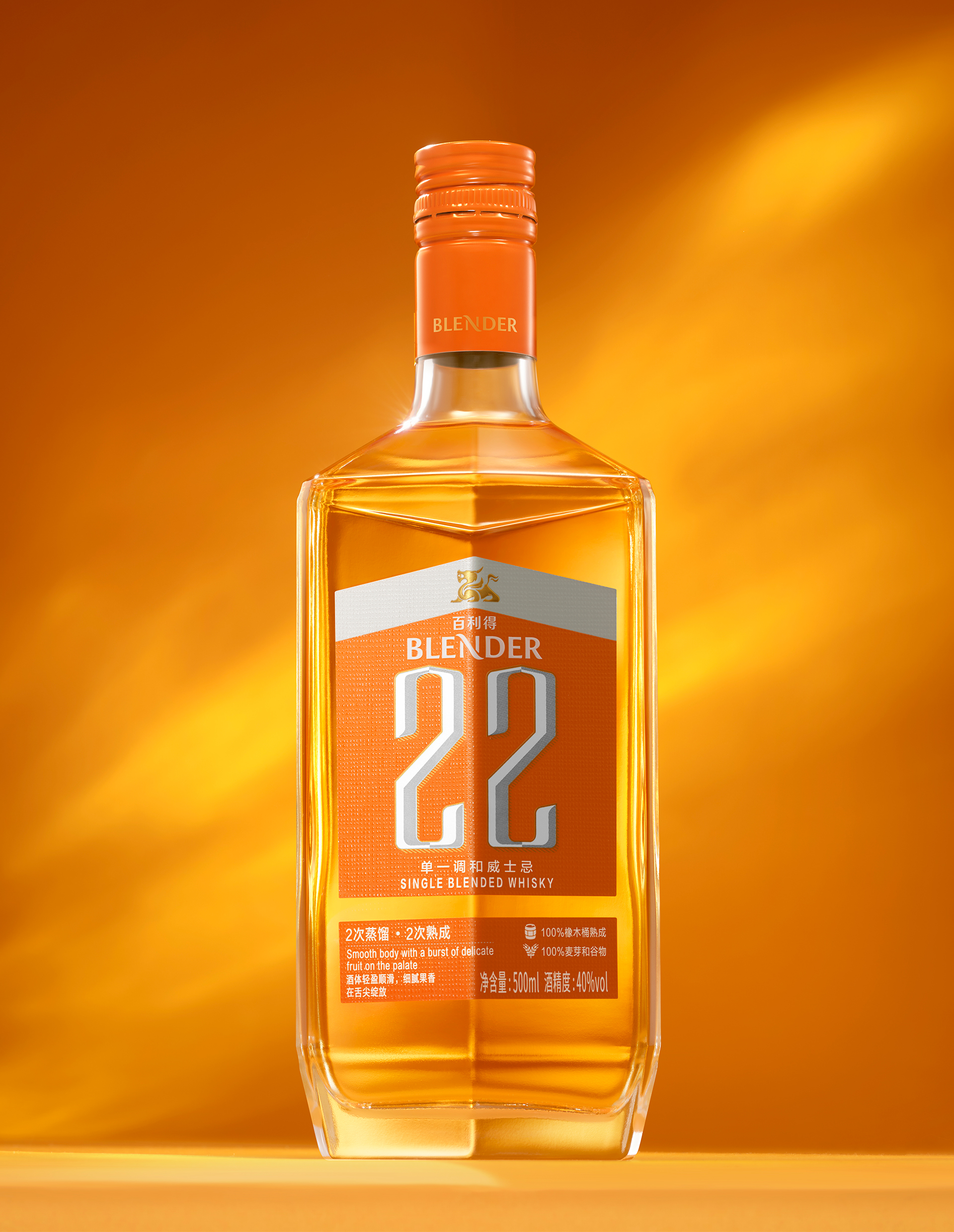
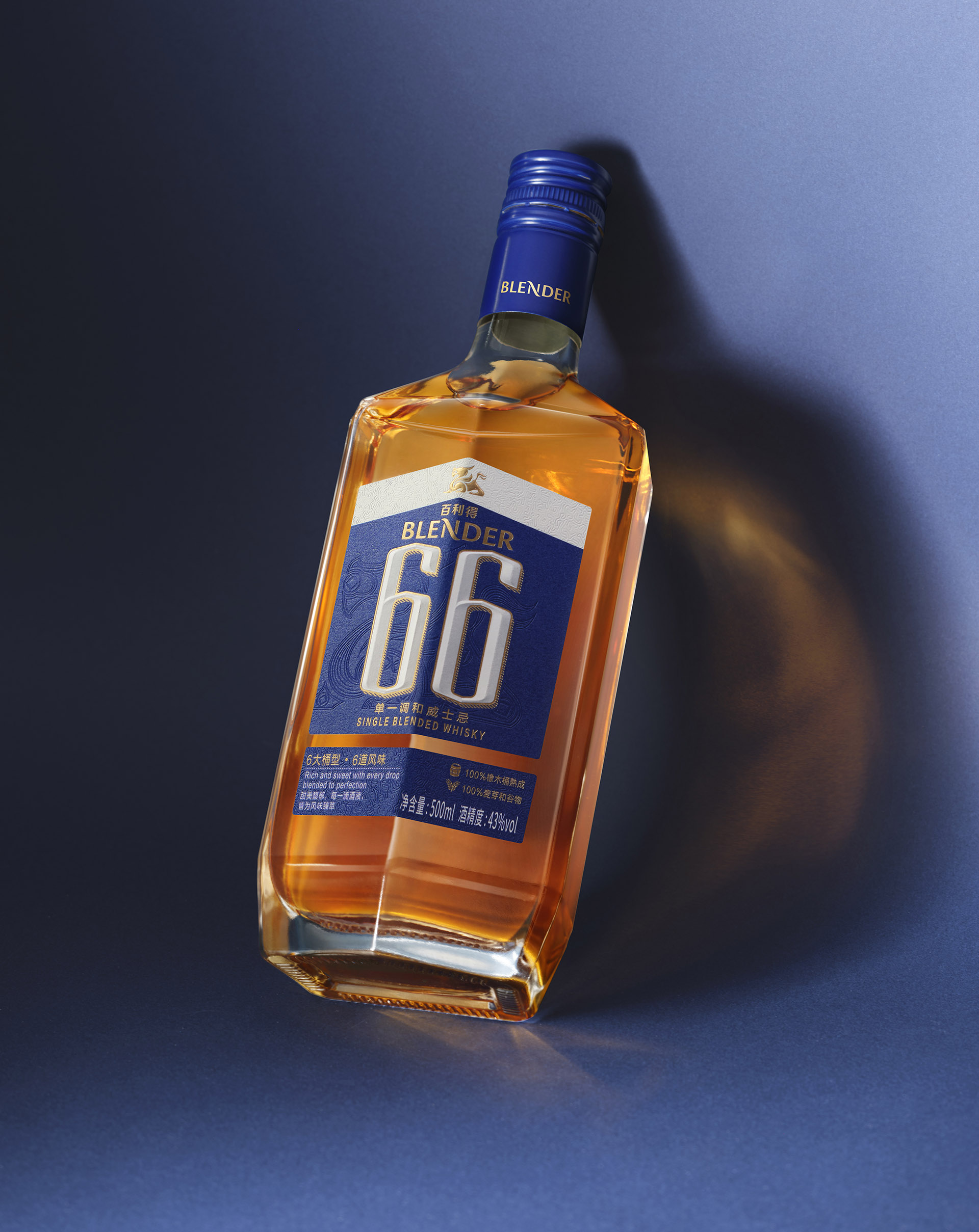
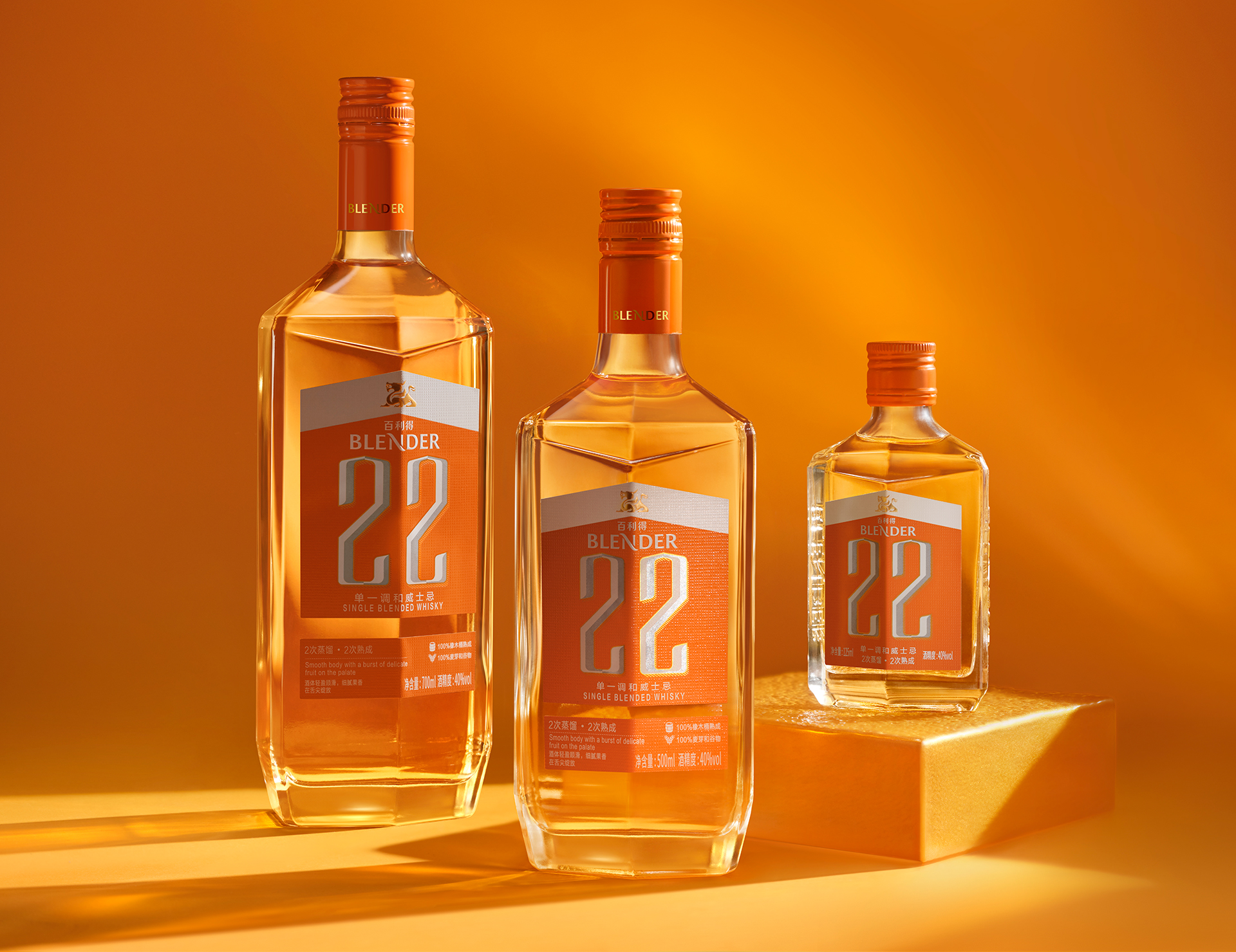
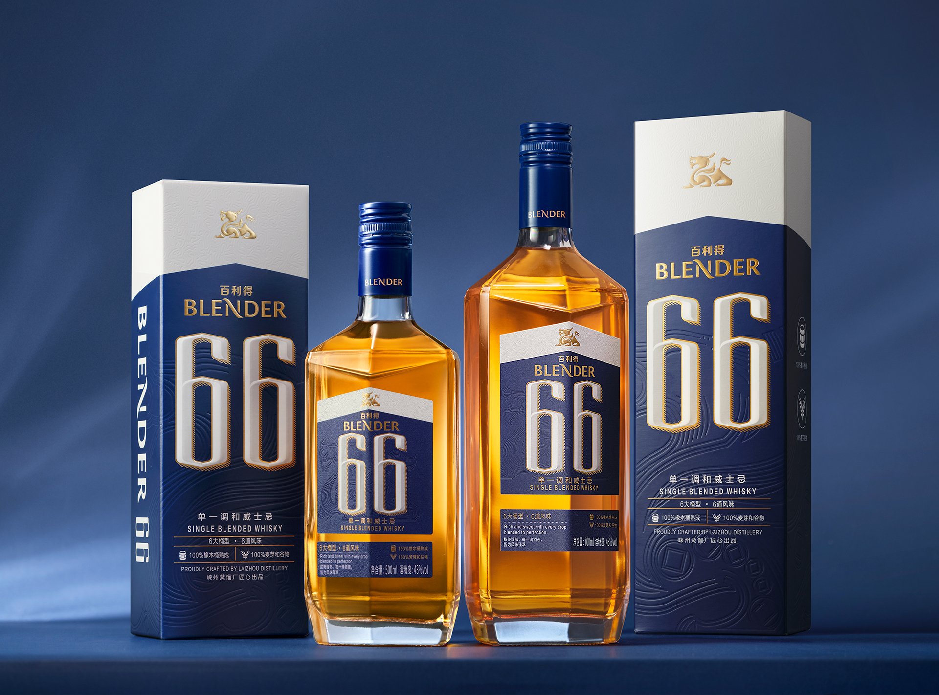
BLENDER upholds the philosophy of “harmonizing nature and wisdom to craft the art of time,” exploring an original Chinese expression of whisky. Its packaging design integrates Eastern philosophy, modern distillation logic, and eco-friendly materials, achieving a unified balance of culture, function, and sustainability. The pentagonal-prism bottle is inspired by the Five Elements’ intergenerative harmony and corresponds to the five essential elements of whisky making: water, wood, terroir, metal, and fire. The faceted form not only strengthens visual tension but also enhances grip stability and roll-resistance.
The label continues the pentagonal design to form a cohesive visual language. At its center, a minimalist approach highlights the core symbols “22” and “66,” representing the craftsmanship behind double distillation and double maturation, and the use of six cask types shaping six layers of flavor. In color, the pairing of orange and blue creates an emotional duality of “warm vitality” and “quiet depth,” establishing BLENDER’s unique chromatic narrative. Furthermore, the label uses 100% natural cotton fiber—biodegradable and recyclable—whose gentle tactile feel affirms a simple truth: sustainability and quality never need to be at odds.


 Derrick Lin
 monther al omari
 43oz
43oz lilyz design23
 Modern Theory
 Eighteen Brand Studio
 Bhumika Singh
 MohamedMashaly
 Pixels Studio
 Gulya
Gulya UPRISE
 Lizaveta Kharitonyuk
 Bonsanco Creative Studio
 DesignRepublic
 GIRAFA STUDIO
 PiotrWisniewski
 Sophiagdotcom
 CreativeWise
 SoreThumbStudio®
 Modern World Studio
 Palashcc
 Valérie Colace