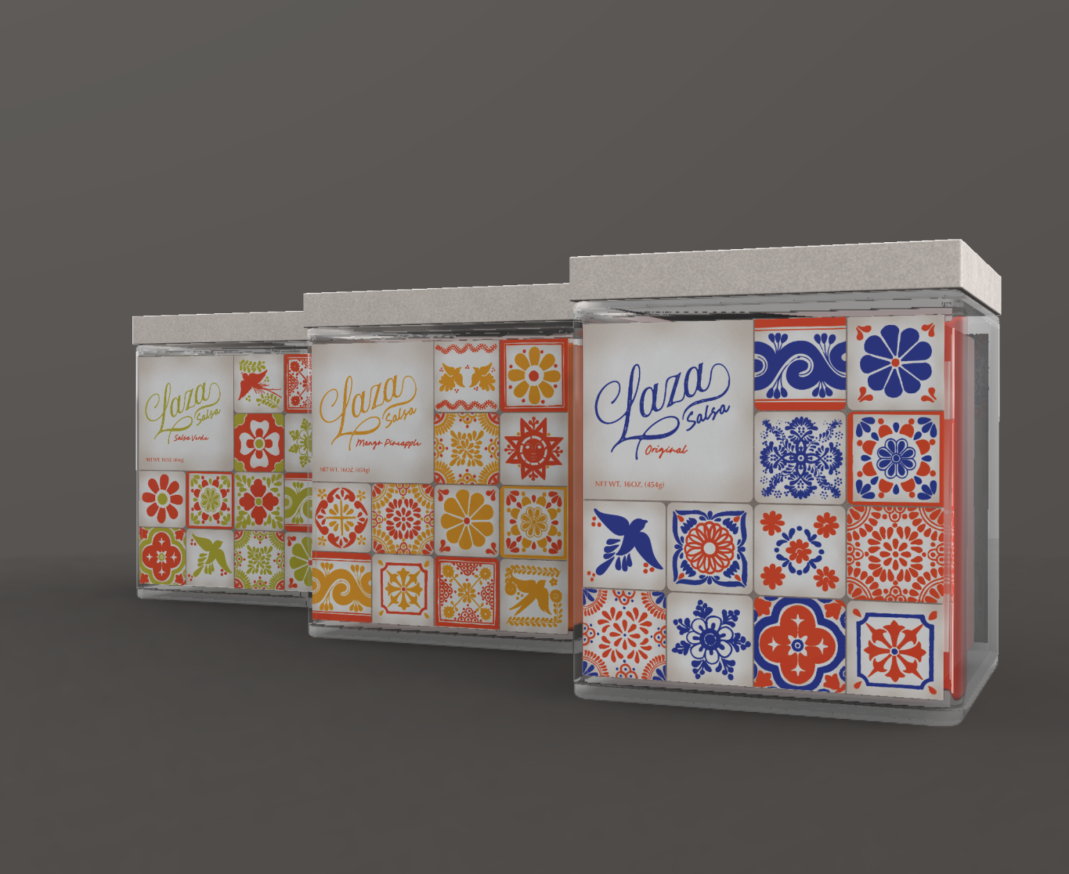

I am Grace Dose, a student my third year at the University of Wisconsin – Stout, majoring in Graphic Design & Interactive Media. This project was done in my Product and Packaging design class as a rebranding project.
For this project I really wanted to choose a brand that was very rich in values and concept, but needed to be represented better in their packaging. This brought me to Mama Torrez Salsa, a family owned brand that has a very rich history but is lacking that richness in their current packaging. They also use plastic containers that have no reusability.
Mama Torrez prides their company in their history. The company was founded by a daughter using her mother’s recipes straight from Leon, Mexico. The original packaging heavily focuses on the Mexican origin using an outline of Mexico as the focal point, but I thought there was a better way to tie the products back to their origin. I also wanted to focus on the bonds that salsa can help make in social settings, as well as the ones that help make the products themselves. The new packaging also needed to reflect the fresh products used to make the salsa, as well as the fact that it is natural and does not use preservatives.
This brand did a very good job at tying in its history with the name, but it didn’t reflect all of the values of the brand. I wanted the name to reflect the freshness of the products they make, while also tying the brand back to its roots. To do this I chose the name Laza. It is a play on the Spanish word lazo, which can mean bond in certain contexts. Laza also feels bright and punchy, reflecting the products themselves.
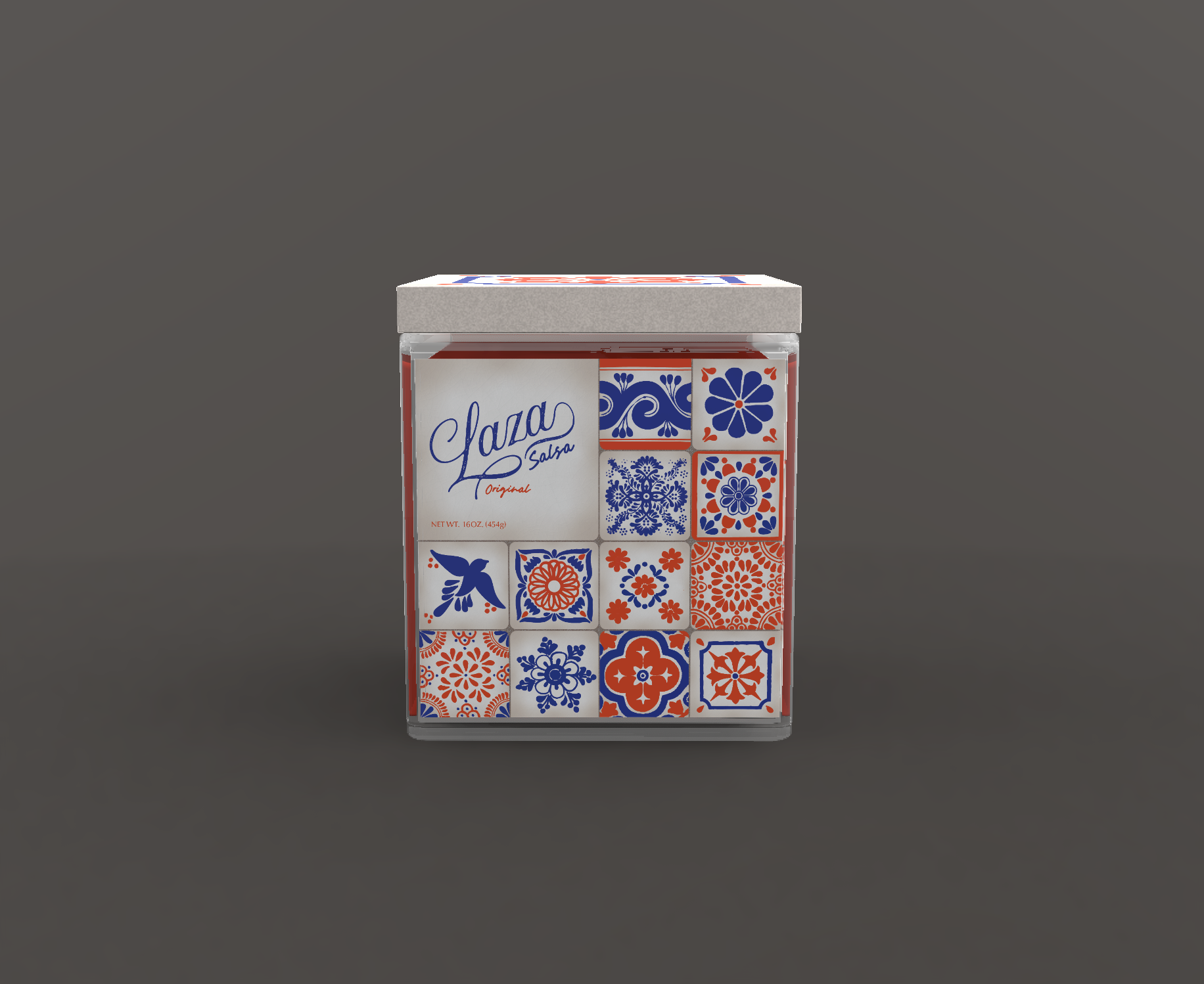
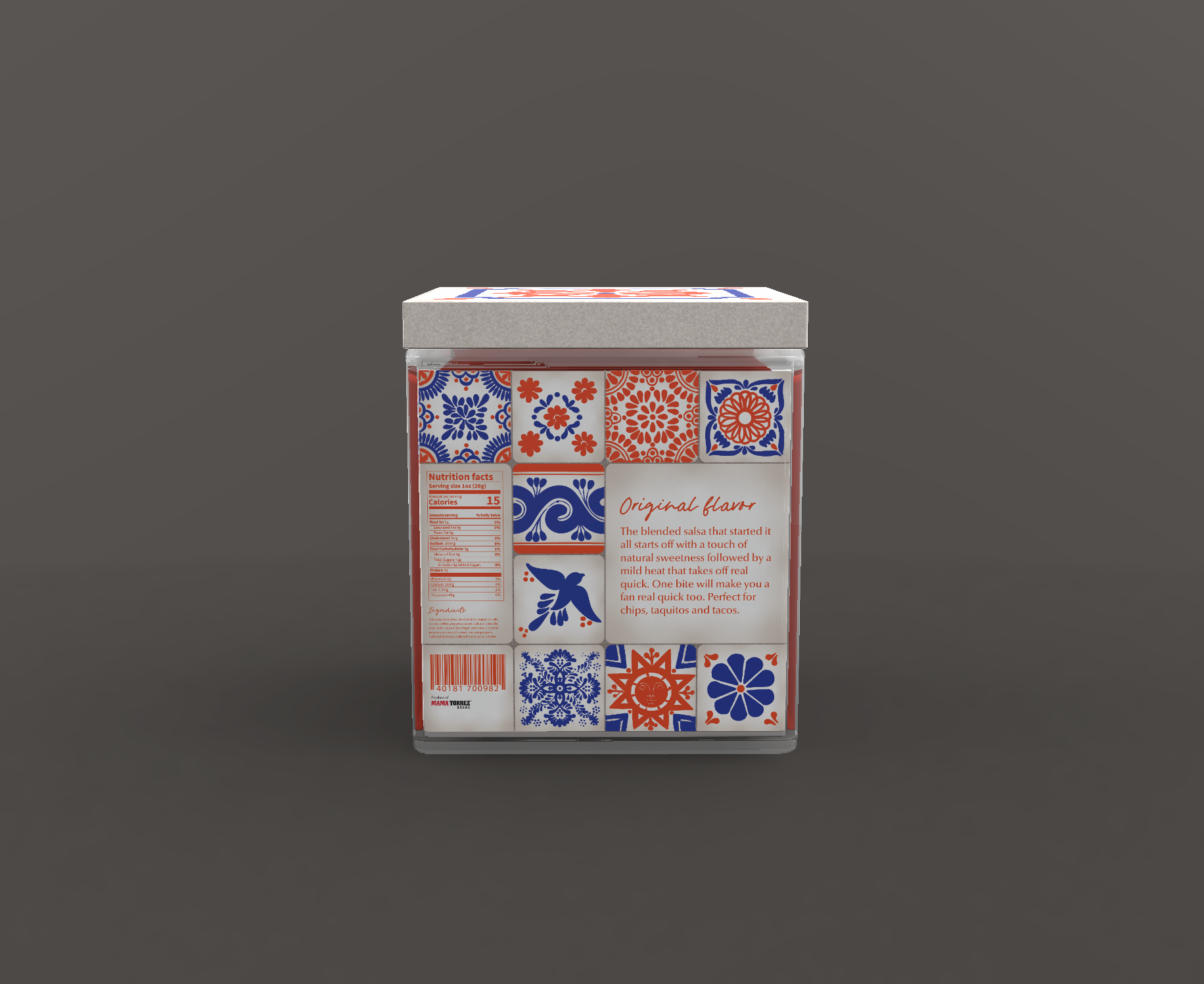
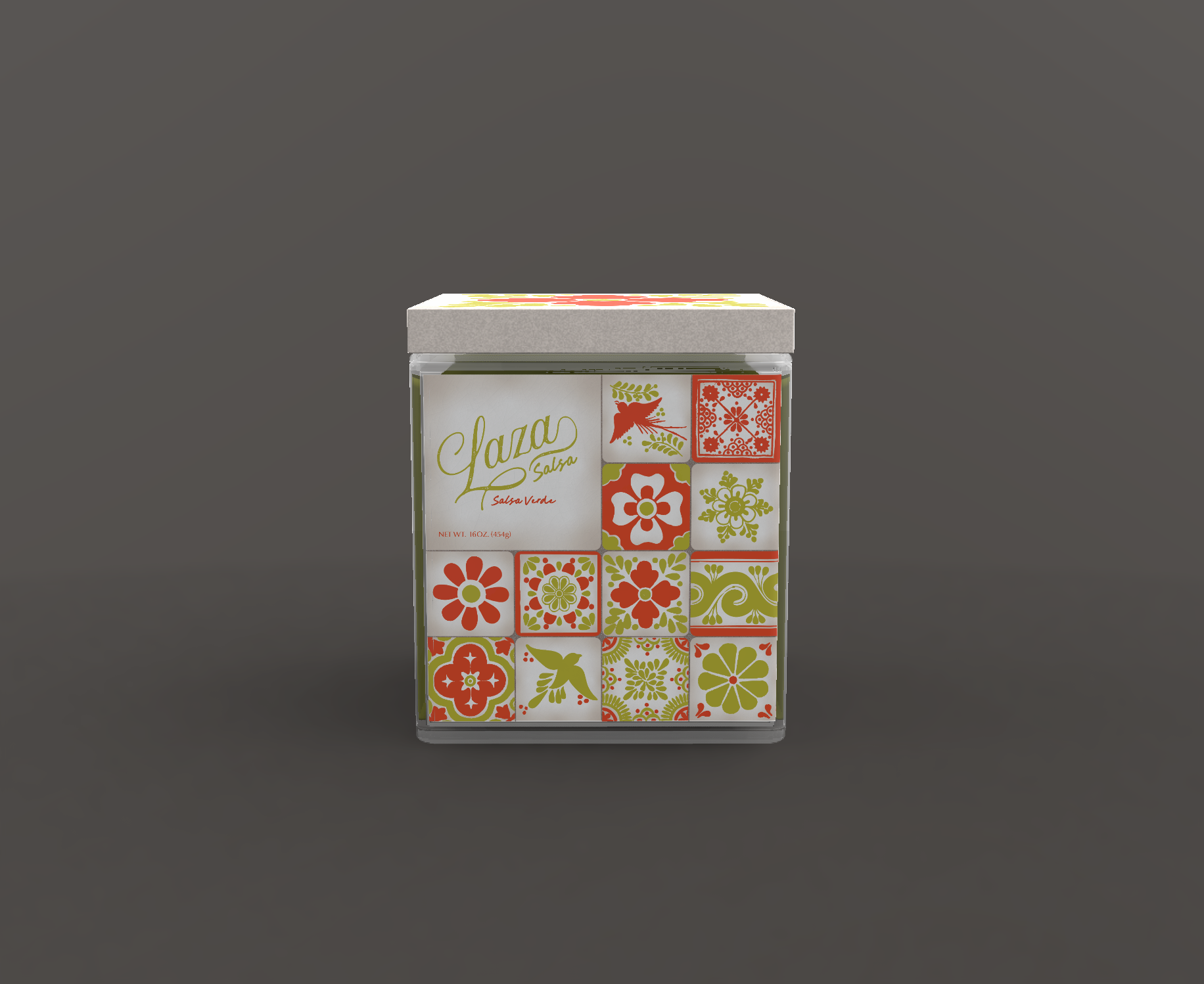
I chose to rebrand their original, mango pineapple, and salsa verde salsas, as they offer the most unique color palettes in their ingredients. To represent the Mexican culture that helped make this brand a reality, I decided to focus on one of the most iconic Mexican products that shows up time and time again in their culture. That product would be Mexican tiles. I used hand drawn tiles in a gridded layout with bright, punchy colors to grab customers’ attention. The imperfectness of the tile illustration also shows the human touch in the product itself, each one being a little different from the next. All of the colors used reflect the flavors inside of the jars. With the mango pineapple having the red orange color paired with the yellow to represent the mangoes and pineapples used to make the product.
The shape of the jars are square to represent the tiles themselves. The lid of the jars mimic a real tile. Each flavor has its own tile pattern on the top, making it easy for customers to find their favorite flavors on the shelf. I wanted the colors and patterns to make it easy to tell where this product originated, as well as the values that this brand holds.






 Asprey Creative
 About House of Ta
 Up-Brands
 KJS CRAFT
 hello ocean
 PG Branding
 CF Napa Brand Design
 booouuuche
 Hyejung Choi
 Abbydraw Designs Unique Conceptual Branding & Packaging Designing Ideas
 Hollóka Grafikai Műhely / Graphic Design Studio
 Minim Brand Design
 saerom81
 YNL
 bilel tkouri
 vitoramockup
 Lampra
 Sanavala
 www.branding.uz
 alchimistestudioParis
 Estudio Argo
 Modern Theory
 monther al omari
 Ohmybrand
 Affogato Brand Design