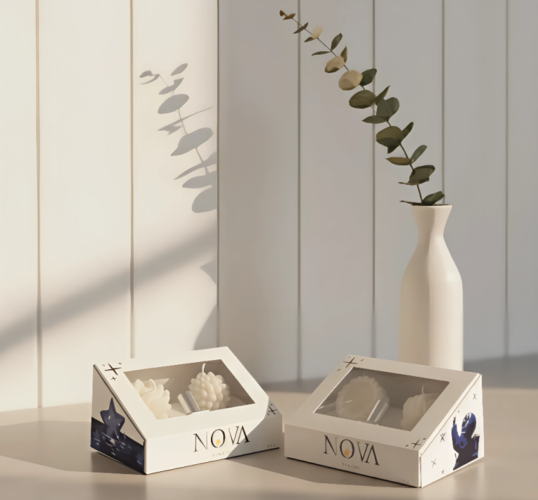

NOVA Candles – Handmade Box (University Project)
ABOUT THE PRODUCT
NOVA Candles aims to ignite small moments of clarity. Each candle represents a luminous pause, and the box acts as that first visual spark. This project was part of a university assignment in which I developed both the concept and the physical packaging.
CONCEPT
The design is inspired by the idea of a nova: a star that bursts into sudden light. The aesthetic is minimalist and balanced, intended to convey calm, radiance, and a clean visual presence.
COLOR SELECTION AND DESIGN
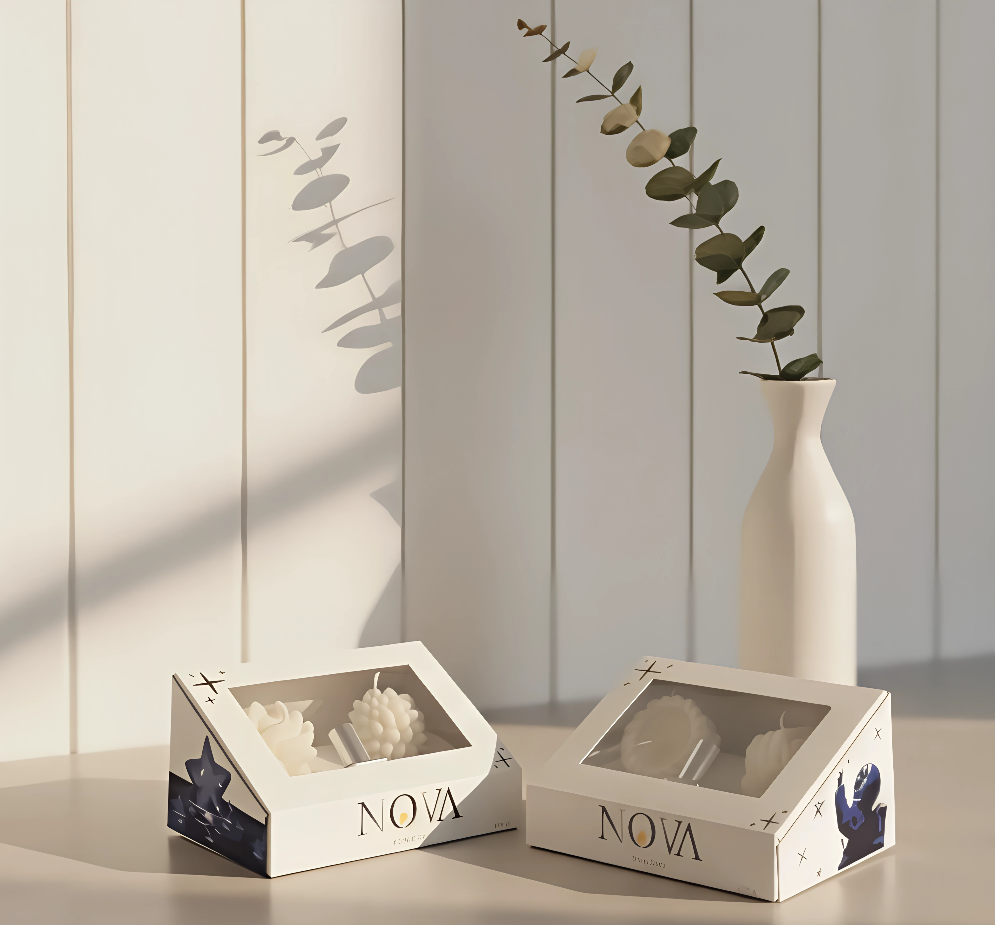
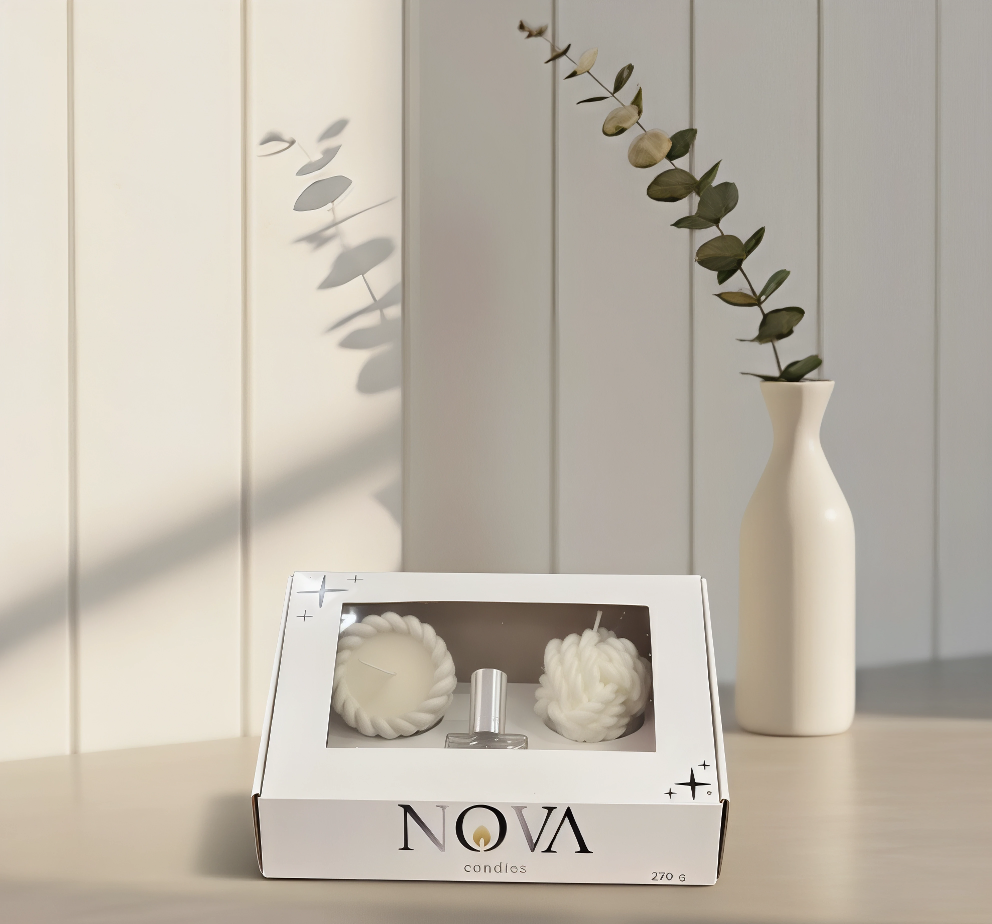
I chose a neutral palette—light tones with dark accents—to symbolize the duality of light and shadow that exists before a candle is lit. Soft colors bring serenity and modernity, while subtle contrasts make the NOVA brand stand out elegantly. Clean typography and an orderly composition reinforce a sense of balance and contained energy.
SOLUTION
As a university project, I decided to construct the box entirely by hand, carefully attending to measurements, folds, and finishes so the final result approached professional packaging quality. Every detail was designed to reflect intention and craftsmanship.
TECHNIQUE
Manual modeling combined with digital design for layout development, typographic distribution, and overall visual structure.
WHAT MAKES IT UNIQUE?
Its strength lies in simplicity. The design isn’t overloaded; instead, its impact comes from the concept, the carefully chosen colors, and the artisanal process.
RESULT
An elegant, subtle, and memorable box that elevates NOVA Candles’ identity and demonstrates how a university project can transform into packaging with real brand-level aesthetics.
 softmachine
 monther al omari
 alchimistestudioParis
 airobtq
 Buzz & Co.
 Ruby
Ruby themythographer
 IDNB Inc.
 viktorflr
 Zenpack
 Wessam Hussien
 samarabdelmonem
 StudioMordius
 Polaris Designs
 Atiq Alam
 duha mohamed
 HassanEtman22
 agarcia studio
 Wynand88
 Eva Chistyakova
 Maria Bukhtilova