

General Description:
“Professionally crafted food product packaging design for ‘TRIPS’ potato chips, showcasing a vibrant and appealing aesthetic across various flavors. These snack packaging designs are meticulously optimized for shelf impact and consumer appeal, featuring clear branding, flavor differentiation, and essential product information like ‘Gluten Free,’ ‘Reduced Fat,’ and ‘No Added MSG.’ As a packaging designer, my goal is to create eye-catching packaging solutions that resonate with your target audience. Elevate your product’s presence with bespoke packaging that communicates quality and flavor at a glance.”
- Specific to the Ketchup Flavor:
“This is a dynamic and appetizing ketchup flavored potato chips packaging design for TRIPS. The vibrant blue and white color scheme, coupled with inviting visuals of ketchup and tomatoes, effectively highlights the flavor profile of these snack chips. My food packaging design work focuses on clear readability and strong brand recognition, making it an excellent example of retail packaging that captures attention and conveys key benefits like ‘Gluten Free’ and ‘Reduced Fat.’ It’s perfect for snack brands looking for engaging and market-ready custom packaging.”
- Specific to the Chili Flavor:
“Presenting a bold and fiery chili flavored potato chips packaging design for TRIPS. The striking red and black palette, combined with impactful imagery of chili peppers and flames, immediately communicates the spicy nature of this snack product. This creative packaging solution is engineered for maximum shelf visibility and flavor anticipation, while clearly stating ‘Gluten Free’ and ‘Reduced Fat’ attributes. As a packaging designer, I aim to deliver strong visual branding for consumer goods packaging that truly stands out.”
- Specific to the Cheese Flavor:
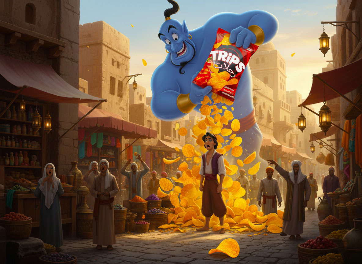
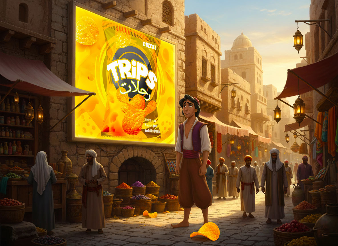
“Here’s a rich and inviting cheese flavored potato chips packaging design for TRIPS. The warm yellow and orange tones, integrated with appealing cheese imagery, effectively convey the delicious cheese snack flavor. This food packaging design ensures instant recognition and consumer attraction, prominently featuring health benefits such as ‘Gluten Free,’ ‘Reduced Fat,’ and ‘No Added MSG.’ It’s an ideal example of effective branding for food products that combines visual appeal with crucial product information for the snack market.”
Price Charged: $520 USD (Total for three distinct flavor designs)
Steps Taken During the Project:
- Initial Brief & Research:
Action: Conducted an in-depth discussion with the client to understand the brand’s vision, target audience, desired tone, and specific requirements for each flavor. Researched competitors’ packaging to identify market gaps and opportunities for differentiation.
Purpose: To align design strategy with business goals and gather necessary information for concept development.
- Concept Development & Mood Boards:
Action: Developed initial design concepts for each flavor, including color palettes, typography styles, and imagery suggestions. Created mood boards to visualize potential directions and gather client feedback.
Purpose: To explore creative possibilities and ensure the design direction resonated with the client’s aesthetic preferences.
- Preliminary Design & Layout:
Action: Created initial digital drafts of the packaging for Ketchup, Chili, and Cheese flavors, focusing on overall layout, primary branding elements (TRIPS logo), and placement of key information (flavor, benefits, Arabic text).
Purpose: To establish the foundational structure and visual hierarchy of each package.
- Flavor-Specific Visuals & Elements:
Action: Integrated unique visual elements for each flavor: ketchup/tomatoes for Ketchup, chili peppers/flames for Chili, and cheese textures/blocks for Cheese. Ensured consistency in brand elements while providing distinct flavor identities.
Purpose: To clearly differentiate between flavors and visually communicate the taste experience.
- Refinement & Client Feedback Rounds:
Action: Presented the initial designs to the client for feedback. Iterated on the designs based on their comments, making adjustments to colors, imagery, text placement, and overall aesthetics across multiple rounds.
Purpose: To ensure client satisfaction and refine the designs to perfection, addressing all preferences and functional requirements.
- Final Artwork Preparation:
Action: Prepared high-resolution, print-ready files for each packaging design, ensuring all specifications for production (e.g., bleed, trim marks, color modes) were met. Ensured all text, including Arabic, was correctly placed and rendered.
Purpose: To deliver flawless artwork ready for manufacturing, minimizing potential production issues.
Challenges Faced & Solutions:
- Balancing Brand Consistency with Flavor Differentiation:
Challenge: Ensuring all three packages clearly belonged to the ‘TRIPS’ brand family while having distinct visual identities for Ketchup, Chili, and Cheese.
Solution: Maintained a consistent logo placement, typography style for “TRIPS,” and overall structure. Differentiation was achieved through distinct color palettes and unique, prominent flavor-specific imagery and background textures.
- Integrating Bilingual Text (English & Arabic):
Challenge: Accurately and aesthetically incorporating both English and Arabic text (e.g., “Ketchup/كاتشب,” “TRIPS/رحلات”) without cluttering the design or compromising readability.
Solution: Utilized strategic placement and appropriate font sizes for both languages, ensuring a balanced visual hierarchy. Collaborated with the client to verify accuracy of Arabic translations and cultural appropriateness.
- Communicating Key Benefits Clearly:
Challenge: Highlighting important product benefits like ‘Gluten Free,’ ‘Reduced Fat,’ and ‘No Added MSG’ in a prominent yet non-intrusive manner.
Solution: Placed these benefits in a consistent, clean, and easily scannable section at the bottom right of each package, using legible typography that stood out without dominating the main design.
- Achieving Shelf Impact & Appeal:
Challenge: Designing packaging that would stand out in a crowded snack aisle and immediately attract the target consumer.
Solution: Employed vibrant, high-contrast color schemes and dynamic imagery that visually communicated flavor excitement. Focused on a clean, modern aesthetic that allowed the product visuals to pop.
Tools Used:
Adobe Illustrator: For creating vector-based graphics, precise layouts, typography, and preparing print-ready files. (Essential for scalable and clean packaging artwork).
Adobe Photoshop: For photo manipulation, enhancing imagery (e.g., chips, ingredients), and creating realistic mockups for client presentations.
Communication Platforms: Email, WhatsApp, or similar tools for client communication, feedback rounds, and file sharing.


 softmachine
 monther al omari
 alchimistestudioParis
 airobtq
 Buzz & Co.
 Ruby
Ruby themythographer
 IDNB Inc.
 viktorflr
 Zenpack
 Wessam Hussien
 samarabdelmonem
 StudioMordius
 Polaris Designs
 Atiq Alam
 duha mohamed
 HassanEtman22
 agarcia studio
 Wynand88
 Eva Chistyakova
 Maria Bukhtilova