

Client: Grovo
Design Studio: AbbyDraw Design
Country: India
Packaging Contents: Premium Dry Fruits – Luxury Healthy Snacking
Packaging Substrate / Materials: Gloss-laminated stand-up pouches (flexible packaging film)
Printing Process: High-quality offset/screen printing with rich, premium color finishes
Project Overview
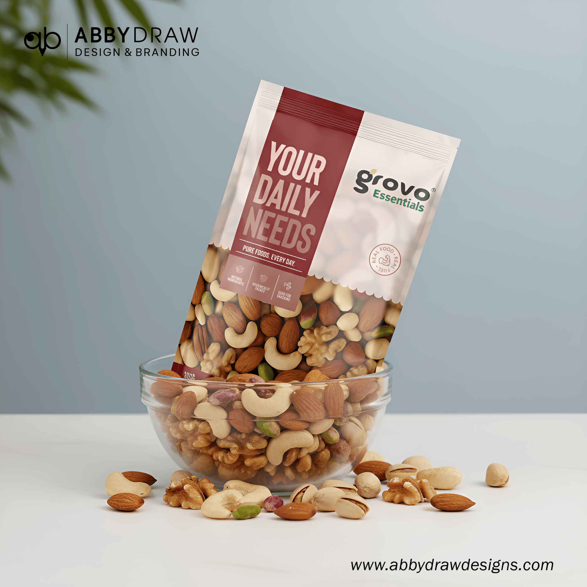
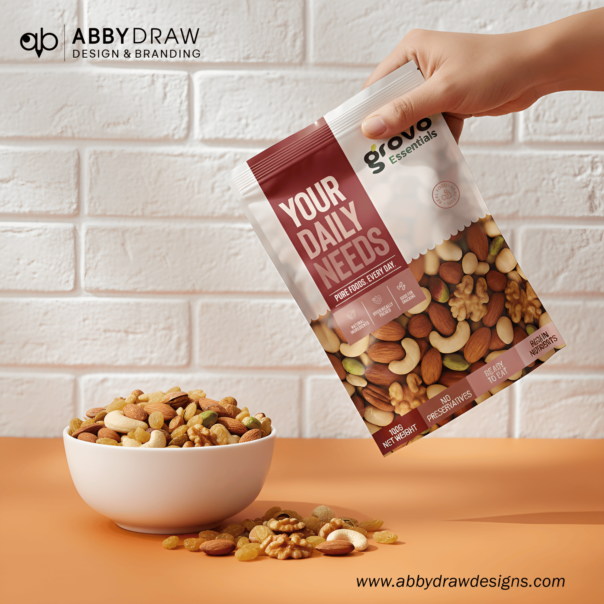
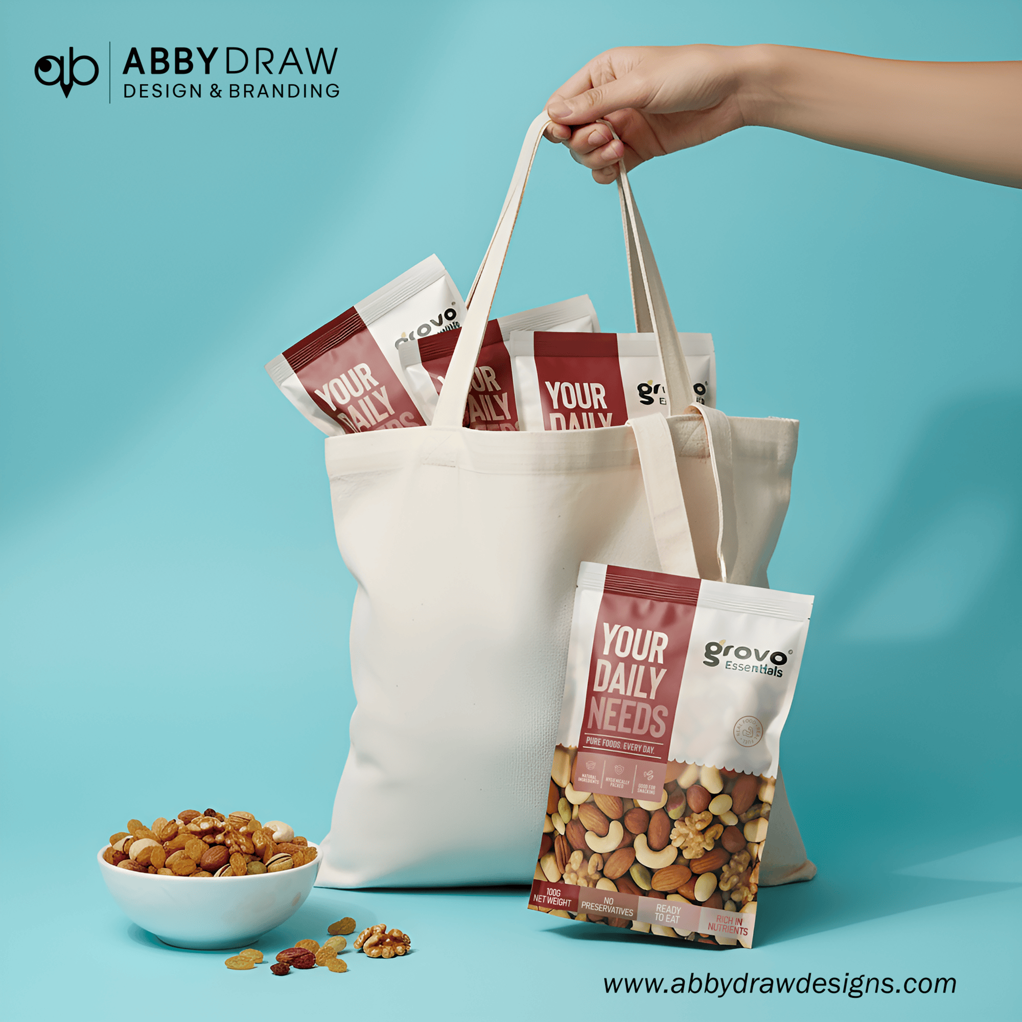
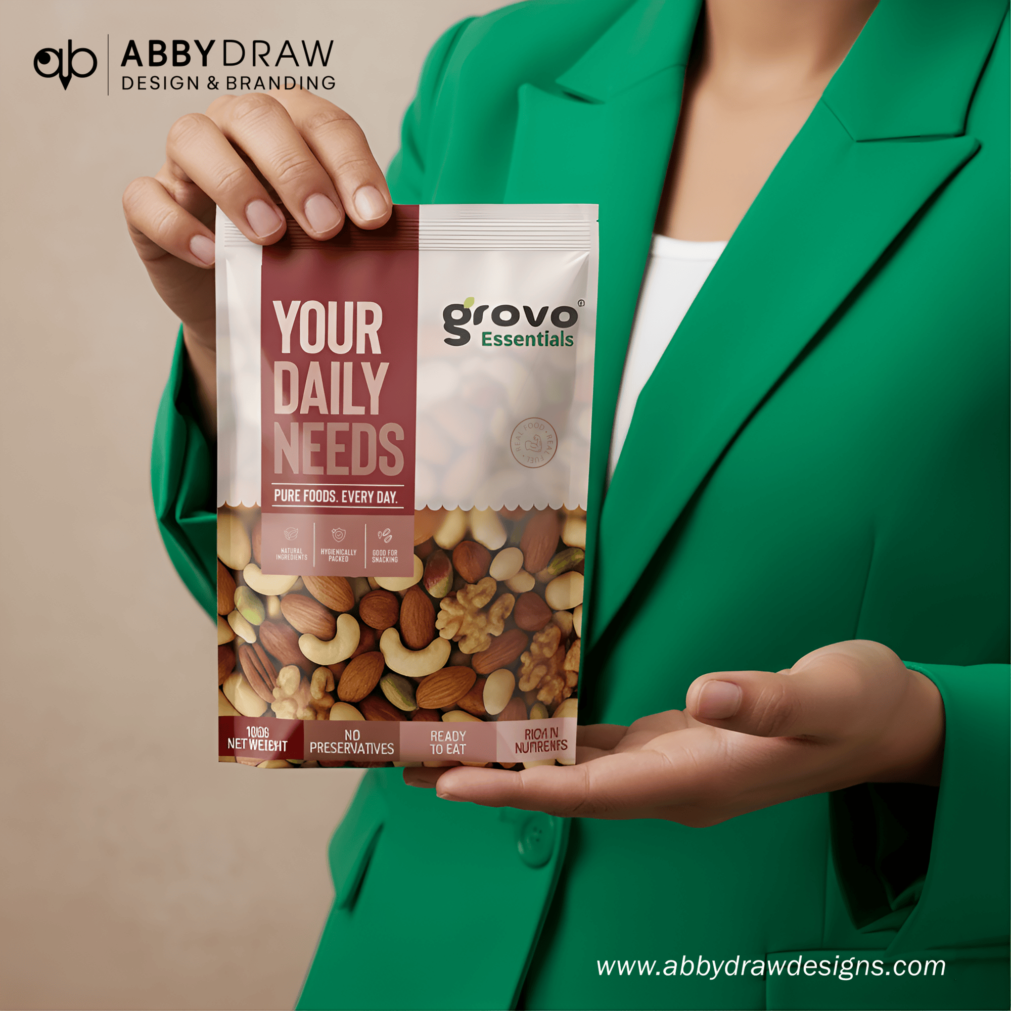
Grovo unveils a modern, luxurious identity for its premium dry fruit collection—crafted to elevate everyday snacking into a refined, indulgent experience.
Inspired by natural textures and Indian landscapes, the packaging creates a calm, nature-led aesthetic paired with a minimal, elegant illustration style. Every visual element communicates purity, richness, and a premium food experience.
Each detail is intentionally crafted to reflect Grovo’s commitment to quality, sophistication, and mindful nourishment.
Design Concept – “Luxury Snacking Rooted in Purity.”
The concept draws inspiration from the heritage of hand-selected dry fruits sourced from trusted farms. The packaging story is built around clean, premium color blocks, soft organic motifs inspired by nature, minimal balanced illustrations reflecting purity, and a high-end visual style uncommon in the dry-food category. The approach stays modern, elegant, and minimal for instant shelf recognition.
Packaging Design System
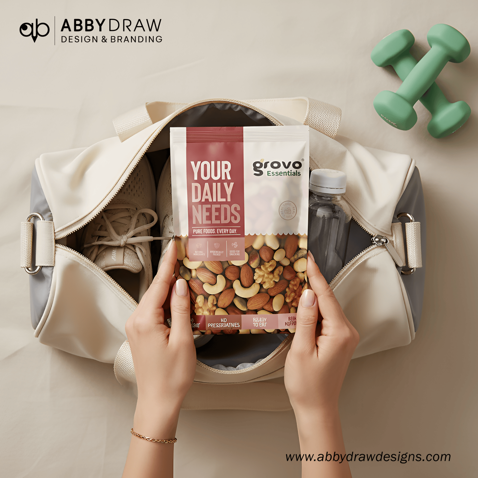
Stand-up, gloss-laminated resealable pouches
Premium shine to enhance color vibrancy
High-barrier material to protect freshness
Typography
Elegant serif typography for the Grovo logotype
Clean sans-serif type for “Luxury Snacking” and variant names
Balanced hierarchy to maintain a premium, uncluttered feel
Illustration Style
Refined vector artwork
Soft leaves, organic shapes, and natural highlights
Minimal, premium storytelling without clutter
Color Strategy
Each SKU uses rich, premium tones such as soft green, deep maroon, and rich yellow/gold. These variations provide strong differentiation while maintaining a cohesive brand language.
Information Layout
Clear placement of product claims
“Handpicked,” variant name, net weight, and purity statements
Clean hierarchy enhancing the luxury feel
Variants (Recreated for Grovo Dry Fruits)
1. Light Green Pack — Gold Variant
Soft, refreshing green tone
Subtle organic motifs
Premium serif + sans-serif typography
Text: “Grovo – Luxury Snacking / Gold”
2. Deep Maroon Pack — Diamond Variant
Rich maroon representing depth and richness
Strong contrast highlighting illustrations
Text: “Grovo – Luxury Snacking / Diamond / Handpicked 250 GM”
3. Golden Yellow Pack — Premium Variant
Vibrant golden-yellow symbolizing luxury
Consistent, minimal illustration and layout
Text: “Grovo – Luxury Snacking / Premium”
Back-of-Pack Story (Rewritten for Grovo)
“Grovo brings you carefully handpicked dry fruits sourced from trusted farms, processed with care to preserve purity, natural nutrition, and delightful crunch. Crafted for the mindful snacker, every variant represents quality, taste, and a refined snacking experience.”
Sustainability & User Experience
High-barrier laminated film for freshness retention
Resealable zipper for convenience
Gloss lamination for premium shelf impact
Design Philosophy
Grovo’s packaging feels premium, modern, and grounded in authenticity. The nature-inspired theme communicates purity, while bold color blocking and elegant typography elevate the brand into the high-end segment. Beyond aesthetics, the packaging reflects craftsmanship, quality sourcing, and a luxurious snacking experience.
Shelf Impact
Grovo stands out on shelves through bold, rich color variations, minimal storytelling via refined illustrations, a strong serif logotype, clean layout, and a gloss finish that enhances color richness and contrast. These elements make Grovo instantly recognizable and memorable.
Final Thought
Grovo transforms everyday dry fruits into a premium lifestyle choice. Through refined illustration, premium typography, and luxurious color tones, the packaging conveys purity, heritage, and craftsmanship—appealing to today’s health-conscious, design-savvy consumers.
 softmachine
 monther al omari
 alchimistestudioParis
 airobtq
 Buzz & Co.
 Ruby
Ruby themythographer
 IDNB Inc.
 viktorflr
 Zenpack
 Wessam Hussien
 samarabdelmonem
 StudioMordius
 Polaris Designs
 Atiq Alam
 duha mohamed
 HassanEtman22
 agarcia studio
 Wynand88
 Eva Chistyakova
 Maria Bukhtilova