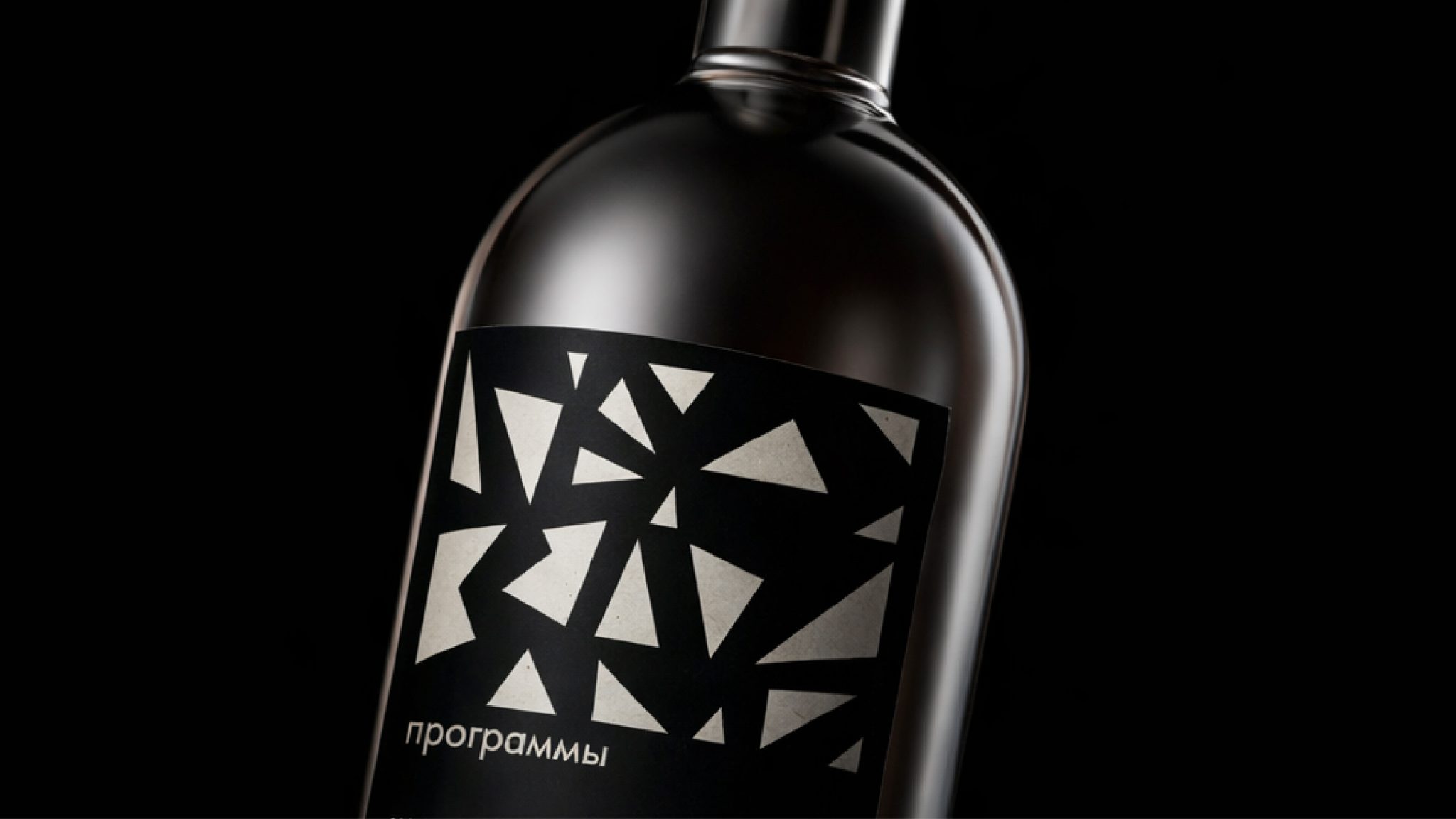

This project explores counterform and typography. The word “Gvozd” (nail) serves as the core graphic element, with its shape used as a visual foundation. Based on this idea, a vodka bottle concept titled “Gvozd Programmy” was created. The concept is reinforced by a cap resembling a nail, whose triangular shape echoes the geometry underlying the lettering, uniting typography and object into a single system.


 United Creatives Studio
 Kingdom & Sparrow
 Anastasia Bakhmatskaya
 CreativeWise
 Great and Golden
 Ximena Ureta Design Studio.
 Sorted Branding
 Lisa Sirbaugh Creative
 vitoramockup
 YQIAN
YQIAN Navegante
 Anastasia Cherepanova | xtramez
 Polaris Designs
 pavlyai
 Milena Kocharyan
 monther al omari
 Mohamed sherif midoo
 DESIGN CONCEPTS
 mmdesign
 markcreativestudio
 Rosario Lo Iacono