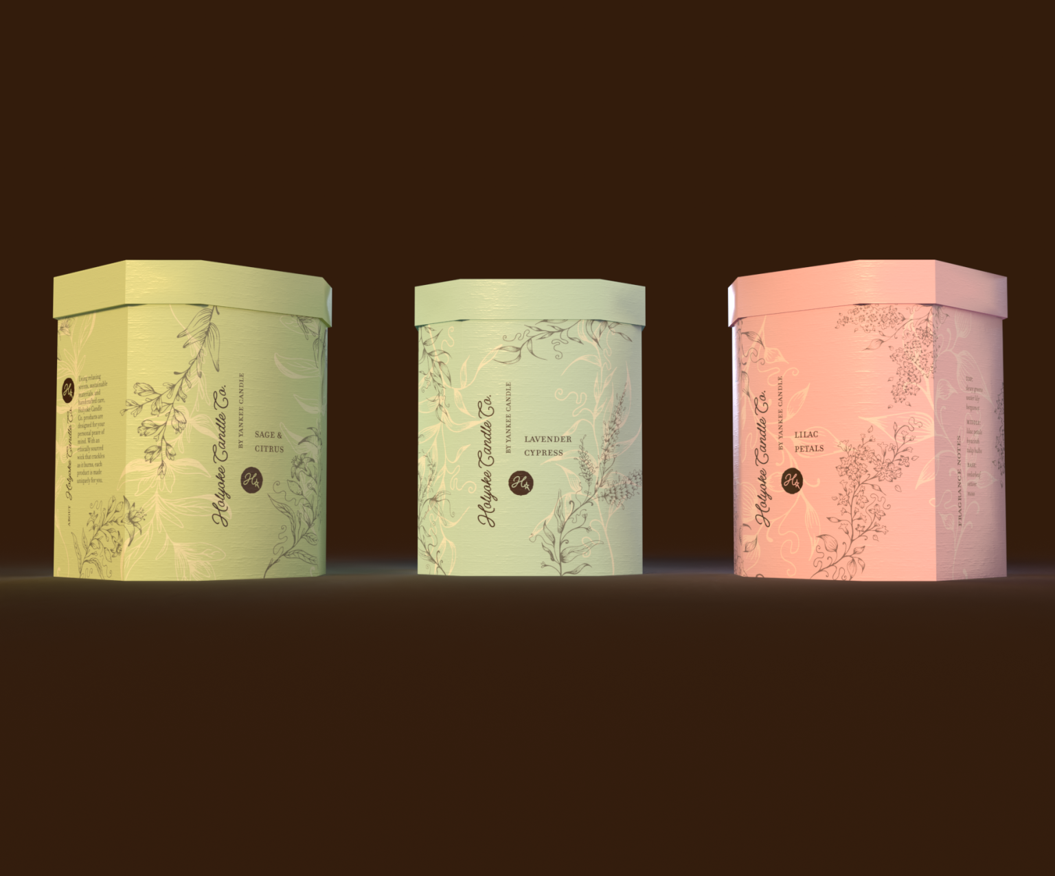

Hi! I’m Grace Weber, a third-year Graphic Design & Interactive Media student at University of Wisconsin-Stout. This project was done in my Product & Packaging Design class as an assignment to redesign packaging for an existing brand and/or design a new product line extending from an existing brand. We were required to use Adobe Dimensions to make these mockups.
I chose to design a product line extending from Yankee Candle. My proposal was to create a sub-brand (similar to WoodWick by Yankee Candle) with a key focus on sustainability, self-care, and personalization, and differentiate this brand from its competitors with a unique approach to typical candle packaging. Candles are a product meant to make an atmospheric contribution to personalized home decoration, so I wanted this product to have a handcrafted feel that would bring high-quality comfort to consumers’ homes.
As I conceptualized the specifics of my brand, I looked to Yankee Candle’s history in order to pull a personal connection from their roots. I ended up naming my brand Holyoke Candle Co. after the Massachusetts town where Yankee Candle originally got started in 1969. The key brand characteristics I wanted to emphasize were as follows: sustainable, thoughtful, personal, unique, homey, calming. This sub-brand would be intended to appeal to a younger audience who are interested in making an environmental contribution with their purchases, and in self-care products for their homes.
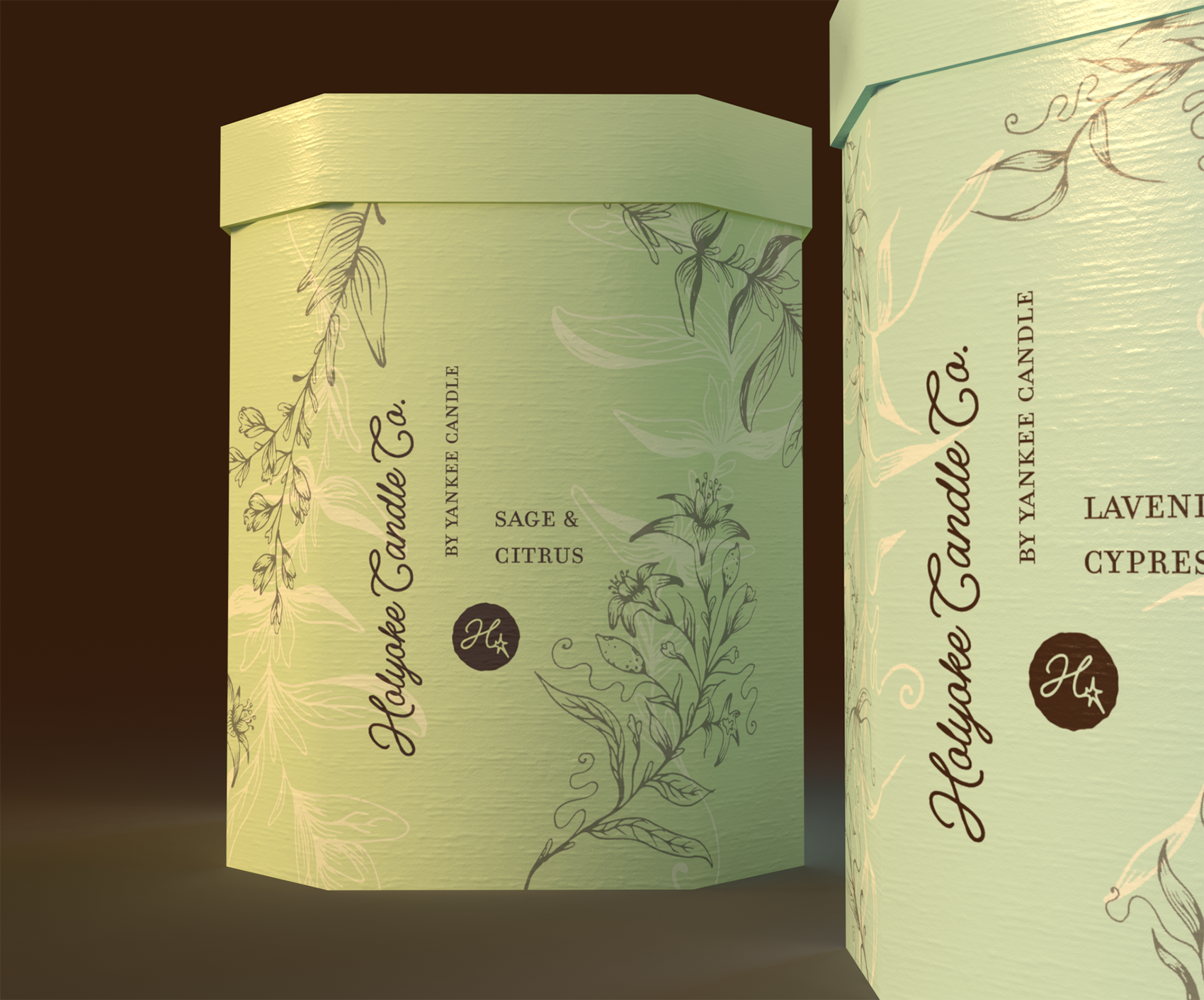
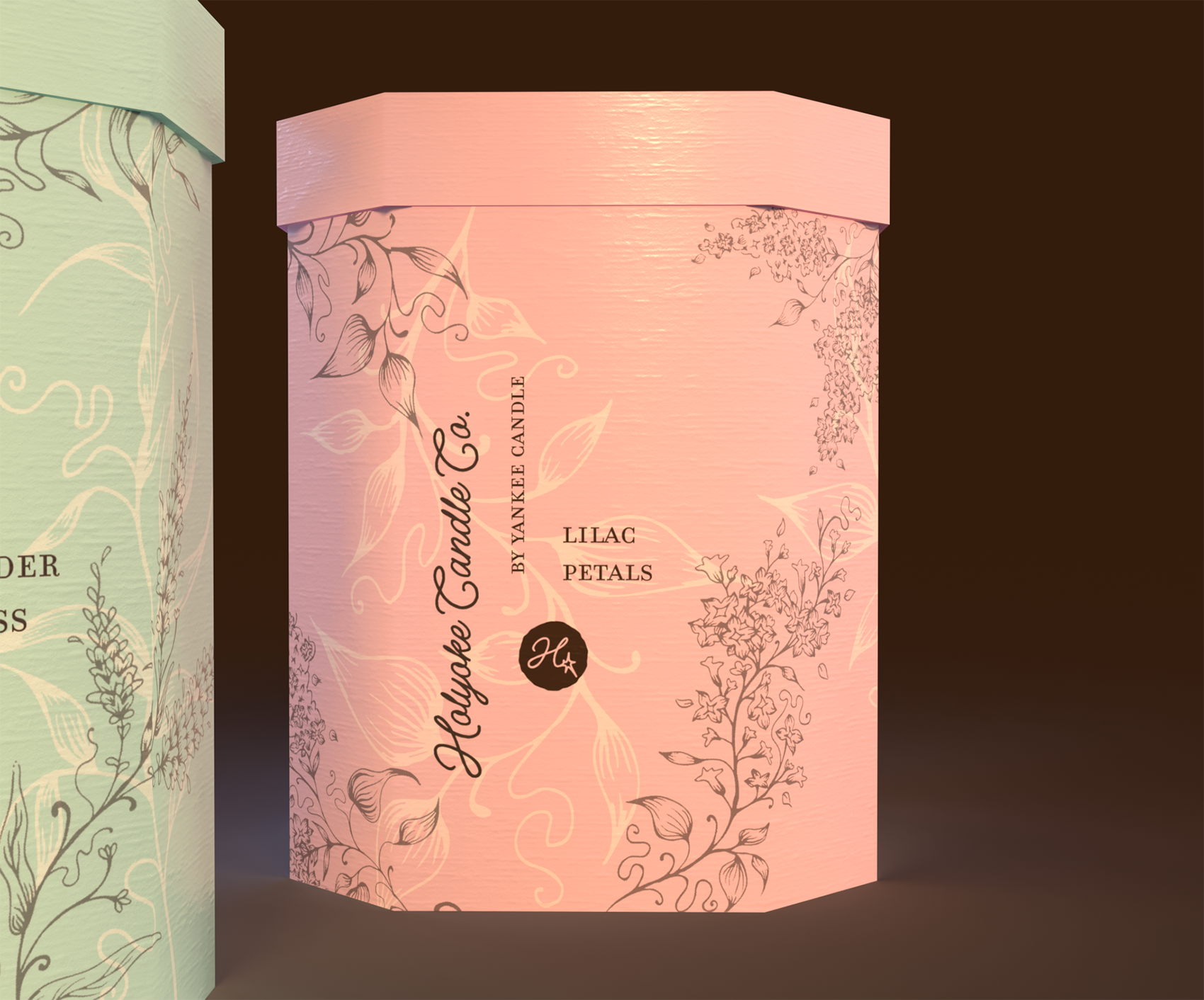
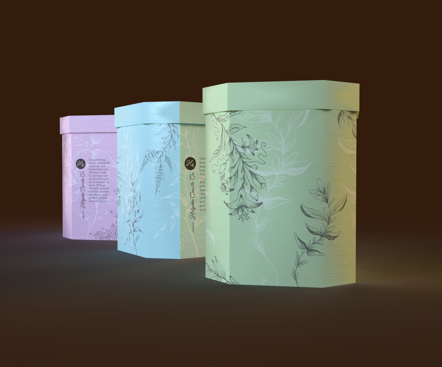
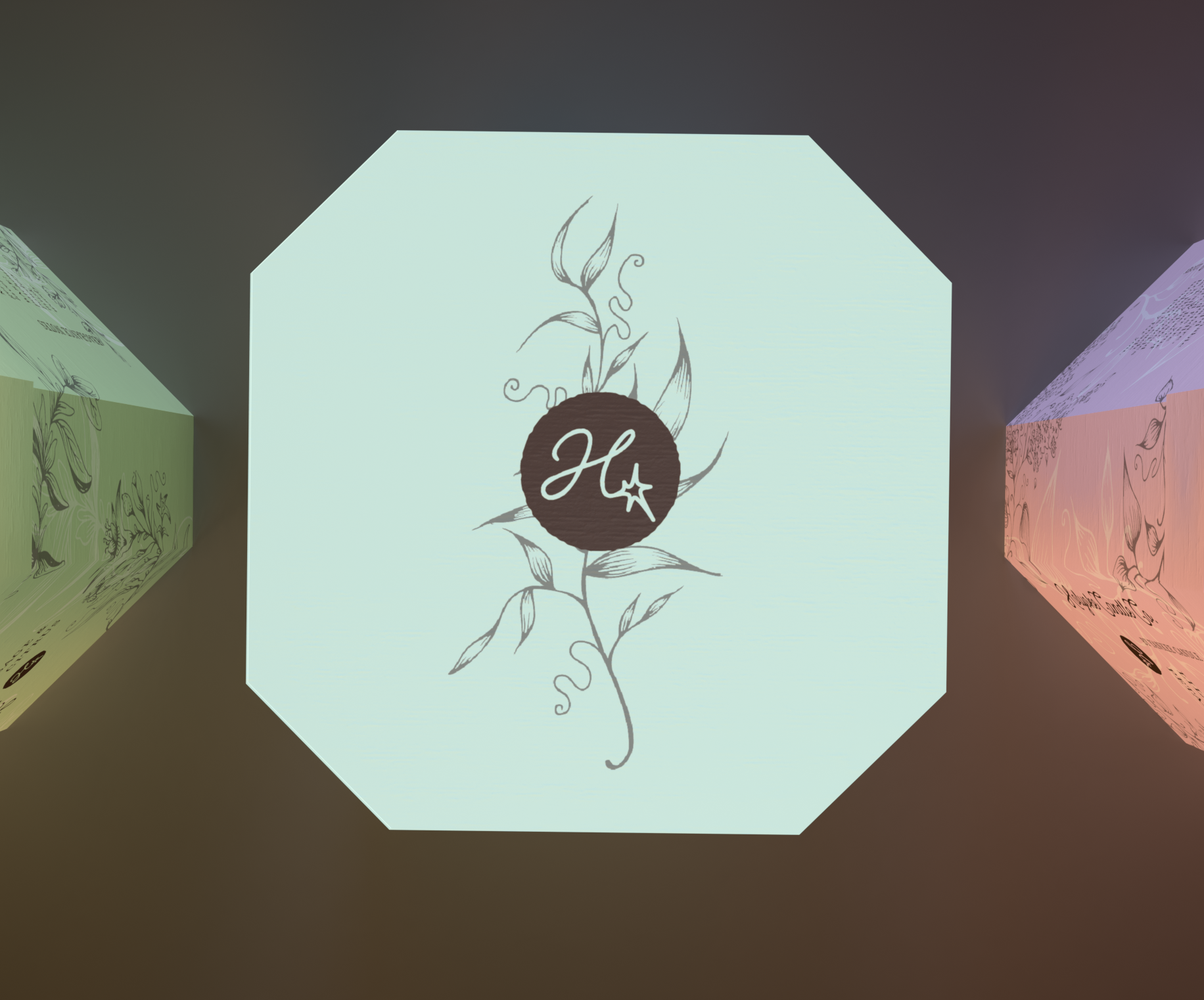
Most candles are sold with their glass containers, a label, and a lid being their only true form of packaging. I knew from the beginning I wanted my product to do more than that while keeping things sustainable and not overly complicated. I decided on designing an octagonal box and lid made from compostable material to protect the product from being dropped in the store, make stacking easier and more stable, and to add another layer to the consumer experience. For my design elements, I chose a few pastel colors for potential scents as well as a dark brown to overlay type and graphics. The font Espiritu Script stood out to me as a good one for my wordmark because it had a hand-written touch but still looked high-quality, and I paired it with Filosofia for secondary and body text. When designing the logo, I took the H letterform from Holyoke in Espiritu Script and connected it to a sparkle-like form to represent the crackle of candles with wooden wicks.
I chose three scents, sage and citrus, lavender cypress, and lilac petals, all plant-based as I thought that contributed to the brand identity of sustainability and calming. I made a variety of hand-drawn illustrations for each of the different plant notes, scanned and image-traced them, and applied the best ones to my designs. For depth and visual interest, I layered dark brown and cream illustrations over each other and laid them out around the different panels of my octagonal box shape.
In the future, I would like to make more mockups showcasing the treatment I would give to the labels on the candles themselves and placing them in different environments, but as my first foray into Dimensions I think these mockups are able to showcase my designs well and really bring focus to the elements of illustration.




 NEV
NEV Stefano Bracci
 Alina
Alina monther al omari
 Lizakjx
 JOAOMARCOSDESIGN
 alchimistestudioParis
 Harriet Neild
 octavio rojo
 宏洛图品牌设计HONGLT
 DESIGN CONCEPTS
 Alexander Skurihin
 Studio K95
 ARMBRAND
 Richa Rai
 houseoferas by Miti
 Agence des Coteaux
 Kushi Eaknath
 Ann Treasa
 Xiao Ning
 krrrrrllii
 babyage
 Deep
Deep