
EN |
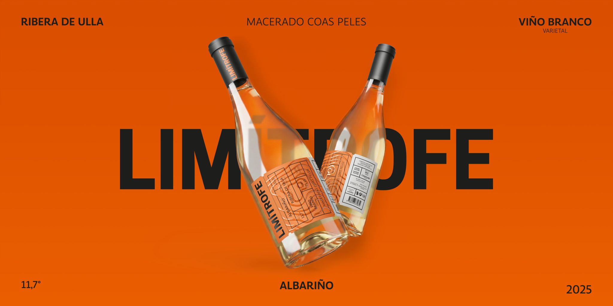
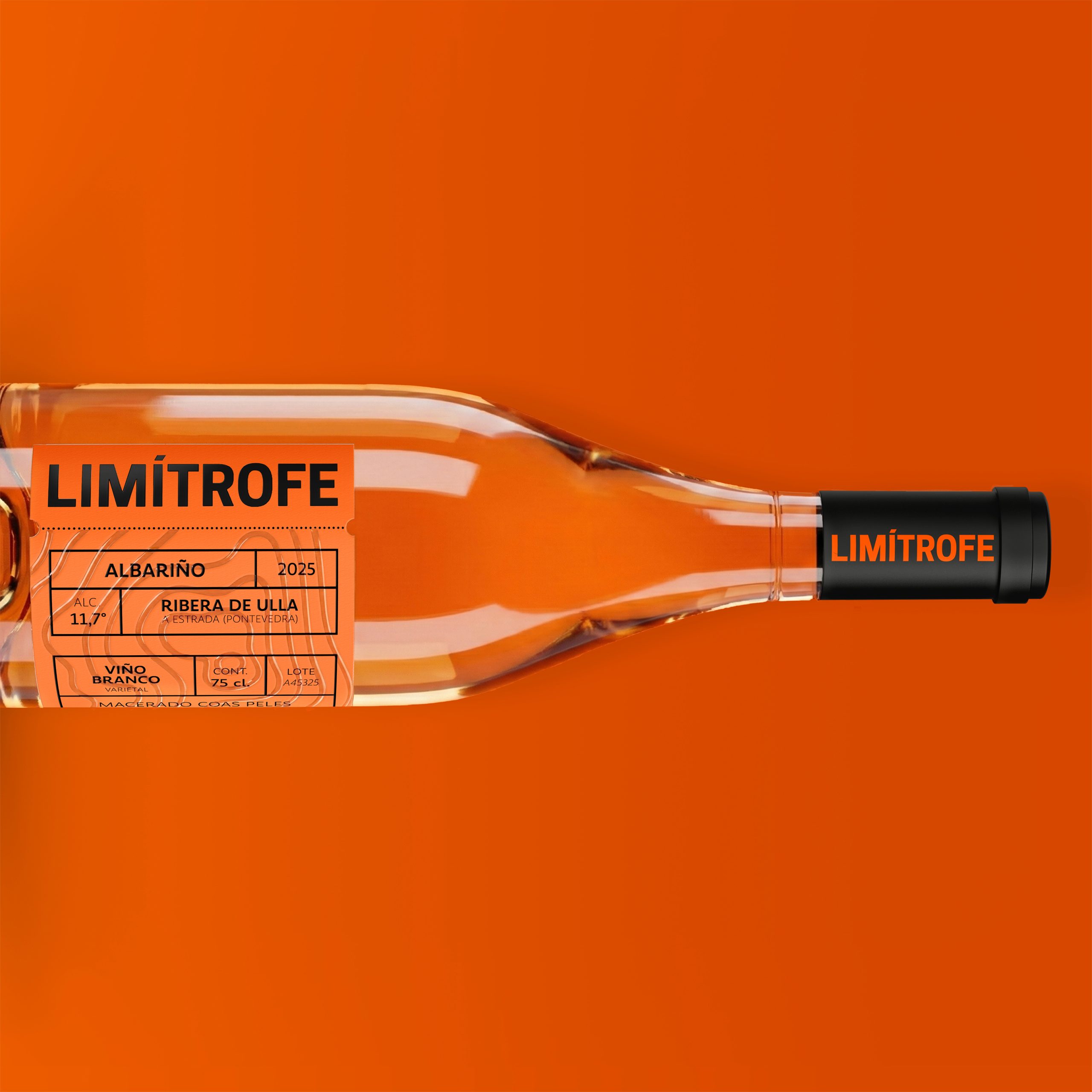
Limítrofe is a skin-contact Albariño born on the fringes of the Ulla river. The design pairs typographic rebellion with an intense orange hue. It celebrates the transgression of growing on the border—breaking molds while embracing its wild roots.
Originating in A Estrada, on the banks of the Ulla River, this skin-contact Albariño defies the tradition of the region’s standard white wines. The narrative centers on the concept of the “limit”. Existing on the edge of a territory and a technique, thriving on the periphery where creative freedom outweighs strict norms.
VISUAL PORPOSAL
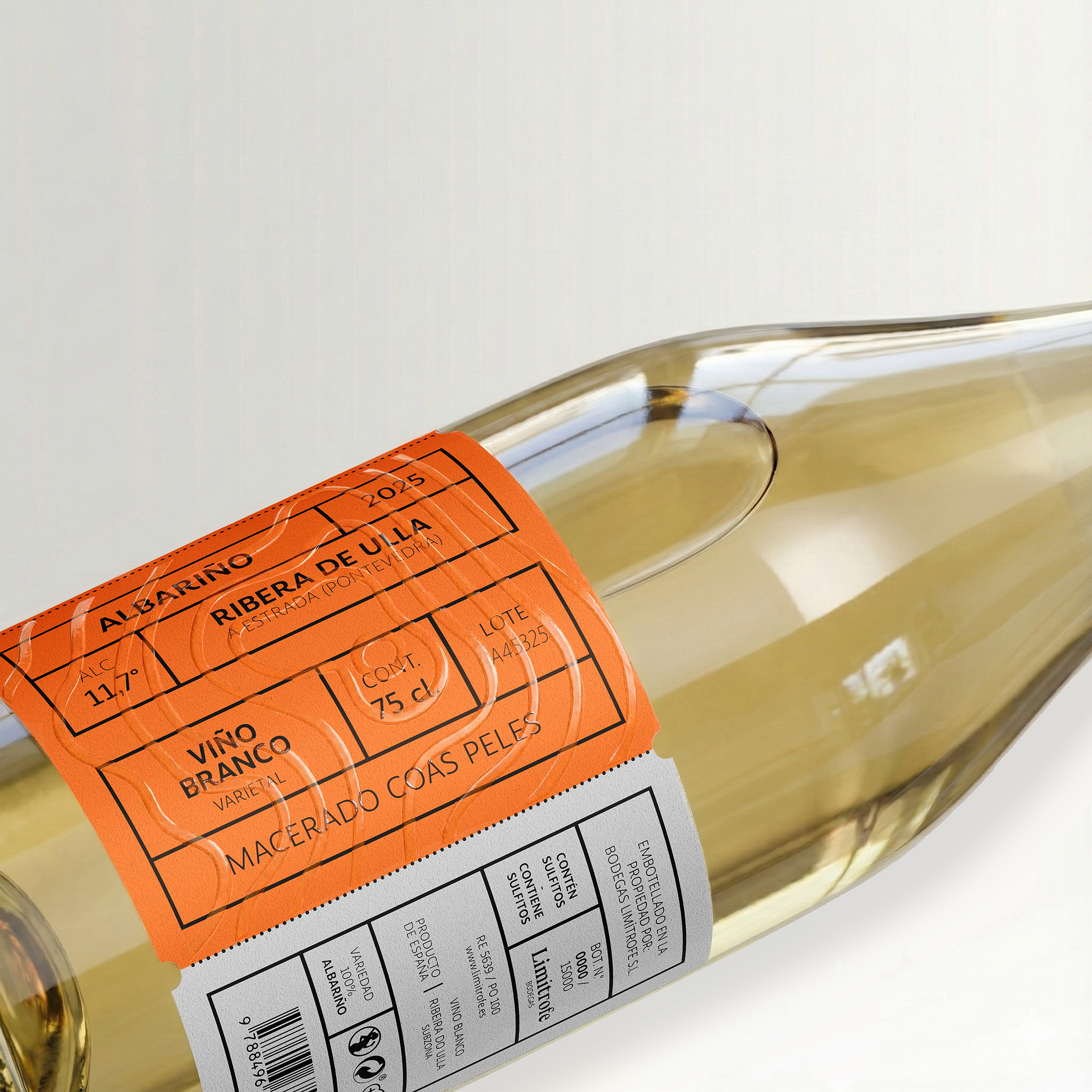
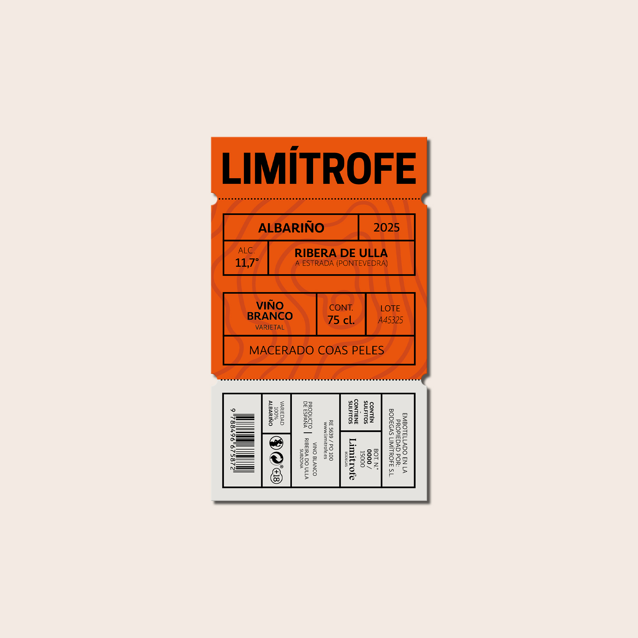
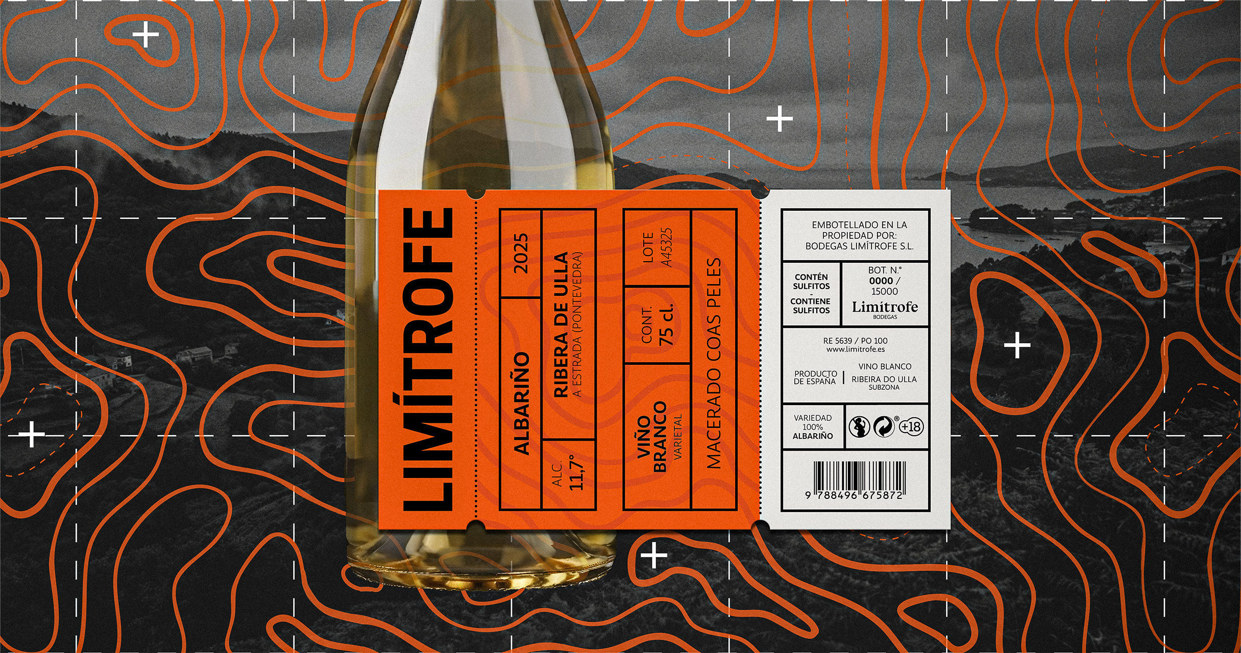
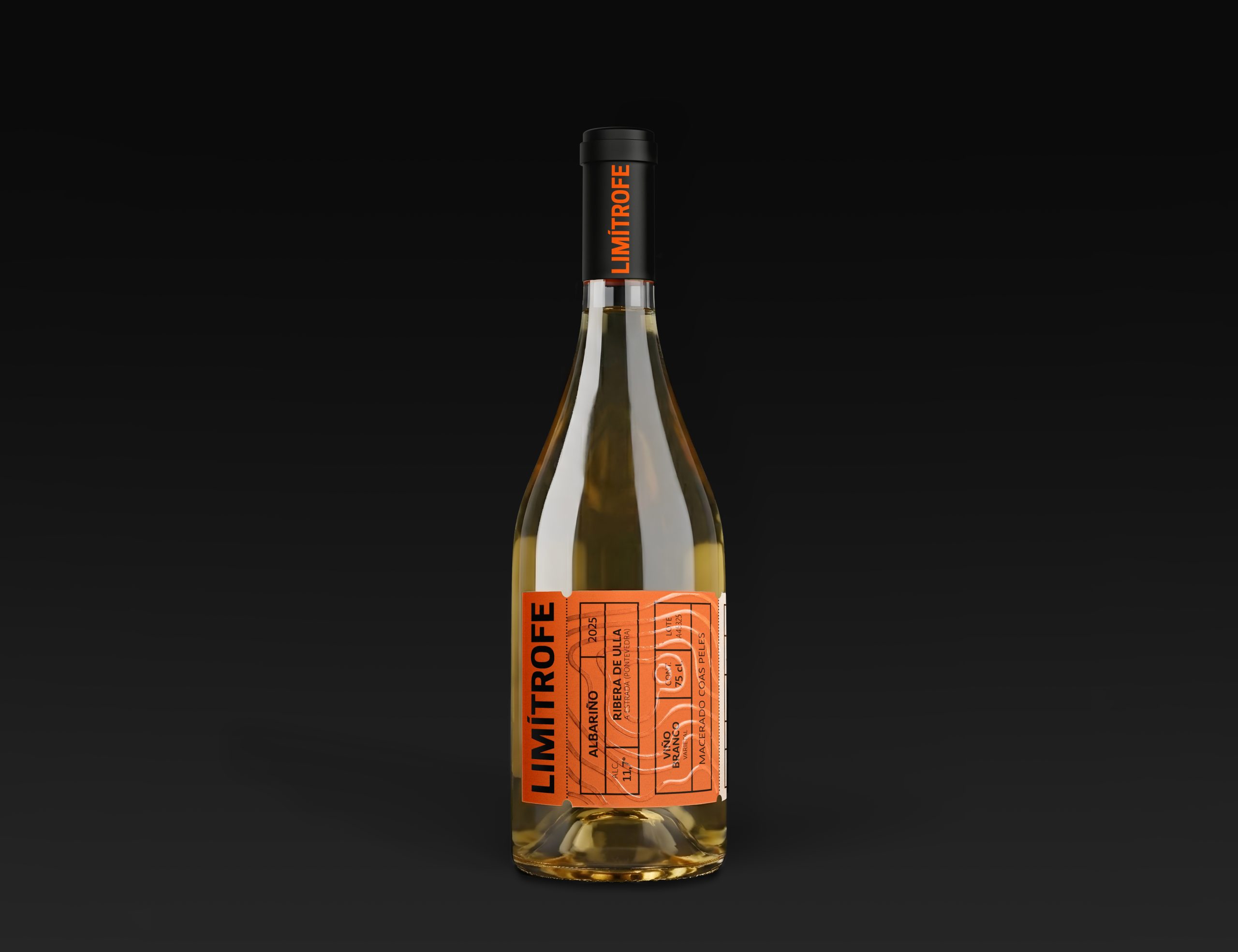
To translate this tension between deep roots and technical rebellion, the design steps away from the classic codes of Galician wine, favoring voice and attitude over tradition. The visual identity is anchored by a bold, modern typographic composition that dominates the label, symbolizing how the wine overflows pre-established boundaries, paired with an electric, saturated orange palette that pays homage to the bervage itself. However, the experience of the label goes beyond sight. The design incorporates a layer of clear 3D varnish applied over the artwork, tracing the winding curves of a topographic map. This tactile finish invites the consumer to physically trace the geography of A Estrada with their fingers, feeling the relief of the land. By engaging the sense of touch, the design makes the concept of geographical “limits” tangible, grounding the transgressive, modern aesthetic in the very soil from which the grapes are harvested. Limítrofe is proof that the most interesting things happen on the margins.
ES |
Limítrofe es un Albariño de maceración con pieles nacido en los márgenes del río Ulla. El diseño combina la rebeldía tipográfica con un intenso tono naranja. Celebra la transgresión de crecer en la frontera: romper moldes mientras abraza sus raíces salvajes.
Originado en A Estrada, a orillas del río Ulla, este Albariño de maceración con sus pieles desafía la tradición de los vinos blancos estándar de la región. El relato se centra en el concepto del «límite». Existir en el borde de un territorio y de una técnica, prosperando en la periferia donde la libertad creativa pesa más que las normas estrictas.
PROPUESTA VISUAL
Para traducir esta tensión entre raíces profundas y rebelión técnica, el diseño se aleja de los códigos clásicos del vino gallego, priorizando la voz y la actitud por encima de la tradición. La identidad visual se articula en torno a una composición tipográfica audaz y moderna que domina la etiqueta, simbolizando cómo el vino desborda los límites preestablecidos, acompañada de una paleta naranja eléctrica y saturada que rinde homenaje a la propia bebida.
Sin embargo, la experiencia de la etiqueta va más allá de la vista. El diseño se complementa con una capa de barniz 3D transparente aplicada sobre el diseño, que traza las curvas sinuosas de un mapa topográfico. Este acabado táctil invita al consumidor a recorrer físicamente con los dedos la geografía, sintiendo el relieve del terreno. Al involucrar el sentido del tacto, el diseño hace tangible el concepto de los «límites» geográficos, anclando la estética transgresora y contemporánea en la propia tierra de la que se cosechan las uvas. Limítrofe es la prueba de que las cosas más interesantes ocurren en los márgenes.
Art Direction & Design: Cristian Valverde Pérez
Client: Bodegas Limítrofe (Concept / Student Project)
Location: Valladolid
Project Type: Concept / Student Project
Images: Cristian Valverde Pérez
Packaging Contents: Orange Wine (Albariño)
Packaging Substrate / Materials: Burgundy transparent glass bottle.
Label paper / Finishes: Paper label Laid Corolla Ivory 80 gr/m² 100 µ. High-build 3D clear varnish. Black 2D Stamping.

 Natasha Spitsyna
 babyage
 GruppoSaida
 ahmedraoudgfx
 Hi estudio
 Nadezhda Gorelikova
 Studio Garces
 Brandsbylufo
 Rewot
Rewot alchimistestudioParis
 Asprey Creative
 kat bres
 Valérie Colace
 Atiq Alam
 Sara Communications
 David Hakobyan
 monther al omari
 Innovāt - Empowering Creative Innovation
 mmdesign
 Amjad Battal
 Hollóka Grafikai Műhely / Graphic Design Studio
 Palashcc
 ABC Design Communication
 ChrisSkarlatos
 Hedayat Hadavi
 Tia Nguyen