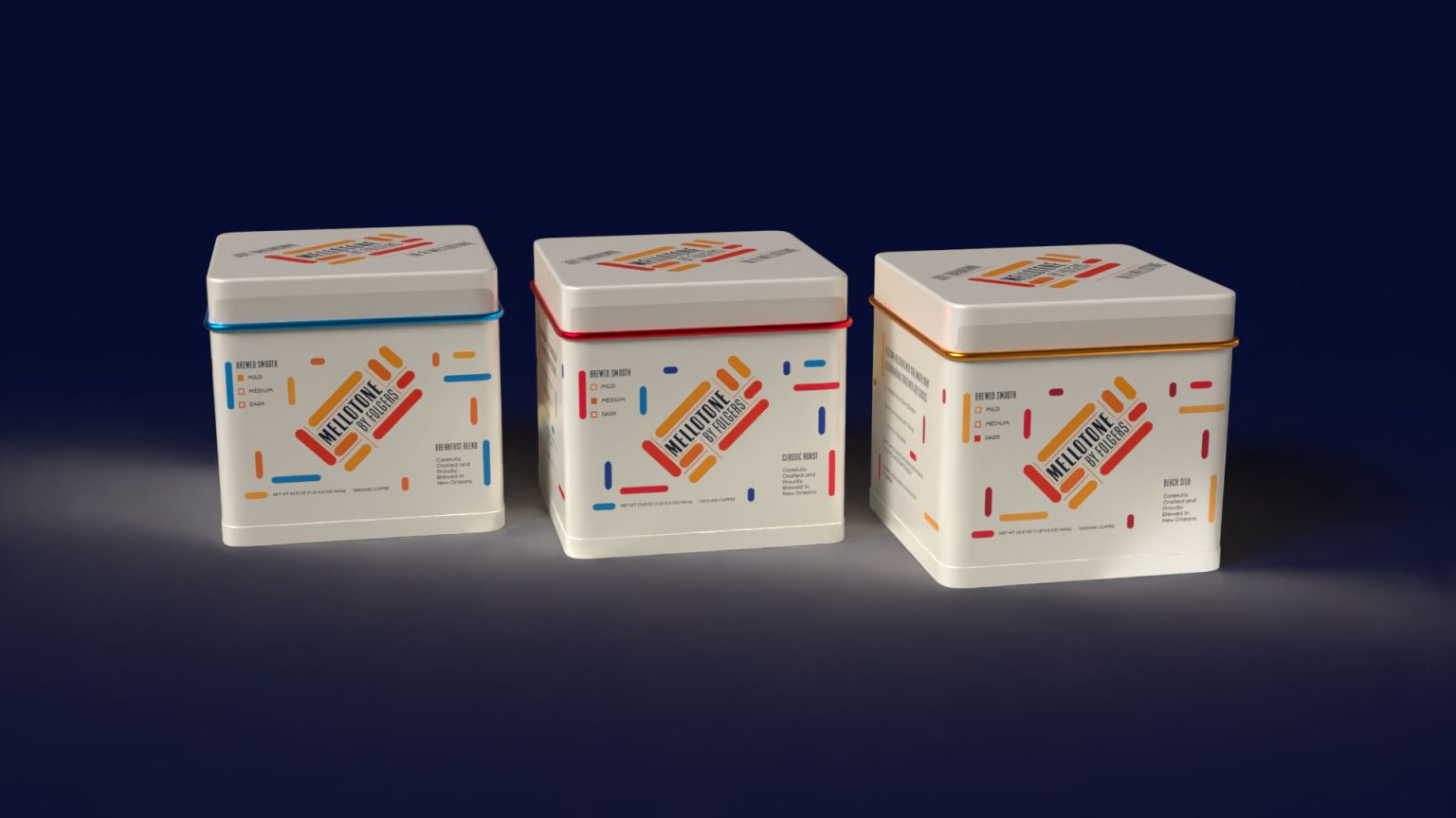

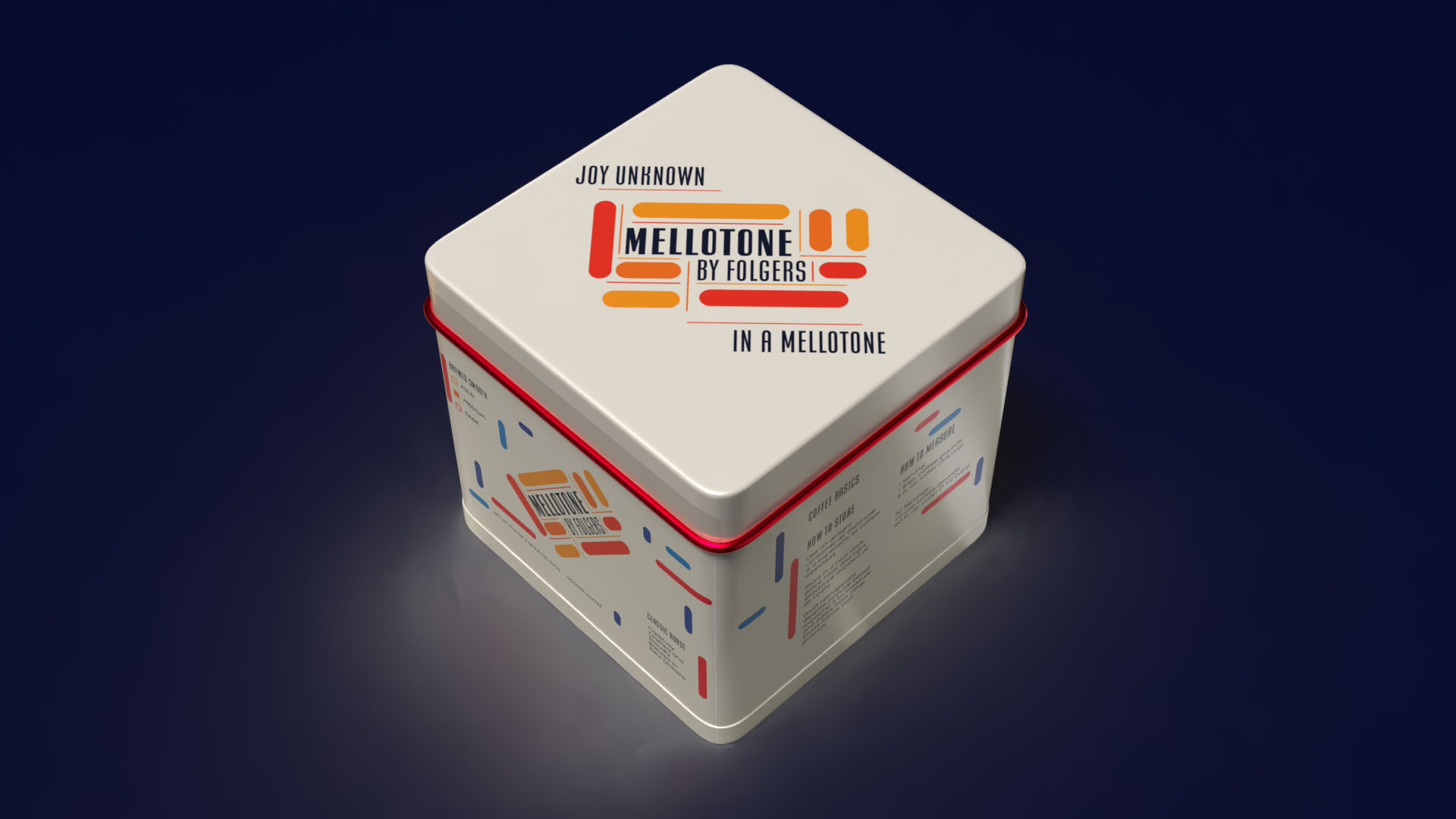
For this project, we were to create a product line for an existing company. I really wanted to create a line for Folgers that celebrates, just a little bit more, how proud they are to brew their coffee grounds in New Orleans. When you browse through the Folgers website, they mention how proud they are to be based in New Orleans, but with the original packaging and logo, we don’t get to see that. I did a deep dive into New Orleans and what represents them, and an obvious big one was jazz. So, a lot of inspiration in my design comes from jazz through the titles of songs and album art.
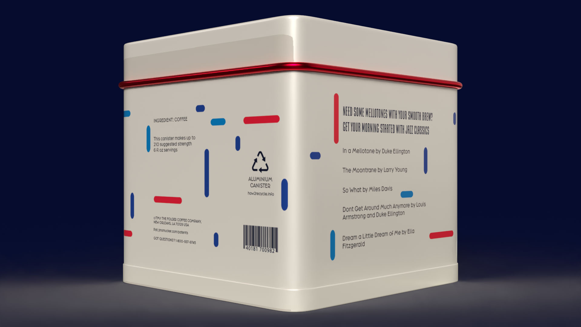
In the ’50s and ’60s, Swiss Style heavily influenced jazz album art, as it portrayed the same things jazz was portraying: sophisticated and modern. I looked at many Swiss Style album covers to really understand what Swiss Style looked like for the jazz community at the time, such as Horace Parlan Quintet – Speakin’ My Piece, Lennie Niehaus Vol. 3: The Octet #2, and Thelonious Monk – Genius of Modern Music Vol. 1. As for the name, I chose to name it after Duke Ellington’s song In a Mellow Tone because, to me, the lyrics had that similar feeling to the Folgers jingle, “The best part of waking up is Folgers in your cup.”
“Just go your way and laugh and play, there’s joy unknown (scat) in a mellow tone. Feeling fancy free, and I’m not alone, I’ve got company. Everything’s okay the live-long day. With this mellow song, I can’t go wrong.”
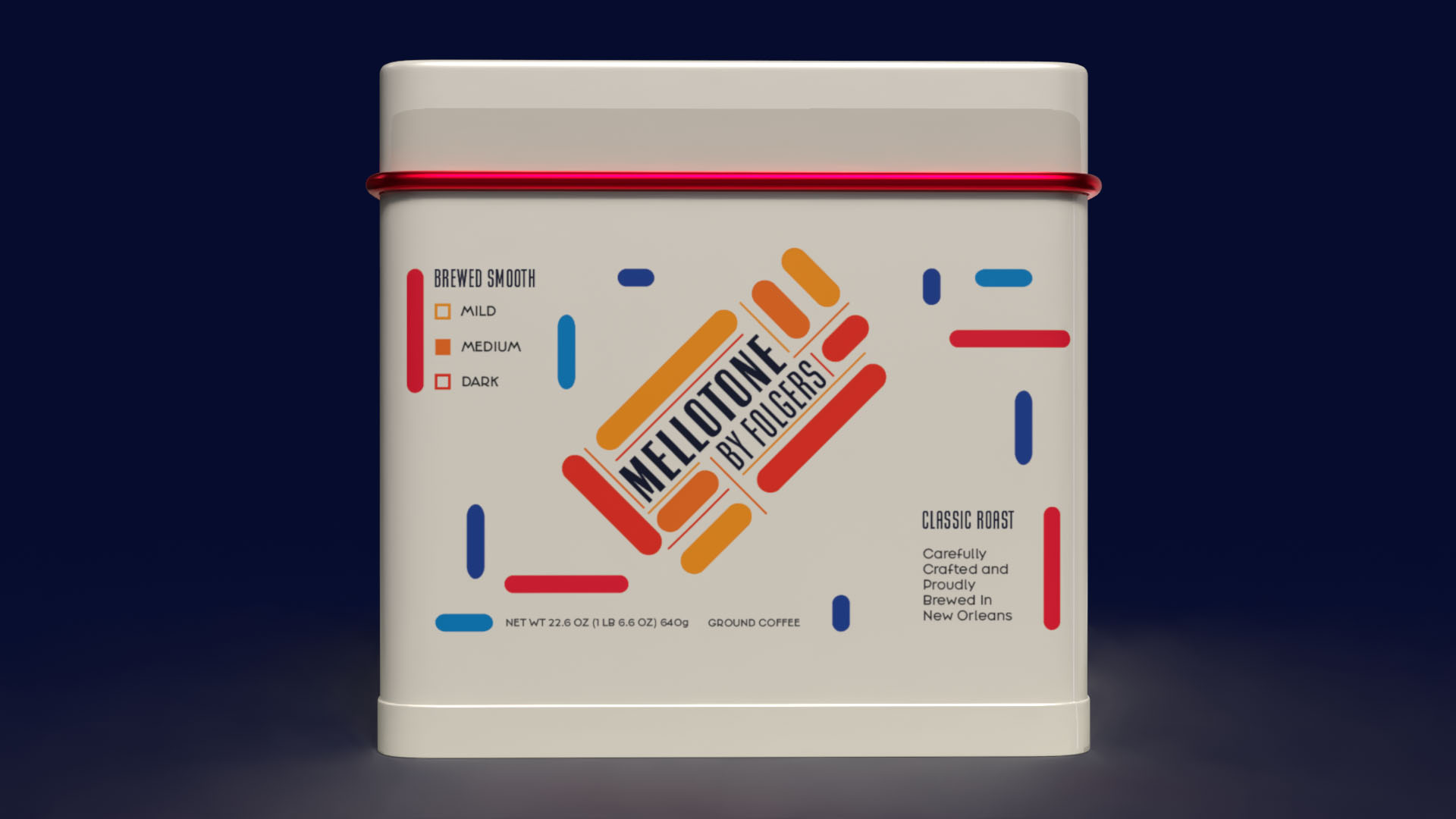
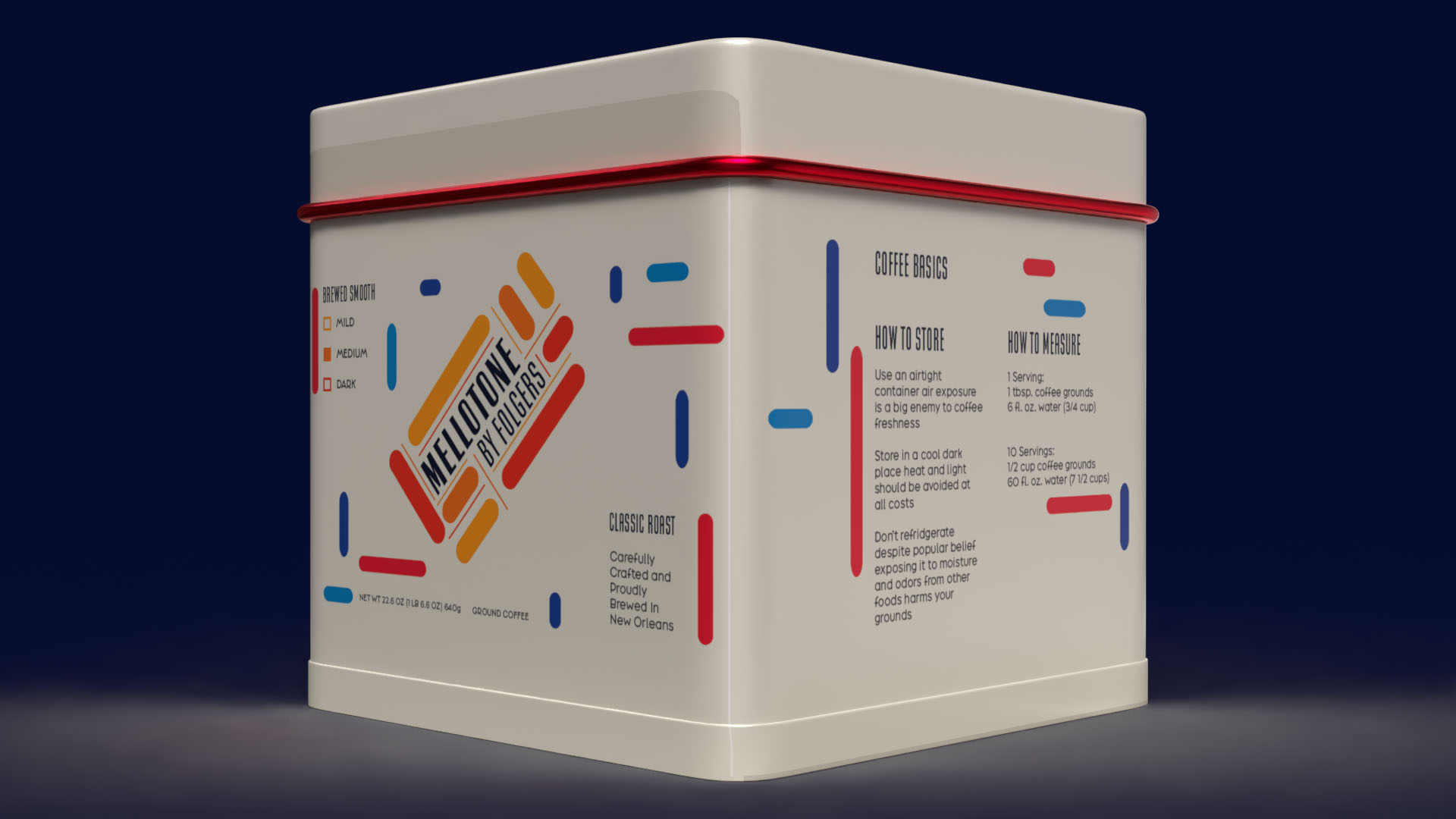
For the coloring, I tried to hold onto the red somehow because it’s so important to the Folgers image, but I wanted to dilute it to appeal to a younger audience who tends to go for products that are “aesthetic.” Each container has the same coloring, but the main color is different. For the Breakfast Blend, its main color is blue; for the Classic Roast, its main color is red; and for the Black Silk, its main color is orange. This design was rendered in Adobe Dimension but would preferably be in metal or tin, because the best way to keep coffee grounds fresh is by storing them in an airtight container.

 Derrick Lin
 salutifg
 ADStudio
 WeAreDepot
 Manuvila
 Yellow Umbrella Creative
 Toka
Toka Studio Zak
 Atiq Alam
 monther al omari
 Modern Theory
 Sirka Agency
 DESIGN CONCEPTS
 Eva Chistyakova
 Puigdemont Roca
 marianaaworks
 bloomburo
 andreamarinnn
 Alina
Alina Saadmost
 Bruhken
 Maruf Nishat
 Richest Branding Pvt. Ltd.
 Sophiagdotcom
 saifullahmaslool
 Up-Brands