
What is this product about?
Minko is a product rooted in nature, made with intention and care. It’s about purity, restraint, and trust, offering something quiet but confident, where the ingredients and the experience come first.
What is the concept behind the packaging design?
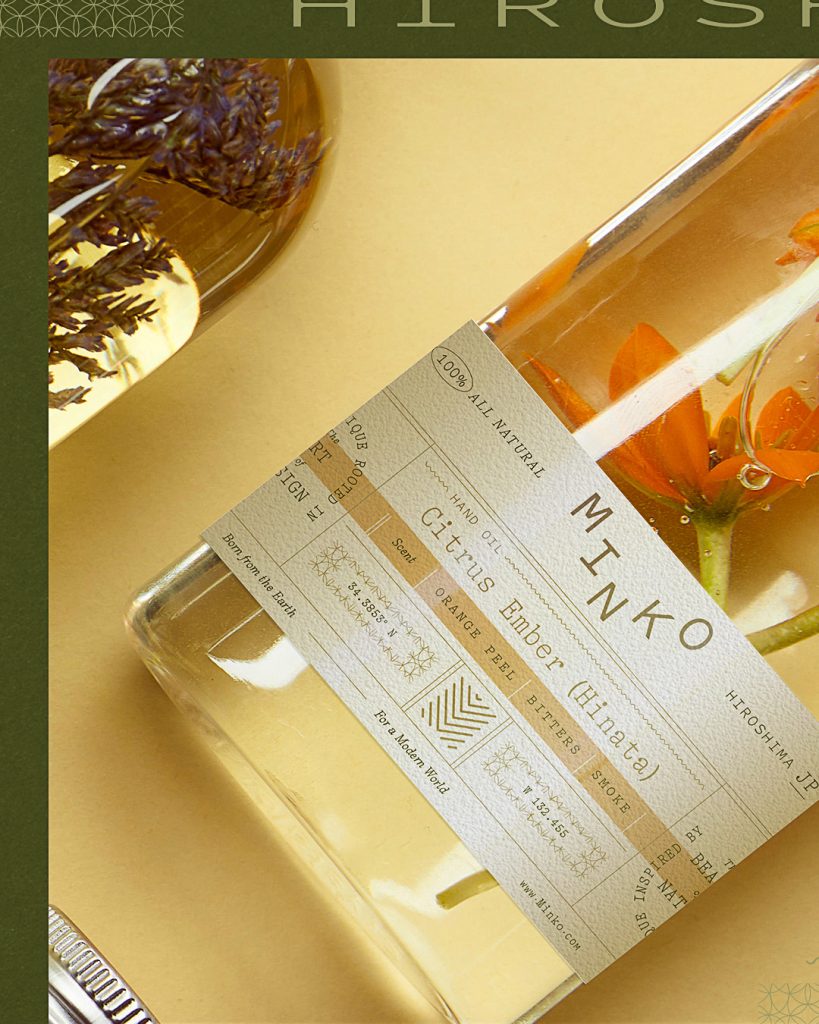
The packaging is designed to reveal rather than obscure. Instead of relying on heavy decoration or noise, the system creates space, allowing the product to feel clear, elevated, and honest. The concept is built around calm presence, minimal interference, and a sense of quiet refinement.
Solution
We created a logo and packaging system that feels composed and deliberate. A calm typographic voice, a restrained layout, and carefully controlled details work together to give Minko clarity, presence, and shelf confidence, without ever overpowering what’s inside.
The technique used to design the packaging
The design is rooted in reduction and precision: simplified forms, considered hierarchy, and intentional spacing. Typography leads the experience, supported by subtle structure, clean alignment, and tactile choices that emphasize quality and restraint.
What is unique about your packaging design?
What makes it unique is its confidence in understatement. The packaging doesn’t try to persuade through excess. It communicates through clarity, balance, and tone, creating a system that feels modern, natural, and quietly premium.
The results
The result is a packaging identity that feels timeless and assured. It elevates Minko with a clear point of view, strengthens recognition across the line, and creates a refined first impression that matches the care behind the product.


 Device Creative Collaborative
 United Creatives Studio
 Kingdom & Sparrow
 Anastasia Bakhmatskaya
 CreativeWise
 Great and Golden
 Ximena Ureta Design Studio.
 Sorted Branding
 Lisa Sirbaugh Creative
 vitoramockup
 YQIAN
YQIAN Navegante
 Anastasia Cherepanova | xtramez
 Polaris Designs
 pavlyai
 Milena Kocharyan
 monther al omari
 Mohamed sherif midoo
 DESIGN CONCEPTS
 mmdesign
 markcreativestudio
 Rosario Lo Iacono