

ABOUT
Santra is a conceptual rebranding project of a locally positioned, low-cost alcoholic beverage, traditionally perceived as utilitarian and disposable. The product had strong cultural familiarity but lacked aspiration, identity, and shelf respect.
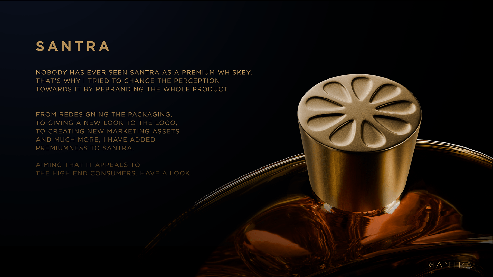
The objective was to challenge this perception and reposition Santra as a contemporary premium whiskey without denying its roots. The project explores how design can shift value, status, and desirability within a highly stereotyped category.
CONCEPT
The core idea was perception shift through restraint.
Instead of adding more graphics or ornamentation, the design removes excess allowing confidence, clarity, and color to do the heavy lifting.
Inspired by the warmth and sharpness of Indian oranges, the visual language draws from citrus tones as a symbol of intensity and freshness. The packaging deliberately avoids traditional “cheap liquor” cues and replaces them with bold typography, strong color blocking, and controlled minimalism signaling a clear move toward premium positioning.
SOLUTION
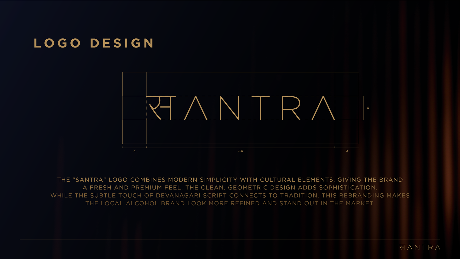
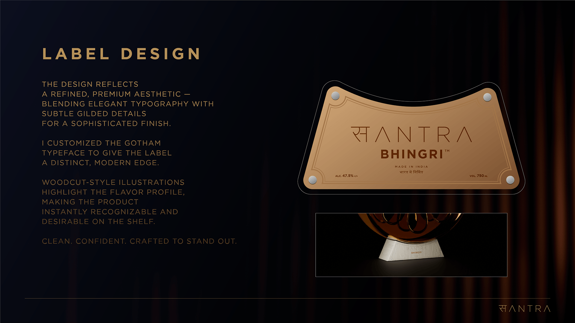
The packaging system is built on a simplified, high-impact structure that prioritizes hierarchy and legibility. A strong typographic logo becomes the hero, supported by minimal supporting information and a consistent color system across variants.
By eliminating clutter and exaggeration, the design allows the bottle to feel confident and self-assured capable of standing alongside established premium whiskey brands while still retaining a distinct local identity.
TECHNIQUE
The design approach focuses on:
- Bold, unapologetic typography
- Flat, high-contrast color blocking
- Minimal graphic intervention
- Clear information hierarchy
The packaging was designed to be easily scalable across SKUs, maintaining consistency and recognition while allowing color to differentiate variants.
UNIQUENESS
What sets this packaging apart is its refusal to overcompensate.
Instead of disguising the product’s origins, the design reframes them using simplicity and confidence as tools to elevate perception. The result is a packaging language that feels raw yet premium, familiar yet disruptive.
RESULT
Santra is transformed from a background product into a shelf-forward statement. The rebranding demonstrates how strategic restraint and strong fundamentals can redefine a brand’s value, turning an overlooked local spirit into a modern whiskey with presence, attitude, and credibility.




 MID-AIR STUDIO
 Heramb Arora
 monther al omari
 Tríona O'Donoghue • Design
 Cocoon Prague
 alchimistestudioParis
 hugo zapata
 Bonsanco Creative Studio
 parawaradesign
 UPRISE
 Brand Society
 Que Cálido Studio®
 Richest Branding Pvt. Ltd.
 STRATEDGY
 Shapers Studio
 Platon Ivantsov
 WPA Pinfold
 giselepereiradesign
 ShalaSketches
 05Creation
 Voit Studio
 SSTO
SSTO