

A legacy brand doesn’t just stay relevant. It stays iconic.
Dinshaw’s Dairy Foods Pvt. Ltd. was established in 1932. Nearly 50 percent of its business comes from the ice cream category, followed closely by dairy and milk products, with a smaller share contributed by bakery and namkeen offerings. This legacy brand is headquartered in Nagpur and has a strong presence across various states in India – Maharashtra, Madhya Pradesh, Chhattisgarh, West Bengal, Odisha and many more.
Dinshaw’s has lived in people’s memories for over nine decades, not just as an ice cream brand, but as a part of childhoods, celebrations, and simple moments of indulgence. Our task was to honour this emotional equity while giving the brand a visual identity that feels as rich and delicious as the product itself.
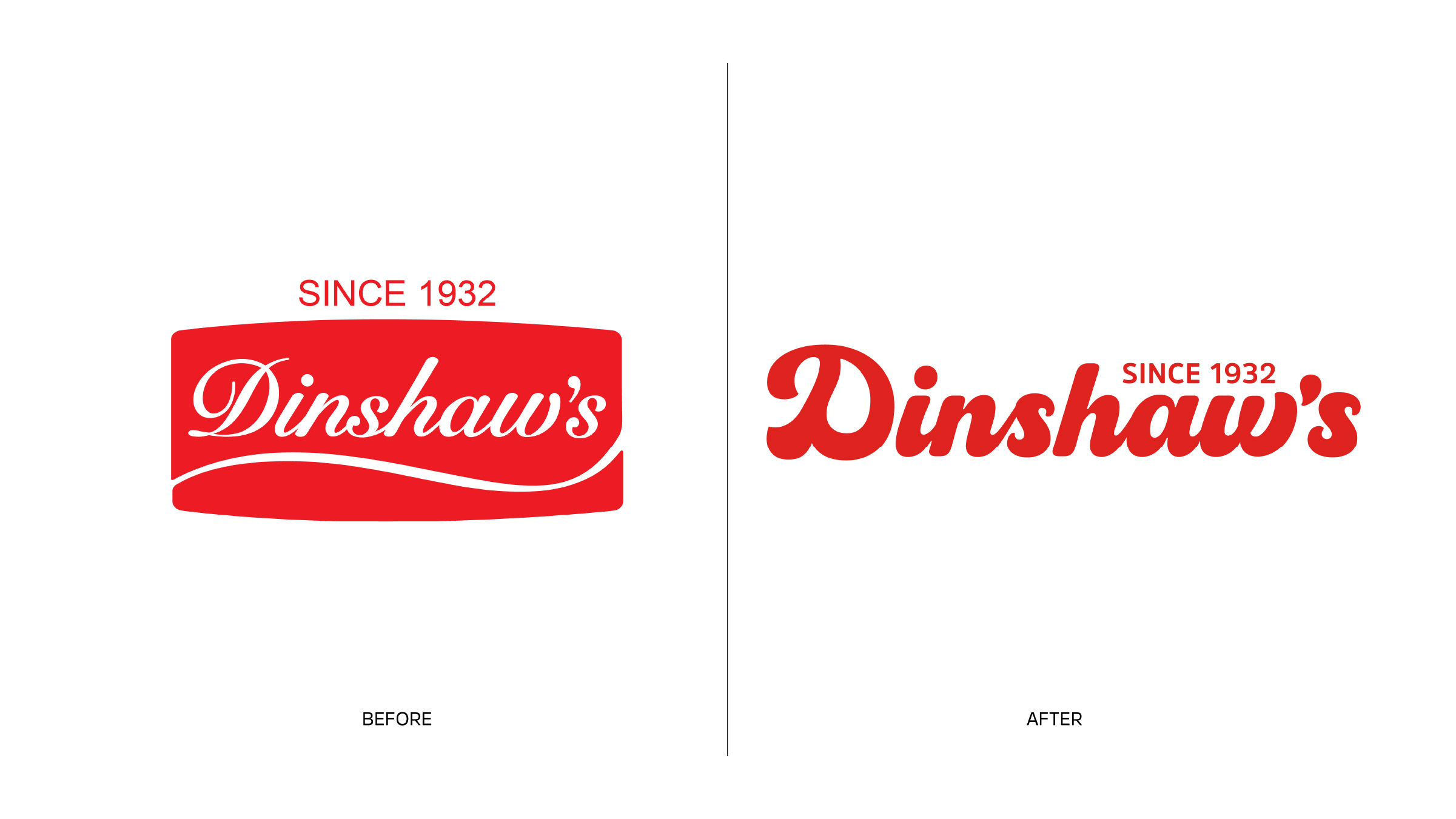
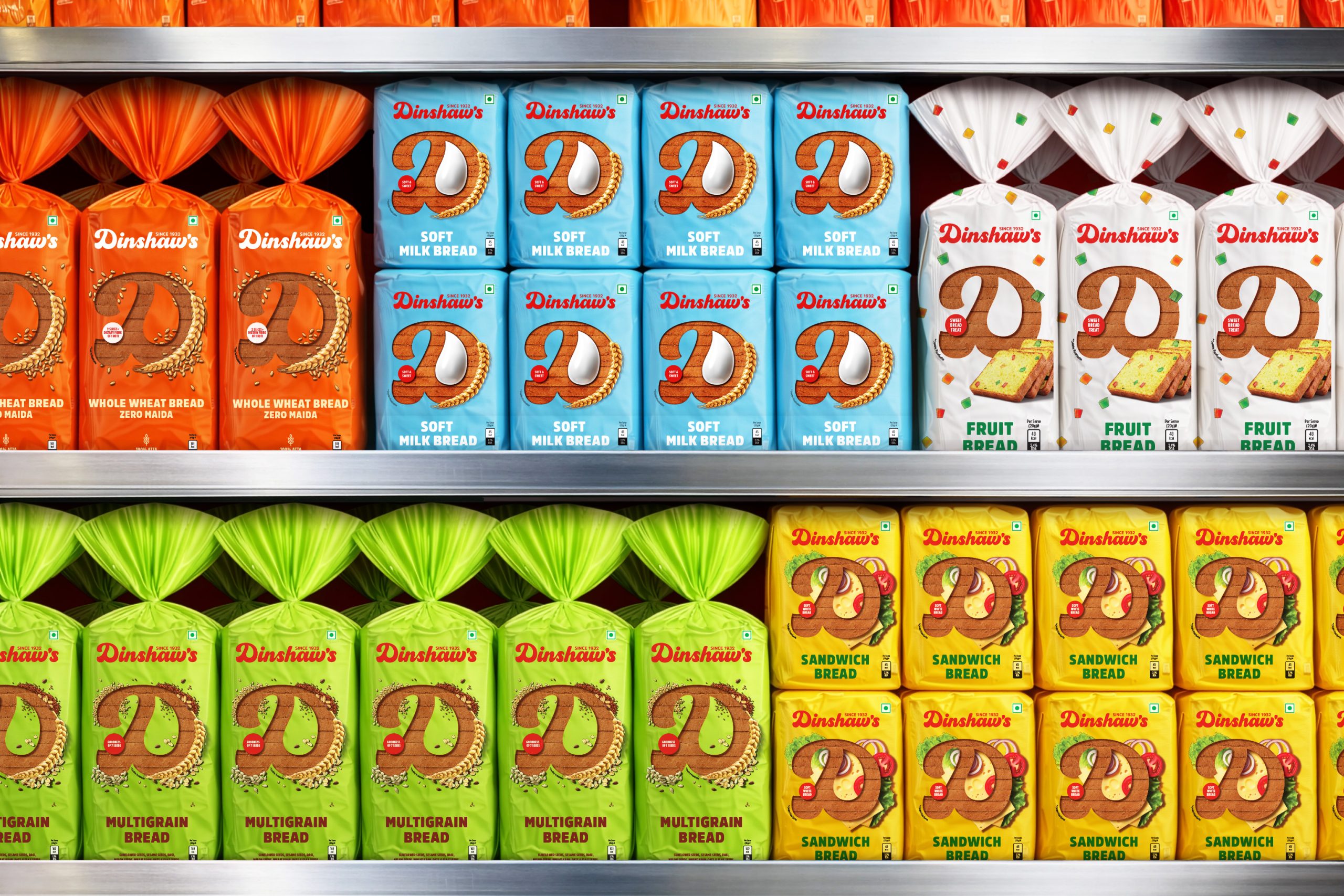
The colour red remains the heartbeat of Dinshaw’s identity, but the logo has been unboxed to move freely across the packaging.
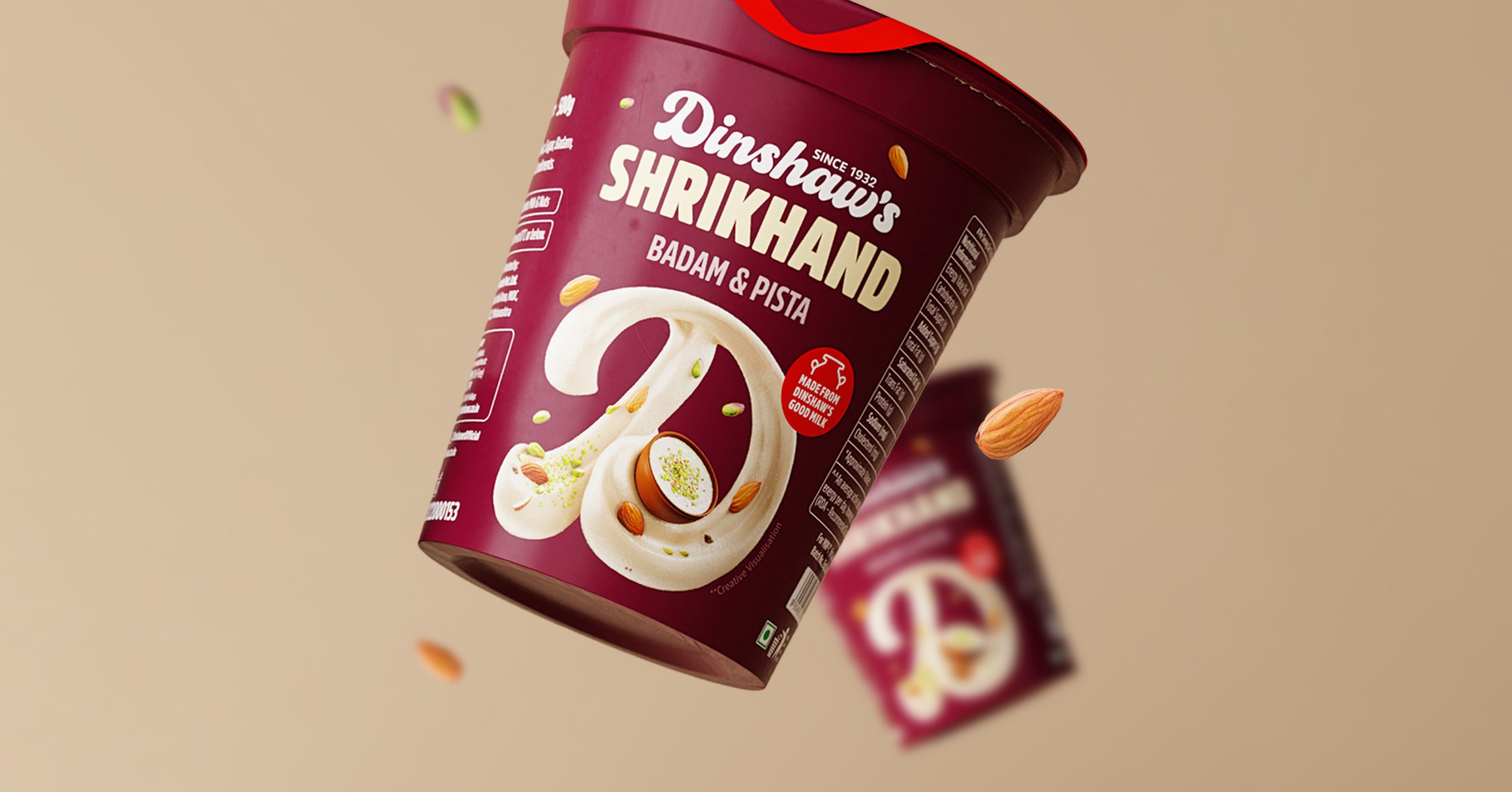
At the core of this redesign lies a powerful detail: a single drop of milk embedded within the ‘D’. This drop is a promise of purity, authenticity, and the wholesome abundance that defines Dinshaw’s.
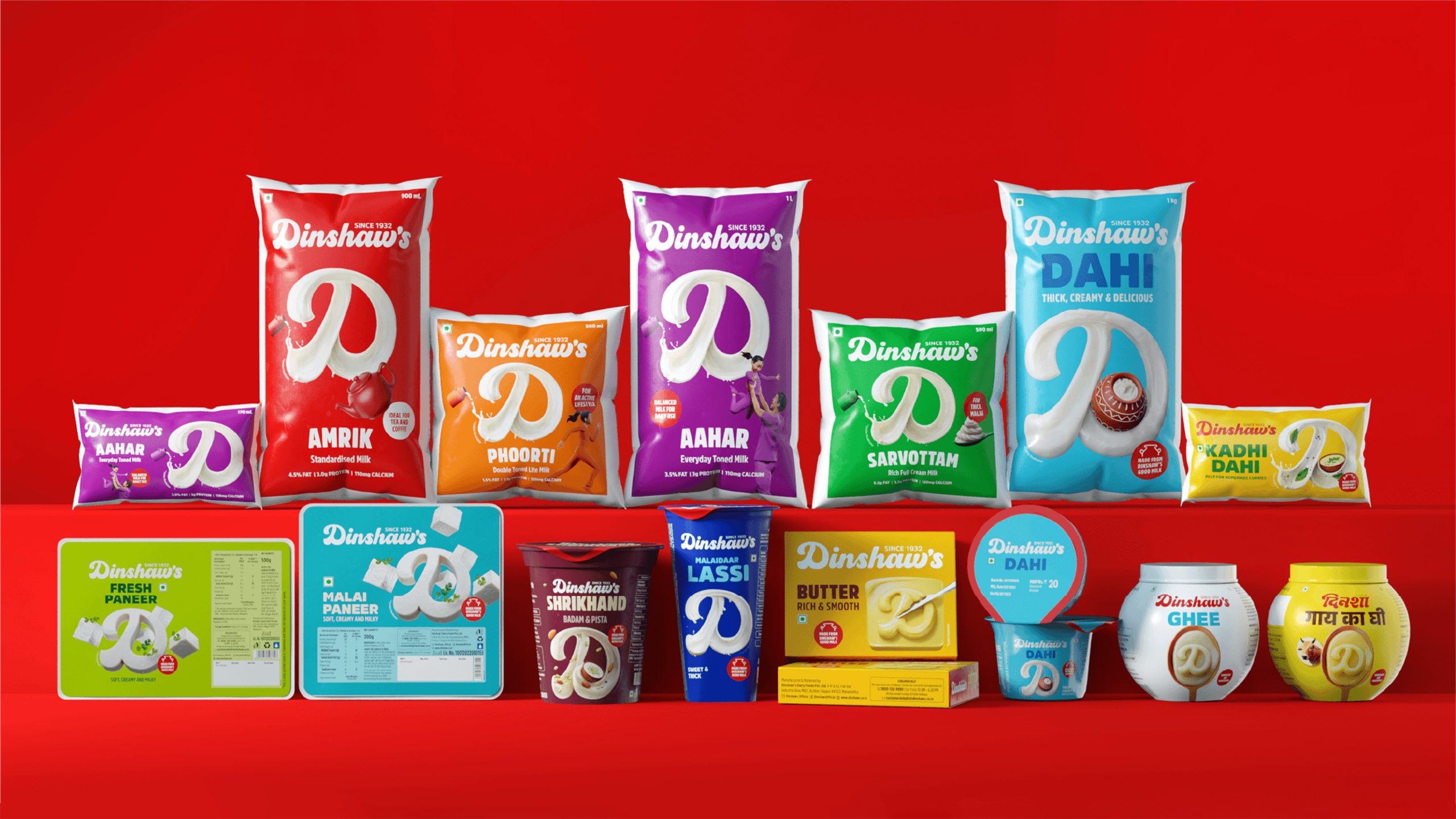
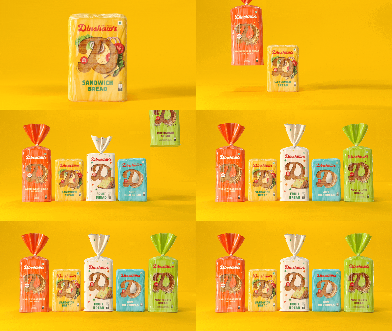
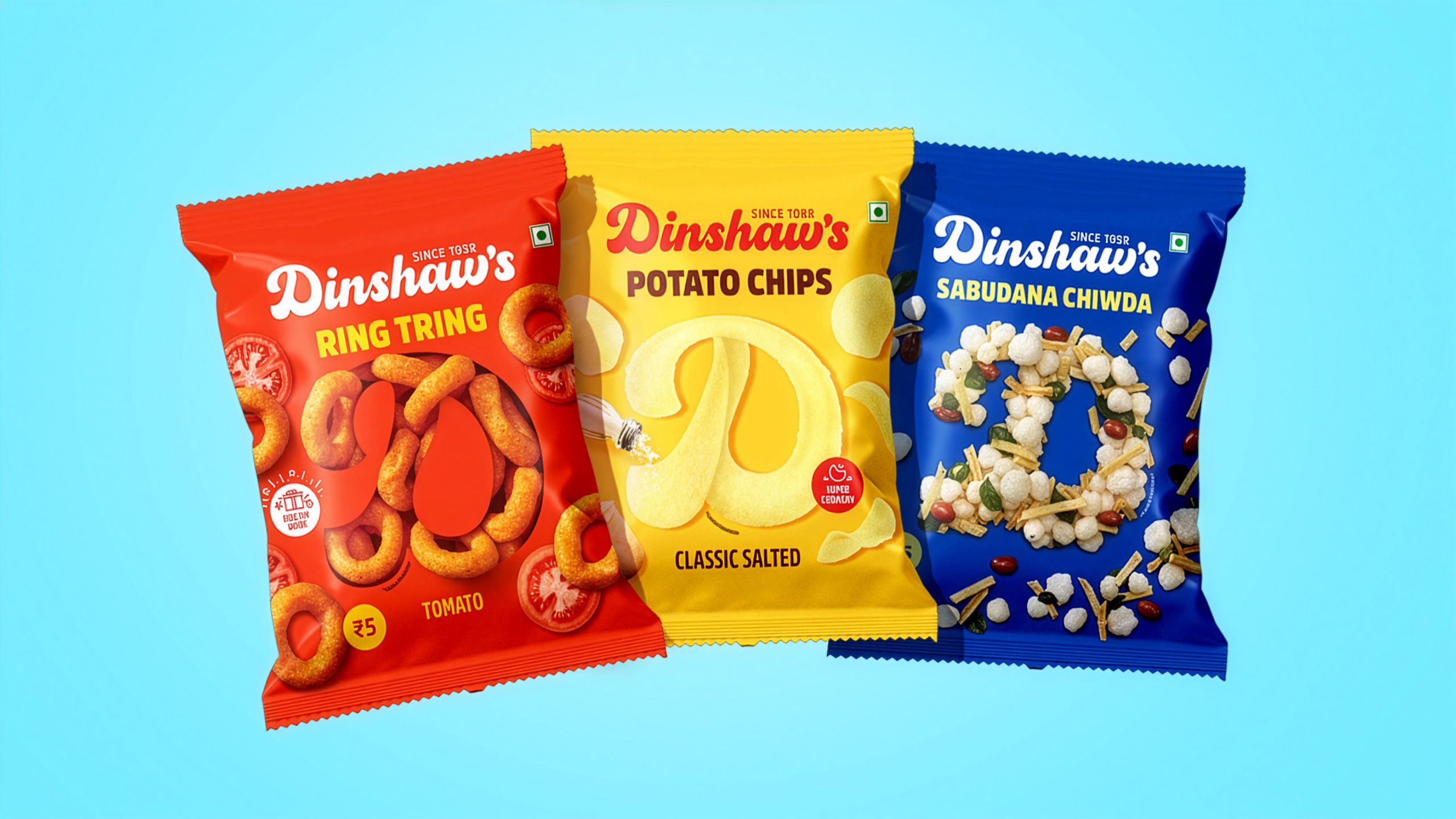
The ‘D’ of Dinshaw’s is not merely a monogram. It transforms into a bold super-graphic that unifies the entire portfolio. Packaging is where brands truly live, and by making the ‘D’ the focal point, the design system builds strong, intuitive brand recall while imprinting Dinshaw’s promise of indulgence and quality ingredients in the consumer’s mind.
This flexible design system allows the brand to own a distinctive and cohesive visual language that consumers can recognise in an instant.





 Lizaveta Kharitonyuk
 Bonsanco Creative Studio
 DesignRepublic
 GIRAFA STUDIO
 PiotrWisniewski
 Sophiagdotcom
 monther al omari
 CreativeWise
 Modern Theory
 SoreThumbStudio®
 Modern World Studio
 Palashcc
 Valérie Colace
 andreamarinnn
 Chochoi Creative
 Hi estudio
 bachir bachchar
 Aferdini
 AUN BRANDS
 vitoramockup
 InterWish
 ash123456
 Studiotaketwo