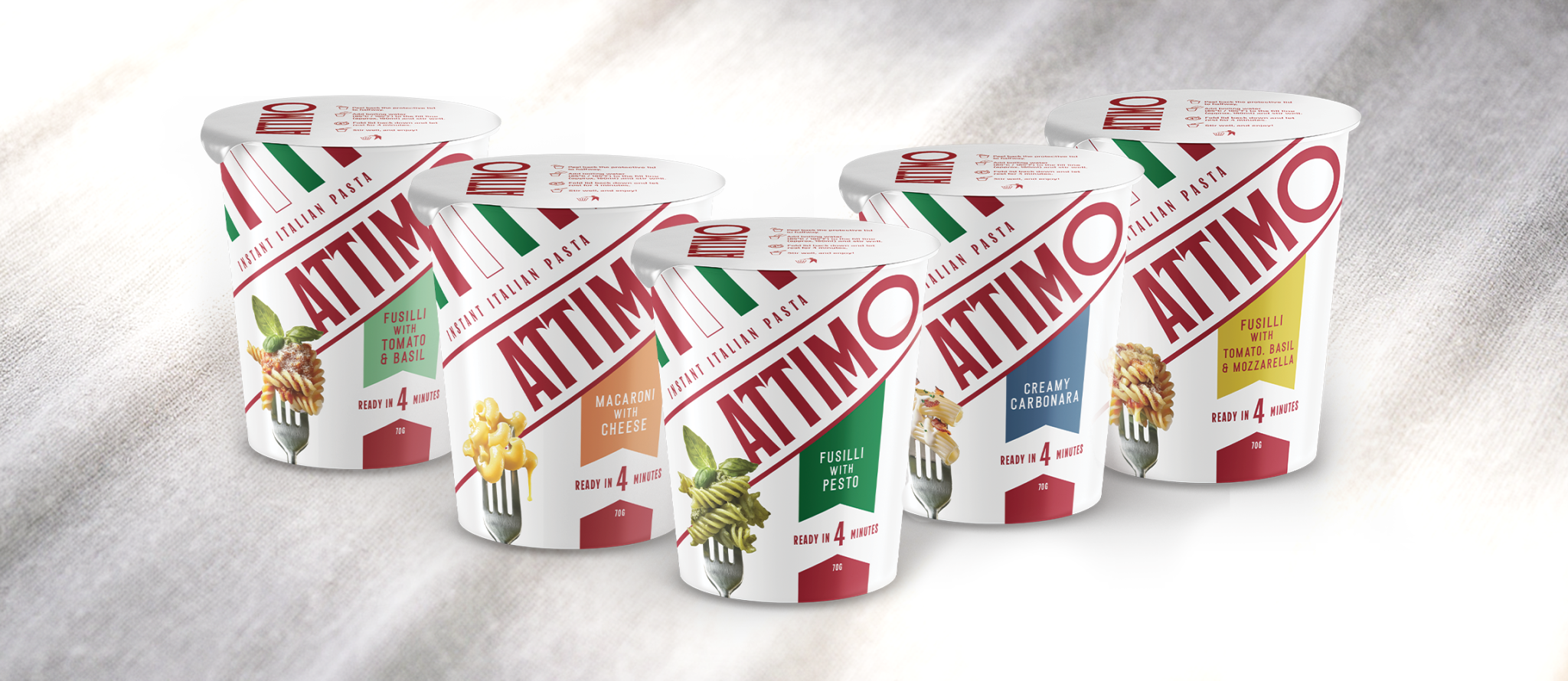

Attimo was built on a compelling product insight: an instant pasta concept that felt 80% familiar and 20% new.
The challenge wasn’t the product itself, it was helping consumers instantly understand it when presented to them in a non traditional way.
The packaging format was new to this category, which meant Attimo needed to communicate clarity, credibility, and authenticity at a glance. While the team had a strong sense of what they wanted to achieve, translating that vision into a coherent, shelf-ready design proved difficult. Previous attempts hadn’t quite landed, and the brand needed a design partner who could bring everything together, quickly and confidently.
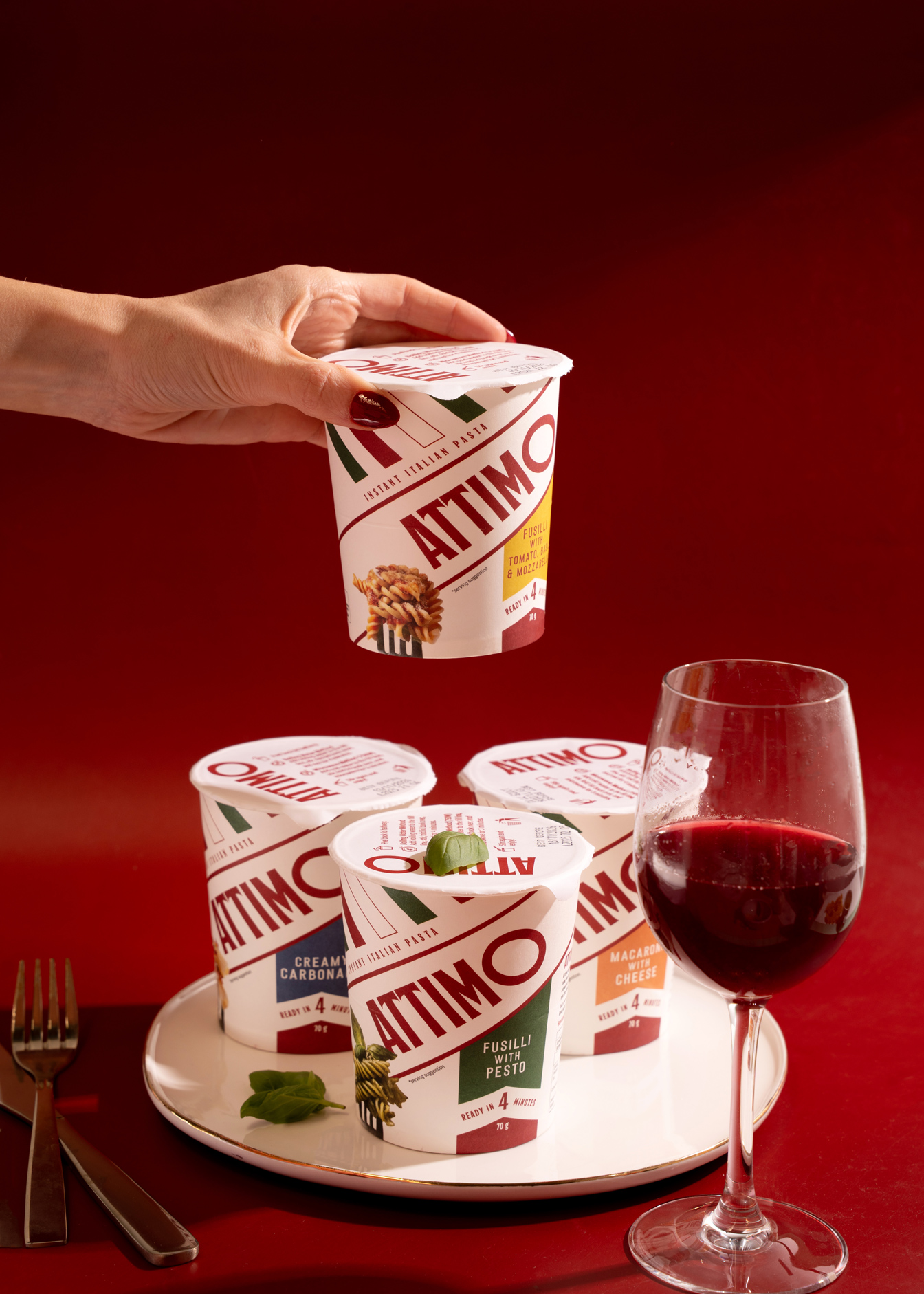
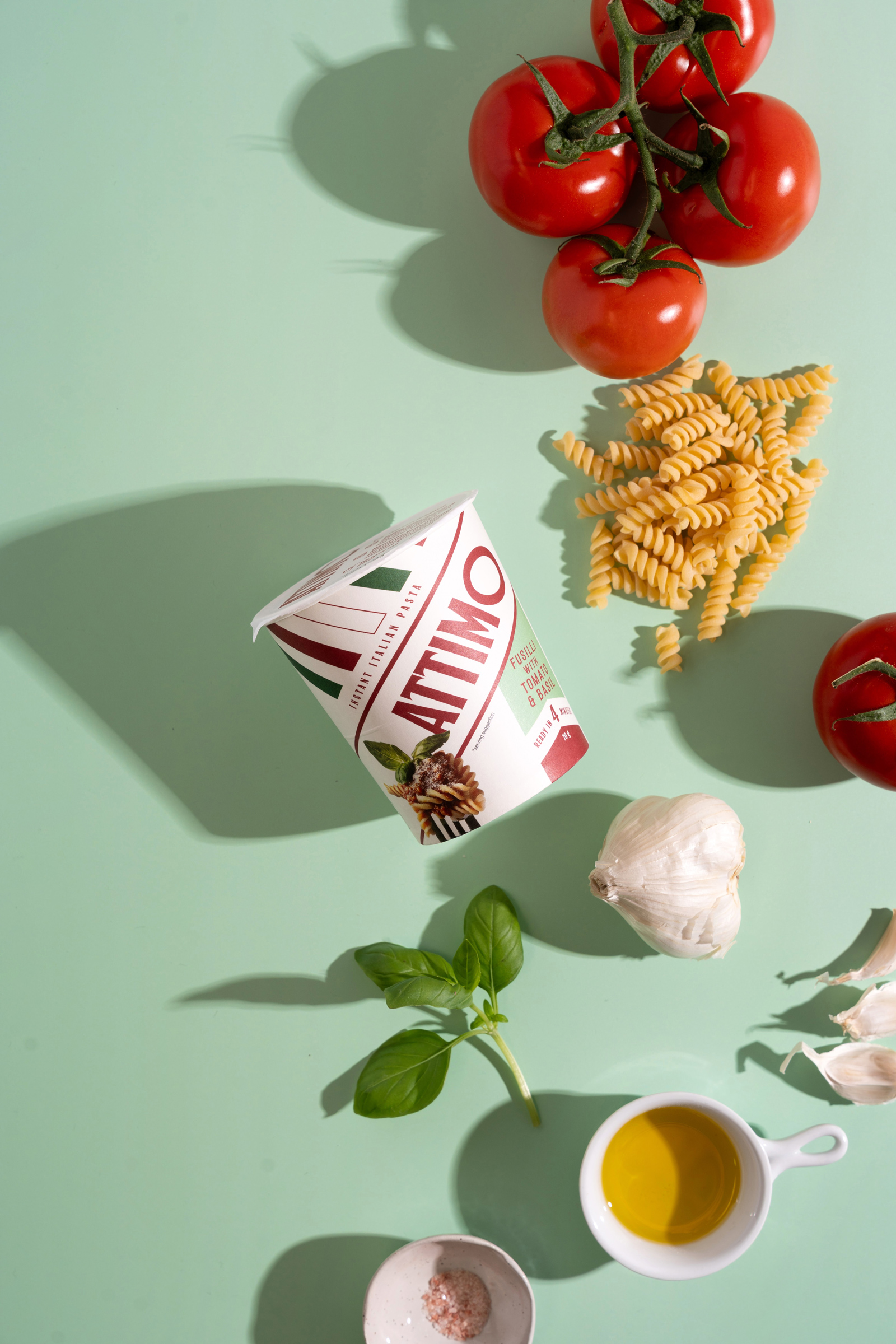
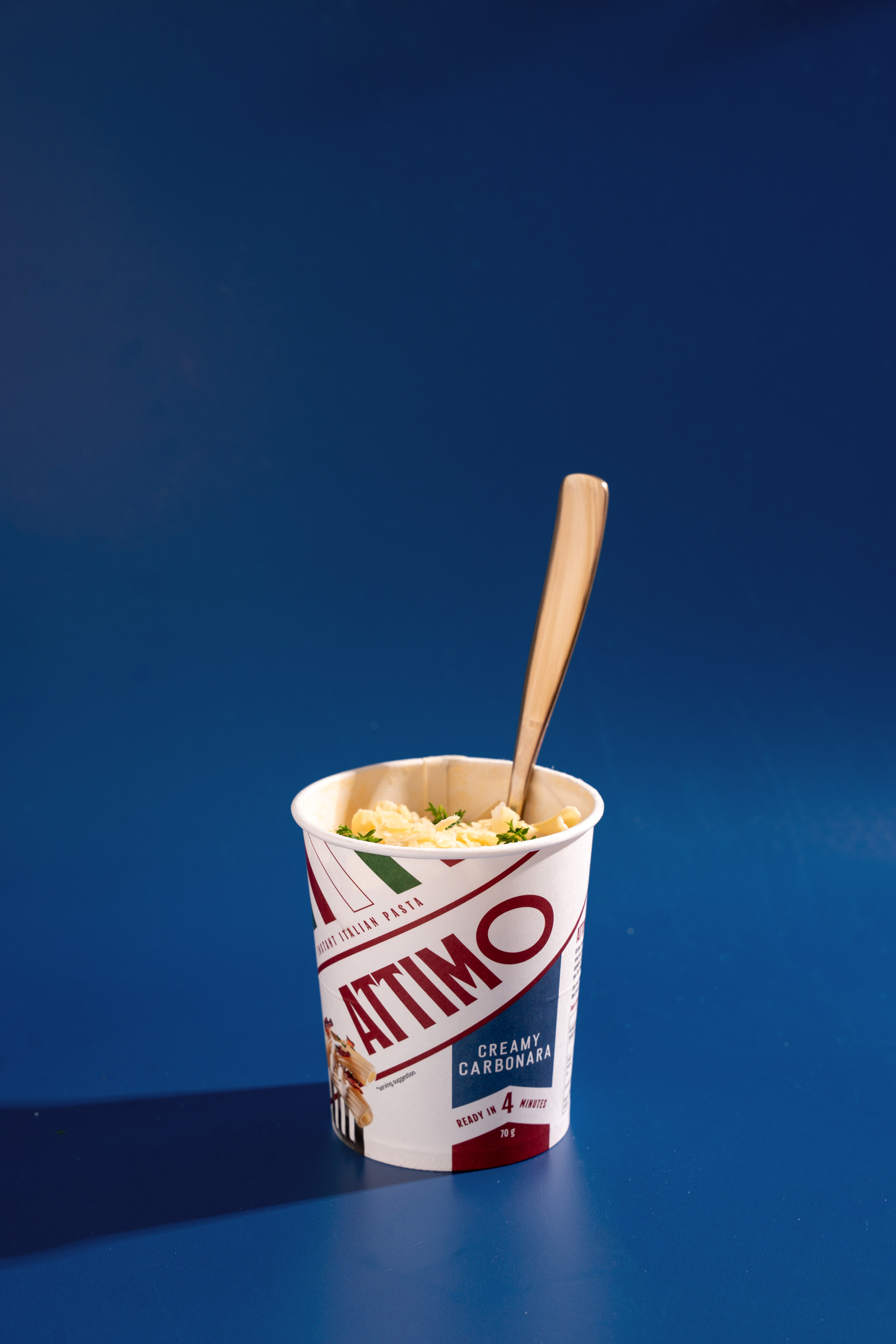
The final packaging delivered a confident, authentic presence that stood out in a crowded category. Since launch, Attimo has received consistent positive feedback on the packaging, with consumers independently calling out the authenticity without being prompted or told it was a key objective.
Most importantly, the packaging design has played a meaningful role in securing retail listings, helping Attimo move from concept to commercial reality with expansion into new retail markets very much on the horizon after launching only last October.

 Natasha Spitsyna
 babyage
 GruppoSaida
 ahmedraoudgfx
 Hi estudio
 Nadezhda Gorelikova
 Studio Garces
 Brandsbylufo
 Rewot
Rewot alchimistestudioParis
 Asprey Creative
 kat bres
 Valérie Colace
 Atiq Alam
 Sara Communications
 David Hakobyan
 monther al omari
 Innovāt - Empowering Creative Innovation
 mmdesign
 Amjad Battal
 Hollóka Grafikai Műhely / Graphic Design Studio
 Palashcc
 ABC Design Communication
 ChrisSkarlatos
 Hedayat Hadavi
 Tia Nguyen