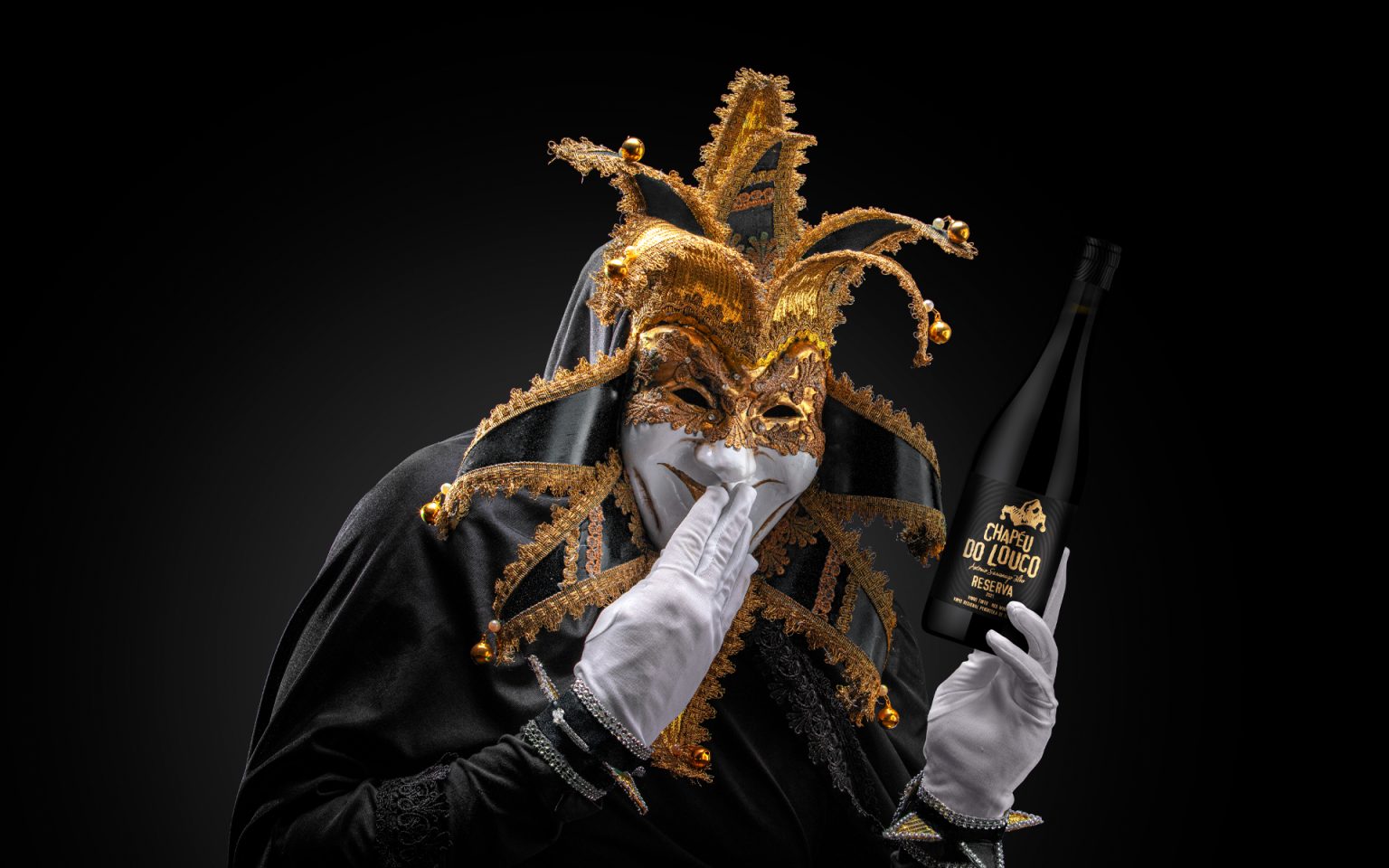

This is not balance. This is beautiful madness.
Chapéu do Louco lives where reason ends and imagination begins. Inspired by the healthy mandness that we all have, the label explores the fragile boundary between lucidity and creative madness. Madness here is not chaos, but liberation: the courage to see differently, to feel more intensely, and to transform perception into experience.
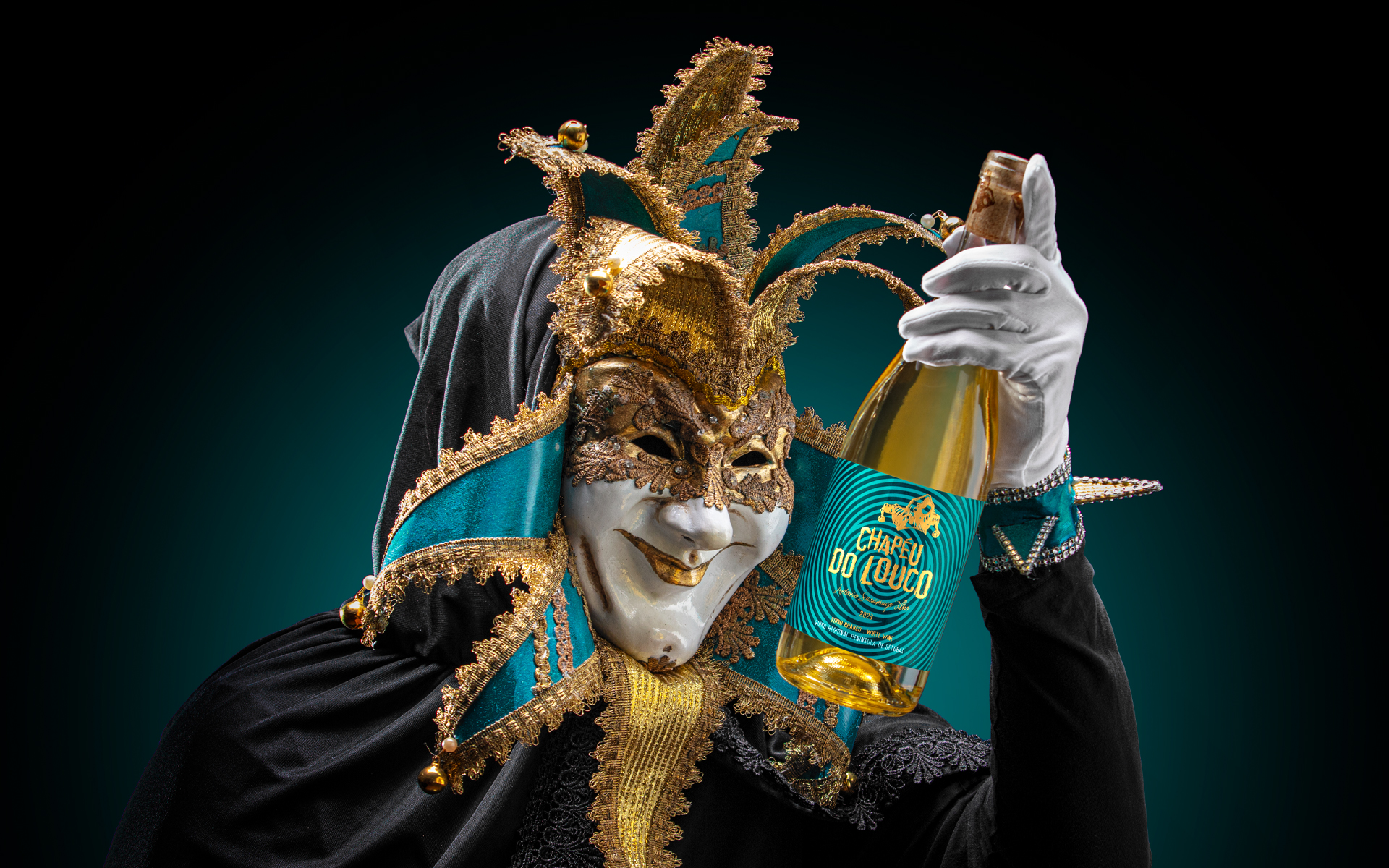
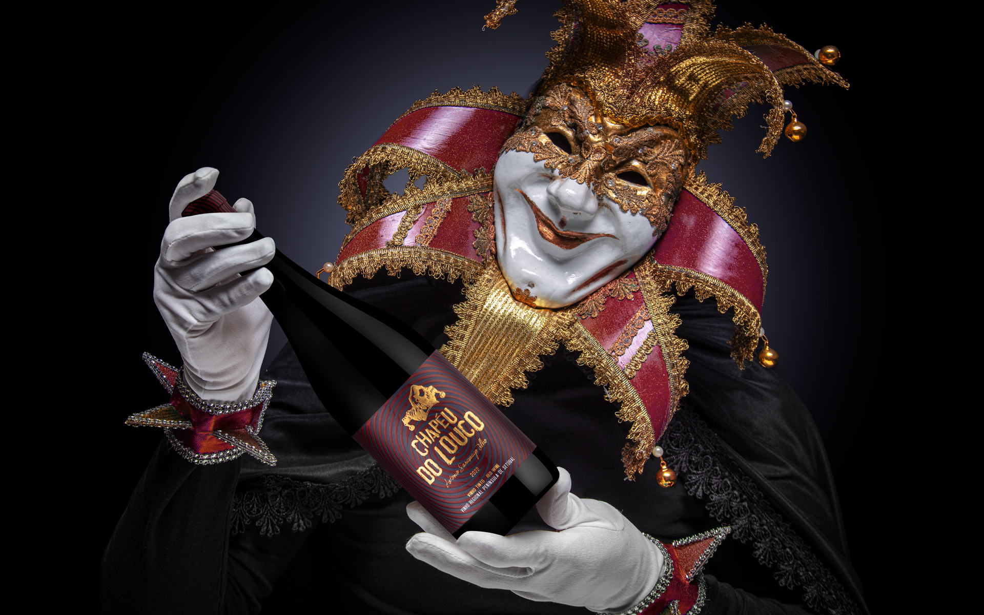
The elliptical pattern that radiates across the label embodies this altered state of awareness. It represents the moment we close our eyes and detach from reality, when thoughts accelerate, distort, and expand beyond logic. The lines create a visual vortex, suggesting movement inward and outward simultaneously, like entering a dream while remaining conscious of its intensity.
The color palette amplifies this psychological tension. The deep red , blue and Black, evoke emotion, passion, and instinct, the primal forces that exist beneath rational control, while the gold typography emerges as a symbol of revelation, clarity found within chaos. Together, these contrasts reflect the duality between darkness and brilliance, madness and genius.
Chapéu do Louco is not simply a name, it is a state of mind, na invitation to step beyond and close your eyes.




 United Creatives Studio
 Kingdom & Sparrow
 Anastasia Bakhmatskaya
 CreativeWise
 Great and Golden
 Ximena Ureta Design Studio.
 Sorted Branding
 Lisa Sirbaugh Creative
 vitoramockup
 YQIAN
YQIAN Navegante
 Anastasia Cherepanova | xtramez
 Polaris Designs
 pavlyai
 Milena Kocharyan
 monther al omari
 Mohamed sherif midoo
 DESIGN CONCEPTS
 mmdesign
 markcreativestudio
 Rosario Lo Iacono