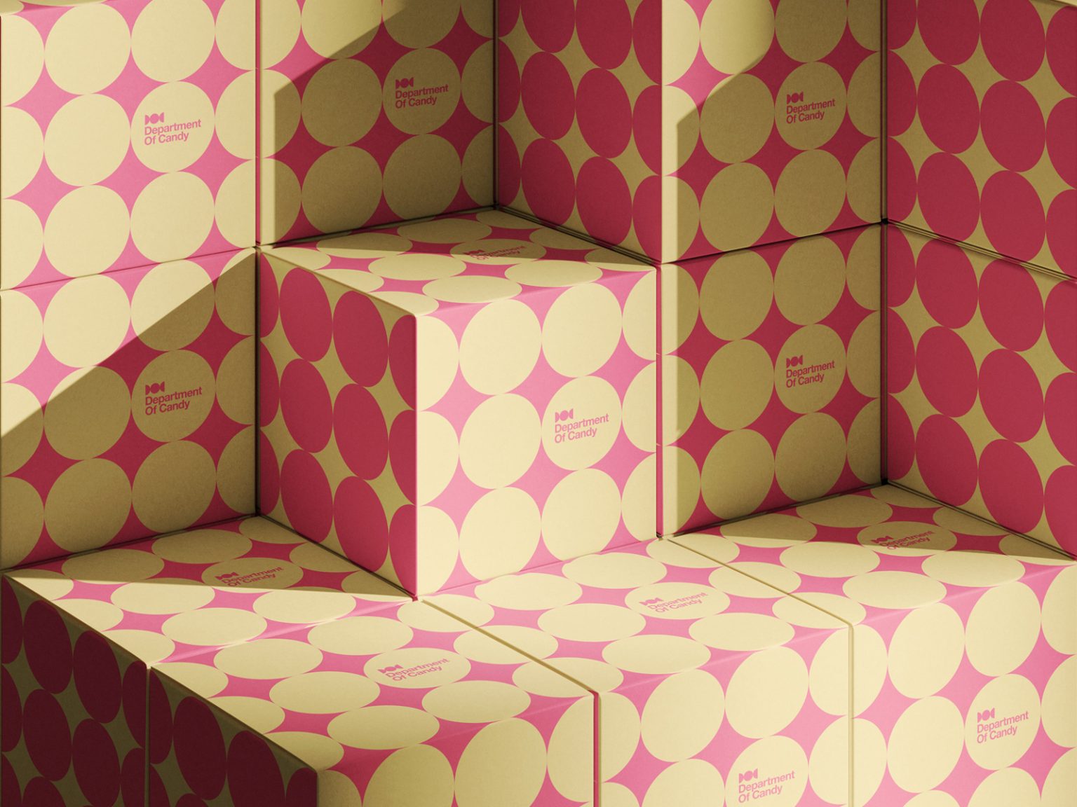

Department of Candy (DOC) is an artisan candy brand conceived as a playful yet premium reinterpretation of confectionery culture. The concept positions candy not merely as a product, but as a carefully crafted experience, where quality, form, and imagination are treated with the seriousness of an institution.
The visual identity originates from the very essence of the product itself: the shape of the candy and its wrapper. These two elements were abstracted and refined into a distinctive symbol that serves as the foundation of the logo. From this symbol, the name Department of Candy was developed, intentionally echoing the tone of an official establishment. This naming approach reinforces the brand’s commitment to high standards, exceptional ingredients, and thoughtfully made sweets, elevating candy-making into a disciplined craft rather than a casual indulgence.
Color plays a crucial role in the brand’s shelf presence. A vibrant two-tone color palette was selected to ensure immediate recognition and strong contrast within crowded retail environments. The bold color combinations not only attract attention but also communicate energy, joy, and confidence, key emotional drivers within the confectionery market.
The packaging design draws inspiration from classic polka dot patterns, reinterpreted through a contemporary lens. While playful in spirit, the system remains structured and intentional, with the DOC symbol acting as the primary design element. Branding is kept deliberately minimal, allowing the form, color, and pattern to speak for themselves. This restraint results in a distinctive “mystery box” experience, an object that invites curiosity and anticipation while housing a selection of flavorful, handcrafted candies.
The entire project remains unpublished and is available for purchase, offering a unique opportunity to acquire a fully developed, market-ready brand with strong visual identity and conceptual depth.



 NEV
NEV Stefano Bracci
 Alina
Alina monther al omari
 Lizakjx
 JOAOMARCOSDESIGN
 alchimistestudioParis
 Harriet Neild
 octavio rojo
 宏洛图品牌设计HONGLT
 DESIGN CONCEPTS
 Alexander Skurihin
 Studio K95
 ARMBRAND
 Richa Rai
 houseoferas by Miti
 Agence des Coteaux
 Kushi Eaknath
 Ann Treasa
 Xiao Ning
 krrrrrllii
 babyage
 Deep
Deep