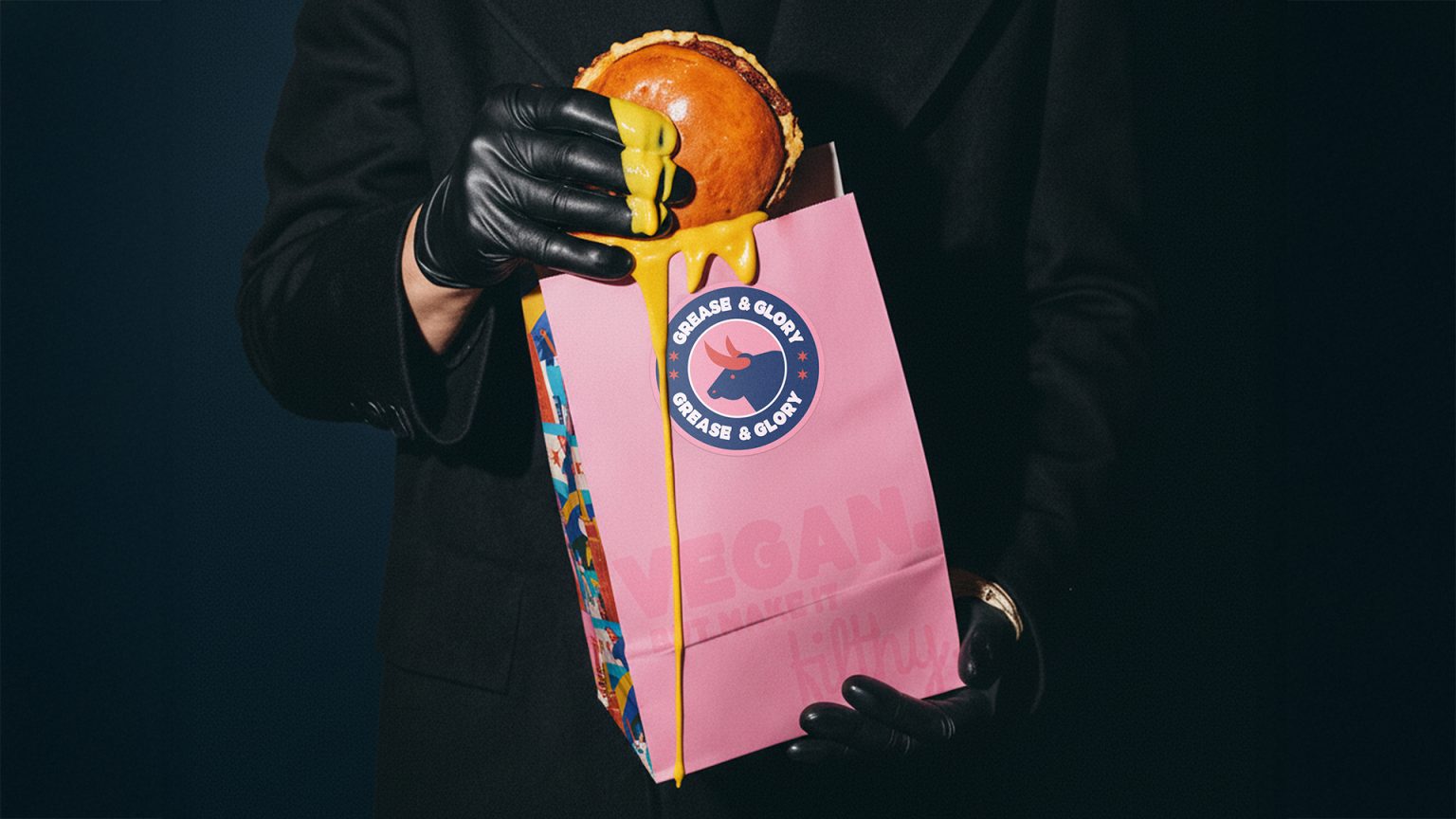

Non conventional brand identity and packaging design for a non conventional fast food.
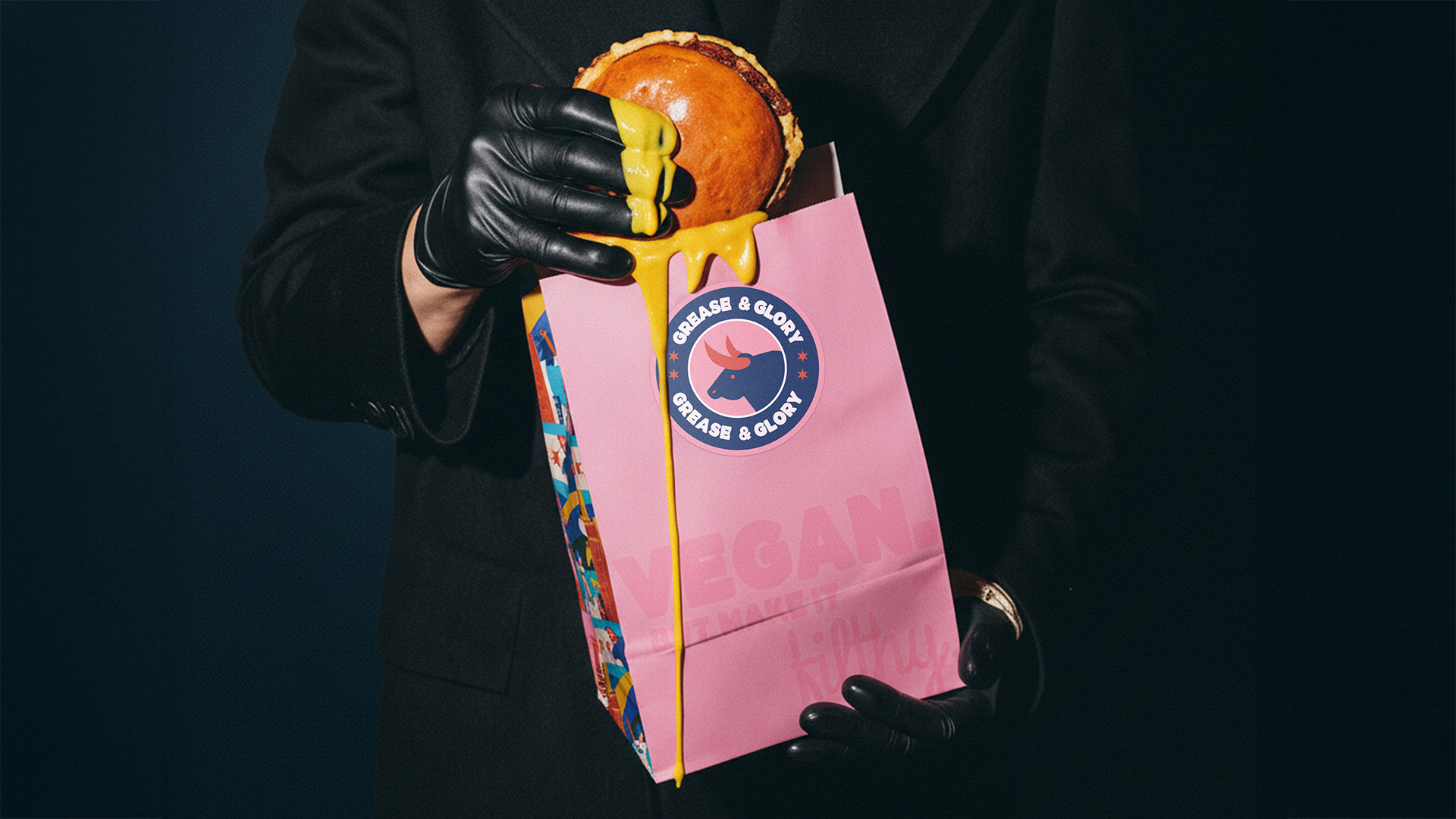
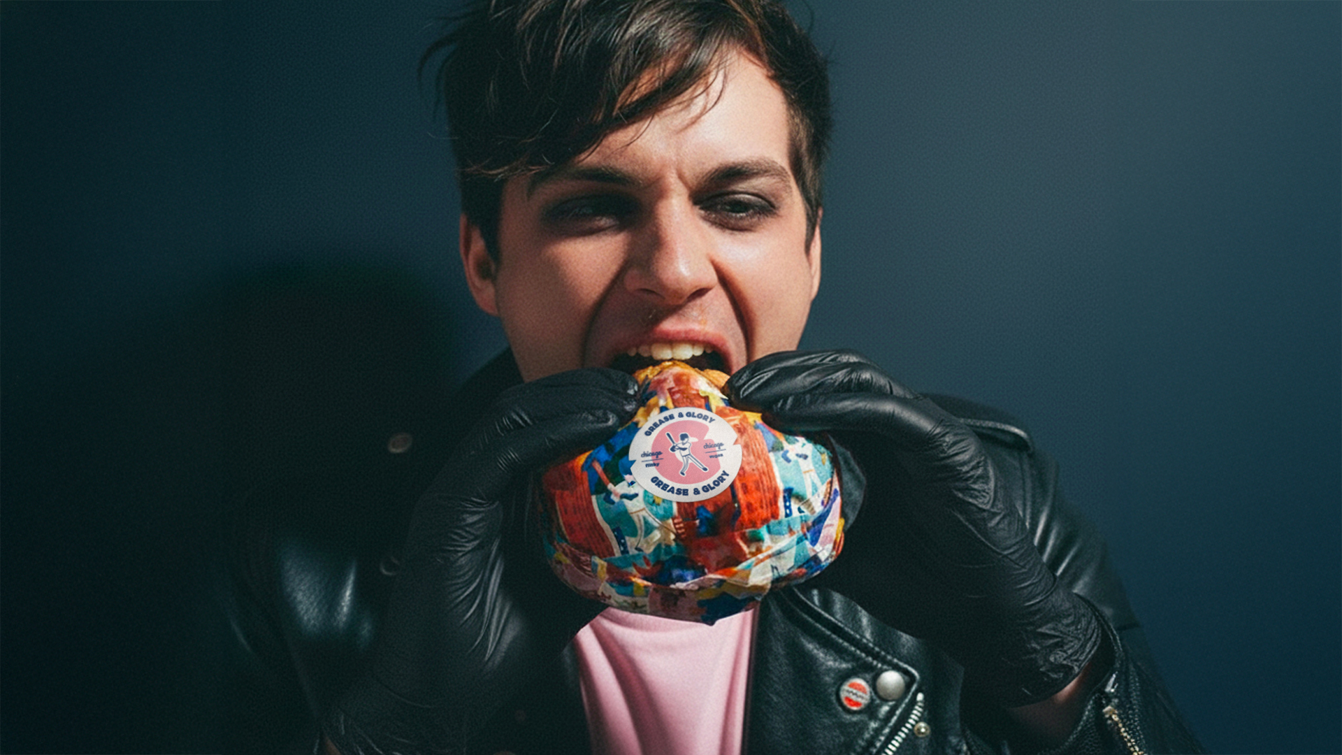
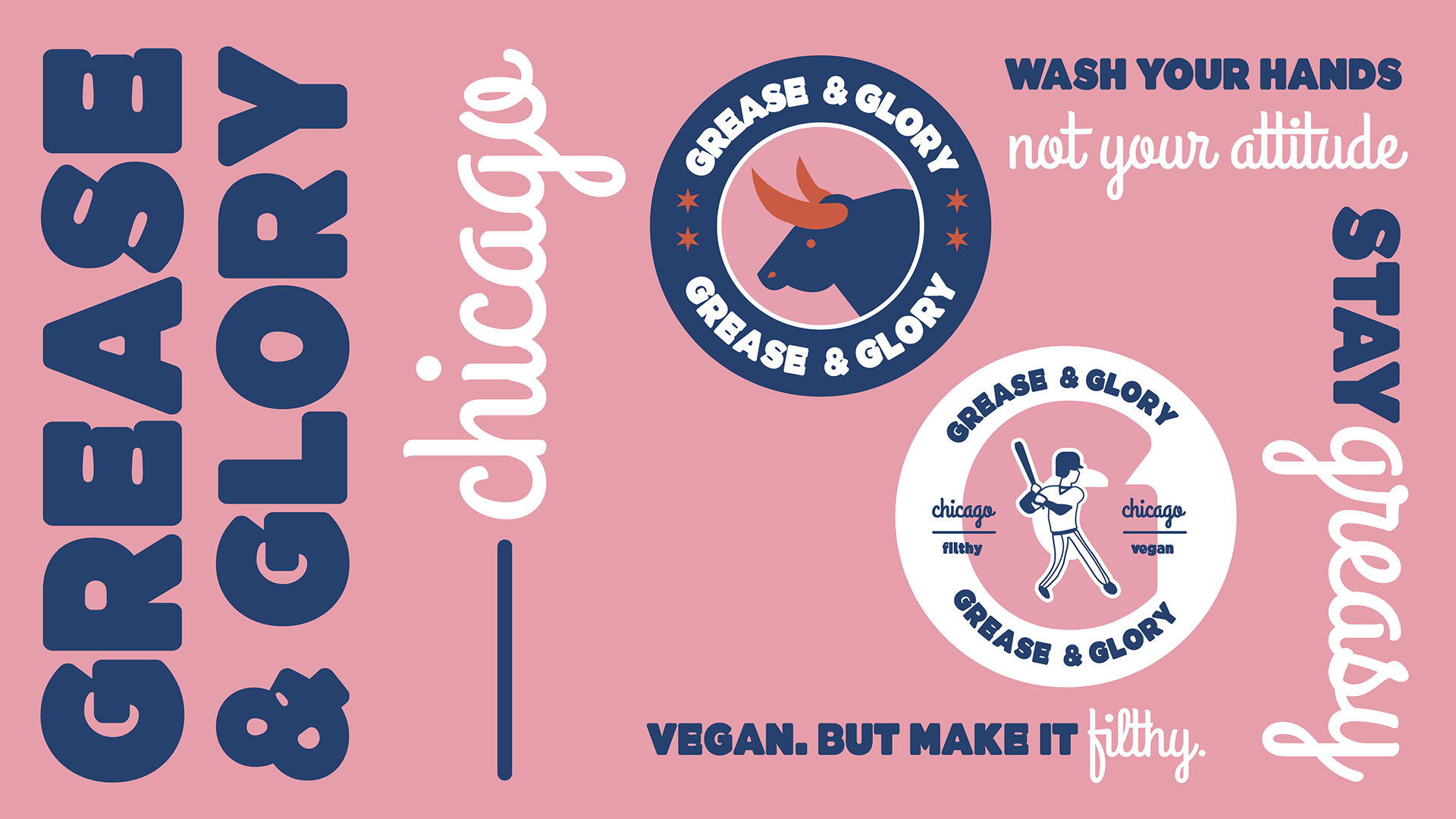
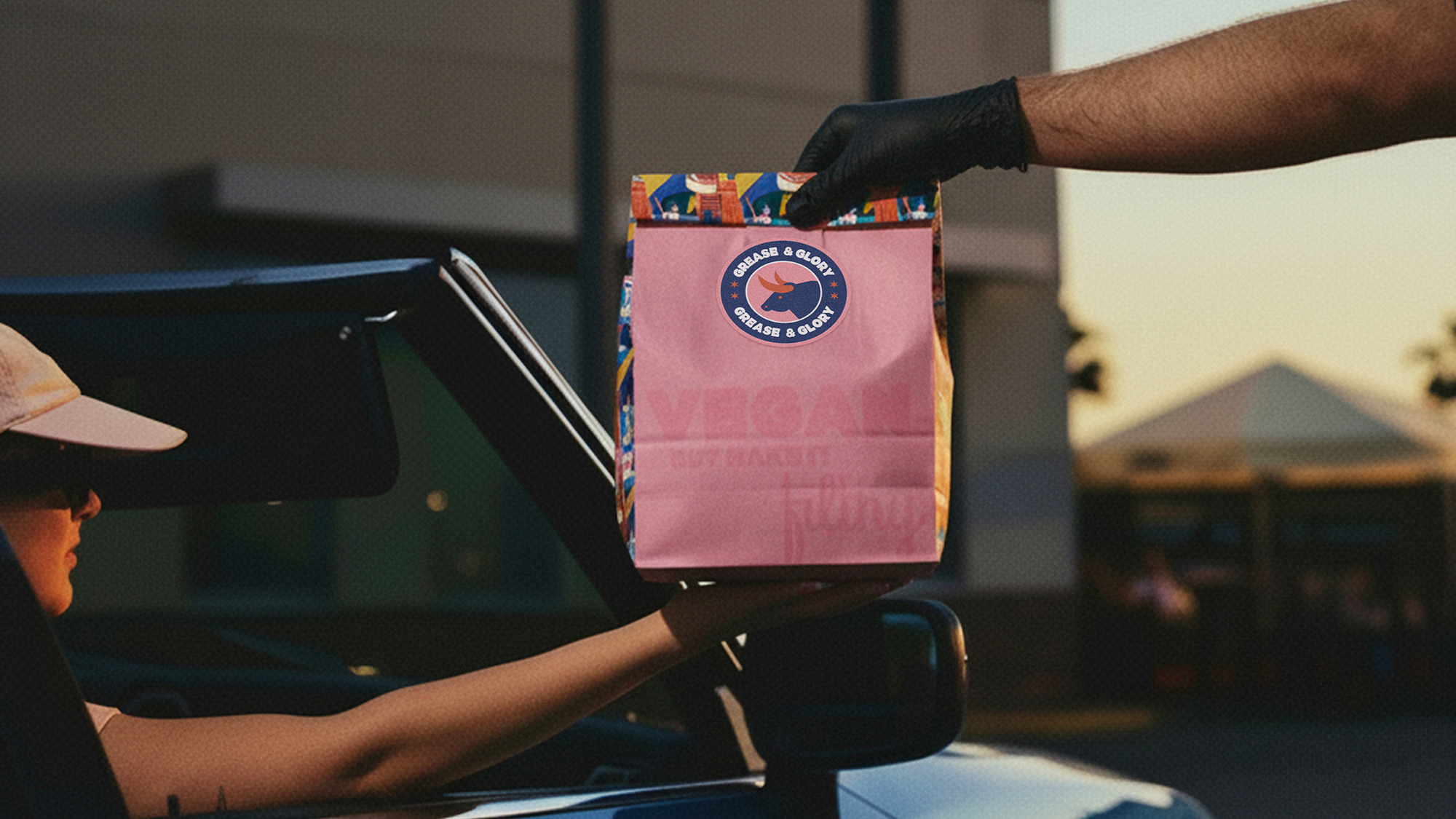
Fed up with the stereotype vegan imagery of green leaves and “healthy” food, we designed a bold, greasy, and joyful brand identity. A rebel imagery paired with daring claims not for the faint of heart speaks directly to a niche yet powerful audience of adventurous foodies.
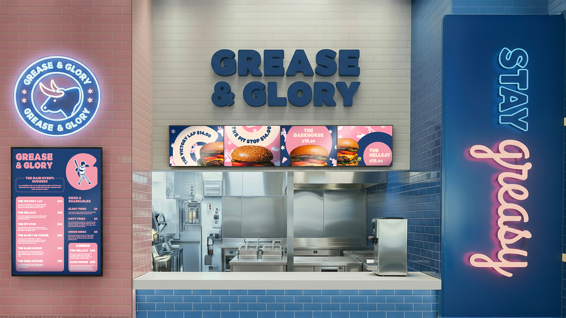
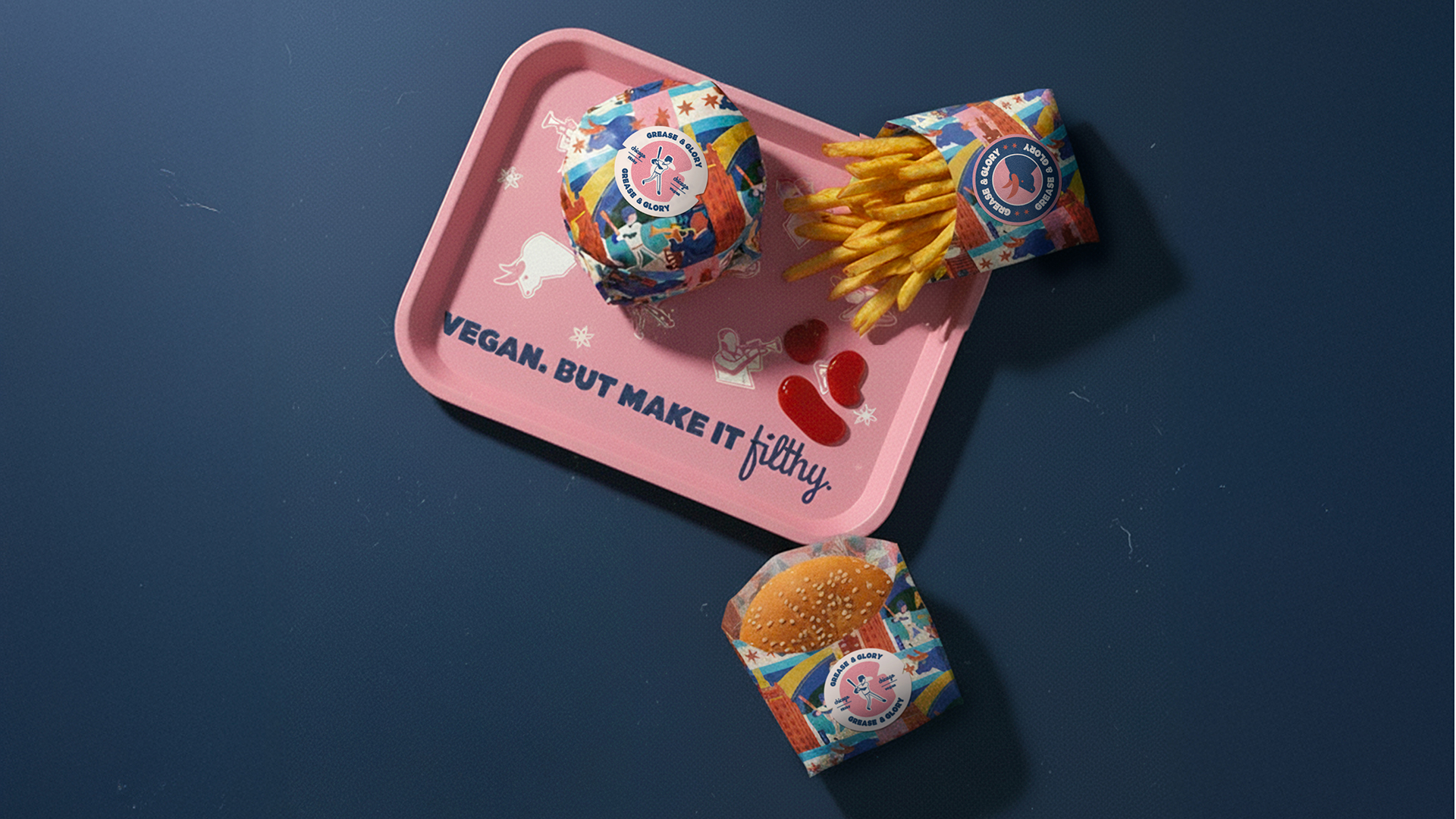
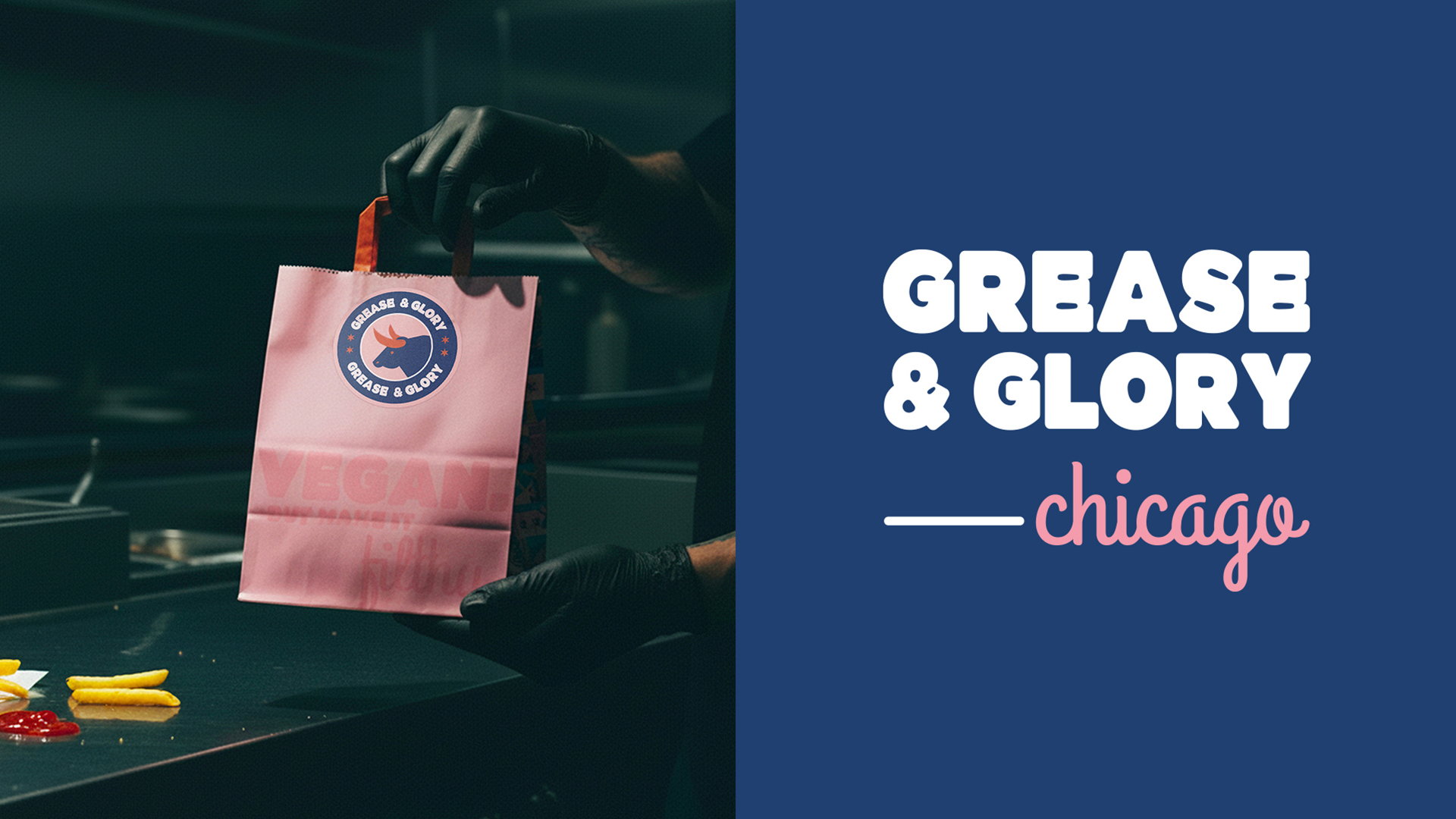
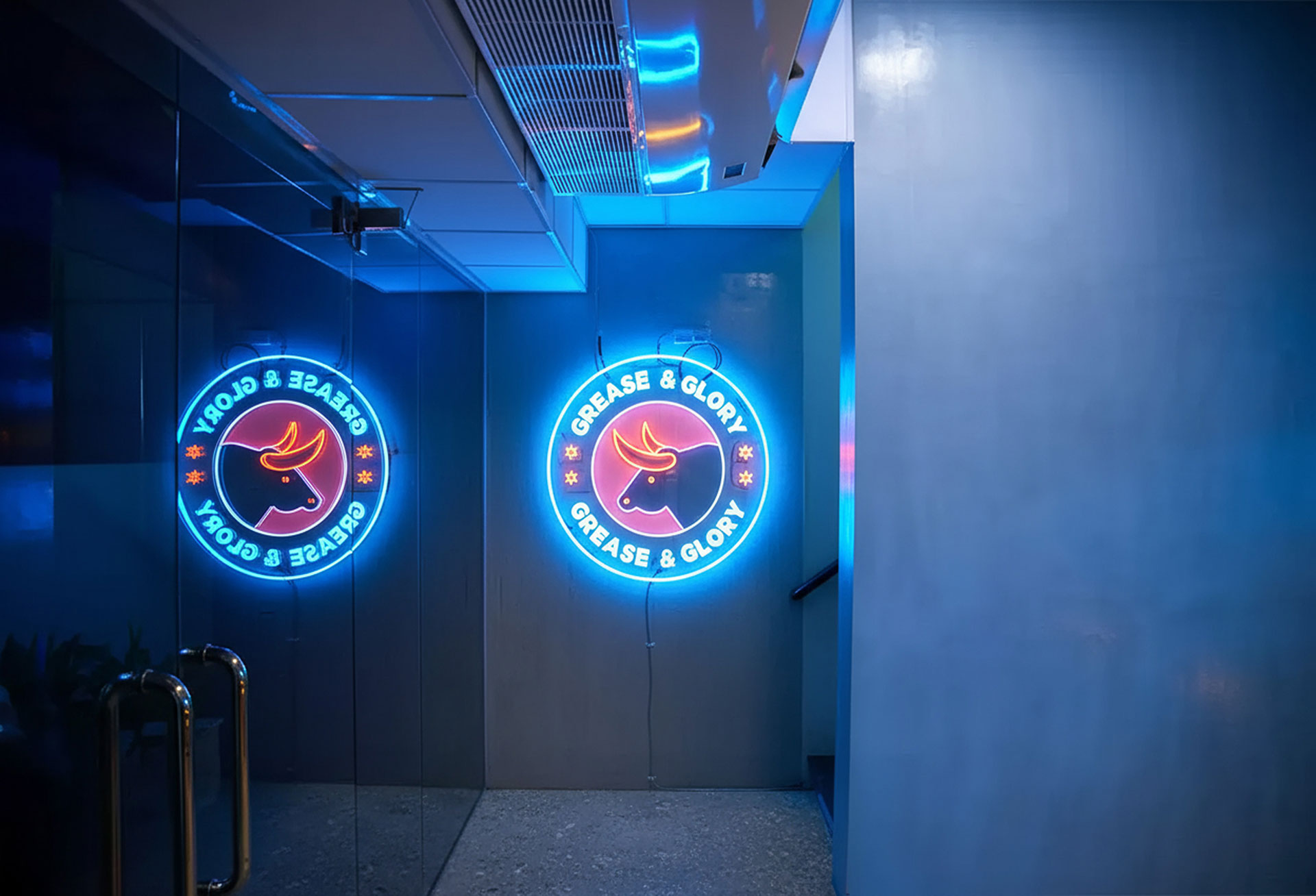
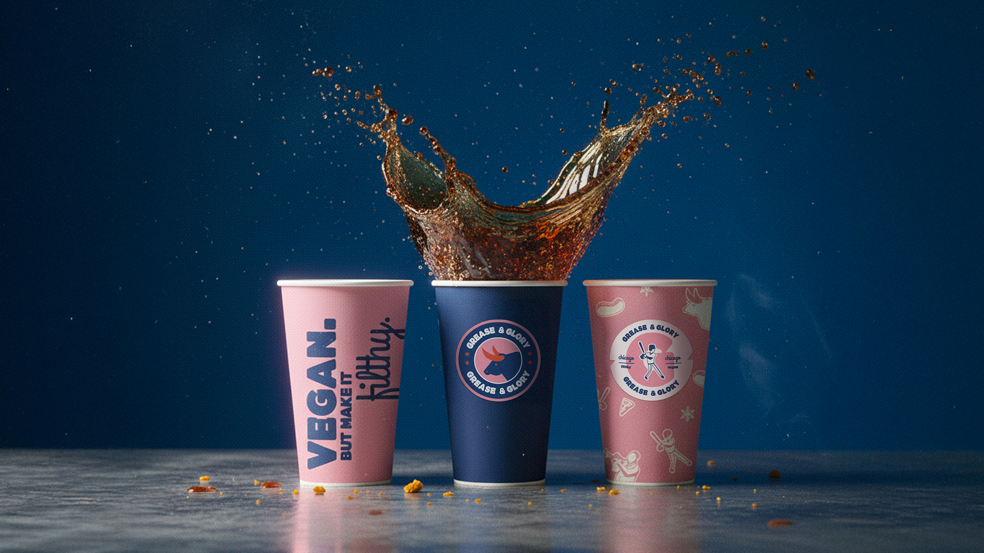
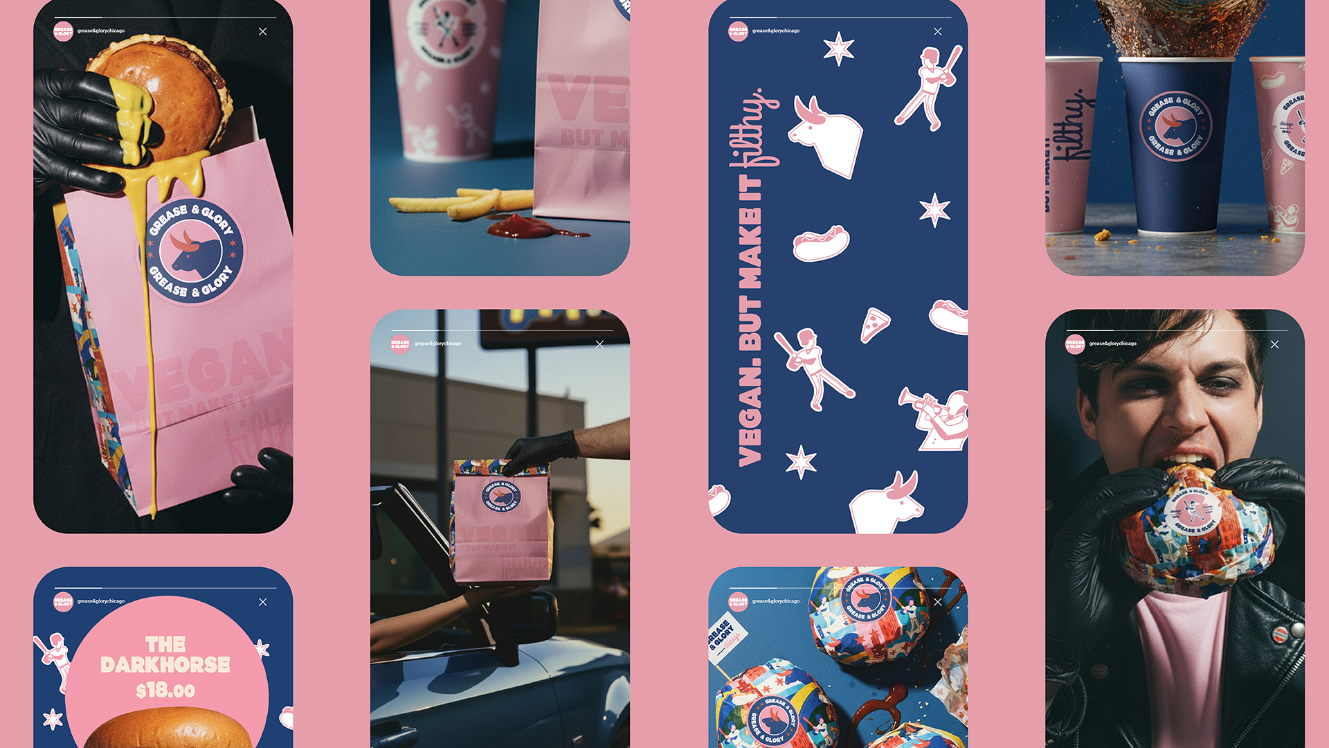
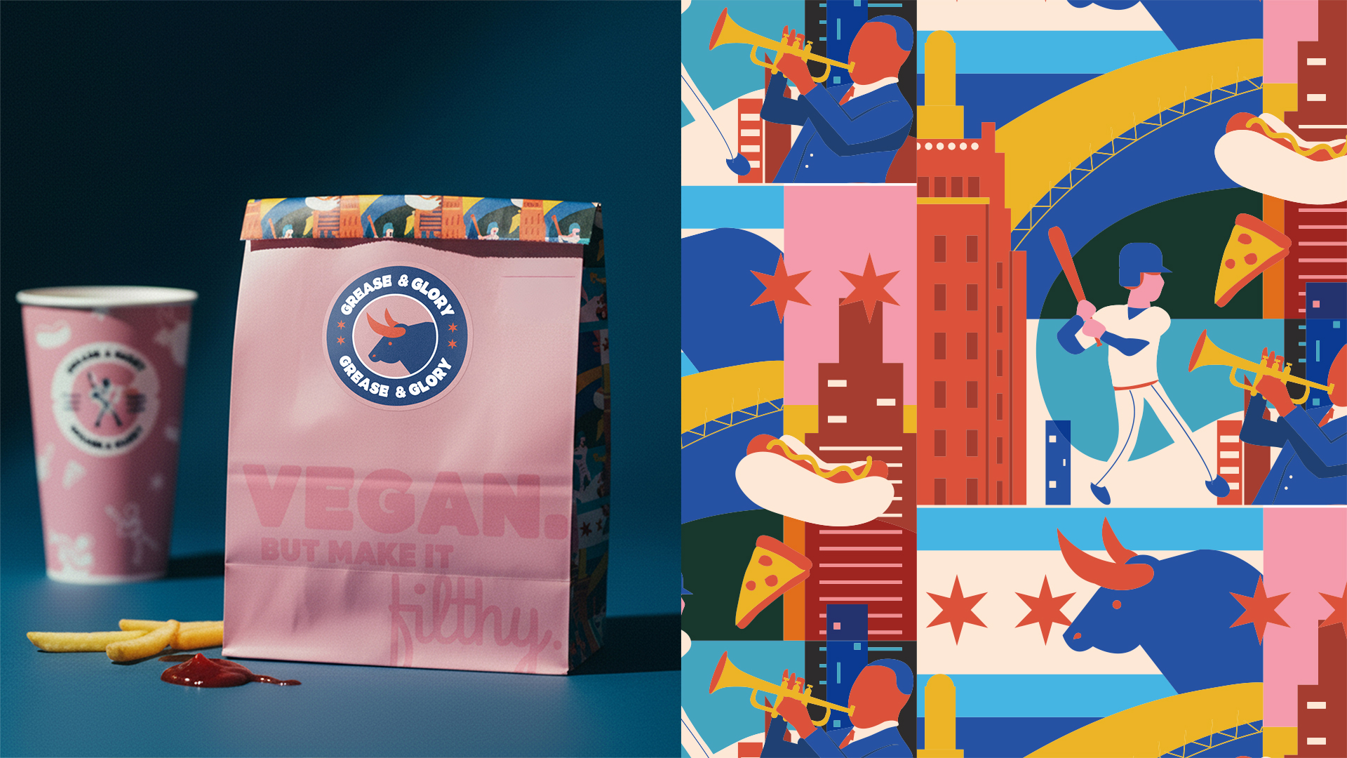
The brand’s abundance is enhanced by a playful mix of patterns, branding elements, and logo variations. This allows flexible applications across stickers, neon signs, packaging, social media, and in-store displays, creating a cohesive and energetic presence everywhere.
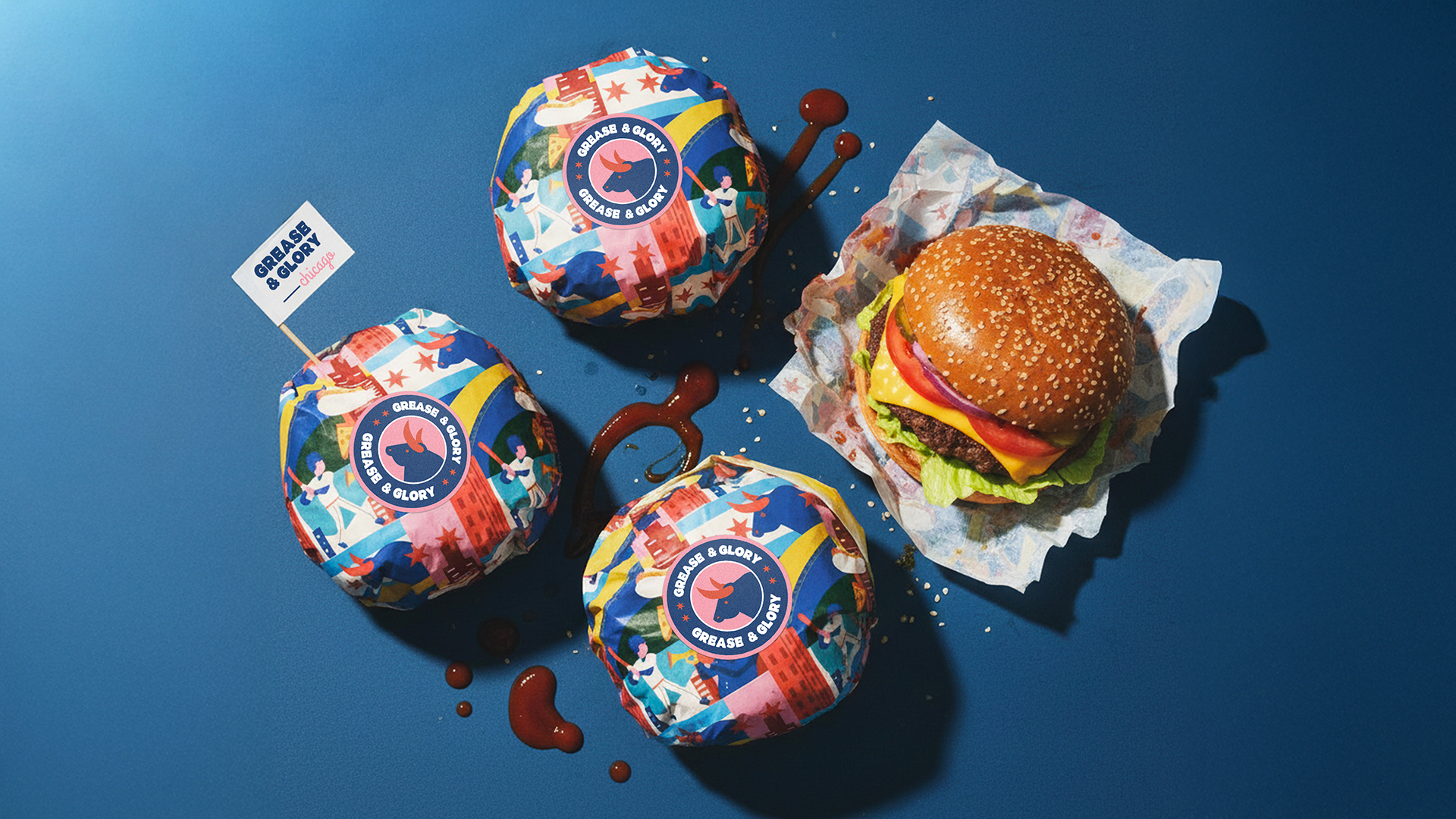
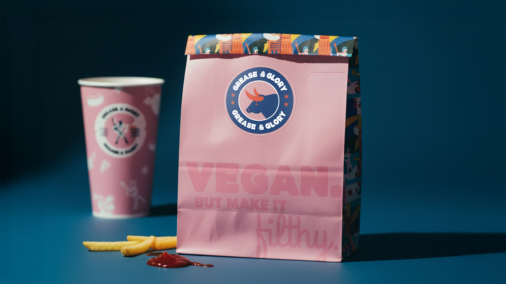
The pattern is the true soul of the brand. It brings together iconic Chicago references, reinforcing the fast food’s deep local roots. The color palette is bold, pop, and high-contrast: mouth-watering, food-inspired hues like cheddar yellow, ketchup red, and “meat” pink are paired with a contrasting blue, unconventional in the food market, emphasizing the brand’s rebel identity and grabbing attention.
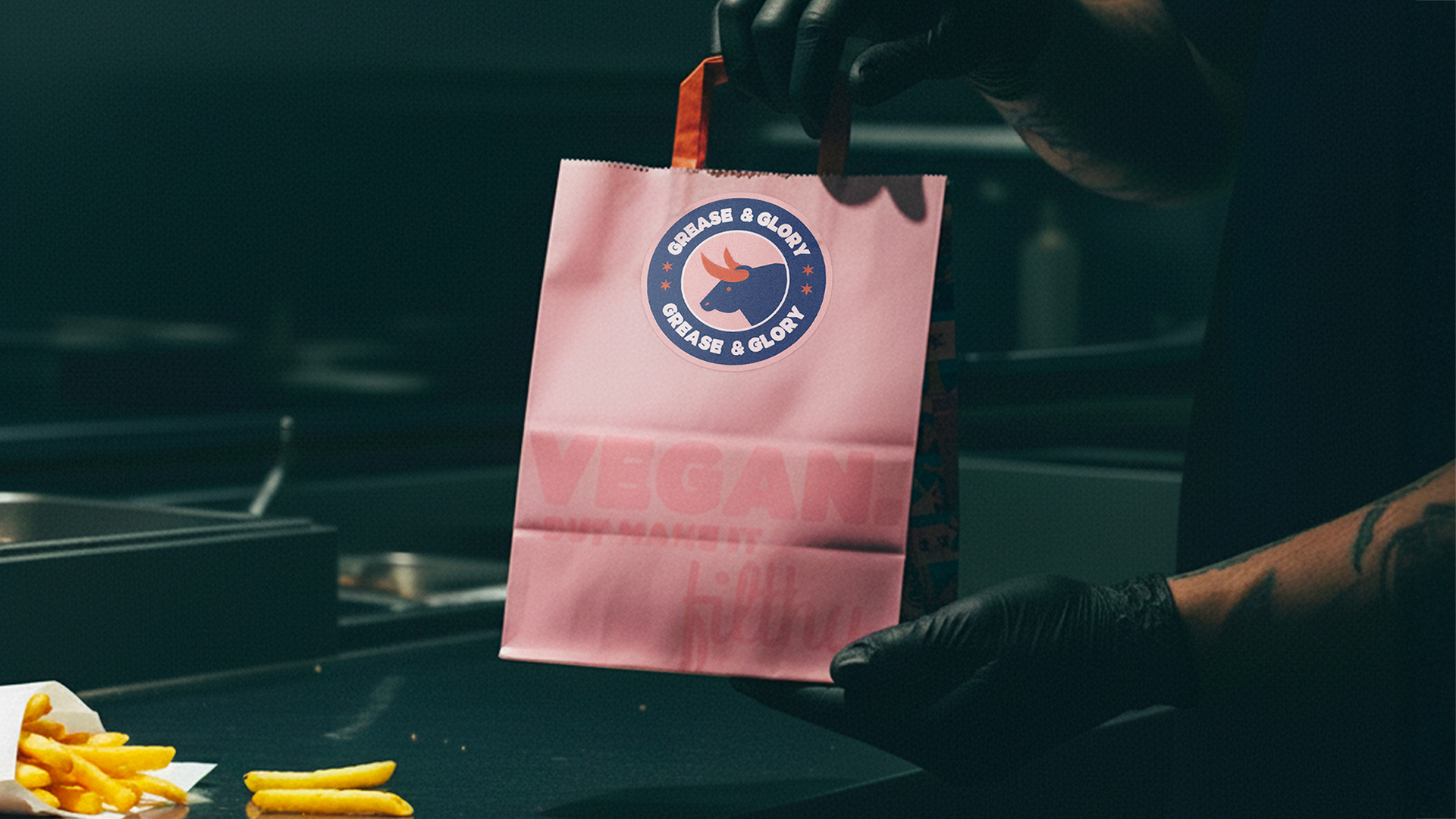
The packaging is made from fully recyclable materials, in line with the fast food chain’s vegan and eco-friendly values. The final result is a fresh, exciting visual identity for vegans, while also intriguing and appealing to audiences with more traditional dietary choices, inviting everyone to join in on the fun.

 Ander Sanchez
 Atipus
 Widarto Impact
 hovski
 Ohmybrand
 CreativeWise
 Rauf Karaev
 Hooperstudio
 La Nube de Ideas
 Modern Theory
 Akim Melnik Design Studio
 preflightcreative
 Seyf El Haq Menouer
 Badraddine Attik
 Samriddhi Ravi
 Alessandro Ammaturo
 Amblr Studio
 vladlenalevit
 Sis Tsarukyan
 monther al omari
 alchimistestudioParis
 designsbysukaina
 About House of Ta
 Amjad Battal