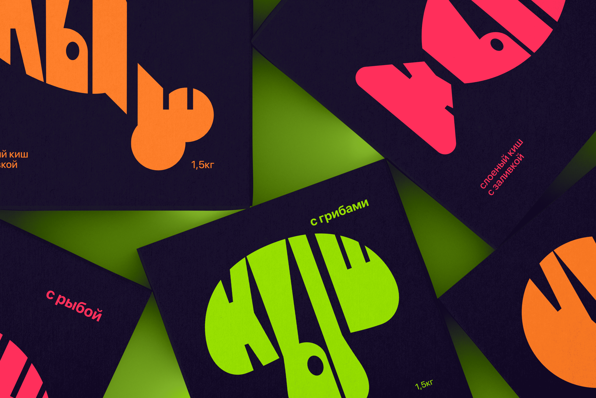

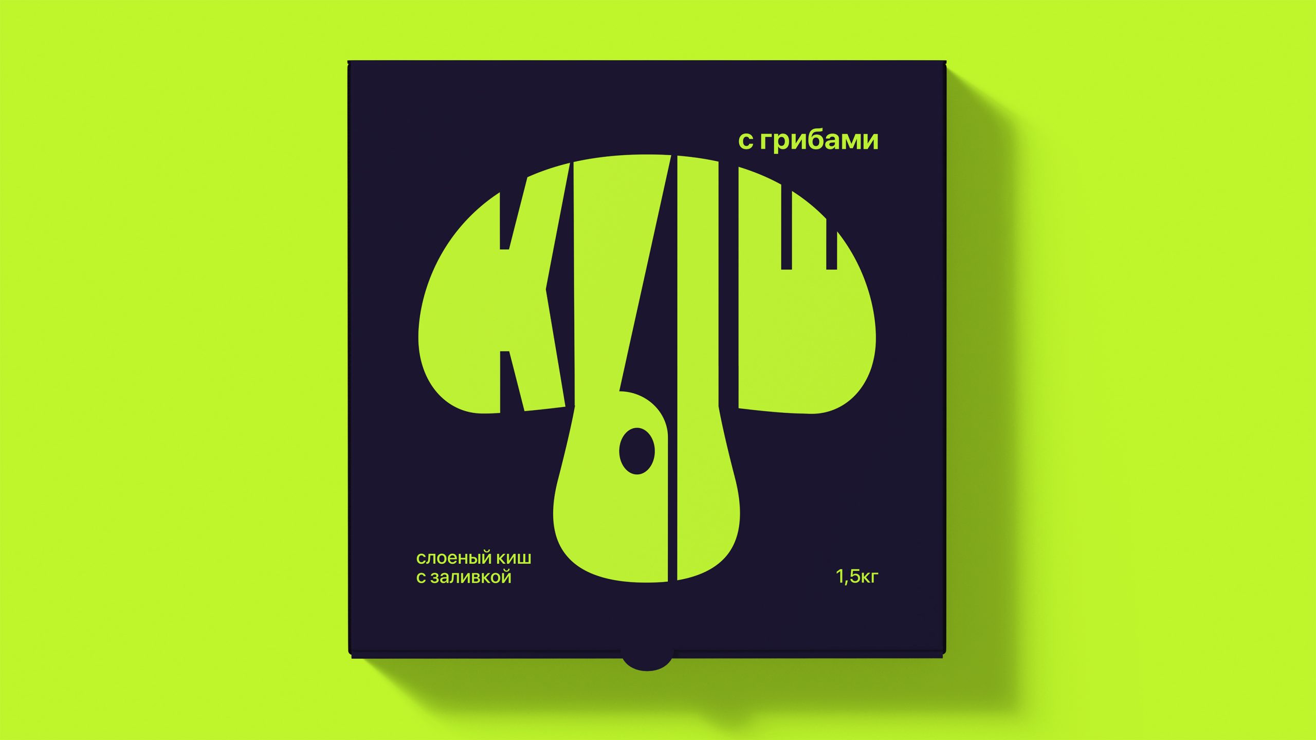
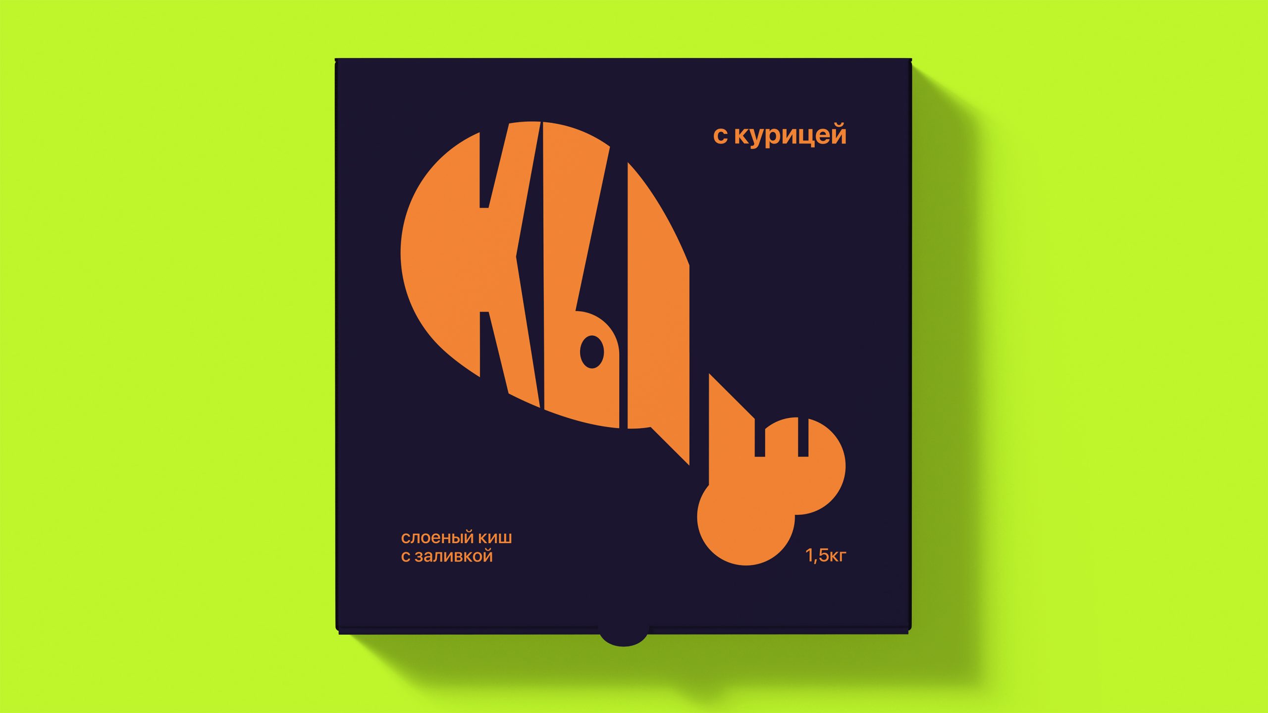
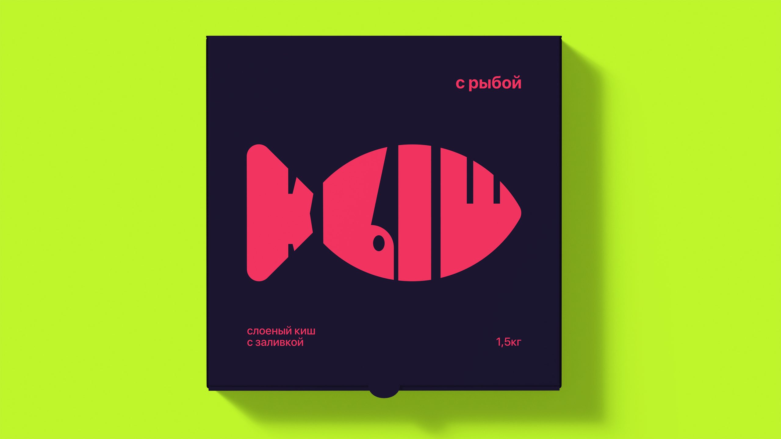
КЫШ is a student packaging design project for a fictional quiche line with three flavors: fish, chicken, and mushrooms. The project focuses on the top cover of the box and explores how typography can function as the primary visual element of packaging without the use of illustrations or imagery.
The task was to create a clear and expressive packaging system that allows quick flavor identification while maintaining a strong visual identity across the line.
CONCEPT
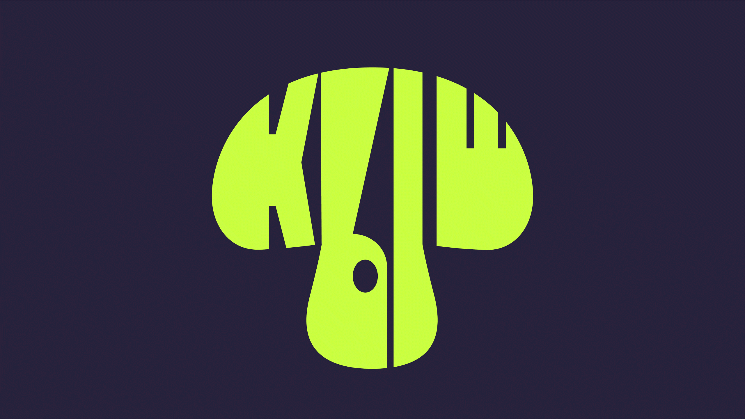
The core concept of the project is the deformation of the word «КЫШ» according to the shape and character of the main ingredient. The name is treated not as neutral text, but as a flexible visual form that transforms into a graphic representation of taste.
Each flavor is expressed through the same word, reshaped to visually reference fish, chicken, or mushrooms. This approach turns typography into a metaphor, where the form of the word communicates the product’s content before any additional information is read.
SOLUTION
A unified typographic system was developed in which the word «КЫШ» becomes the central graphic element of the packaging. For each flavor, the letters are deformed while preserving recognizability, allowing the viewer to intuitively distinguish between products.
Bright, saturated colors are assigned to each flavor and work together with the typographic forms to enhance contrast and visibility. This combination ensures fast navigation on the shelf and reinforces flavor differentiation within the line.
RESULT
The result is a cohesive packaging system where form and color work together to create a strong and intuitive visual identity. The consistent deformation principle unifies the line, while variations in shape and color enable quick flavor recognition.
The project demonstrates how typography alone can carry both informational and emotional value, turning the product name into a functional and expressive design element.
 hello ocean
 monther al omari
 the Labelmaker
 alamgirbrands
 kat bres
 Vantablack Studio
 GruppoSaida
 studiorevv
 grafisercreative
 Kate Reichel
 UPRISE
 Modern Theory
 By siddika
 MAISON D'IDÉE Prague
 Kinshuk Bainss
 Palashcc
 www.branding.uz
 Hutton Creative
 DESIGN CONCEPTS
 Tancybox
 habiba hatem
 Up-Brands
 sayadworks
 Kingdom & Sparrow
 furtgoods
 Si me preguntas