

TASK
Our agency was commissioned to develop packaging for a new brand, LilPop, specializing in the production of makhana — a popular Indian popcorn made from water lily seeds. The objective was to create bright, eye-catching packaging that would emphasize the product’s Indian origin while being adapted for the Swiss market.
SOLUTION
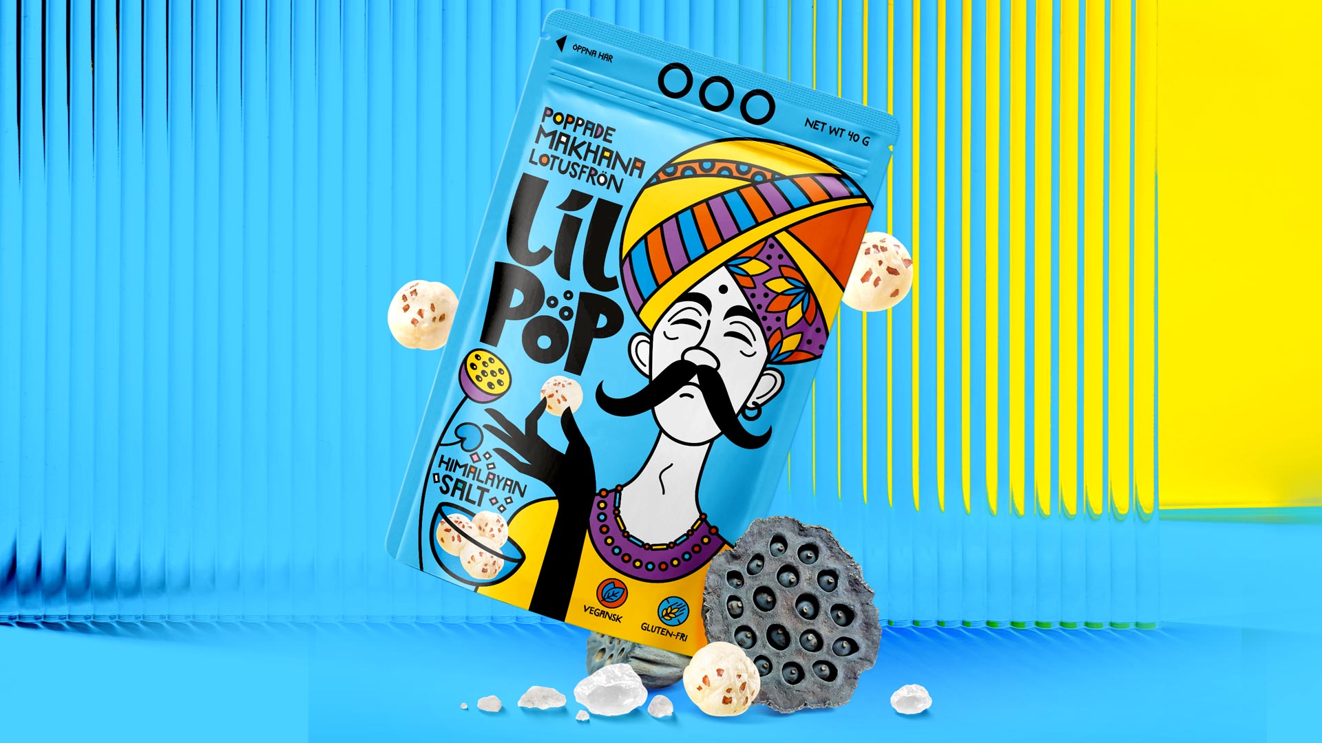
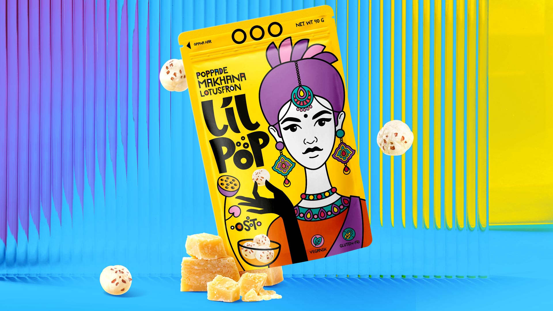
The core idea of the design concept was built around vibrant portraits of Indian people dressed in traditional attire. A key visual element was a large close-up of a character wearing colorful national clothing and jewelry. Through the personalities of the characters, we aimed to convey the individual features of each SKU.
To achieve maximum contrast and visual appeal, we used a stained-glass technique. Bold black outlines were filled with bright colors, creating a multicolored mosaic effect. This approach gave the packaging a rich, expressive look and evoked associations with Indian culture.
We designed the LilPop logo using bio-organic shapes to highlight the natural origin of the product. The logo reinforces the overall perception of makhana as a natural snack.
It was also important to showcase the product itself on the packaging. For this, we depicted the character’s hand reaching into a bowl of makhana, as if taking a tasty bite.
To differentiate flavors and SKUs, we varied the character’s look and the background colors. This allows consumers to easily distinguish between product variants and choose based on clear visual differences.
The result of our work is packaging that combines the bold contrast of stained glass, Indian national themes, natural authenticity, and flavor diversity — making it perfectly suited for the Swiss market and highly appealing to consumers.



 Derrick Lin
 monther al omari
 43oz
43oz lilyz design23
 Modern Theory
 Eighteen Brand Studio
 Bhumika Singh
 MohamedMashaly
 Pixels Studio
 Gulya
Gulya UPRISE
 Lizaveta Kharitonyuk
 Bonsanco Creative Studio
 DesignRepublic
 GIRAFA STUDIO
 PiotrWisniewski
 Sophiagdotcom
 CreativeWise
 SoreThumbStudio®
 Modern World Studio
 Palashcc
 Valérie Colace