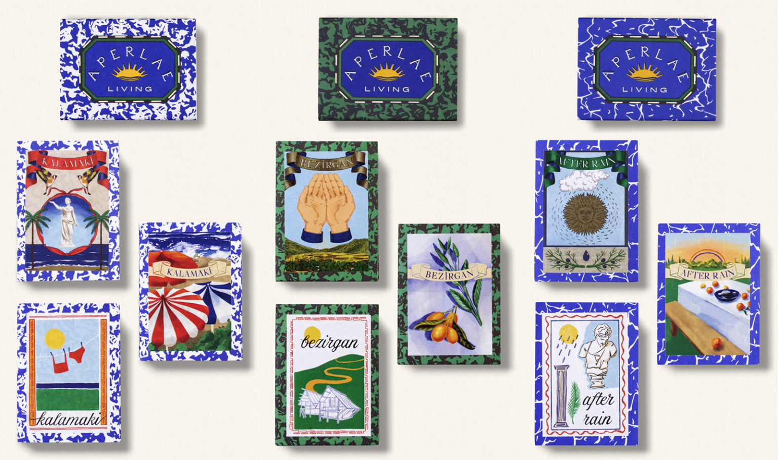

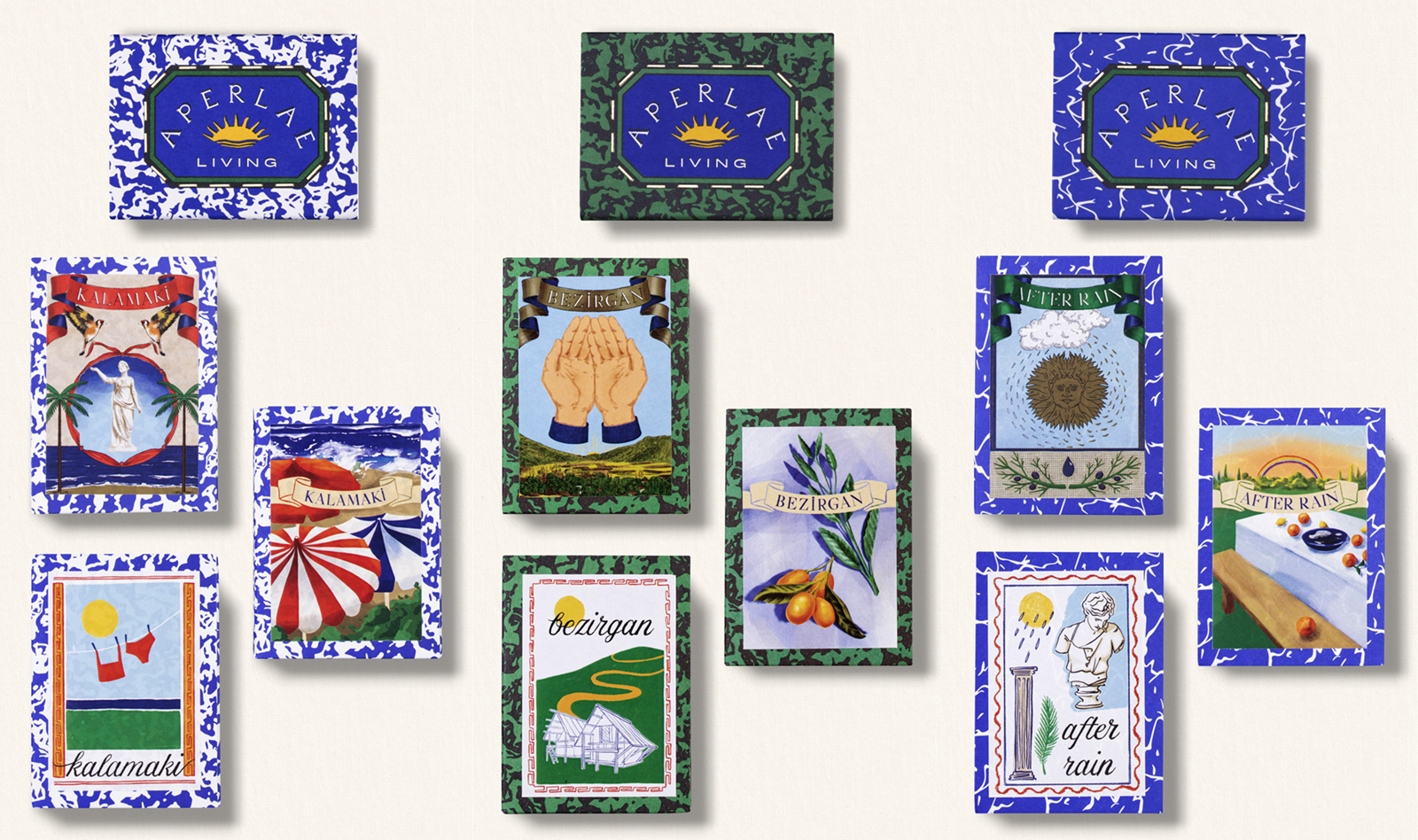
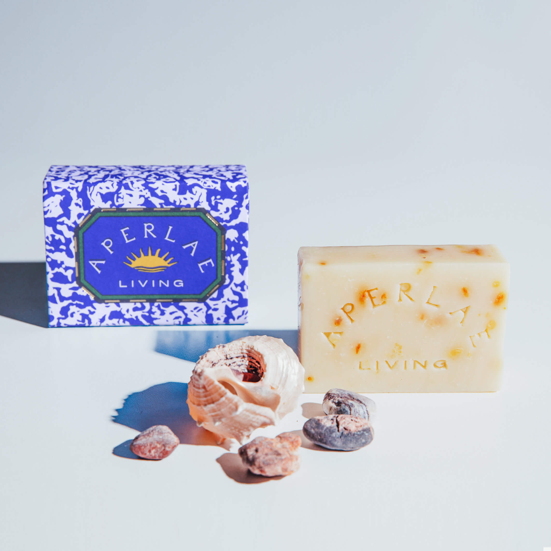
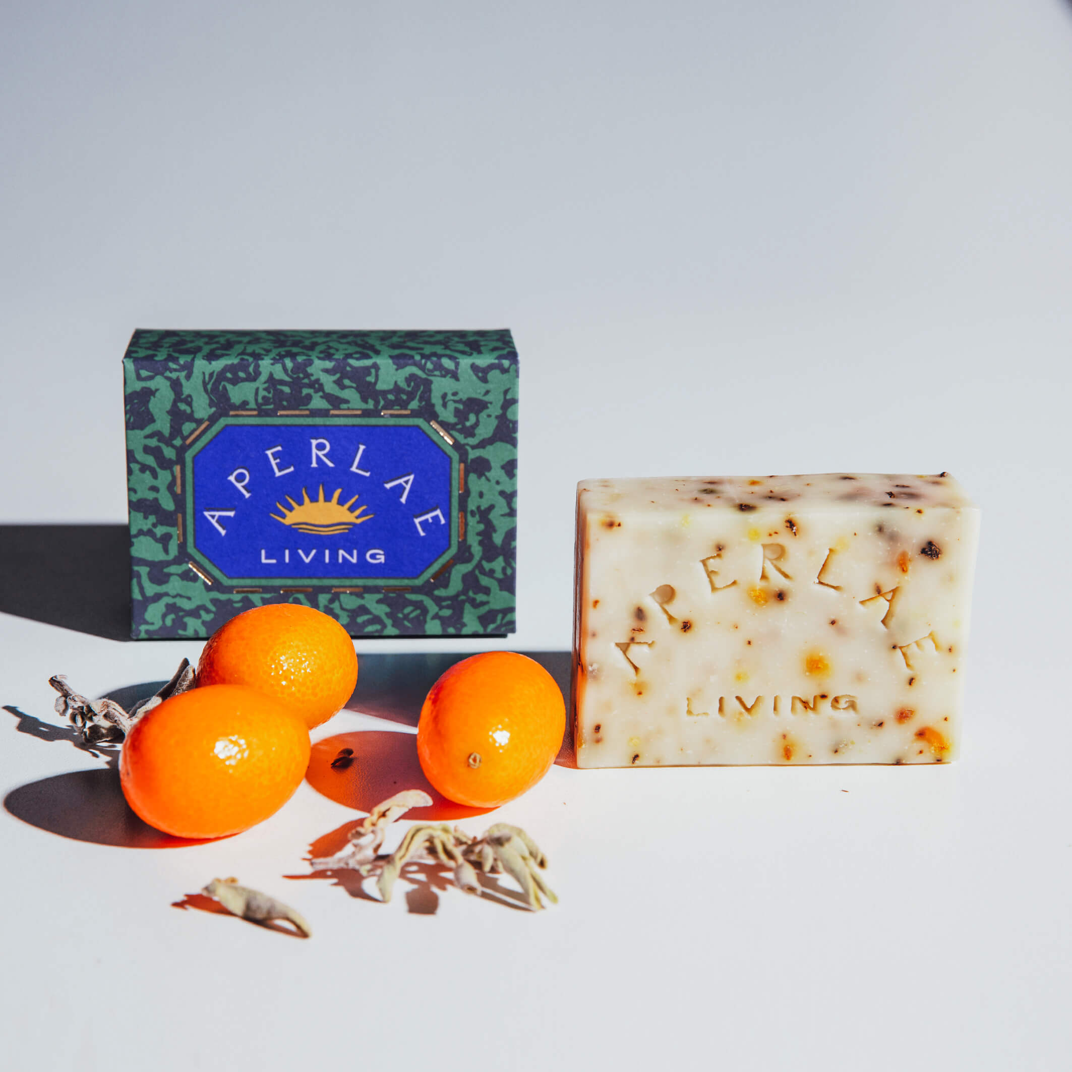
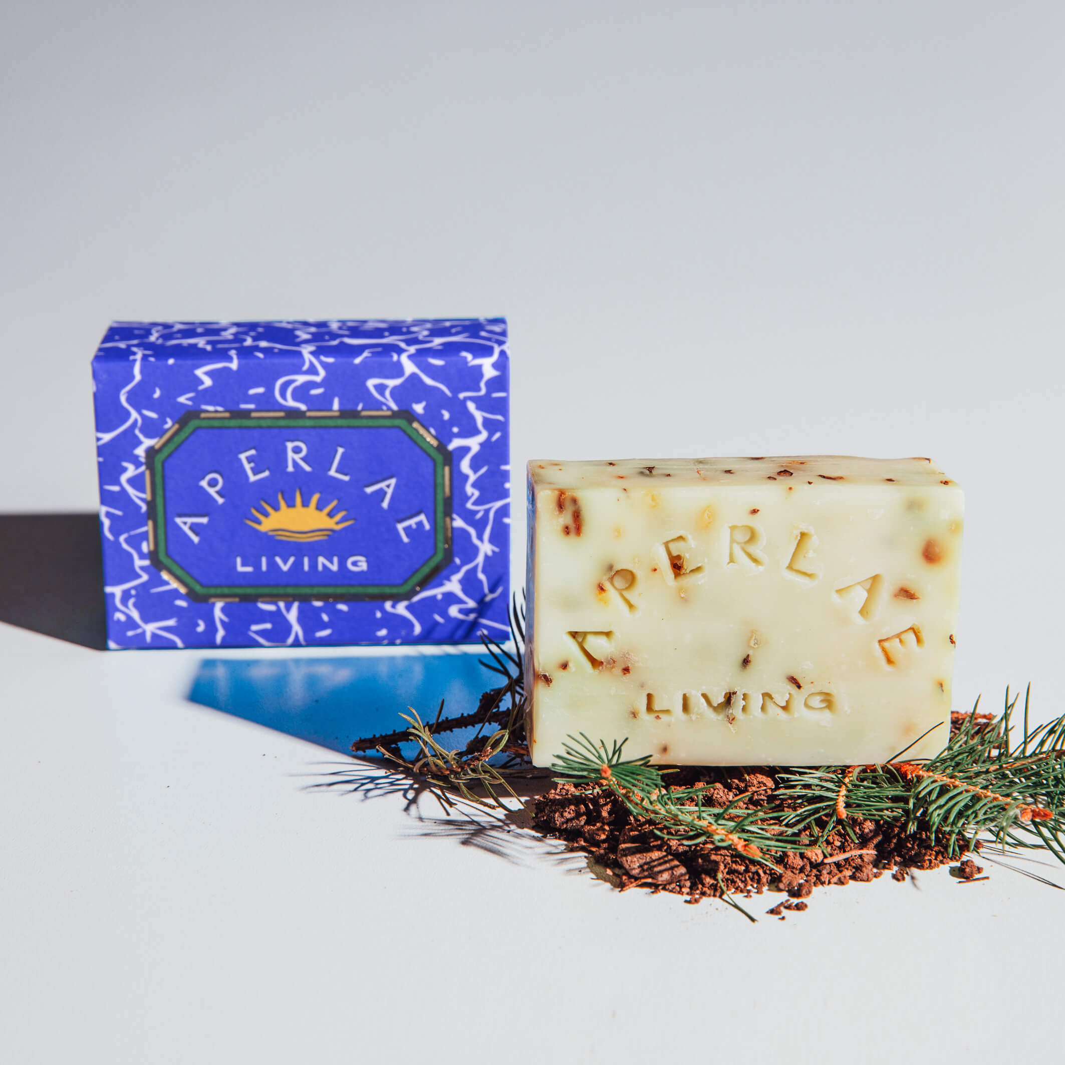
The visual identity for Aperlae Living draws its foundation from the Mediterranean coast — from the deep blue of the sea and the warmth of the sun. While developing the brand story, references to Leto and the ancient city of Aperlae were incorporated to ground the identity in place and history. The narrative also leans on memory — at times recalling 30 years ago, at times acknowledging Antiquity — shaping a visual language that moves between past and present. From the logo to the color palette, from packaging to illustration, each design decision was informed by specific coastal references.
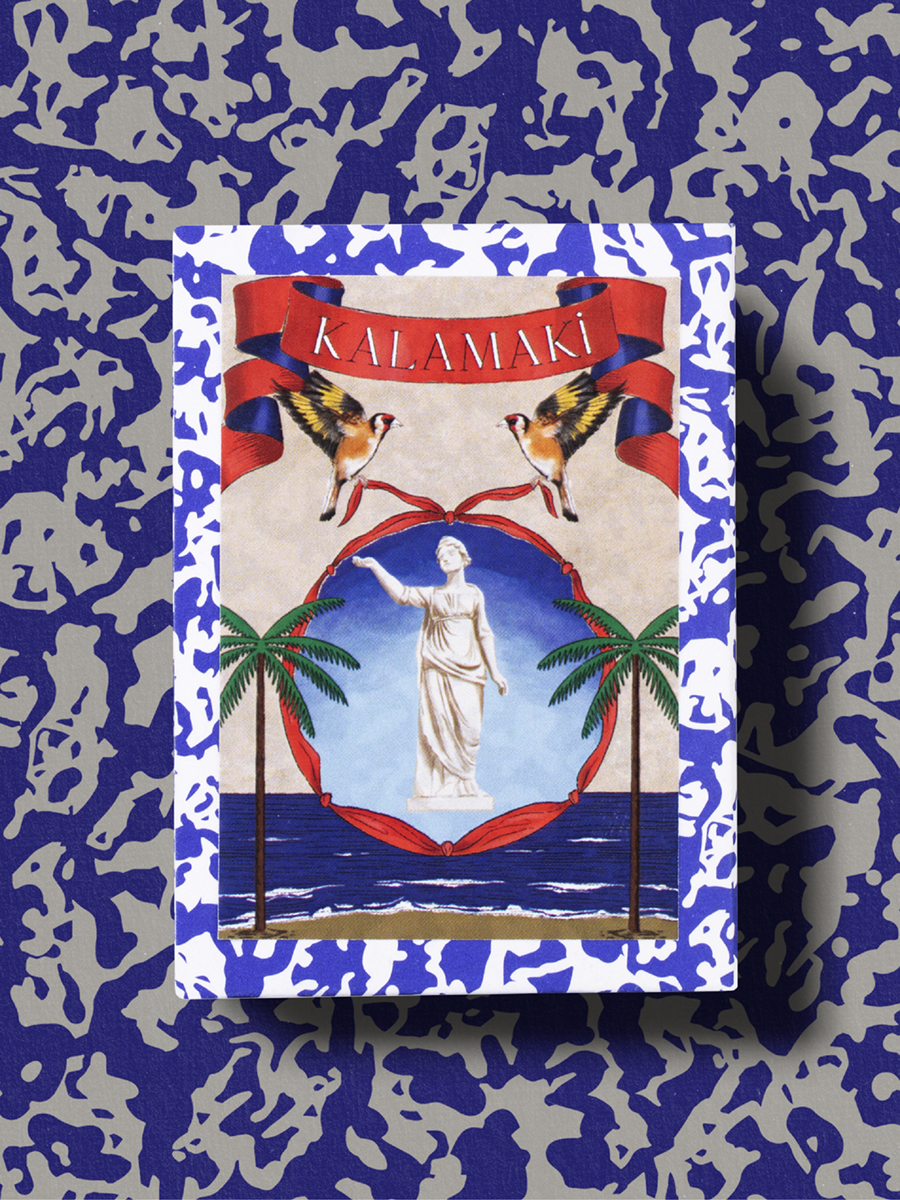
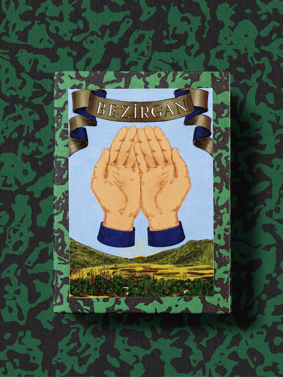
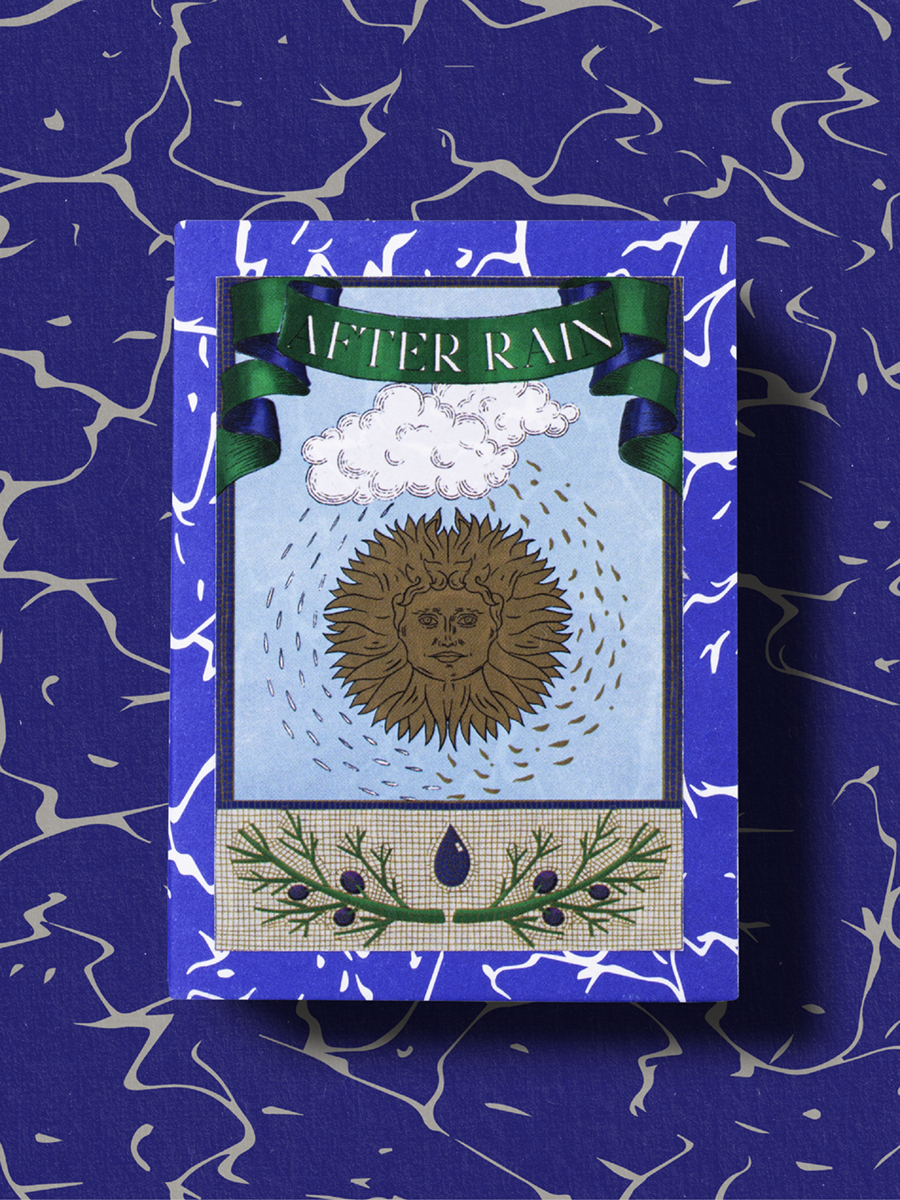
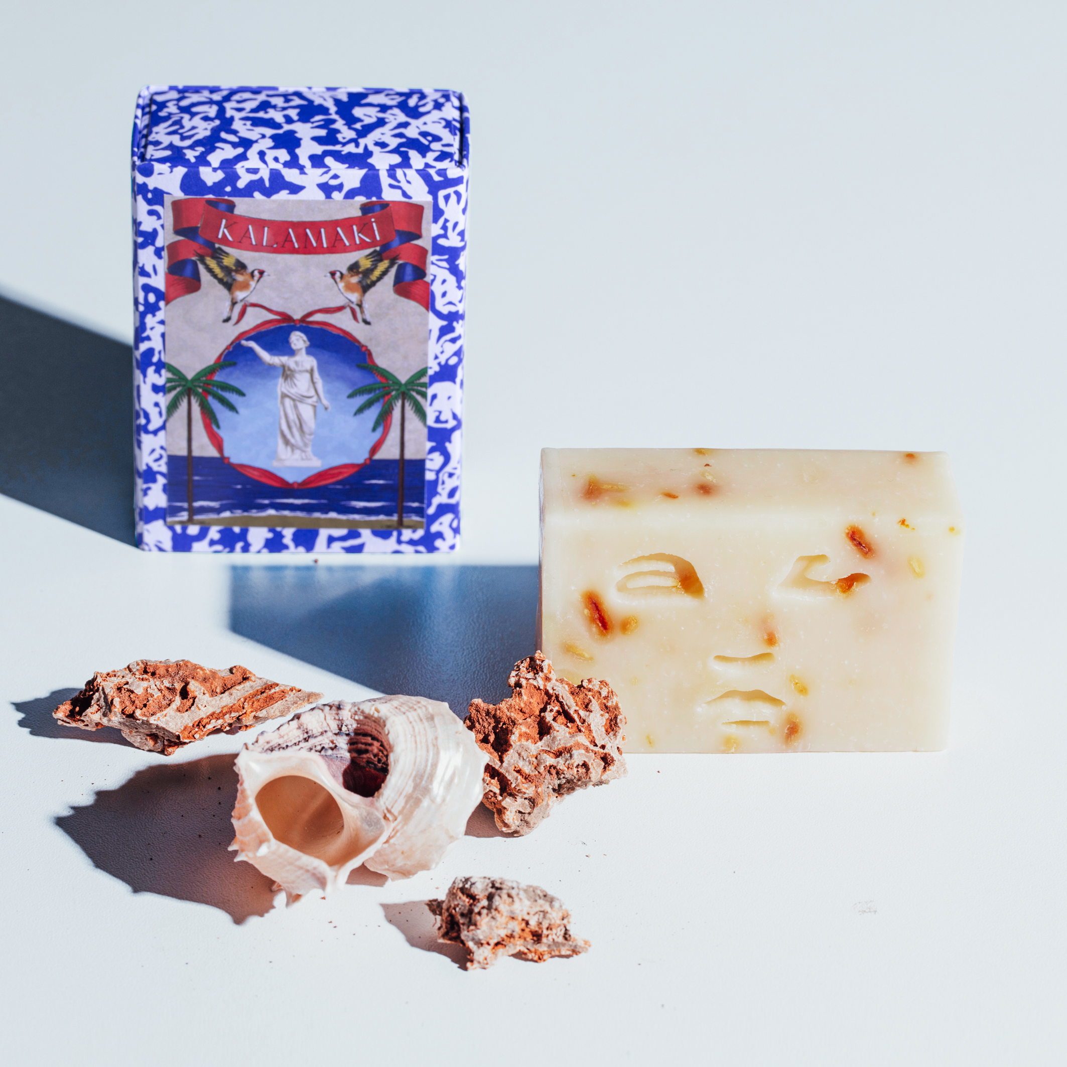
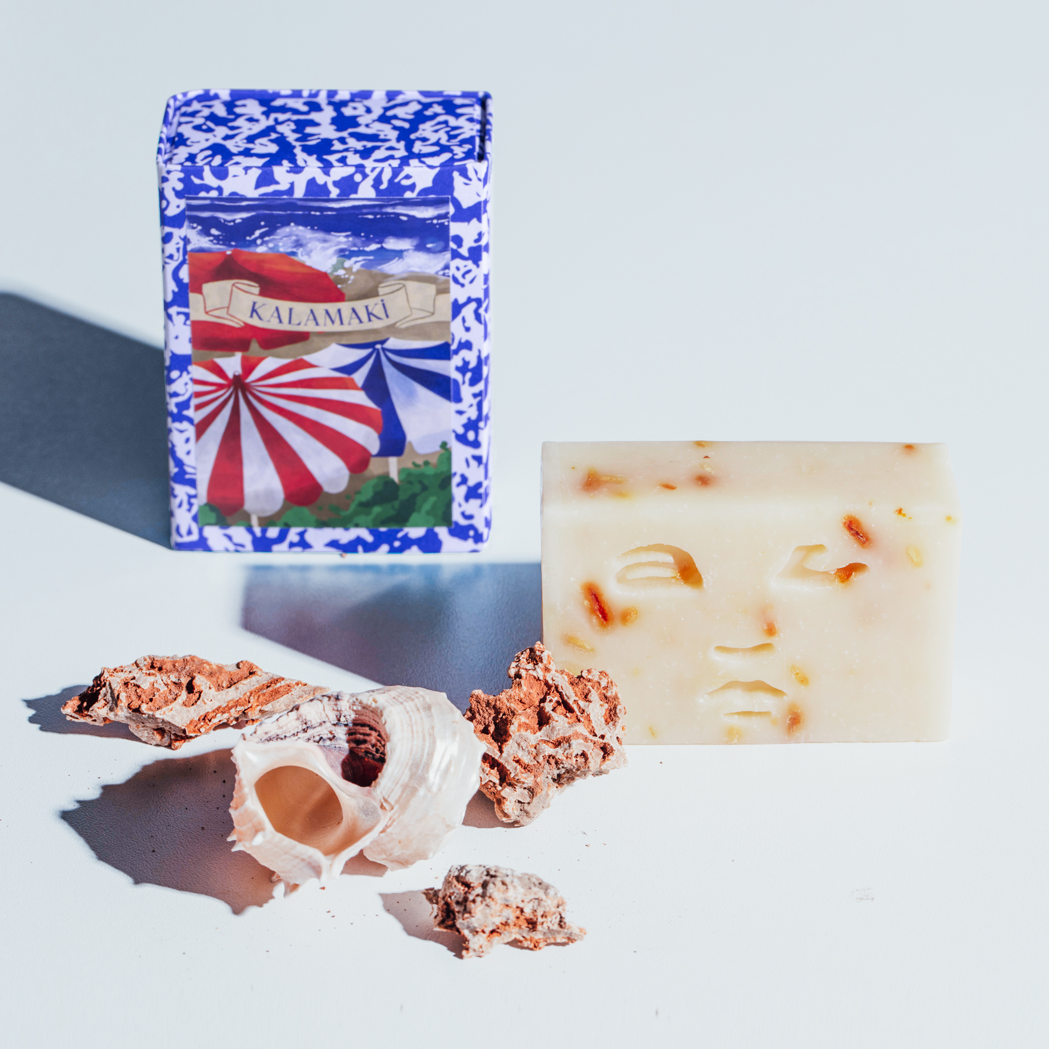
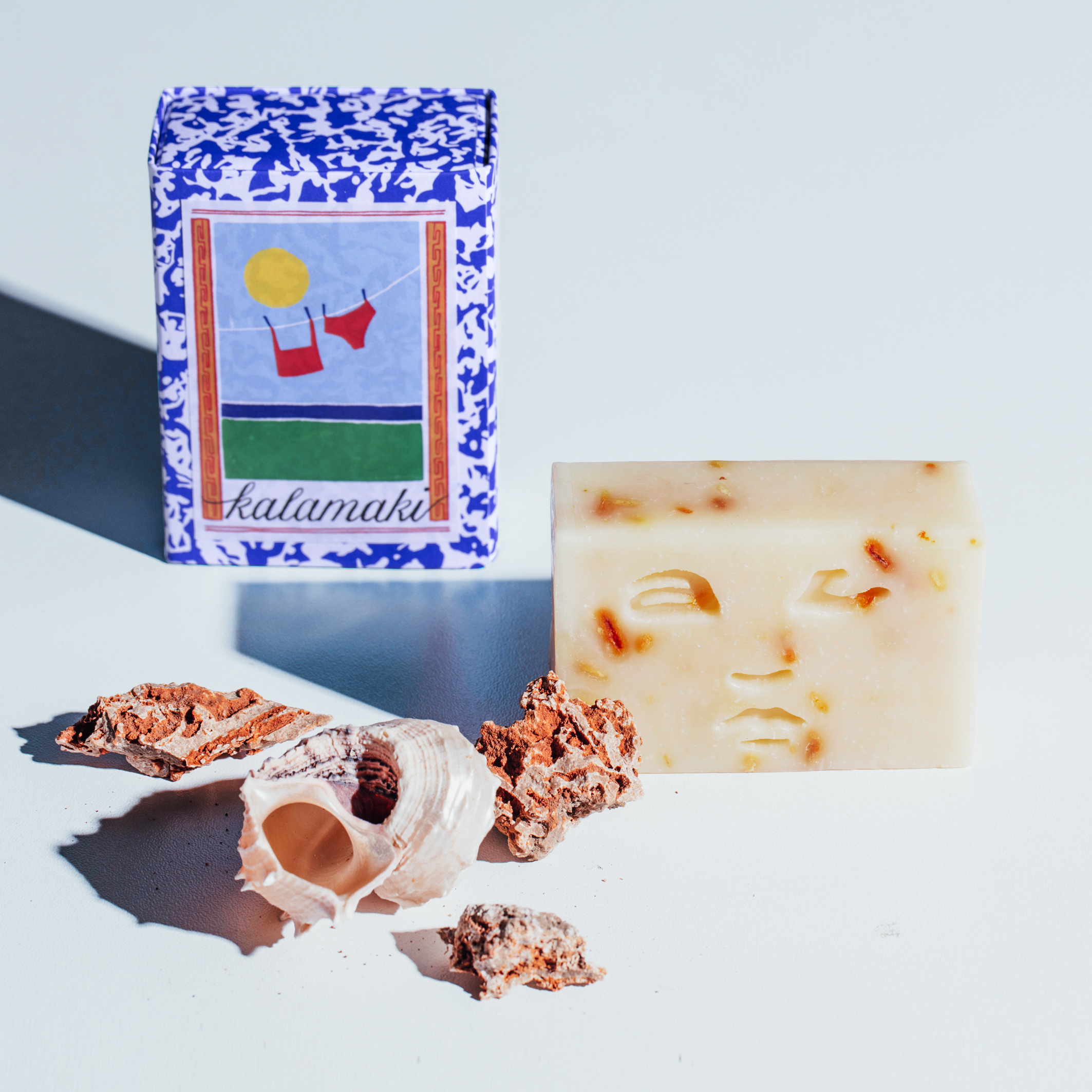
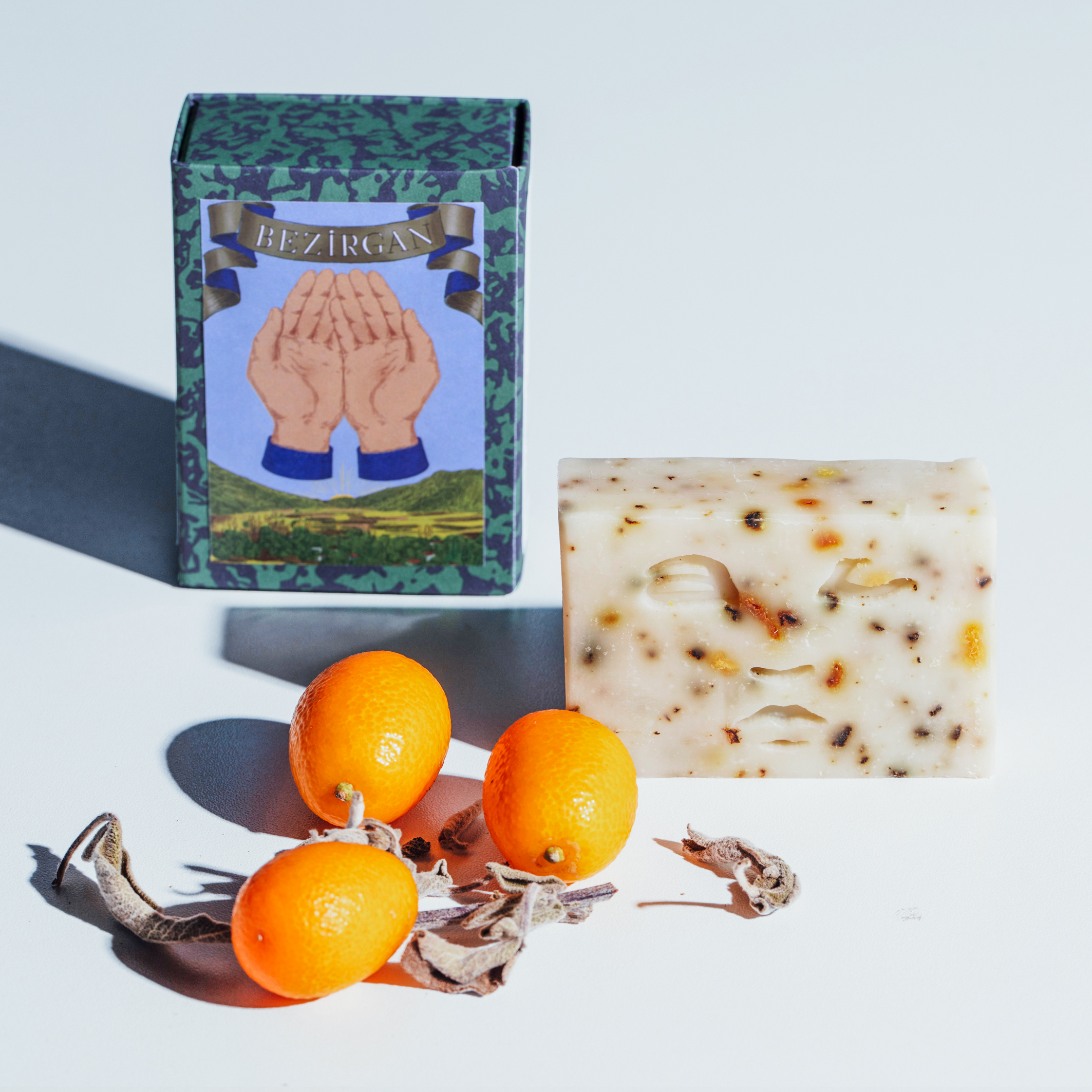
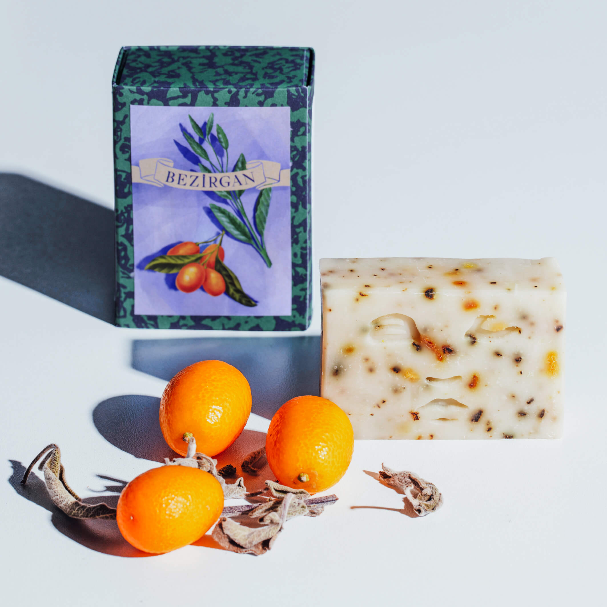
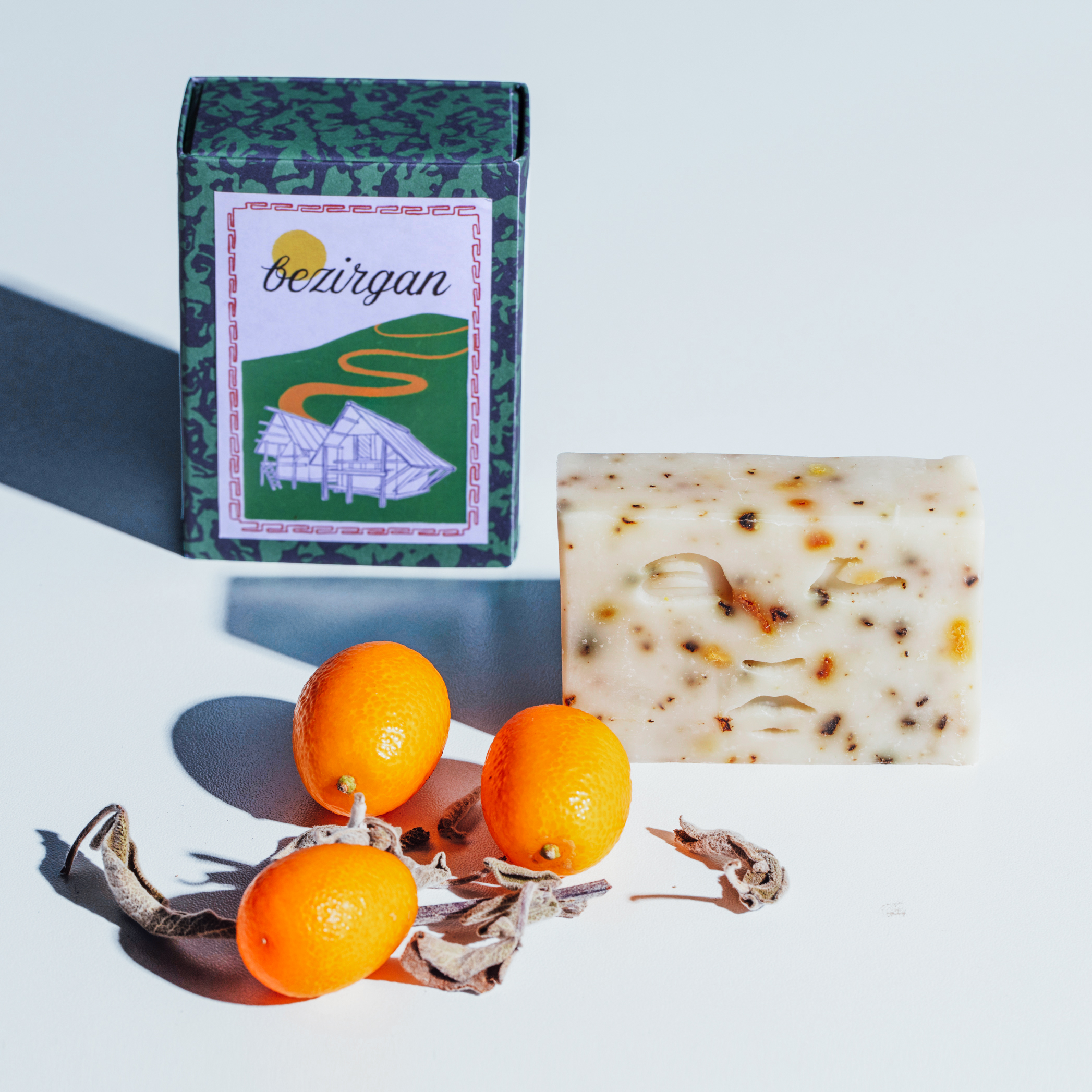
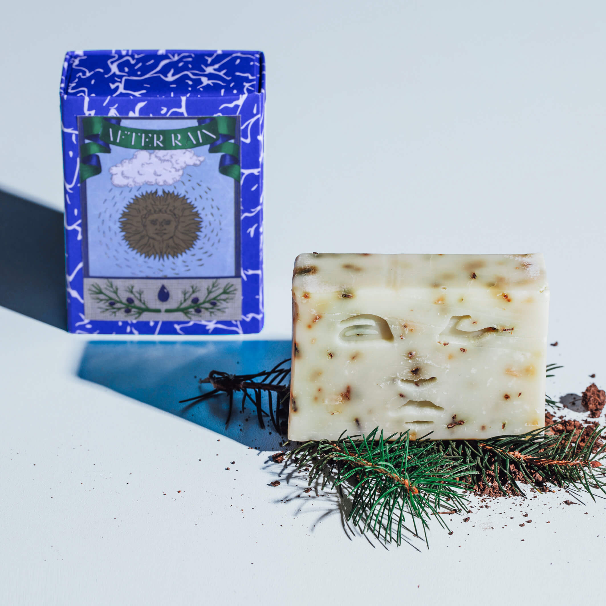
The pattern system was developed directly from observed Mediterranean landscapes. The After Rain products are inspired by the way sunlight and raindrops reflect on the seabed. Kalamaki references the foam formations of coastal waves. Bezirgan takes its name and color from Bezirgan Village, inspired by the night sky seen through coastal pines and its distinctive green.
Archival motifs and traditional pattern references informed the overall illustration language, aligning with the brand’s memory-driven narrative. Each box was designed as a keepsake — referencing a place, a story or a person — with the intention of creating packaging that feels considered and worth keeping. For the soap packaging, three illustrated label variations were developed for each product, reflecting the full illustration system of the brand.



 habiba hatem
 Up-Brands
 sayadworks
 Kingdom & Sparrow
 furtgoods
 Si me preguntas
 Narrow House Packaging Branding & Design
 Clever Branding
 About House of Ta
 Hossam khalifa
 Valentyna Hradova
 Backbar Studios
 Holy Studio
 Prime
Prime Naeema Raashid
 Buddy Creative
 ezgidesignstudio
 Minim Brand Design
 Nenad Došen Studio
 Atyan
Atyan Massimo Lo Cascio
 Carreto Concepts Design Studio
 Charles Mason
 Pinot Agency