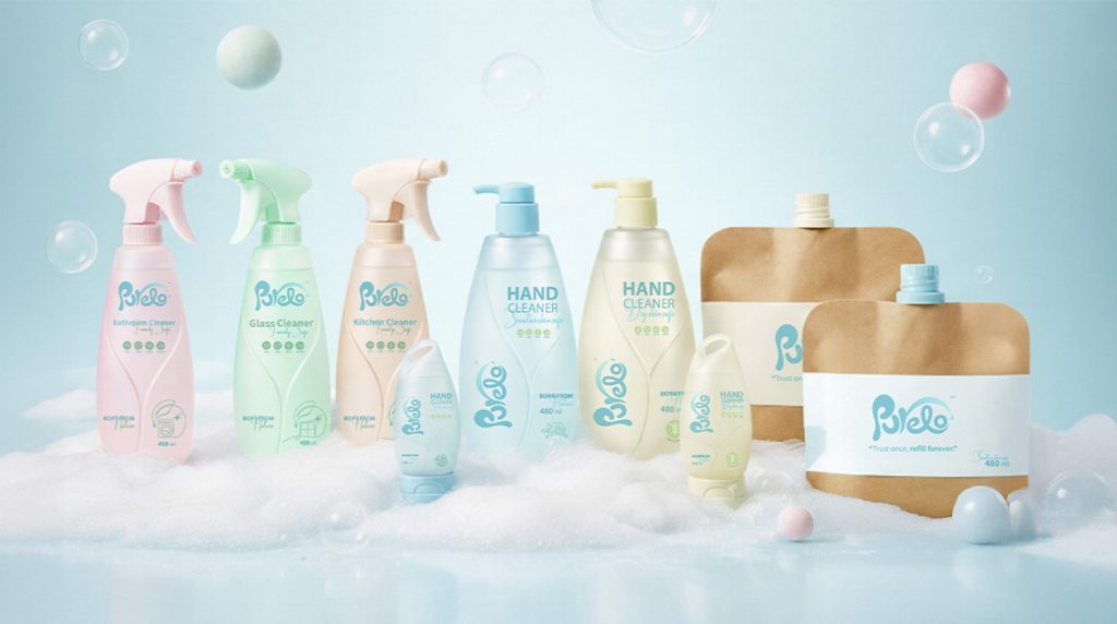

Project Overview
Purelo is more than a product — it’s a promise and a responsibility. Every purchase lets users care for their family while taking part in protecting the planet, turning daily hygiene into a meaningful ritual. The packaging expresses the brand’s identity—gentle, trustworthy, and instantly recognizable—creating an emotional connection in a world of disposable choices.
Identity & Family Experience
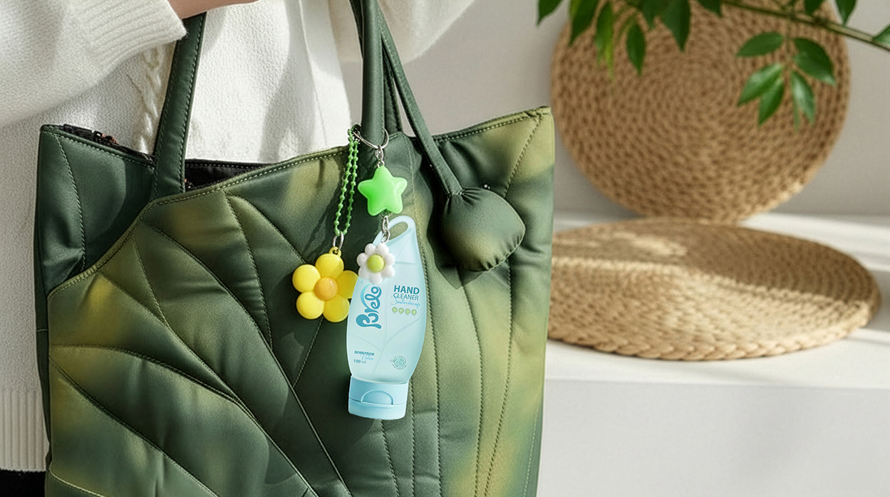
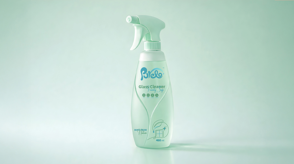
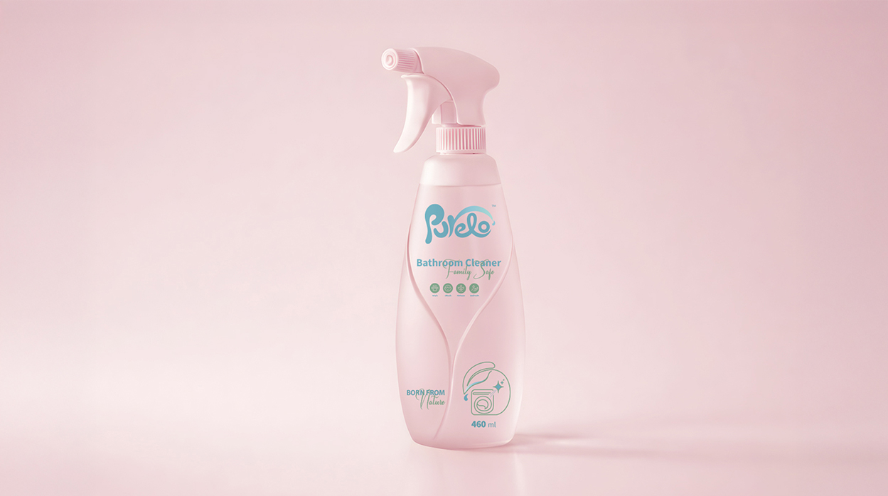
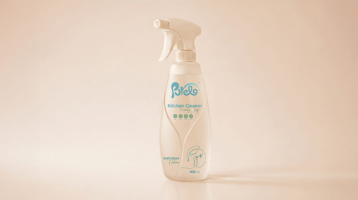
Even without logos or color, Purelo’s shape, balance, and softness communicate care and familiarity. Designed for the whole family, it integrates seamlessly into daily routines at home and on the go. Its calm, approachable design replaces visual clutter with quiet confidence, transforming hygiene into a trusted, emotional experience.
Cohesive Design System
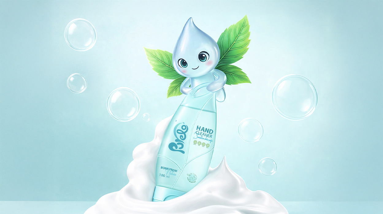
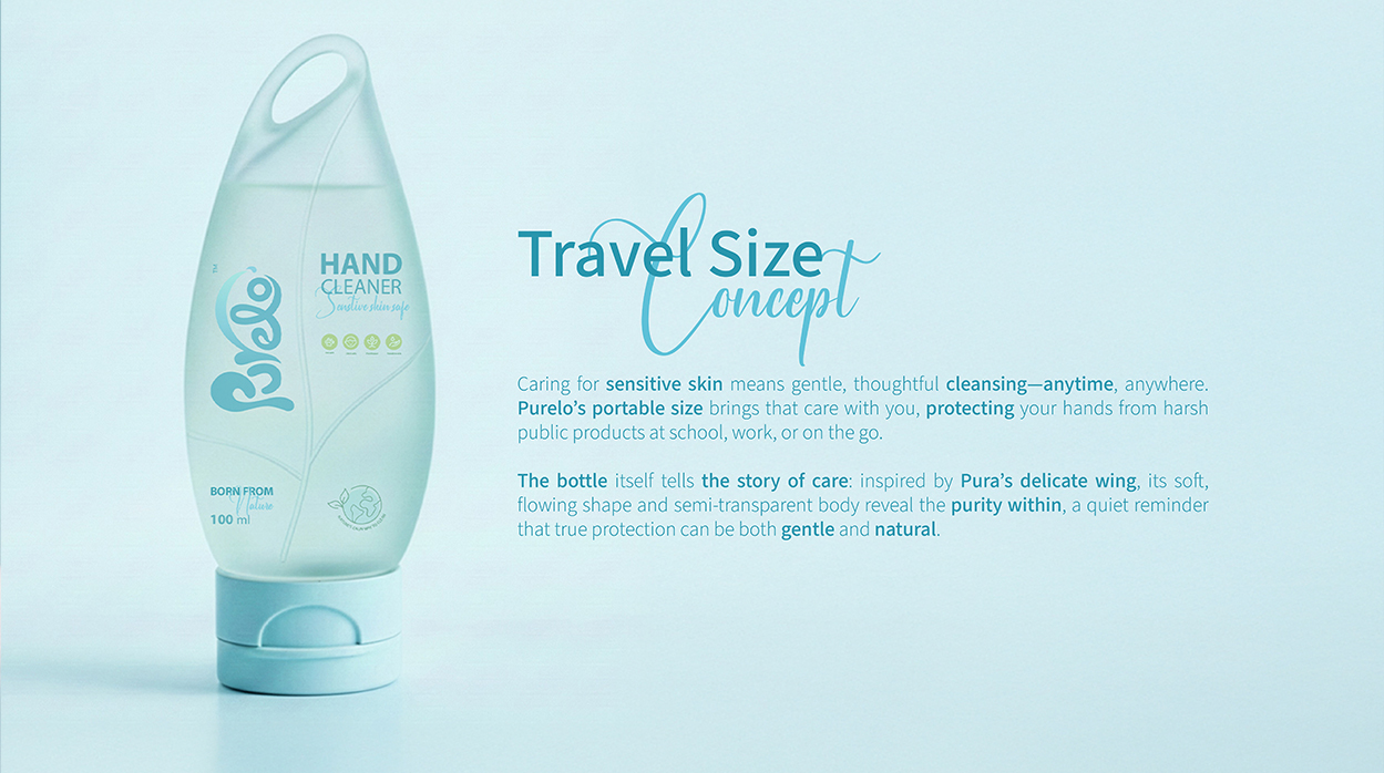
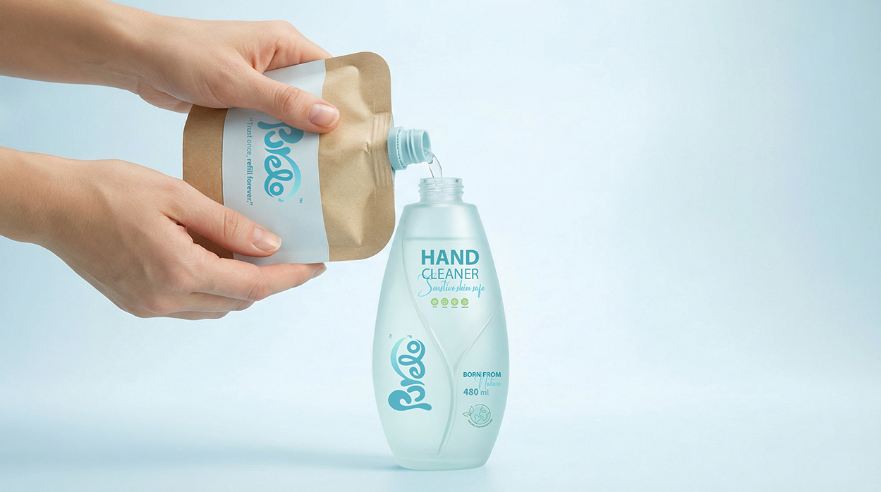
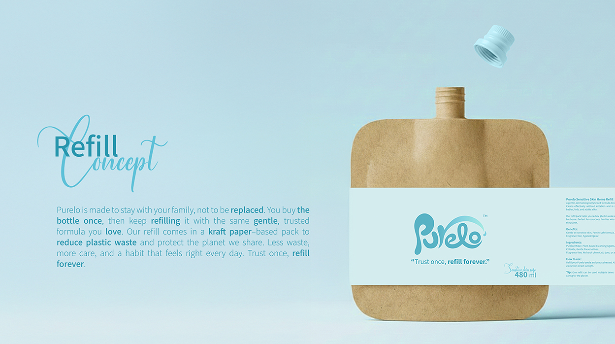
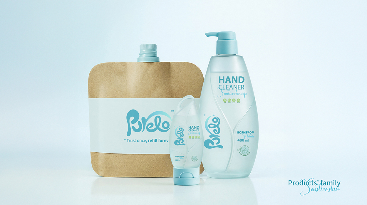
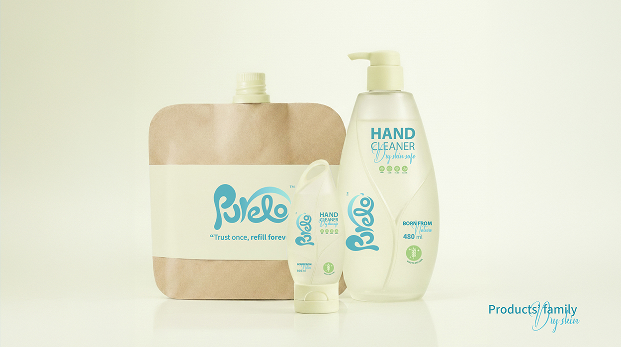
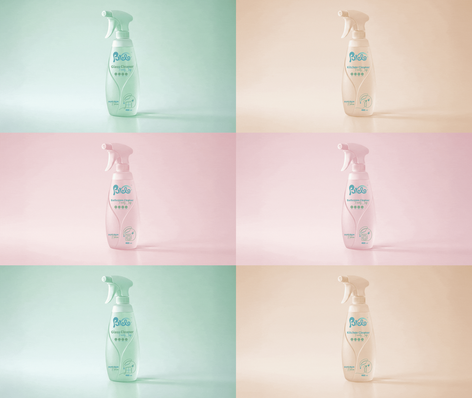
Inspired by Pura’s delicate wing, the system uses flowing silhouettes and subtle transparency to convey protection and purity. Reusable bottles and kraft paper–based refill packs form a unified family system, harmonized through proportion, material, and form, ensuring recognition, consistency, and sustainability.
Impact & Uniqueness
Purelo stands out because the product itself embodies the brand. Its quiet, confident identity builds emotional trust and loyalty, while the refill system encourages long-term, eco-conscious habits. The result is a modern, caring family brand with packaging that is timeless, sustainable, and deeply connected to people, community, and the environment.
 Ayanna
 Flow Creative
 jonathanag90
 Creative Platform
 alchimistestudioParis
 Eman AlGhasra
 andreamarinnn
 ccc
ccc Natasha Alimova
 Heramb Arora
 Denis Ulianov
 monther al omari
 BFS Studio
 Oksana
 Nadya Chunikhina
 Maruf Nishat
 Valérie Colace
 nemethhanna
 Logoclub99
 wd branding
 Palashcc
 Loseou
 dulicy