

Unique Terroir freshness and salinity.
Packaging design as territory
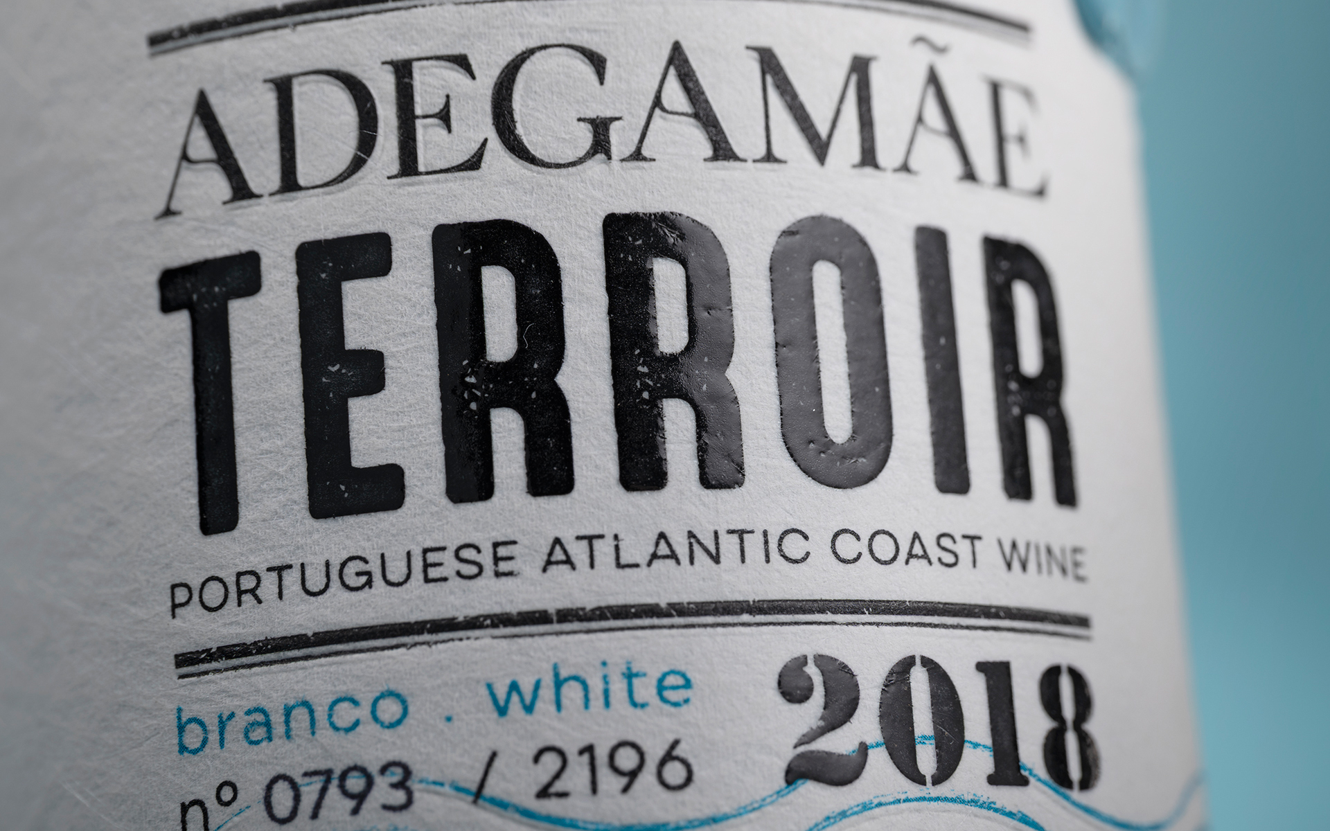
AdegaMãe Terroir project is shaped by the Atlantic; its force, its rhythm, its proximity. Red and White emerge from the same coastal edge, sharing a visual identity that captures the constant motion of the sea through wave-driven graphics and fluid, expressive forms.
The label becomes an oceanic surface: dynamic, tactile, and unmistakably maritime, translating freshness and salinity into bold visual tension. A distinctive bottle closure acts as a final signature-an intentional detail that reinforces the narrative of origin, precision, and craft in this very limited edition.
A design rooted in place, where identity, origin, and ocean converge, capturing the singular expression of AdegaMãe’s coastal terroir.
About AdegaMãe
Raised by the Alves family, founder of Riberalves Group, AdegaMãe is born as a tribute from the men to the family’s matriarch, Manuela Alves. At the same time, it serves as an inspiration to a place of birth and creation, in which the intention is to enhance the best grapes and to create the finest wines.
North from Lisbon and just a step away from the ocean, AdegaMãe brings out the best of a terroir strongly influenced by the prevailing sea breezes, standing out for its Atlantic-inspired wines, brimming with character, freshness and minerality, award winning nationally and internationally.


 Derrick Lin
 monther al omari
 43oz
43oz lilyz design23
 Modern Theory
 Eighteen Brand Studio
 Bhumika Singh
 MohamedMashaly
 Pixels Studio
 Gulya
Gulya UPRISE
 Lizaveta Kharitonyuk
 Bonsanco Creative Studio
 DesignRepublic
 GIRAFA STUDIO
 PiotrWisniewski
 Sophiagdotcom
 CreativeWise
 SoreThumbStudio®
 Modern World Studio
 Palashcc
 Valérie Colace