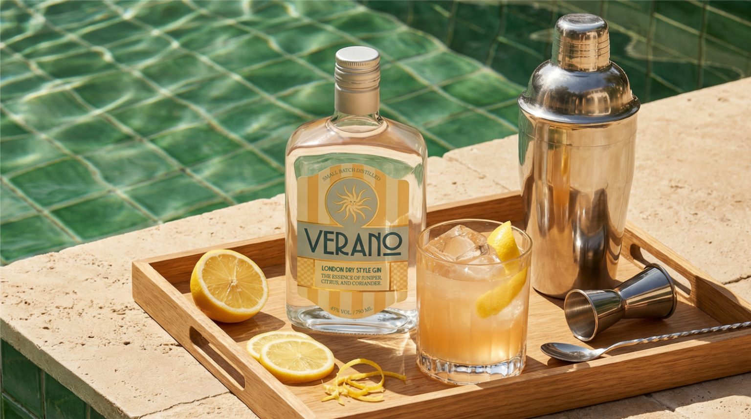

Verano Gin is born from the idea that summer is a state of mind, not just a season. The brand proposes a slower, more sensorial and contemplative summer, designed for a young adult, urban and creative audience that engages with design, photography, fashion and visual culture, and values well-curated experiences, simple rituals and objects with intention. In a market saturated with technical narratives and repetitive codes of sophistication, the main challenge of the project was translating this atmosphere of calm, light and presence into a label that could stand out without relying on excess.
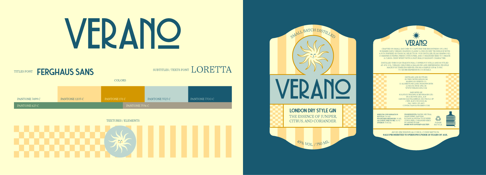
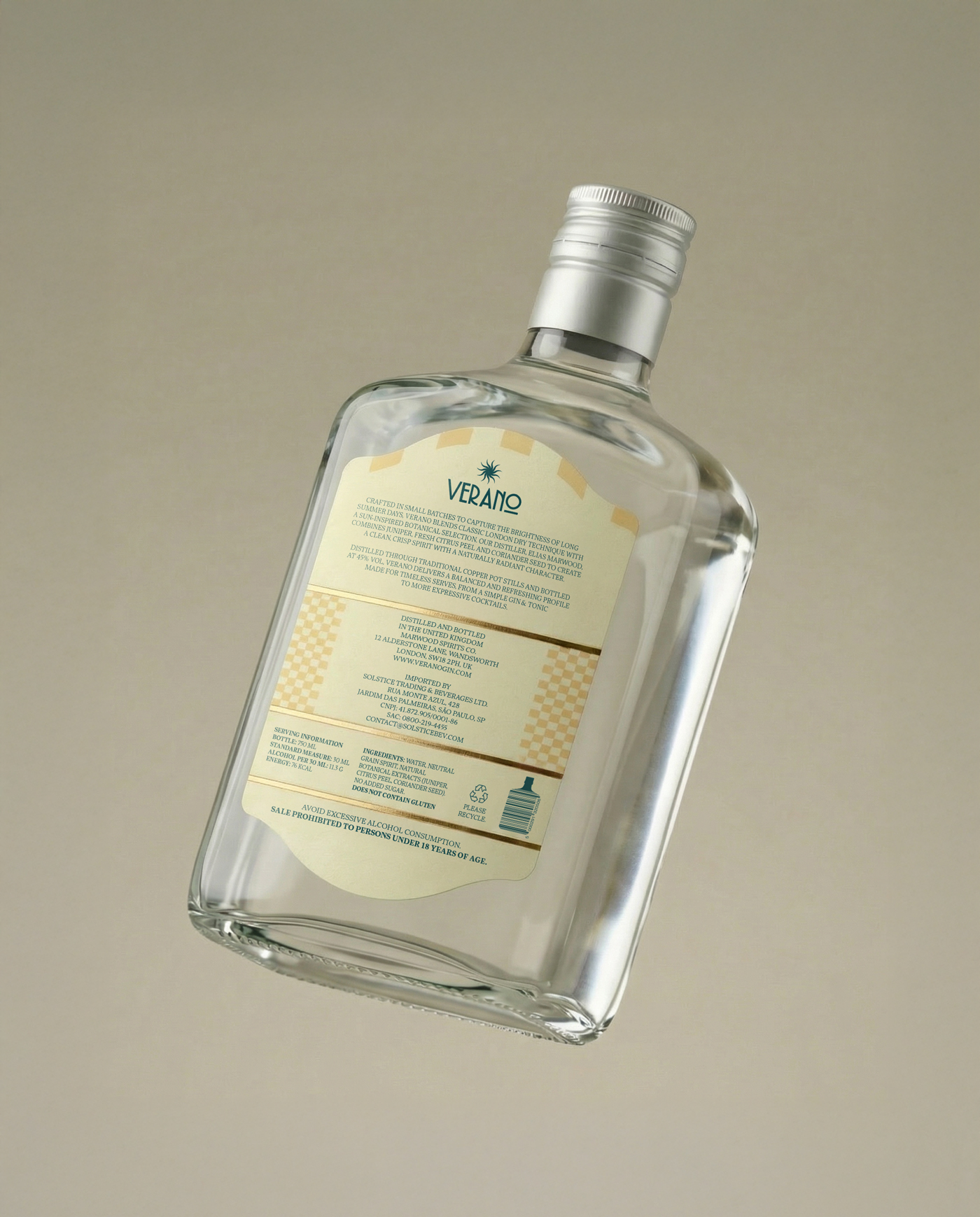
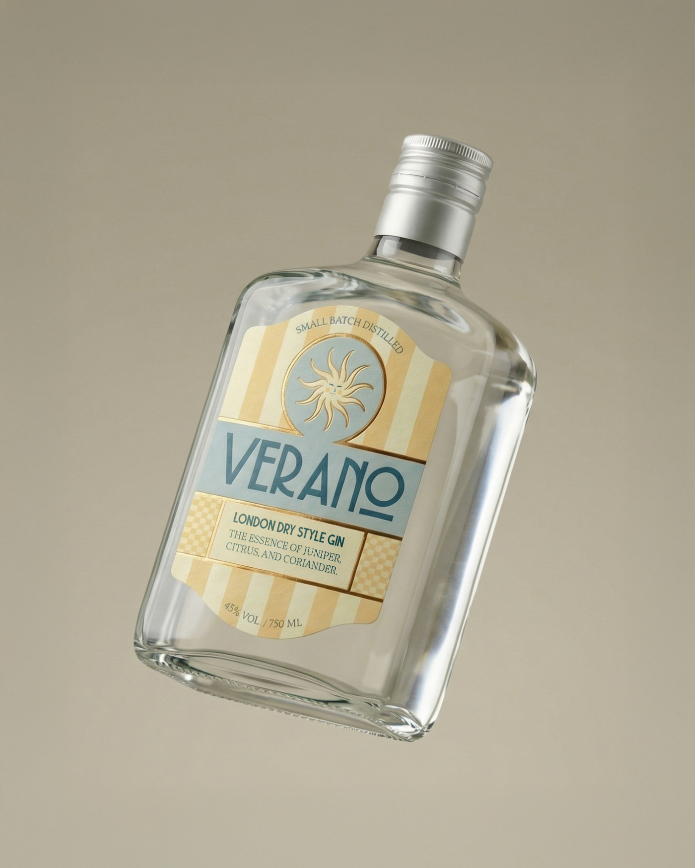
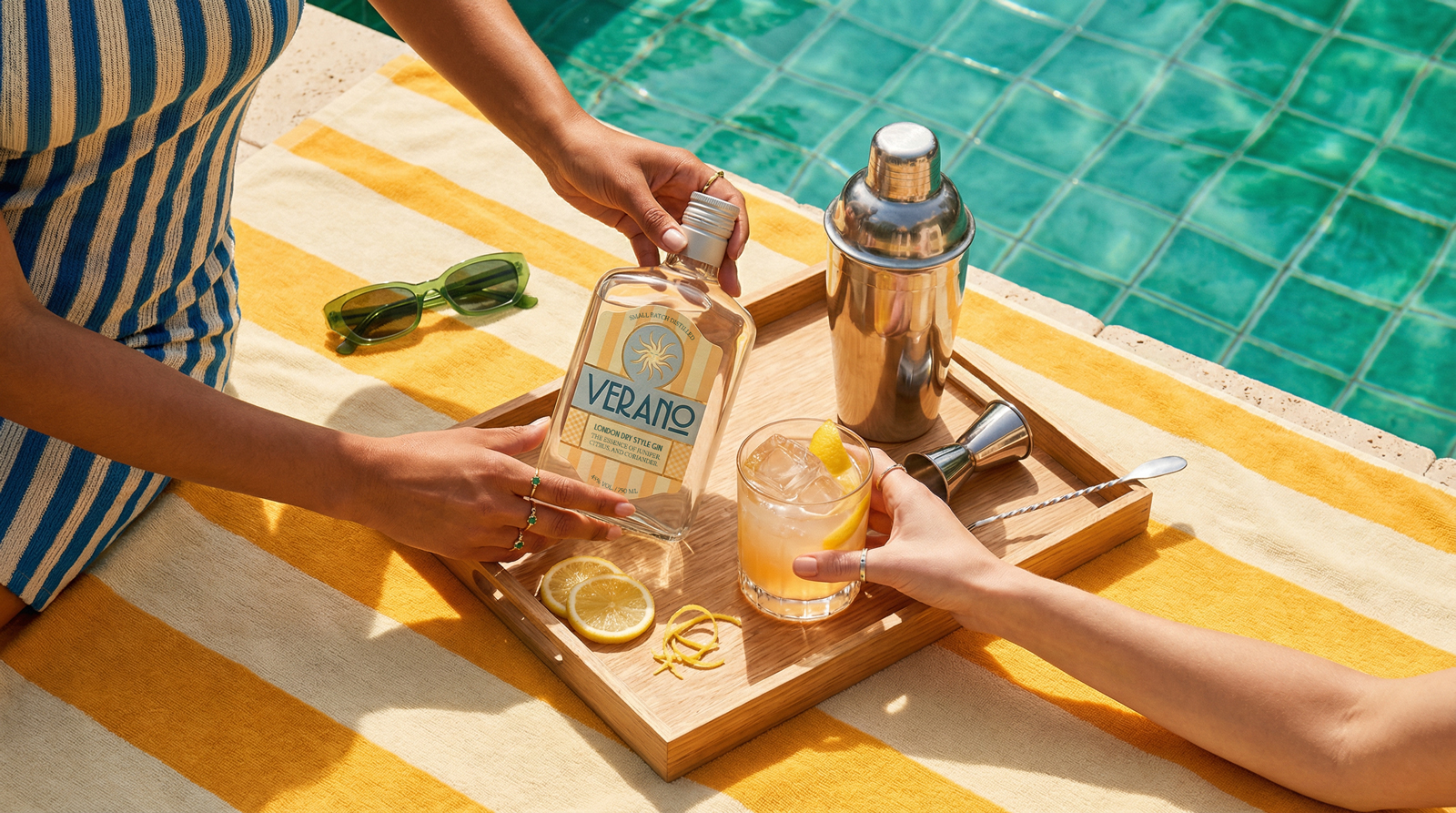
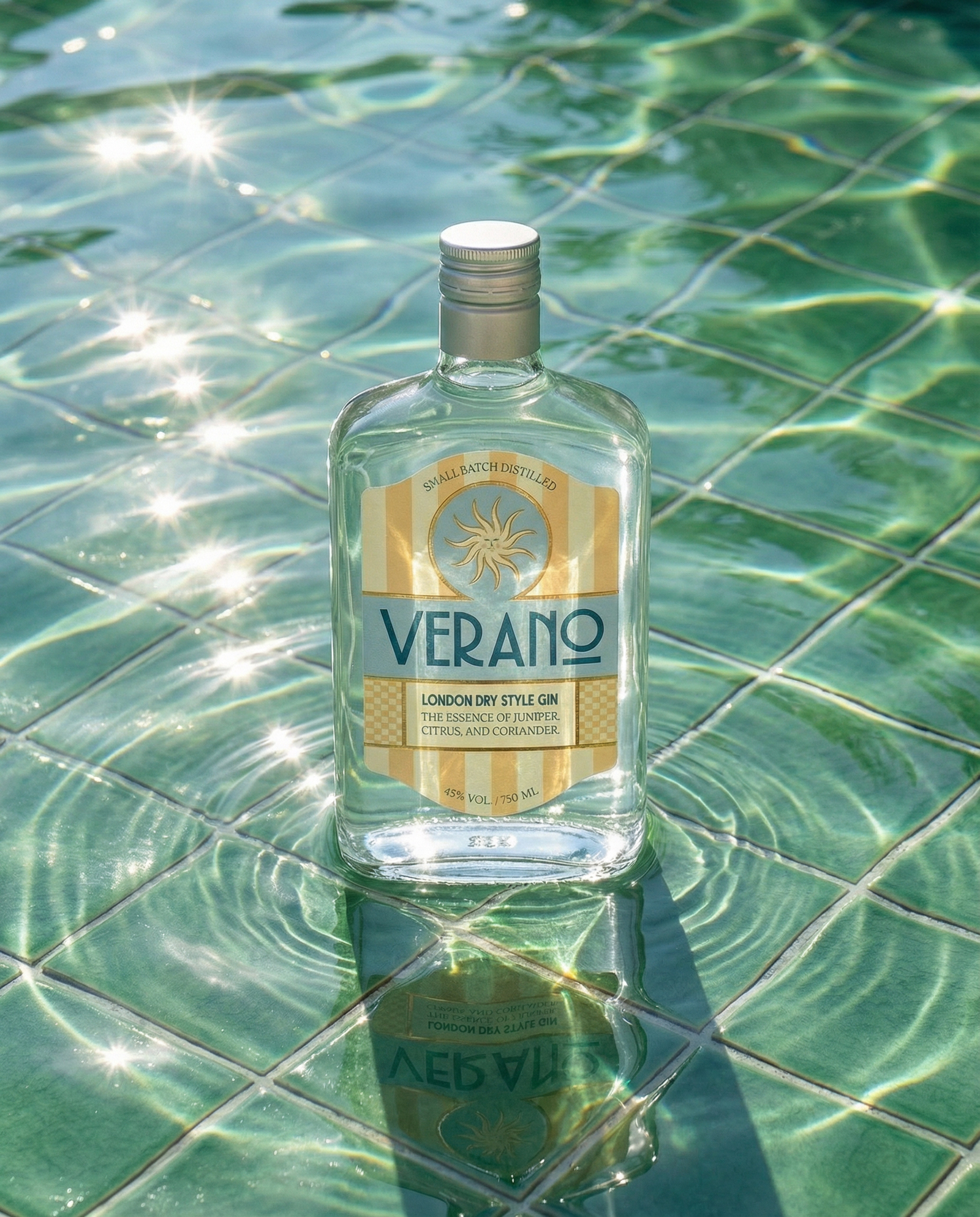
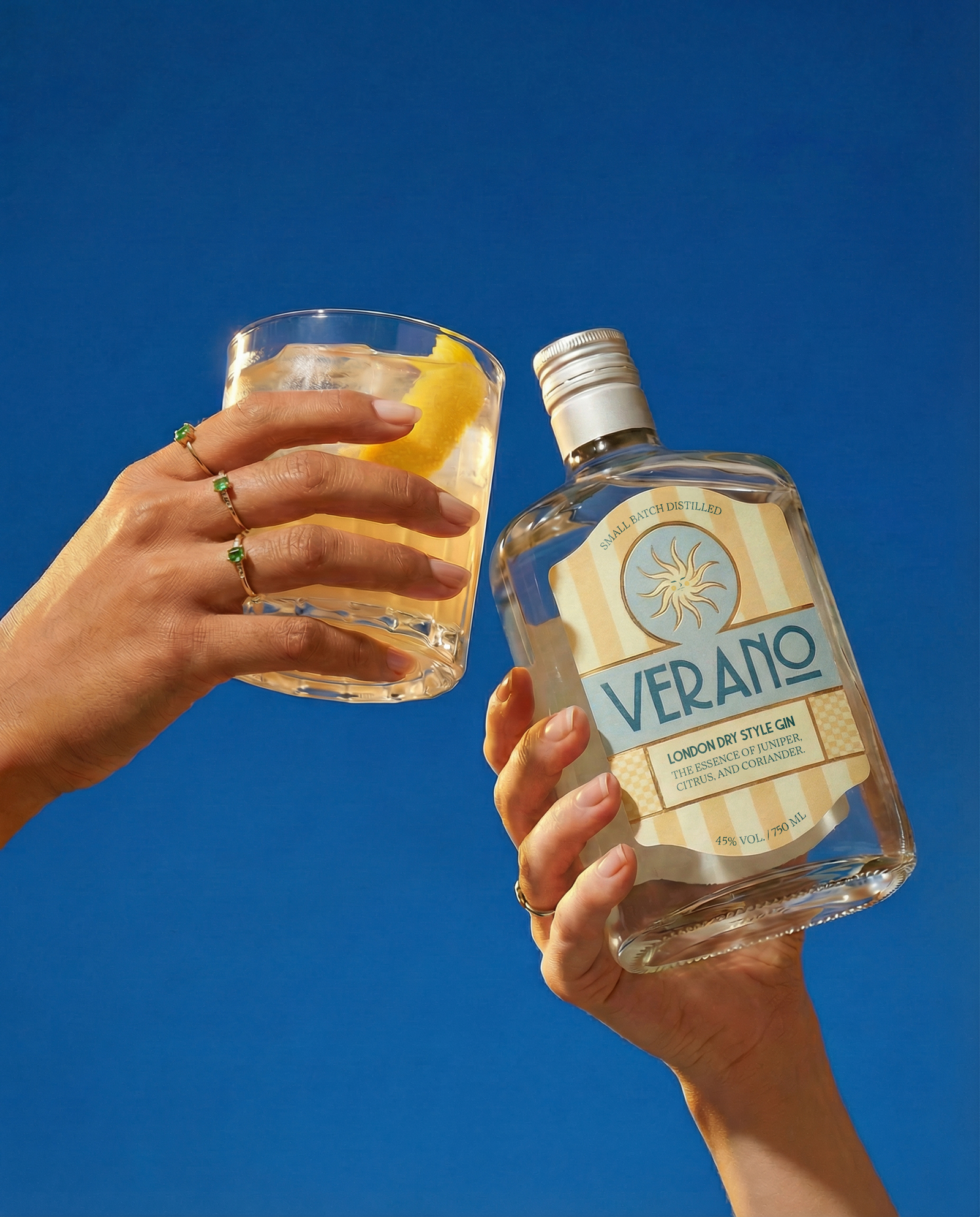
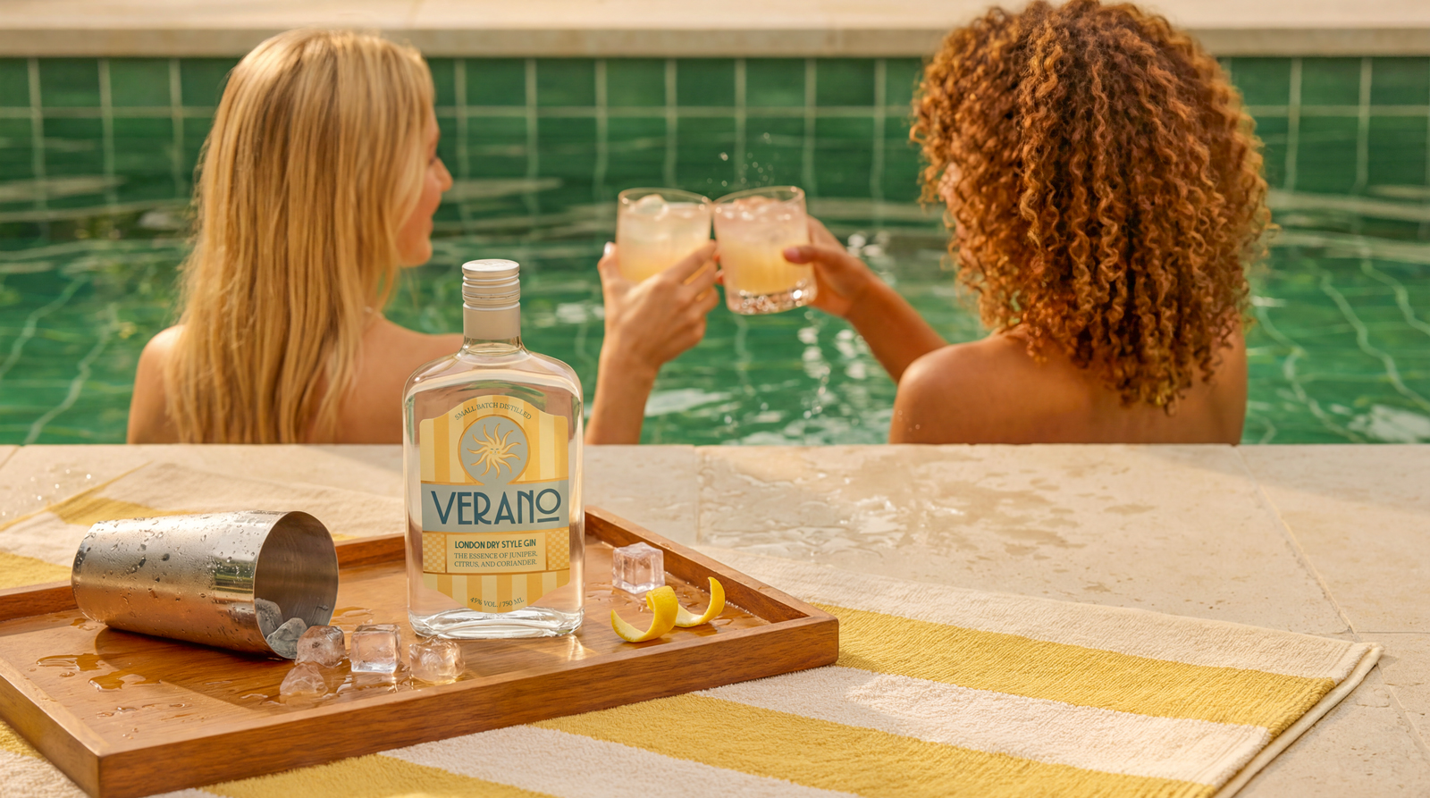
The solution was a design that embraces visual silence and atmosphere building. The light color palette, vertical stripes and centered composition evoke warmth, light and a slower sense of time, while the sun symbol reinforces the concept of summer as a continuous feeling. Clean, well-spaced typography ensures a calm reading experience, and the use of transparent glass allows light to pass through the liquid, integrating the bottle into the identity. As a result, the label goes beyond information and becomes part of the scene, reinforcing Verano’s positioning as a gin that invites you to slow down and experience summer with greater sensitivity.


 Biaa
Biaa Petitmoulin Studio
 White Bear Studio
 Eva Chistyakova
 monther al omari
 Atipus
 alchimistestudioParis
 oneandother
 bloomburo
 helocrene
 Shapers Studio
 Denver Design
 Aidearte
 andrew.huerta
 softmachine
 airobtq
 Buzz & Co.
 Ruby
Ruby themythographer
 IDNB Inc.
 viktorflr
 Zenpack
 Wessam Hussien