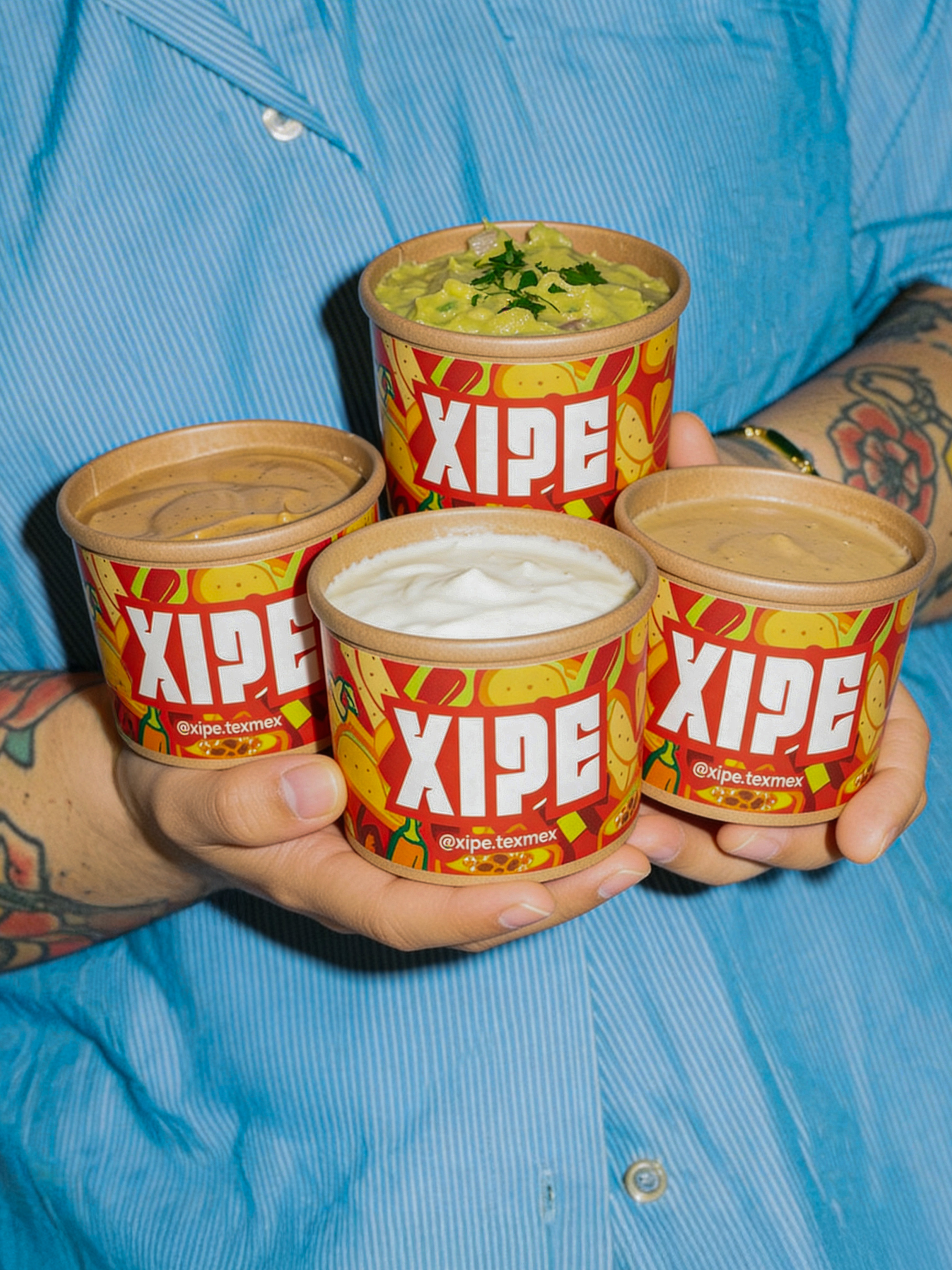

XIPE Dipping Sauces Packaging
Branding & Packaging Design by Fiasco
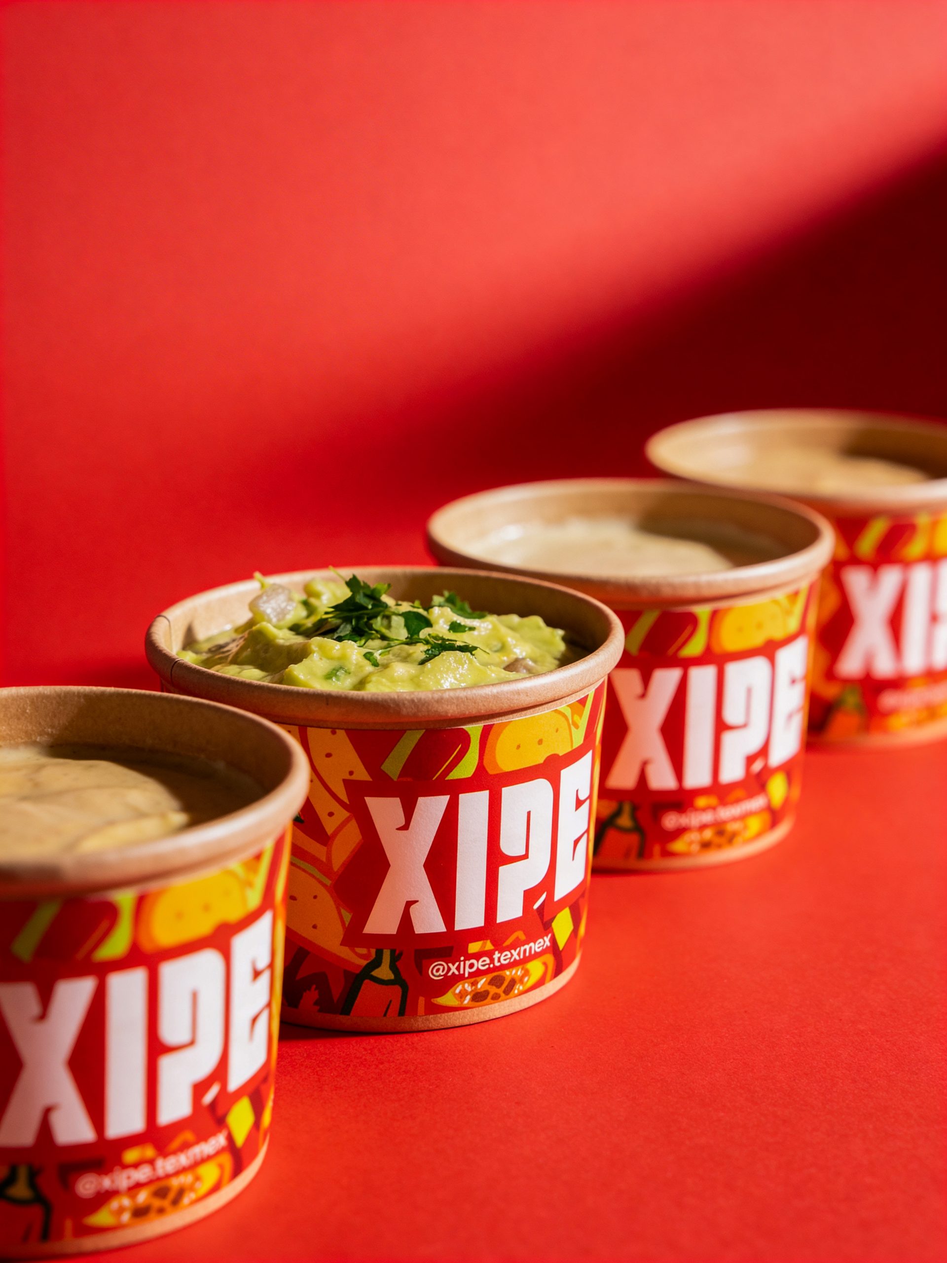
After entering the market with a bold Peruvian Tex-Mex proposal, Xipe quickly built a strong visual and cultural identity. Months later, the brand expanded its product ecosystem with a new line of dipping sauces, and the challenge was clear: create packaging that didn’t just contain the product, but amplified the brand’s attitude.
Fiasco developed the complete branding system for Xipe, from brand DNA and visual identity to graphic language and tone of voice. The sauces became the perfect opportunity to extend that universe into a new, tactile format.
Strategic Approach
Dipping is not secondary in Tex-Mex culture, it’s ritualistic. It’s hands-on, messy, indulgent and unapologetic. We positioned the sauces not as side elements, but as protagonists of the experience.
The packaging had to:
- Reinforce Xipe’s irreverent personality
- Be highly visible in-store and delivery environments
- Work as an Instagram-friendly object
- Turn consumption into a statement
Visual System
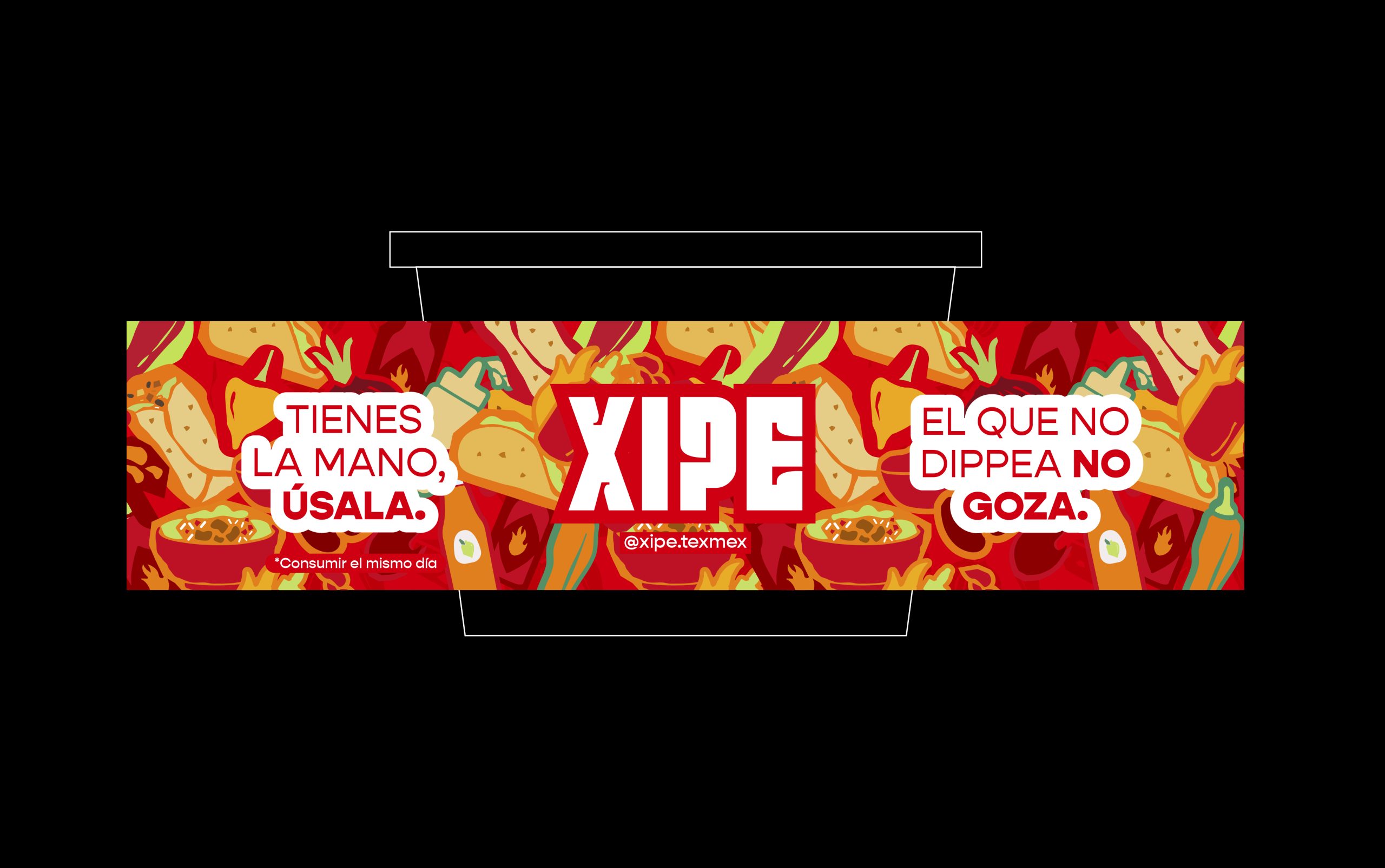
We developed a vibrant illustration system inspired by Tex-Mex iconography; tacos, chilis, flames, corn and ingredients, reinterpreted through bold shapes and high-contrast color blocking.
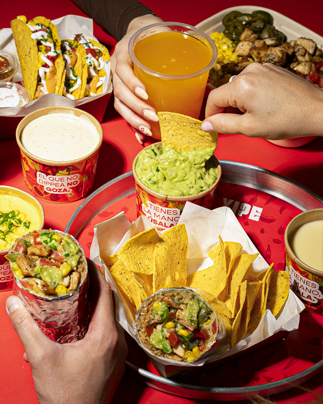
The graphic universe wraps around the entire container, transforming a simple sauce cup into a branded canvas. The dominant red and yellow palette ensures maximum shelf impact while maintaining strong coherence with the master brand identity.
The logotype sits confidently at the center, supported by dynamic visual rhythm and dense pattern layering, creating a 360° immersive experience.
Tone of Voice Integration
Instead of generic product descriptions, we embedded bold, playful statements directly into the packaging:
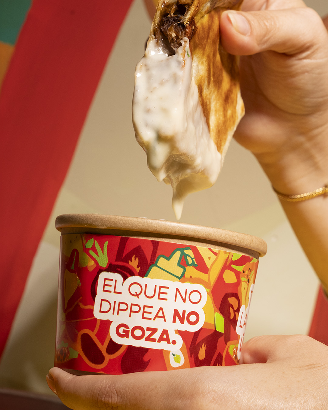
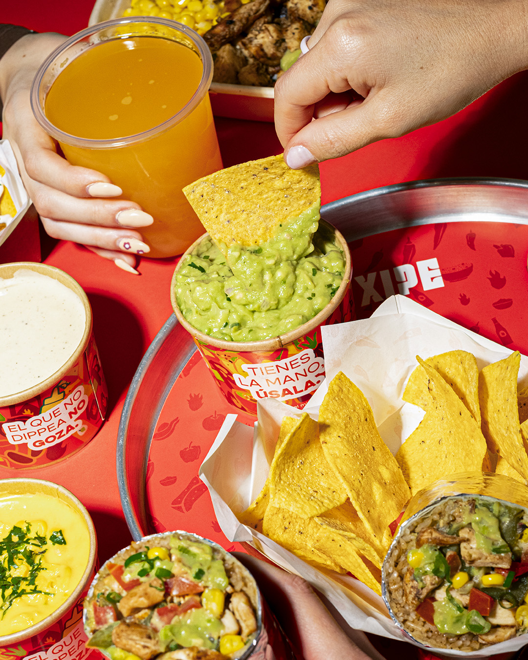
“El que no dippea, no goza.”
(The ones that don’t dip, don’t enjoy.)
“Tienes la mano, úsala.”
(You have hands, don’t be afraid to use them.)
These phrases transform the packaging into a conversation piece. They provoke, invite interaction and reinforce the physical act of dipping as part of the brand ritual.
Design Intent
The goal was to elevate a disposable container into a brand amplifier. Even in delivery scenarios, the packaging maintains visual impact, brand recall and social shareability.
The result is a cohesive extension of Xipe’s identity, bold, unapologetic and culturally charged, turning a simple sauce into a statement.
Sr. Designer
Jimena Gutierrez
CCO
Gabriel Bergelund
 alchimistestudioParis
 Estudio Argo
 Modern Theory
 monther al omari
 Ohmybrand
 Affogato Brand Design
 Tancybox
 waanrong
 nazystudio
 Daria Fox
 g.apolly
 sahildoesartt
 Stiandco
 BREAK DESIGN
 ShreyaDighe
 Sameh Elnahas
 Minim Brand Design
 Ebbi
 Shabouk Printing & Packaging (Shabouk Carton Boxes – شعبوق)
 Brandegree
 Abbydraw Designs Unique Conceptual Branding & Packaging Designing Ideas
 bilel tkouri
 NEV
 Stefano Bracci
 Alina