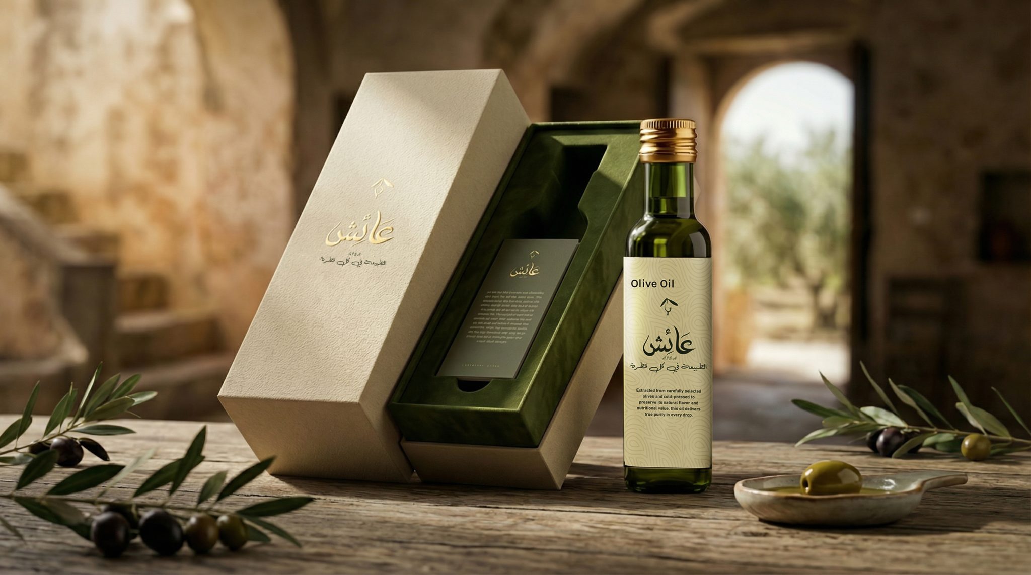

The Challenge
The olive oil market is saturated with traditional visual clichés — olive branches, oil drops, and overly decorative frames.
The challenge was to create a distinctive Arabic identity that:
- Reflects heritage
- Feels contemporary
- Avoids predictable visual patterns
Concept Development
The core idea was inspired by the nature of olive oil itself.
Olive oil is:
- Smooth
- Fluid
- Natural
- Organic
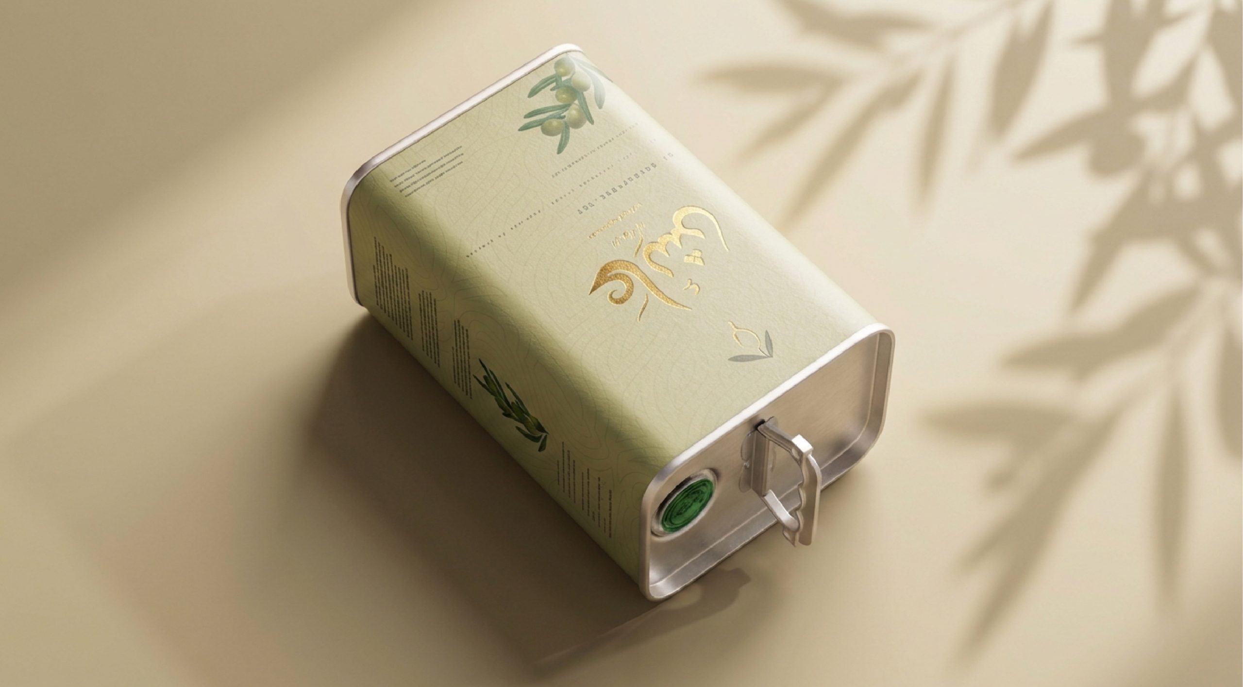
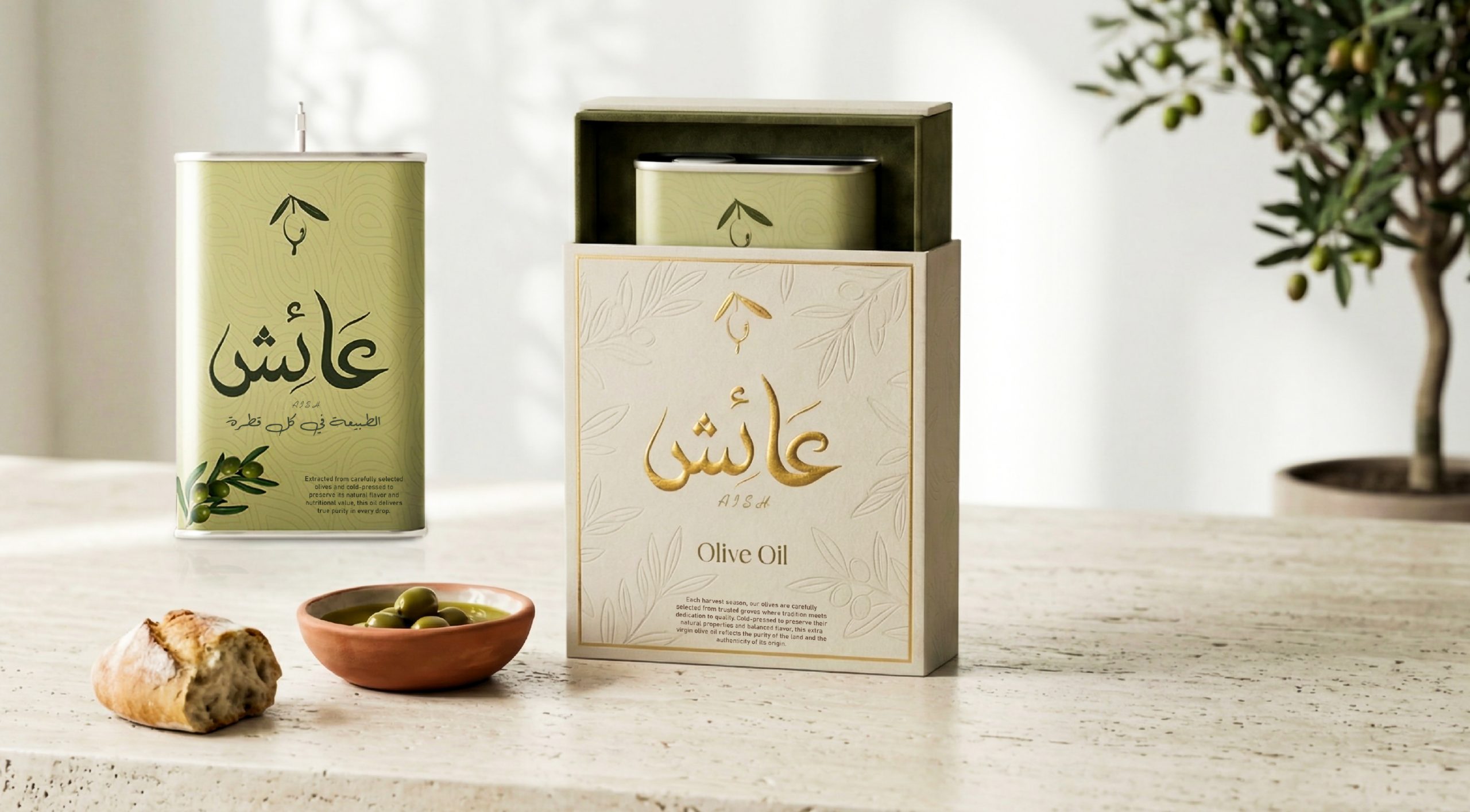
These qualities were translated into a flexible Arabic lettering style with visible flow and movement.
Target Audience
- Egyptian women
- Health-conscious consumers
- Athletes
- Individuals seeking natural and high-quality products
The identity needed to feel: Clean – Natural – Trustworthy – Confident
Without visual clutter or over-design.




 Stefano Bracci
 monther al omari
 Widakk Design
 Studio Garces
 宏洛图品牌设计HONGLT
 DN Designs
 alchimistestudioParis
 BoldCrest
 Maruf Nishat
 Oksana
 Dozen Agency
 erandy
 Leyma Design
 aabnasserr
 Palashcc
 habiba gomaa
 AntaPetrenco1
 Packart Bd
 sophioc
 Marta Wasilewska
 House of Thought
 Krithika Chakkaravarthy
 Reema
Reema