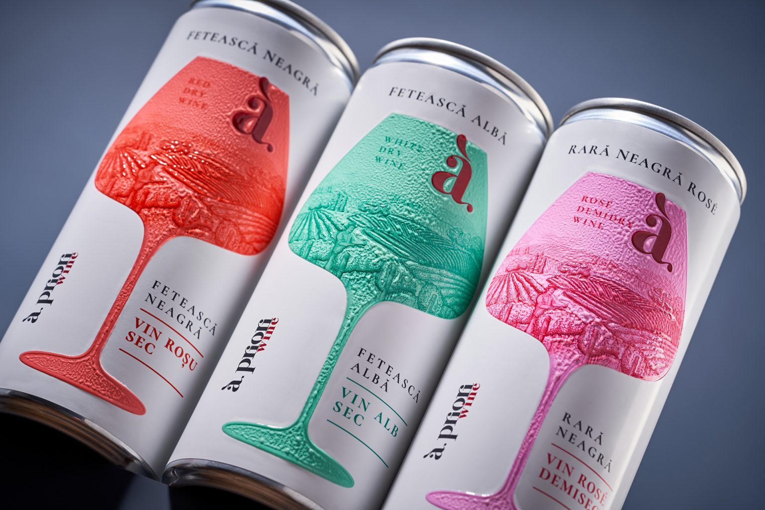

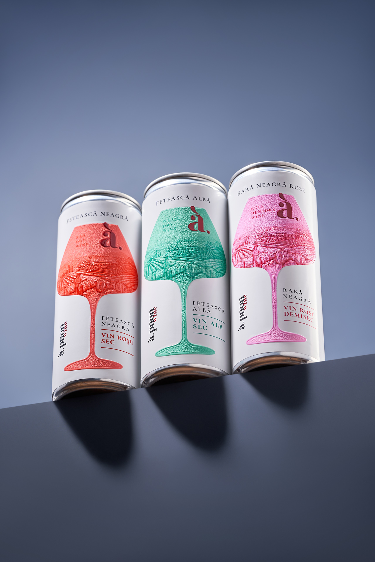
The Apriori Wine cans project addresses a clear tension within the category: while canned formats are widely associated with cocktails, sparkling wines, and more accessible wine-based beverages, they are rarely perceived as a vessel for classic still wine. The objective was to challenge this assumption and communicate that the product inside remains unchanged – the same wine traditionally presented in glass bottles.
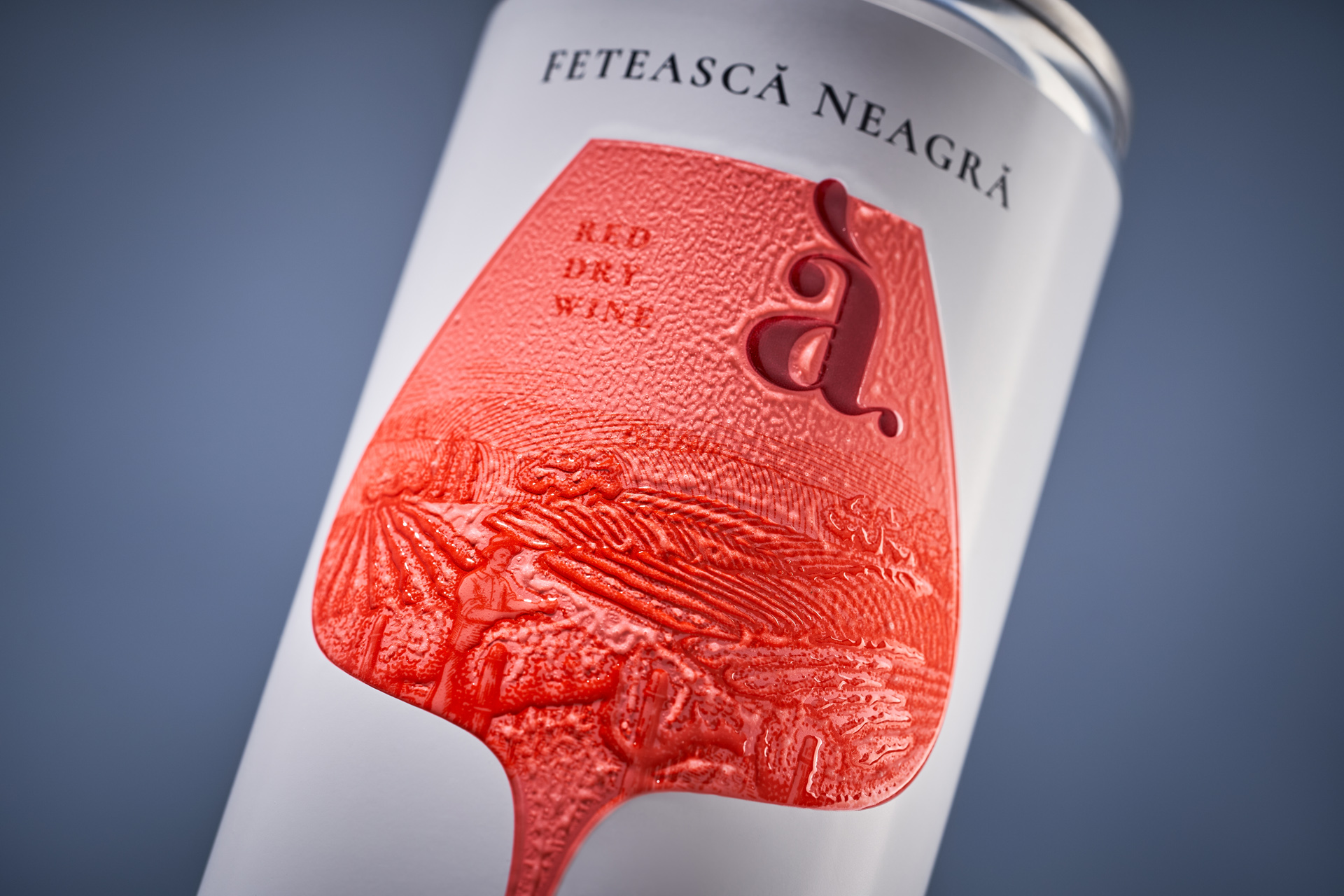
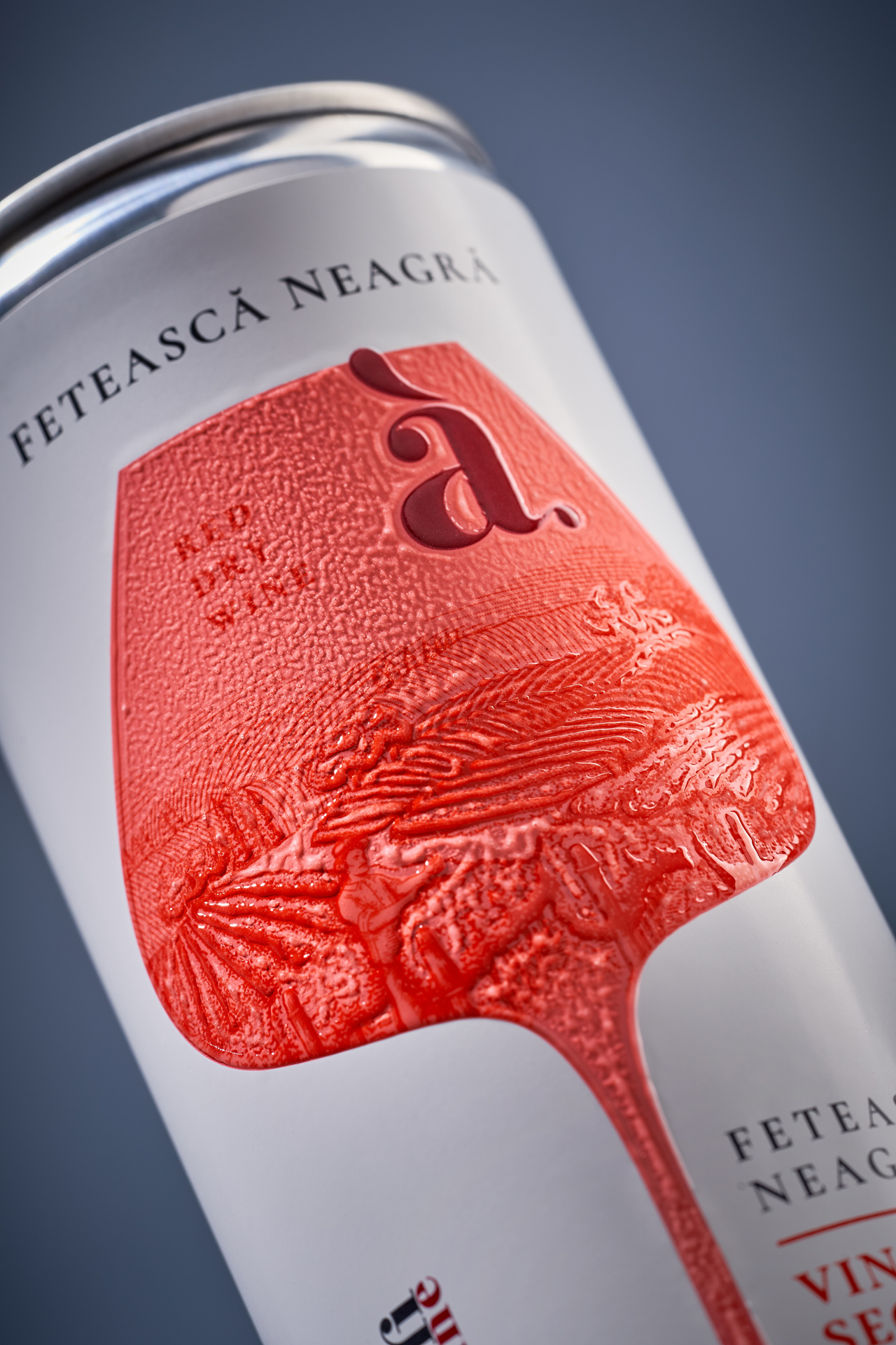
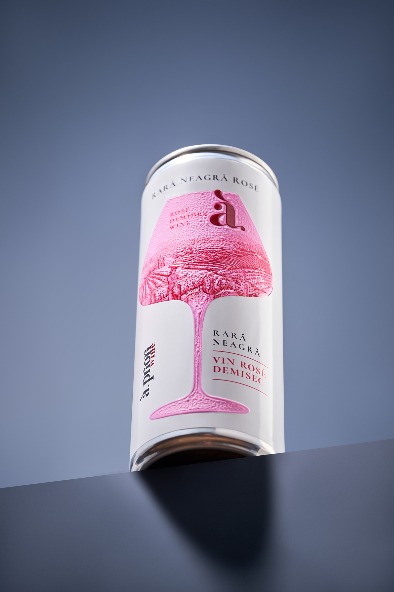
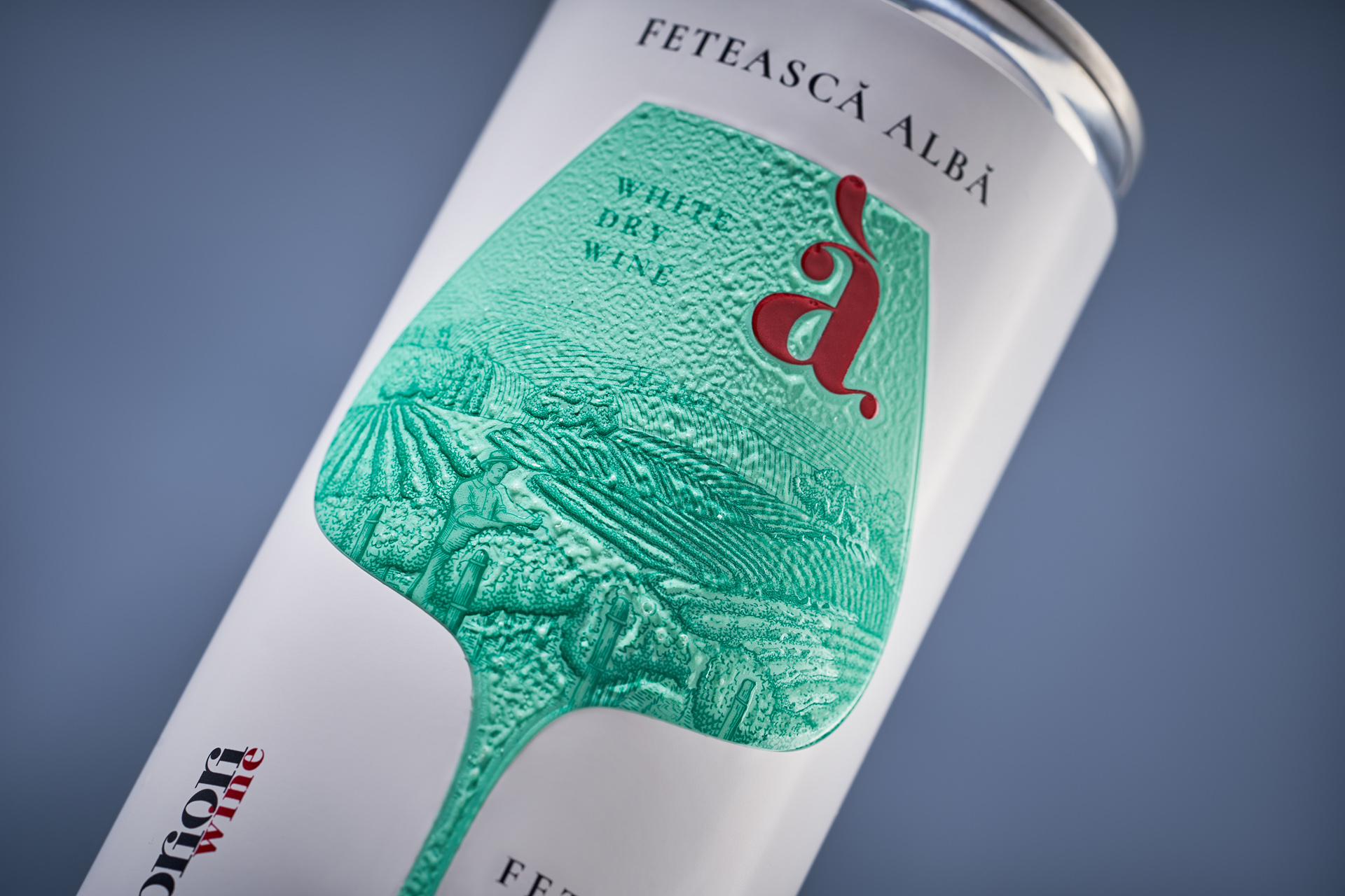
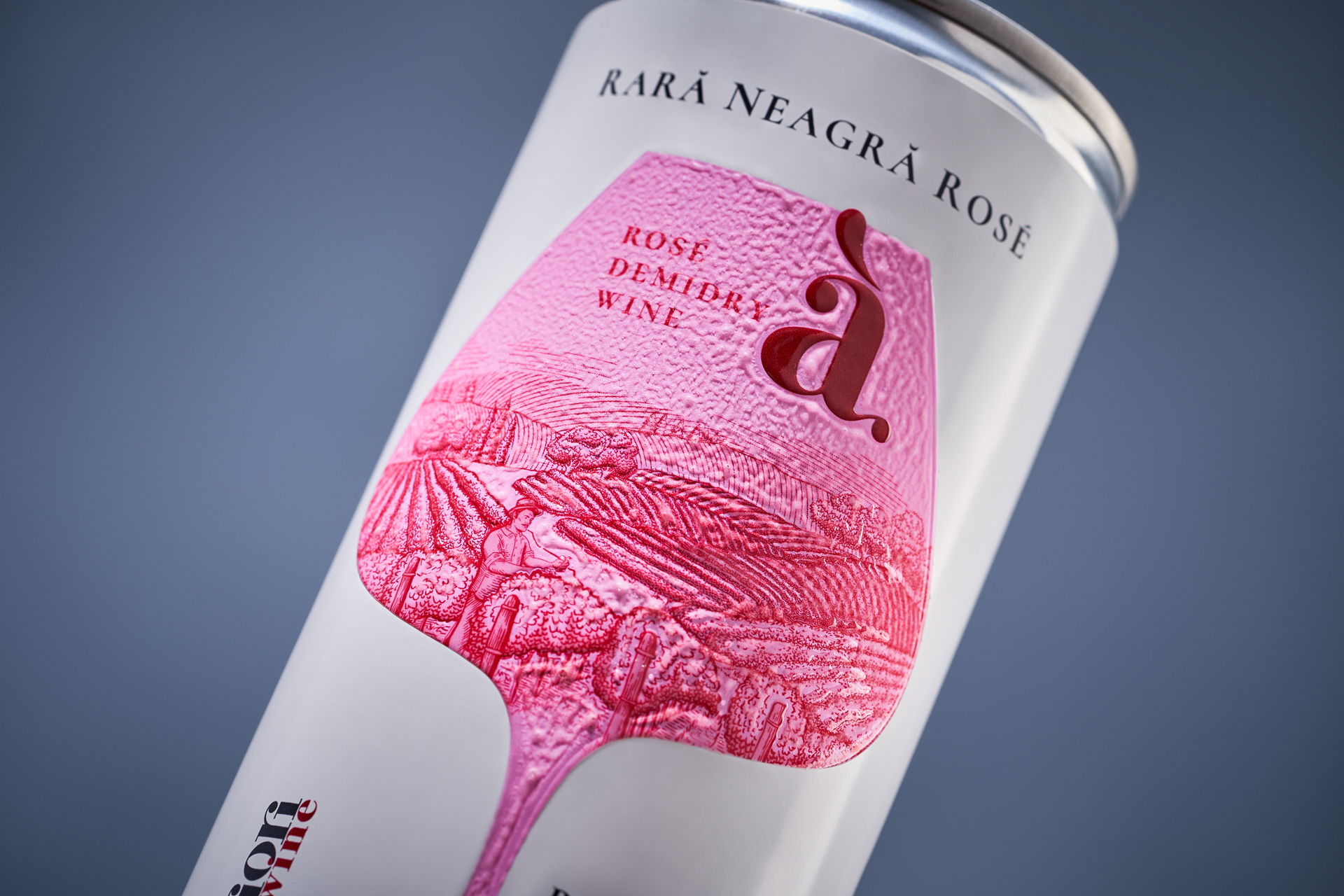
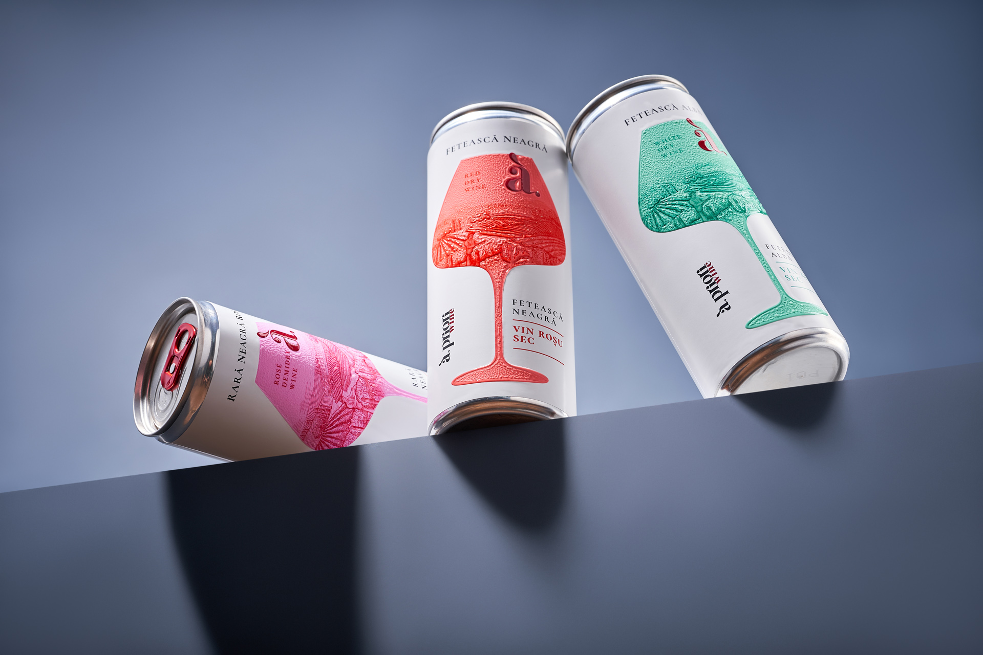
The visual solution builds around the universally recognized symbol of the wine glass, anchoring the product within the established culture of wine consumption. Inside the glass silhouette, a detailed vineyard landscape references the visual codes of classic wine labeling and the concept of terroir. This deliberate contrast between traditional imagery and a contemporary format creates a point of intrigue and repositioning.
To extend the concept beyond visuals, the glass element is rendered with an embossed texture, introducing a tactile dimension that reinforces quality through touch. This physical interaction becomes a key part of the user experience, bridging the gap between expectation and perception.
The result is a packaging system that does not simply adapt wine to a new format, but redefines how that format is understood – aligning modern convenience with the visual and sensory language of classic wine.

 43oz
43oz monther al omari
 Ximena Ureta Design Studio.
 vitoramockup
 Up-Brands
 Sophiagdotcom
 Peter said
 ayeidadezigns
 Tancybox
 宏洛图品牌设计HONGLT
 Modern Theory
 Dozen Agency
 Atiq Alam
 Olio Studio
 Ruchi S. Joshi
 mmdesign
 awaiskhadim
 Octasoft
 United Creatives Studio
 Kingdom & Sparrow
 Anastasia Bakhmatskaya
 CreativeWise
 Great and Golden