
Design: Christine Chan Mun Yan
Location: Malaysia
Project Type: Student Project
School: Dasein Academy of Art
Course: Diploma in Graphic Design
Tutor: Ms. Low Poh Li
Packaging Contents: CASAHANA’s Savory Cookies
Printing Process: Digital Printing
CASAHANA’s Savory Cookies
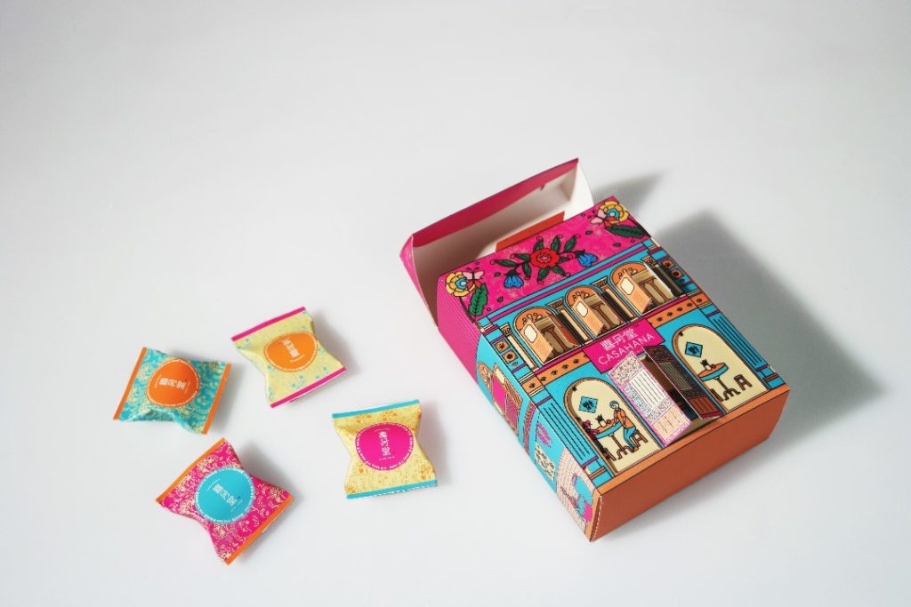
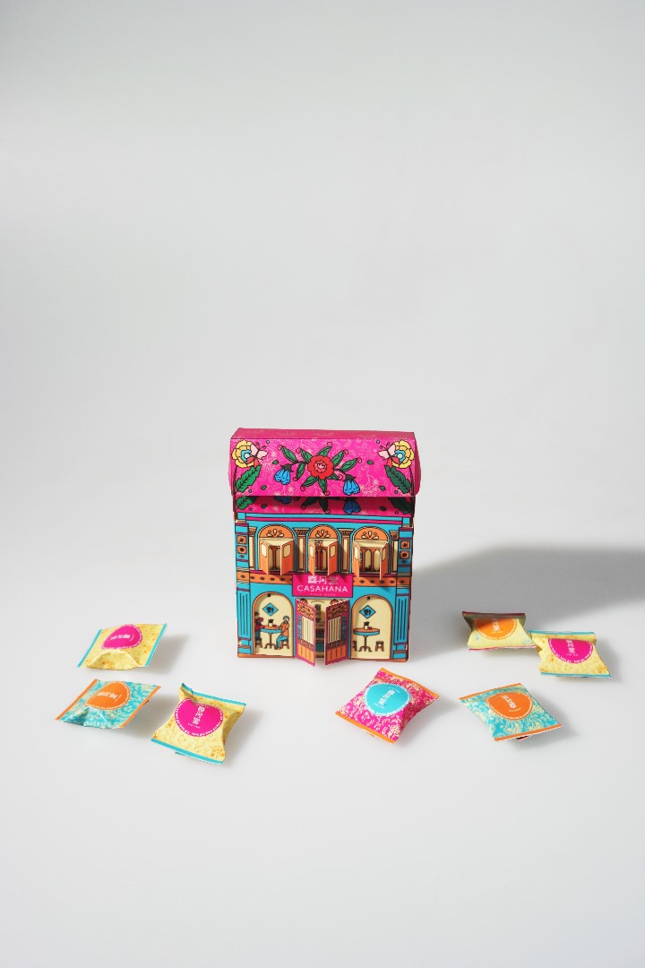
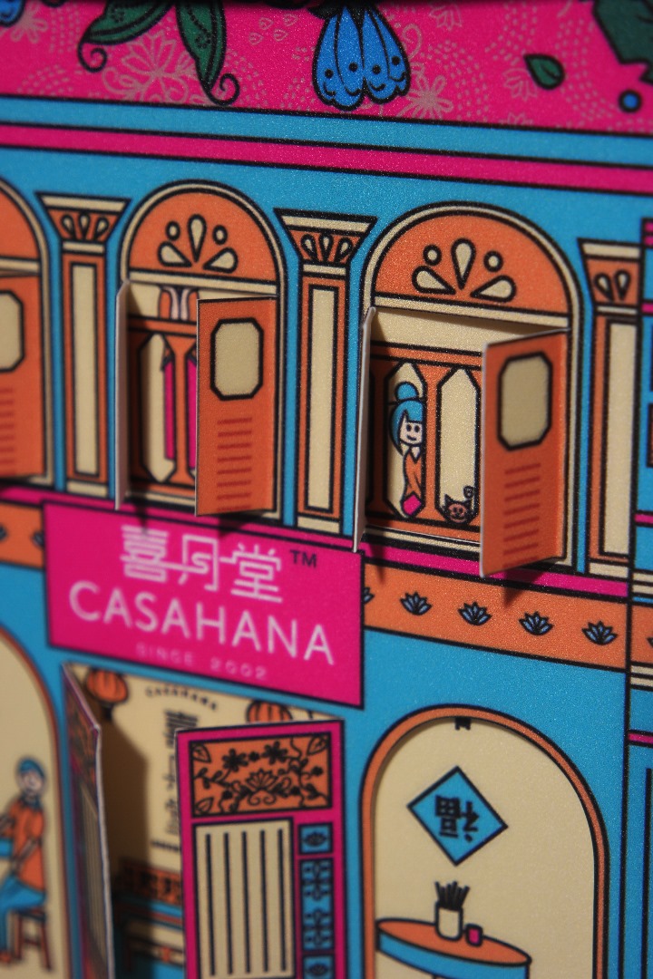
My packaging concept for CASAHANA’s Savory Cookies is inspired by the nostalgic charm of traditional Nanyang shophouses, reimagined as a miniature three-dimensional home. Drawing from the familiar character of old Malaysian streets, the design brings warmth, cultural memory, and a sense of home into the snacking experience.
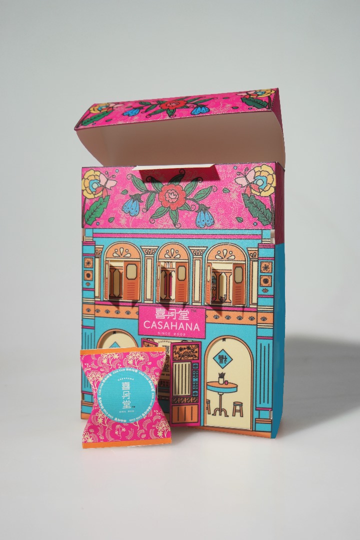
A key feature of the packaging is its interactive structure. The doors and windows can be opened, allowing users to discover the illustrated interior scenes and small characters hidden inside. This playful reveal adds curiosity and storytelling to the design, making the packaging feel more alive and personal rather than functioning as a conventional snack box.
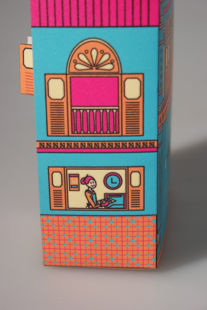
To further express Malaysian identity, the design combines batik-inspired ornamentation with scenes of cooking, spice preparation, and daily domestic life. By linking architecture, food culture, and home traditions within one visual language, the packaging becomes more than a container. It becomes a memorable visual story that celebrates nostalgia, local culture, and togetherness.
The patterns and colour palette are developed to reinforce the Nanyang concept while expressing warmth, vibrancy, and local character. Batik-inspired motifs are featured on the rooftop, together with butterflies and hibiscus flowers that symbolise beauty, festivity, and Malaysian heritage. These elements add decorative richness and strengthen the handcrafted feel of the design.
Architectural details such as arches, shutters, tiled surfaces, and framed openings echo the façade of a traditional shophouse, while the illustrated interior scenes and characters make the packaging feel more intimate and lively. The colour palette uses orange and magenta to suggest spice, warmth, and celebration, while turquoise and pale yellow bring a tropical freshness with a subtle vintage touch. Strong black outlines unify the illustrations and enhance clarity, creating a packaging design that feels vibrant, nostalgic, and culturally expressive.

 monther al omari
 Ximena Ureta Design Studio.
 vitoramockup
 Up-Brands
 Sophiagdotcom
 Peter said
 ayeidadezigns
 Tancybox
 宏洛图品牌设计HONGLT
 Modern Theory
 Dozen Agency
 Atiq Alam
 Olio Studio
 Ruchi S. Joshi
 mmdesign
 awaiskhadim
 Octasoft
 United Creatives Studio
 Kingdom & Sparrow
 Anastasia Bakhmatskaya
 CreativeWise
 Great and Golden