
Client: Cream Pot
Design Studio: AbbyDraw Designs
Country: India
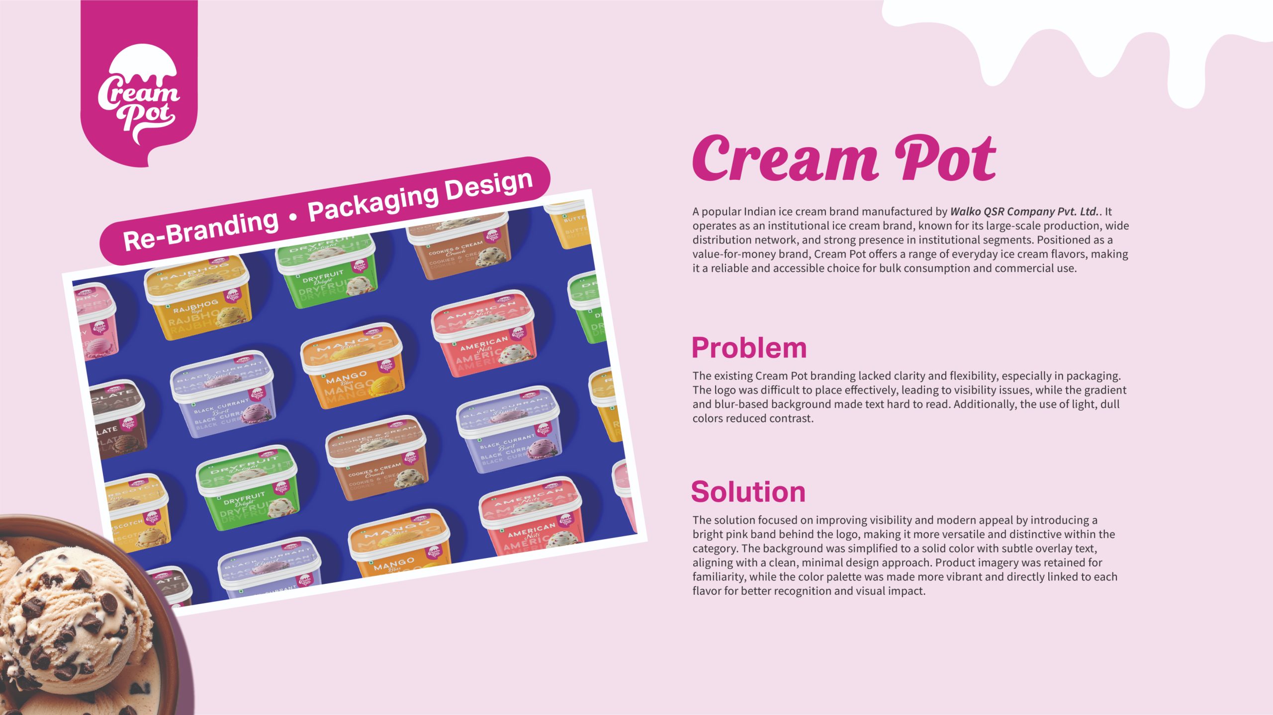
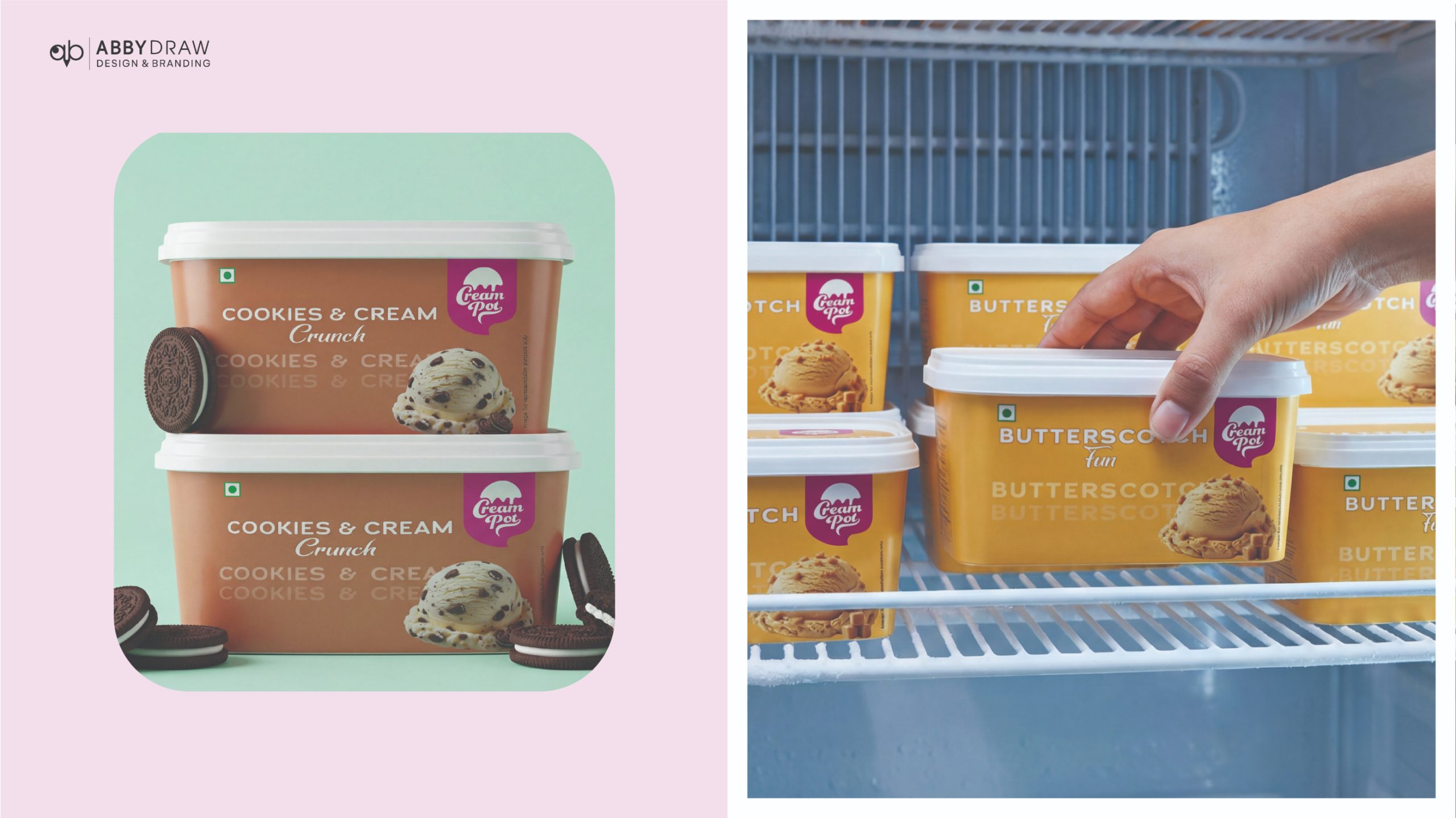
AbbyDraw Designs led the rebranding and packaging redesign for Cream Pot, a well-known institutional ice cream brand, with the goal of enhancing visual clarity, shelf impact, and brand consistency across its wide product range.
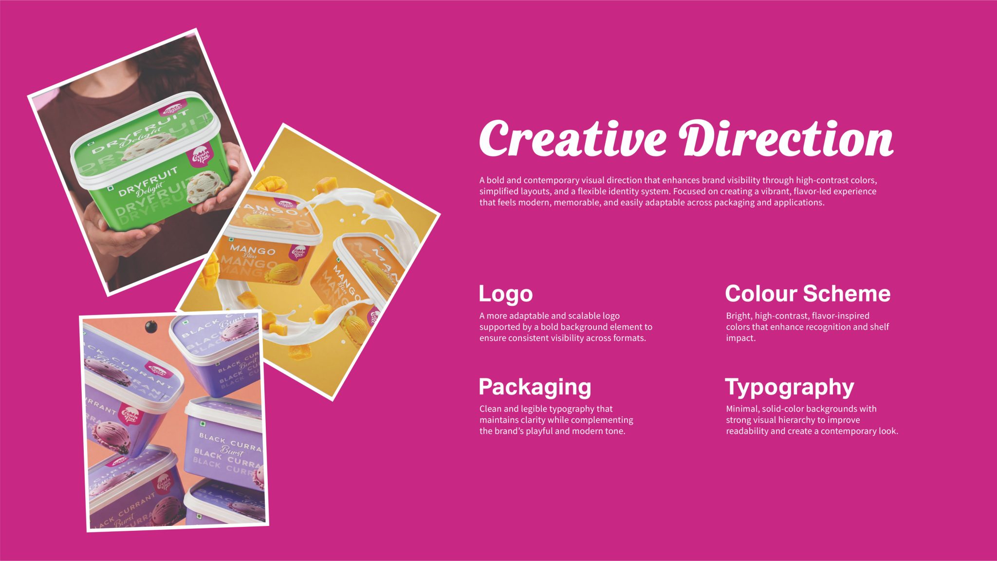
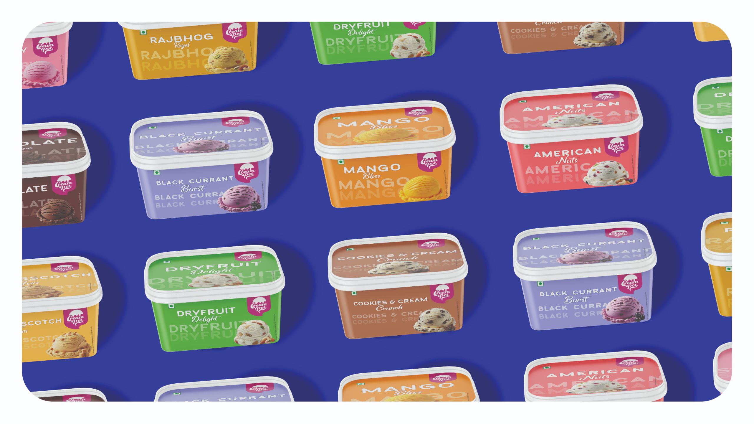
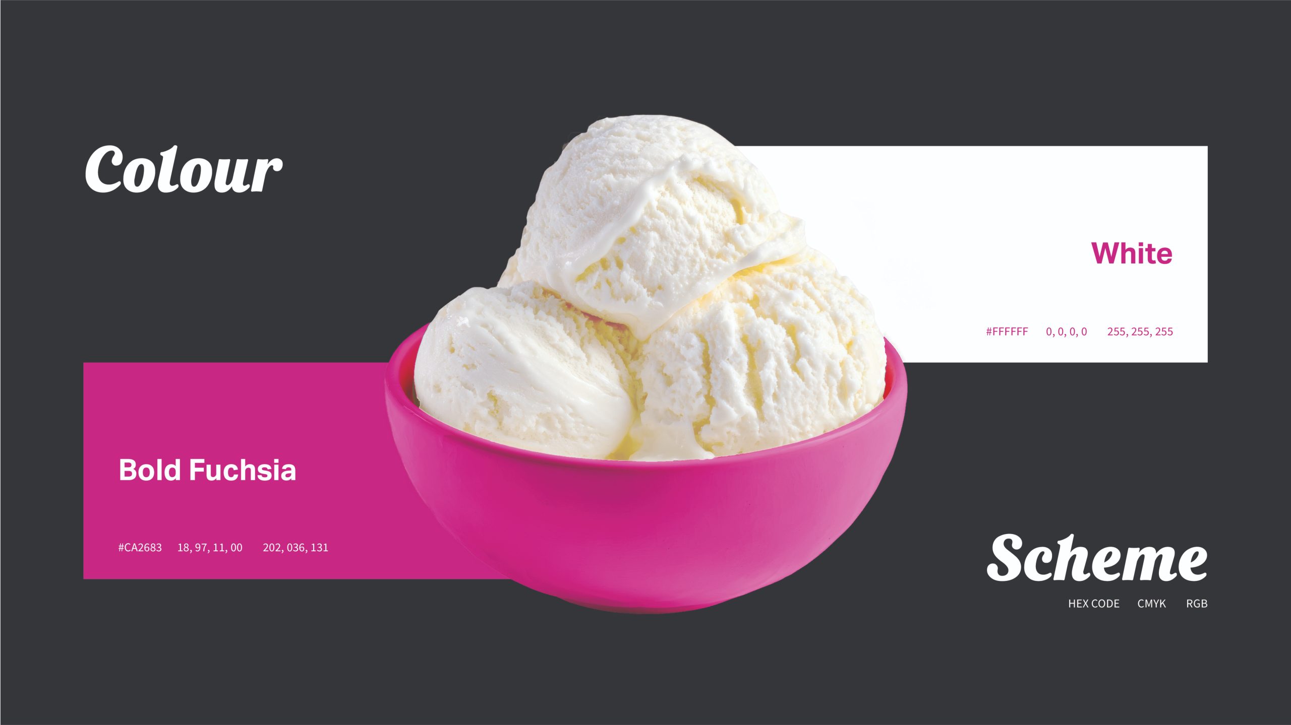
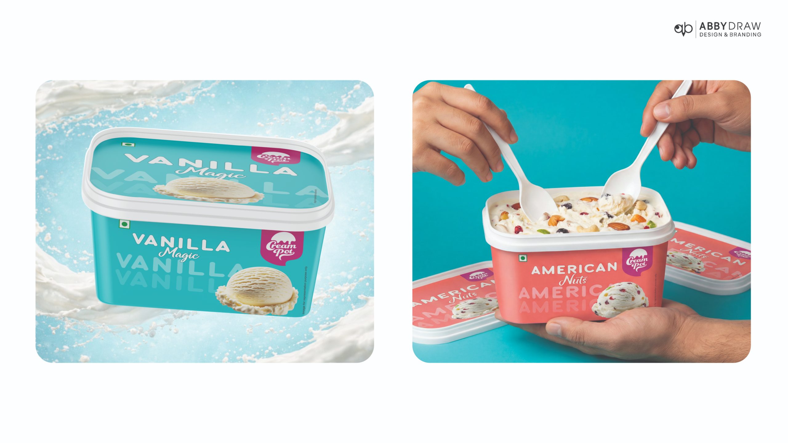
The new design system introduces bold, vibrant color palettes paired with clean, minimal layouts to create strong shelf visibility. Flavor-based color coding allows quick identification, while improved typography and hierarchy ensure better readability and communication. Solid backgrounds replace gradients, resulting in a sharper and more modern visual appeal.
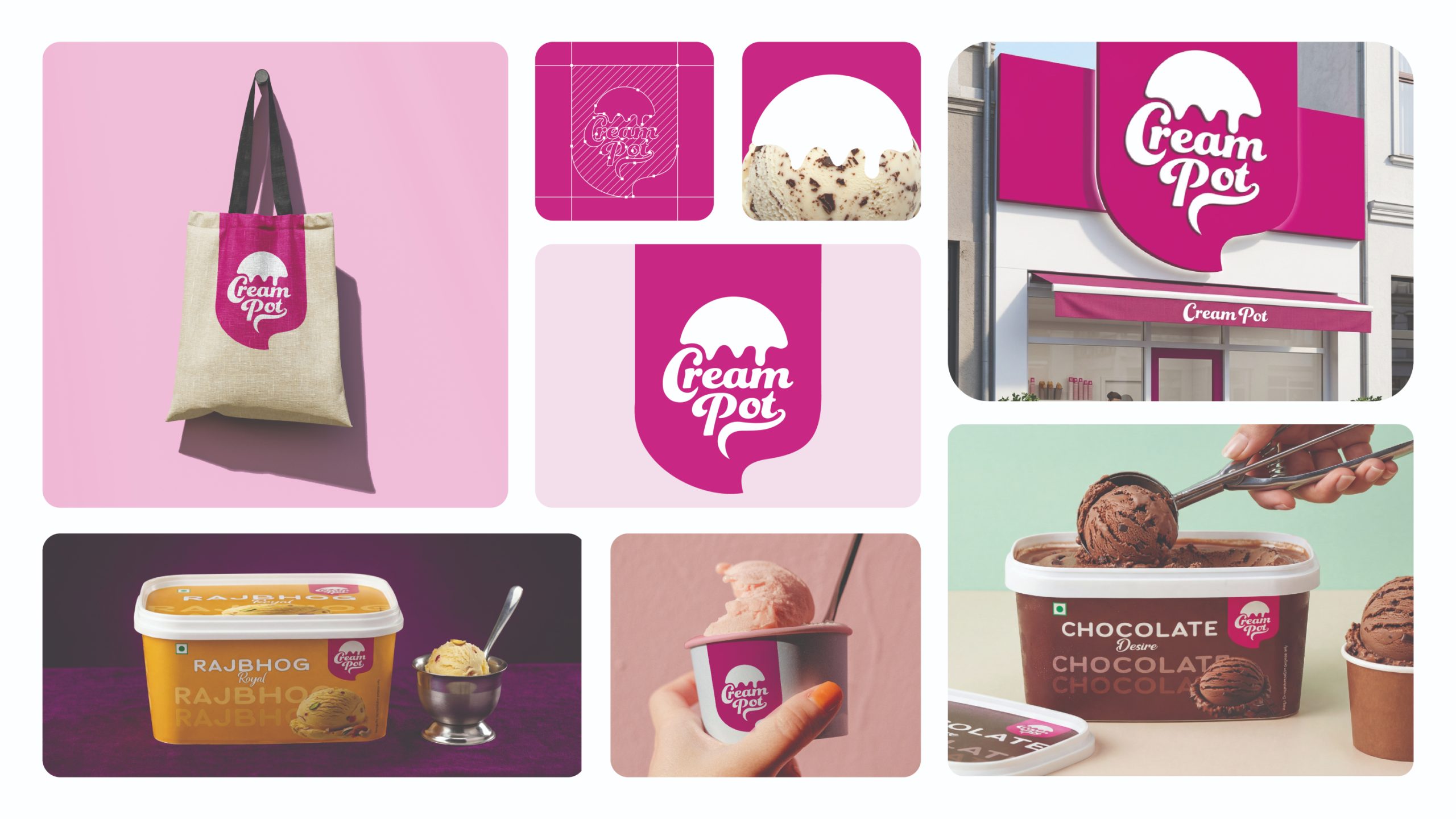
A cohesive and scalable packaging system was developed to maintain consistency across multiple SKUs while allowing flexibility for future expansion. The refreshed identity balances familiarity with a contemporary look, making the brand more engaging and easier to navigate in both retail and bulk purchase environments.
The result is a vibrant, modern packaging solution that strengthens brand recall, improves user experience, and elevates Cream Pot’s overall market presence.
Services: Brand Strategy & Rebranding • Packaging Design • Visual Identity • Creative Direction



 Derrick Lin
 VincoStudio
 lisakaplina
 CreativeWise
 alchimistestudioParis
 Adriana Adamo
 tauqueer
 MAISON D'IDÉE Prague
 Pixels Studio
 Atchayaa
 DESIGN CONCEPTS
 hello ocean
 monther al omari
 the Labelmaker
 alamgirbrands
 kat bres
 Vantablack Studio
 GruppoSaida
 studiorevv
 grafisercreative
 Kate Reichel
 UPRISE