
Half Full Wine Co. launched with a simple belief: wine should be more fun.
This debut collection introduces a new Northern California wine brand built on optimism, originality, and an alternative point of view within modern wine culture. Each release is single-vineyard, single-vintage, and limited in production. Each label follows the same one-and-done philosophy—created for that exact wine, story, and moment in time, with no repeats.
The range is unified by philosophy rather than a repeated visual template: each label was designed to fit the wine, not the other way around. The goal was to create packaging for the next generation of wine drinker—people who care about taste, design, story, and discovery in equal measure.
Rather than force the range into a uniform winery look, the system was built as a set of distinct label worlds tied to place, feeling, and cultural reference.
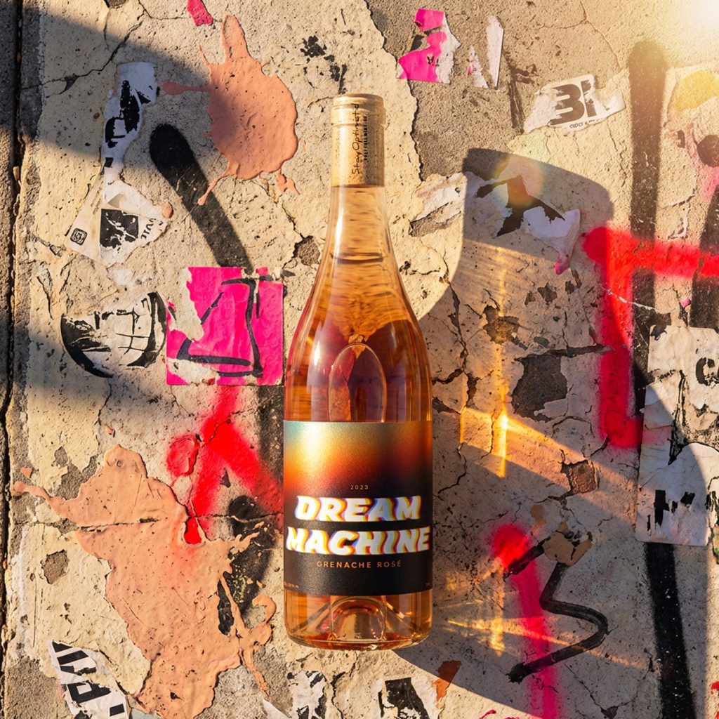
- Dream Machine is the most reduced label in the range, relying on typography, glow, and material effect rather than collage. It draws from retro automotive graphics, chromatic blur, and cinematic light to evoke speed, heat, motion, and late-night California garage nostalgia.
- Fountain of Youth is an illustrated, dreamlike composition built around whimsy, wonder, and the idea of youth as something rediscovered. Centered on a stylized fountain and surrounded by flowing ornamental forms and saturated color, the label feels playful, transportive, and full of imaginative lift.
- No Ray of Sunshine Is Ever Lost uses risograph-inspired print styling, bright neon color, and a cropped image of a woman in sunglasses to channel California freedom through a more graphic, editorial lens. The sunset transposed into one lens becomes the emotional anchor of the piece, turning glamour, motion, and the feeling of chasing light into a single compressed image.
- Just Jump combines scenic vineyard photography with a sticker-like figure in motion, pulling from skate-era DIY culture, school-book collage, and instinctive action. The handwritten title reinforces that raw, immediate energy. The label is about commitment, momentum, and the split second before you go for it.
- All You Need Is Merlot is a maximalist urban collage built from graffiti texture, protest-wall layering, and pop-cultural revisionism. It plays off the long cultural shadow cast over Merlot and reframes the varietal through irony, affection, and rebellion. The label reads like a public surface that has been marked up, reclaimed, and rewritten over time.
- Legend Has It is the most archival and narrative-driven label in the collection. Built from newspaper clippings, documentary-style imagery, distressed texture, and local reference, it turns true Calistoga lore and family-rooted bootlegging history into something that feels part evidence, part folklore. The result is historic, local, and mythic at once.
The bottle structure was treated as part of the storytelling system. The red wines use oversized labels, creating a larger visual field than is typical in wine packaging and giving the denser, more layered concepts room to breathe. Rather than read like standard wine labels, they begin to feel closer to posters, clippings, and cultural artifacts applied to glass.
For Fountain of Youth, No Ray of Sunshine Is Ever Lost, and Dream Machine, the team used a single-wrap format around Burgundy bottles, allowing the artwork to move more fluidly across the bottle and making those wines feel more immersive and transportive.
Production choices reinforced the concept. Most of the range was digitally printed on White Felt stock, chosen for tactile texture, rich color, and a more dimensional physical presence. Dream Machine intentionally breaks from the rest of the system and was printed on shimless rainbow stock, with the title and white text knocked out while the remaining color was laid directly onto the raw material so the stock itself could influence the final effect. Selective spot gloss was used on Fountain of Youth and Legend Has It to heighten contrast and add another layer of depth.
The packaging was created to extend beyond the bottle. Each wine opens into a broader Beyond the Label world through curated recipes, playlists, and editorial storytelling, turning the package into the entry point for a larger experience. The brand is focused on attracting the next generation of wine drinker—an audience drawn to bottles with taste, character, and cultural relevance. The wines are one and done. The labels are too. When the bottle is gone, the label goes with it.
Four labels from the collection—Fountain of Youth, All You Need Is Merlot, Legend Has It, and Just Jump—have already earned early recognition for packaging at the San Francisco Chronicle Wine Competition.
Materials / Production
Most labels were digitally printed on White Felt stock for texture, rich color, and a tactile finish. Dream Machine was printed on shimless rainbow stock, using the raw material as an active part of the final visual result. Spot gloss was applied to Fountain of Youth and Legend Has It. The red wines use oversized labels for a larger storytelling canvas. Fountain of Youth, No Ray of Sunshine Is Ever Lost, and Dream Machine use single-wrap labels on Burgundy bottles.
Credits
Creative Direction & Label Design: Tim Harris, Principal, Tim Harris Creative; Co-Founder, Half Full Wine Co.
Printing: Custom Label and Vintage 99


 monther al omari
 Ximena Ureta Design Studio.
 vitoramockup
 Up-Brands
 Sophiagdotcom
 Peter said
 ayeidadezigns
 Tancybox
 宏洛图品牌设计HONGLT
 Modern Theory
 Dozen Agency
 Atiq Alam
 Olio Studio
 Ruchi S. Joshi
 mmdesign
 awaiskhadim
 Octasoft
 United Creatives Studio
 Kingdom & Sparrow
 Anastasia Bakhmatskaya
 CreativeWise
 Great and Golden