
ABOUT
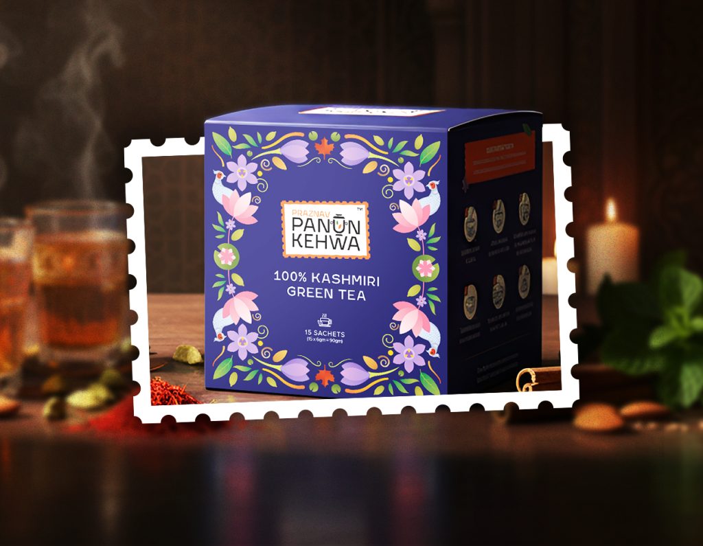
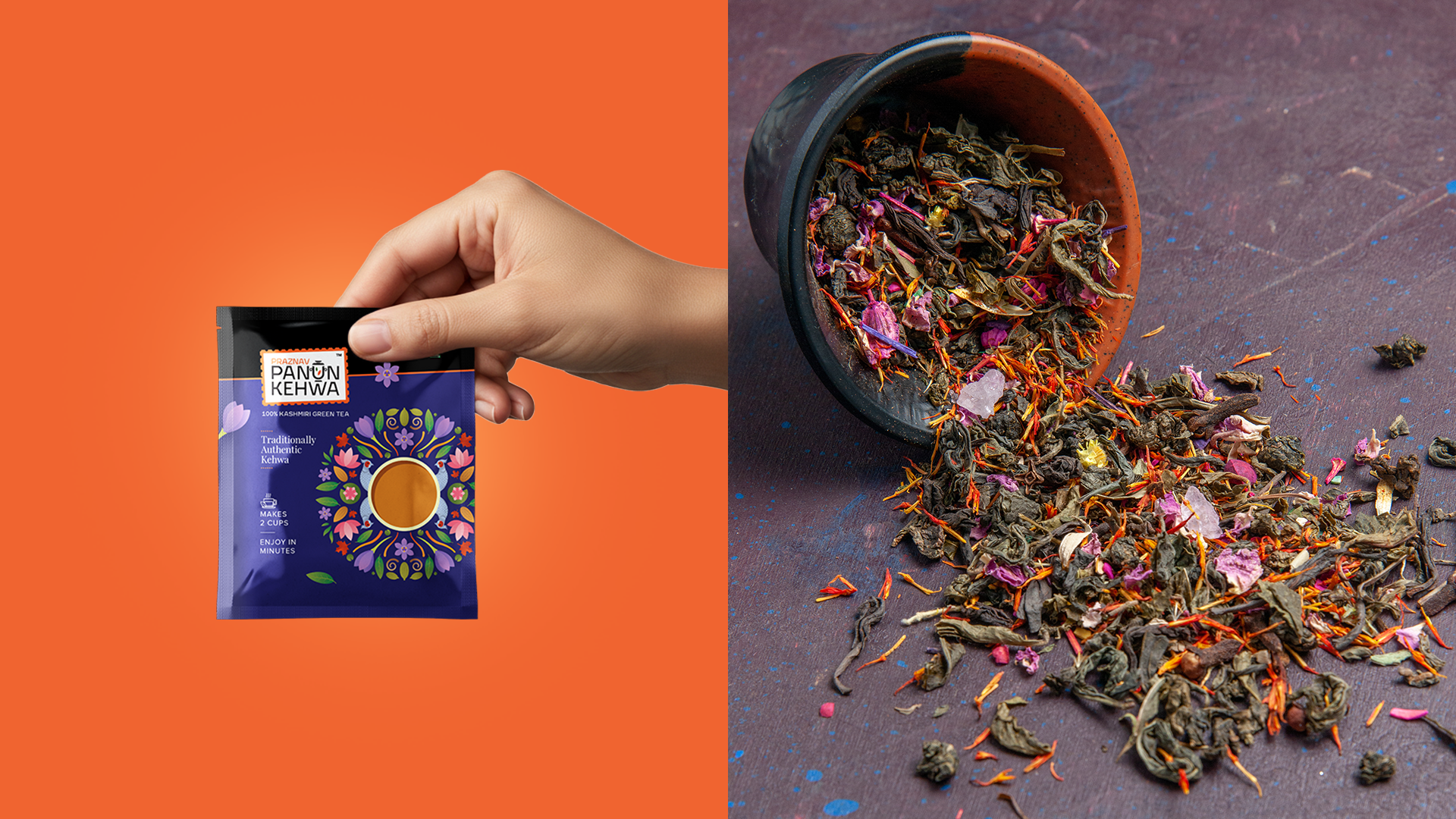
Panun Kehwa is a premium Kashmiri green tea inspired by traditional Kahwa rituals, enriched with saffron, almonds, and aromatic spices. The brand aims to celebrate the warmth, heritage, and cultural richness of Kashmir while positioning the product for modern retail and D2C markets.
The challenge was to design packaging that preserves authentic Kashmiri identity while creating strong shelf presence in a competitive tea category dominated by conventional and minimal designs.
CONCEPT
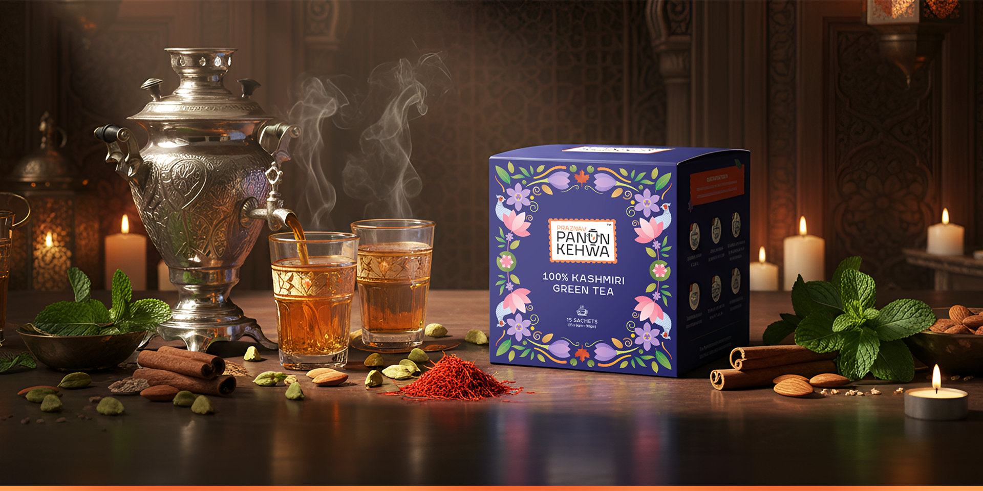
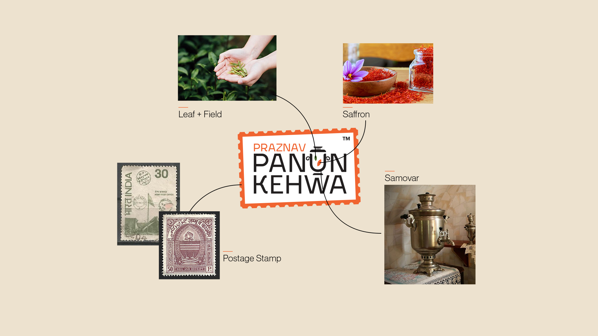
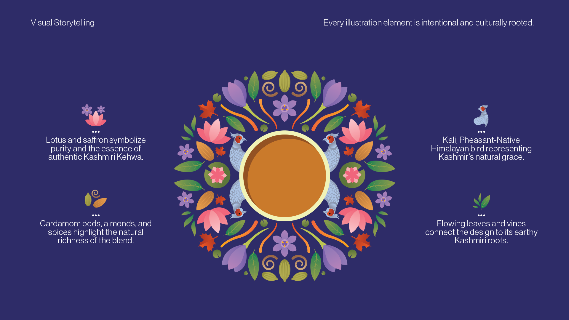
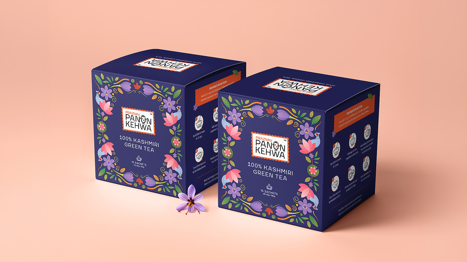
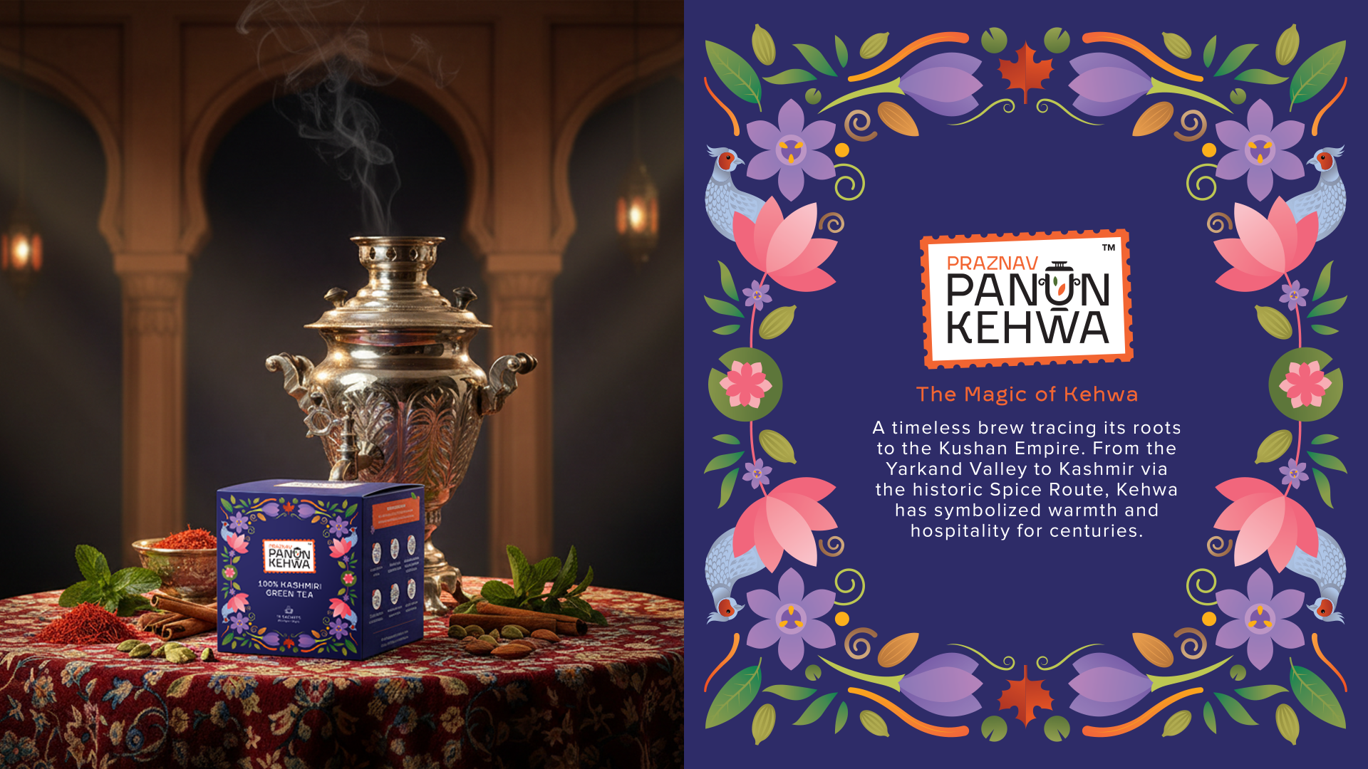
The design blends Kashmiri heritage with contemporary retail appeal. A stamp-inspired logo symbolizes authenticity, while a central illustrated cup is surrounded by regional ingredients and the Kalij Pheasant, reflecting Kashmir’s natural beauty.
SOLUTION
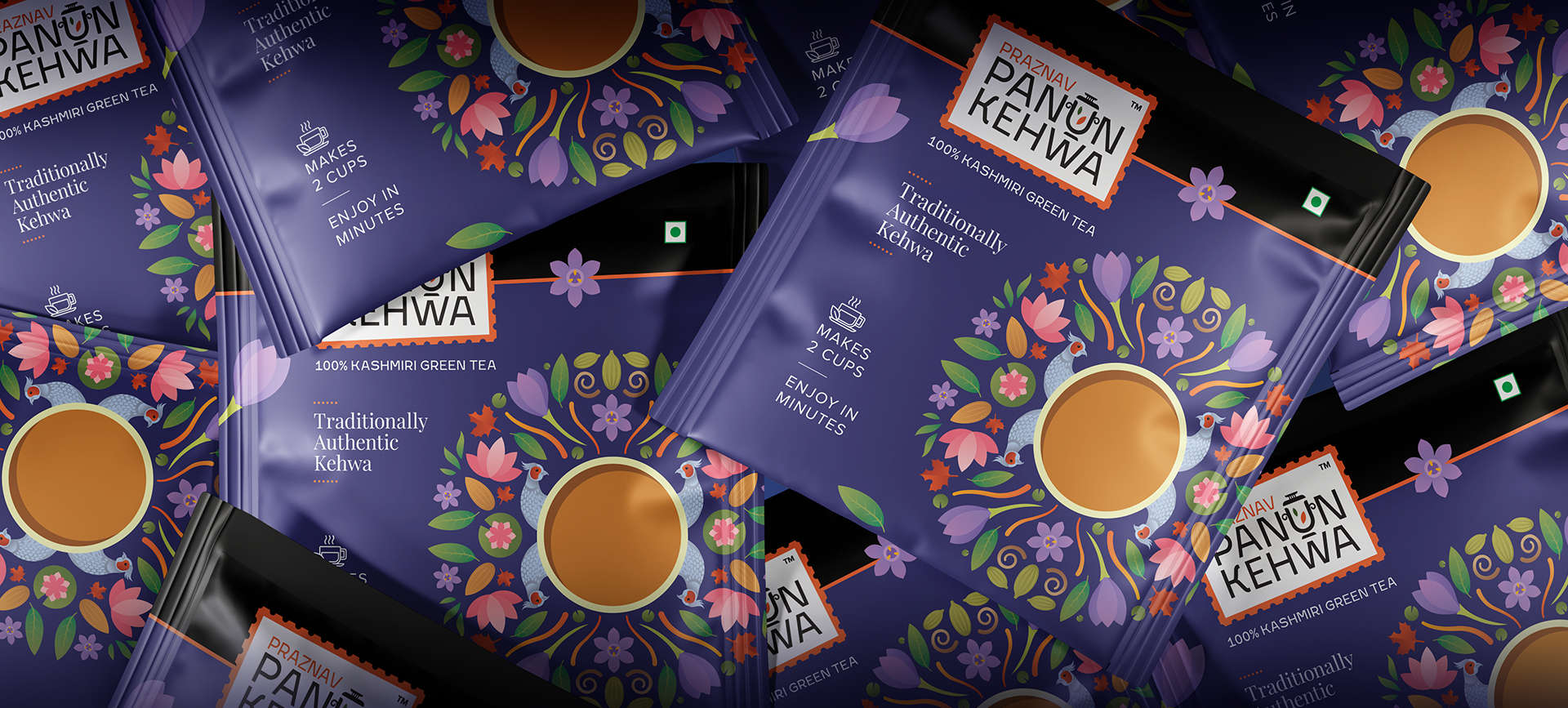
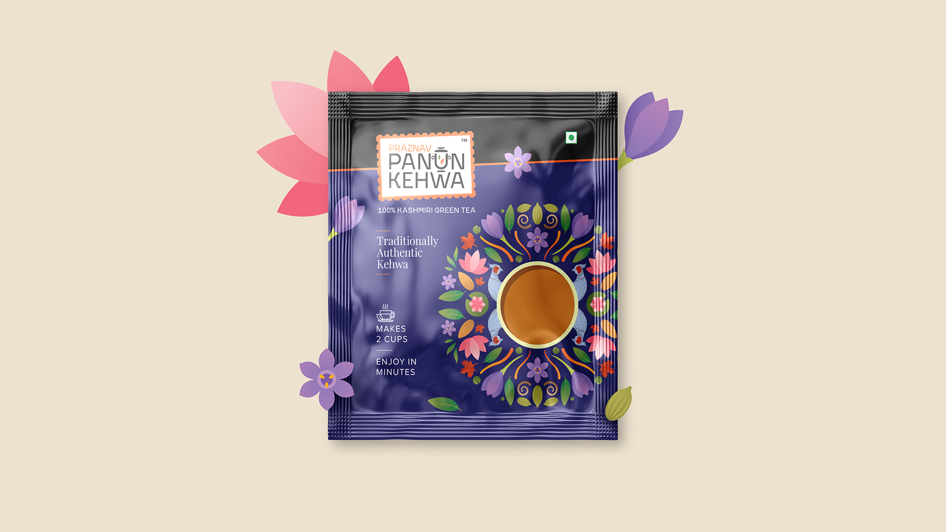
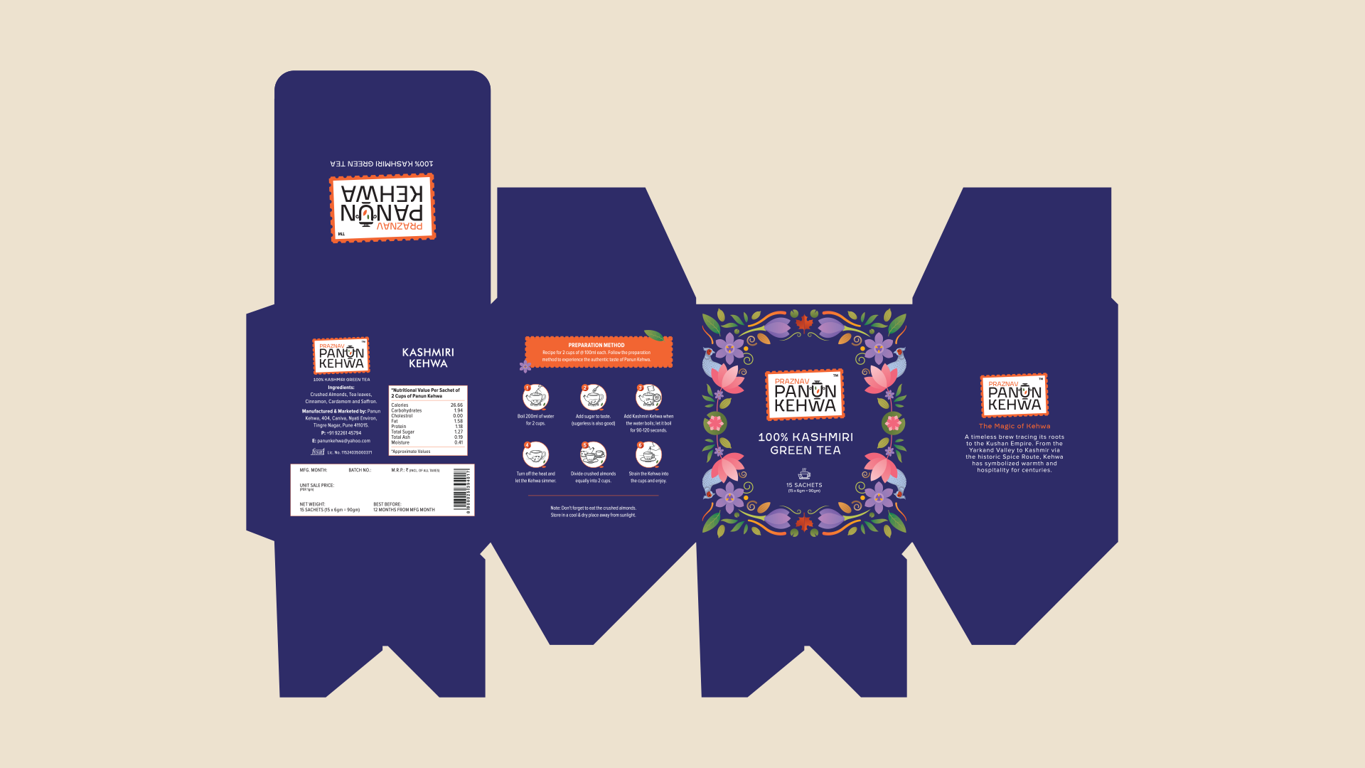
A jewel-toned packaging system was developed to ensure strong shelf presence while maintaining cultural depth. The project included logo design, sachet packaging, mailer box design, and a custom illustration system.
TECHNIQUE
Vector-based illustrations and a symmetrical composition were used to create detailed yet scalable artwork. Bold typography ensures clarity and visibility in retail environments.
WHAT MAKES IT UNIQUE
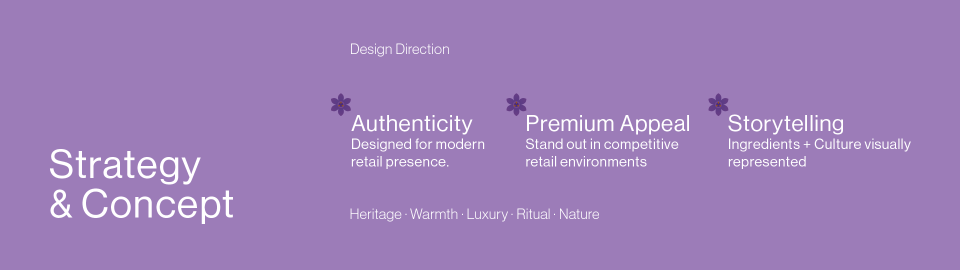
The packaging embraces rich cultural storytelling instead of minimal trends, combining ornamental detail with strong visual hierarchy for a premium feel.
RESULT
The final identity creates a refined and immersive brand experience that feels authentic, vibrant, and retail-ready. The packaging achieves strong shelf impact while preserving cultural depth, making Panun Kehwa both visually distinctive and emotionally resonant.
 krrrrrllii
 babyage
 Deep
Deep monther al omari
 Atiq Alam
 TUERCA Studio
 neo creative studio
 Pinot Agency
 Pixels Studio
 Anastasia Cherepanova | xtramez
 awaiskhadim
 Studio Be Design
 Belova Oksana
 We Craft Studio
 ArtDesignByDIna
 Ananya Taran
 Nadezhda Gorelikova
 orhanirmaktasarim
 WillBe
 Hi estudio
 43oz
43oz Rosario Lo Iacono
 alchimistestudioParis