

Baby Please Come Home (BPCH) is a homeware brand rooted in craft, materiality and thoughtful living. It transforms everyday household objects into pieces that feel intentional, functional and quietly beautiful. They approached us to create a brand identity and packaging system that reflects this balance, elevating the ordinary, honouring the handmade, and turning daily rituals into meaningful moments.
Challenge
How do you create a brand and packaging experience for everyday objects that feels thoughtful and intentional, while still being playful and fun?
Story
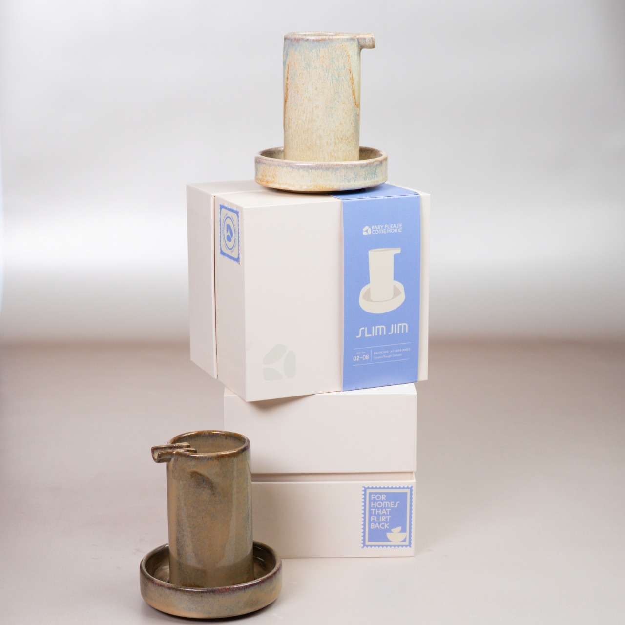
We began by closely studying the forms and proportions of the objects themselves. How they sit in the hand, how they occupy space, and how they’re used in everyday rituals. The process focused on integrating brand and object as one, allowing the identity to feel whimsical without overpowering the pieces, and ensuring the brand adds personality while the products remain at the centre. The goal was to let the products lead the identity, finding visual cues within their shapes, curves and functions rather than imposing an external style.
System
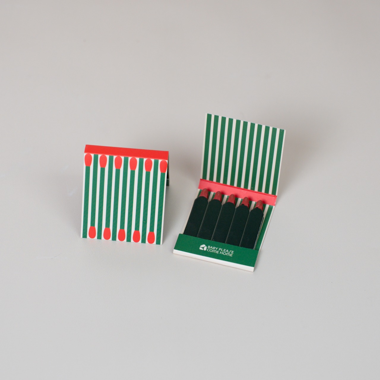
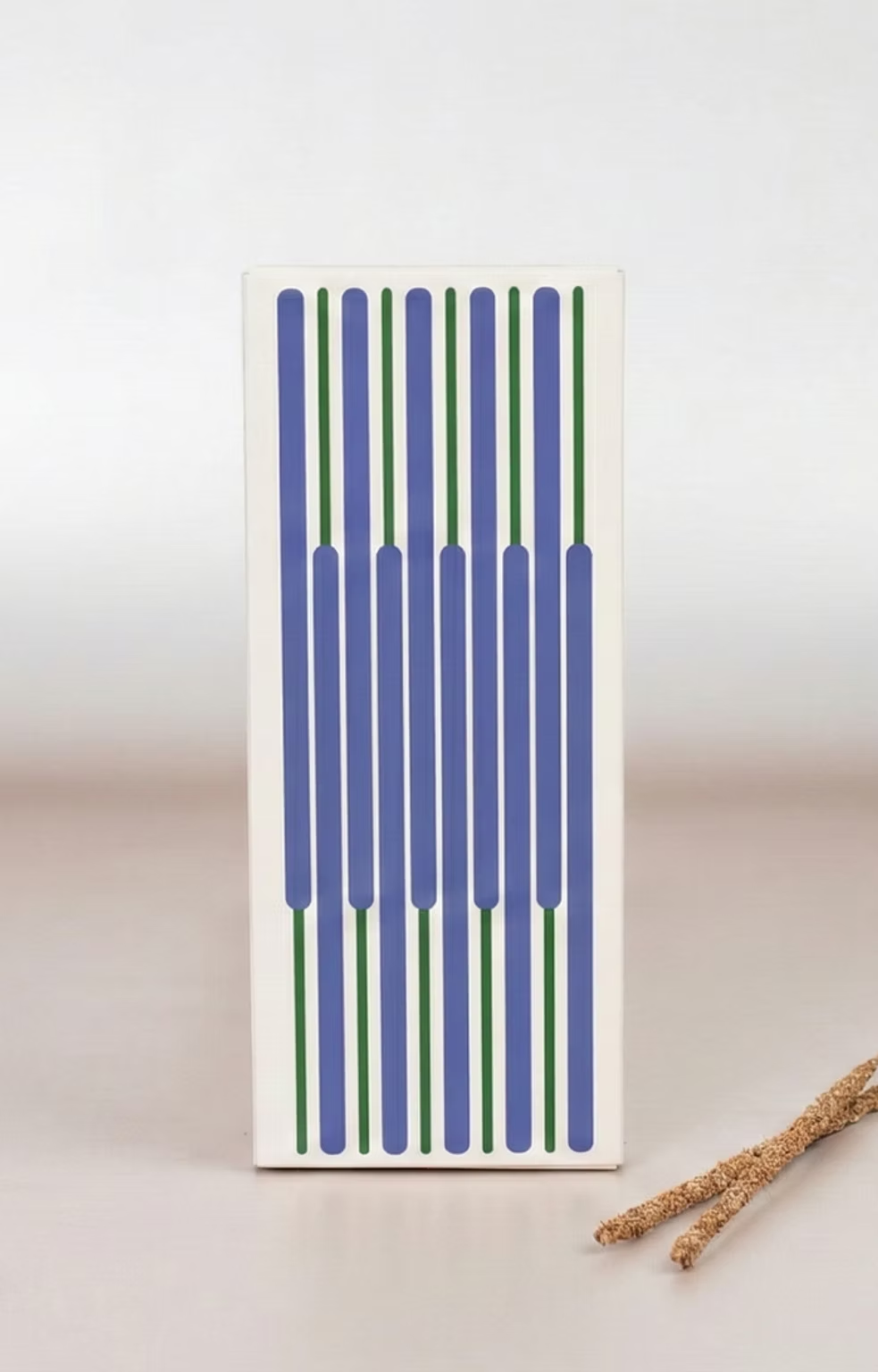
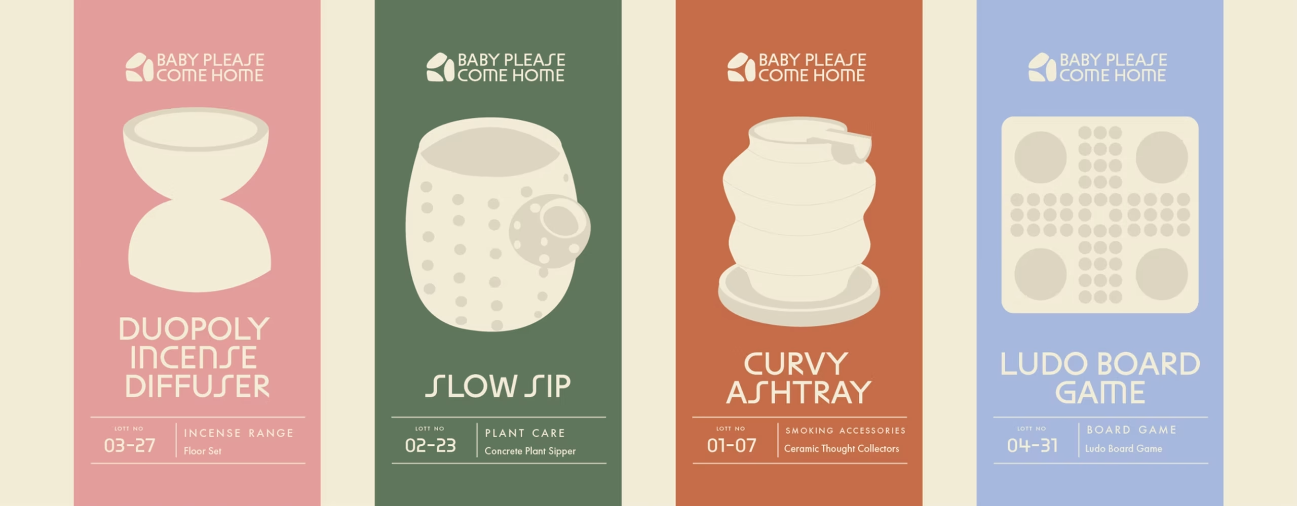
BPCH’s visual system was designed to work in conversation with the objects themselves. The identity draws from the forms and textures of the pieces, creating a language that feels playful yet intentional. This thinking carries through strongly into the packaging where wraps, stamps and tactile materials become part of the experience of receiving the product. Rather than treating packaging as a separate layer, it acts as an extension of the brand, adding character while still allowing the objects to remain the hero. Across print, packaging and physical touchpoints, the system brings together warmth, craft and a sense of quiet discovery.




 krrrrrllii
 babyage
 Deep
Deep monther al omari
 Atiq Alam
 TUERCA Studio
 neo creative studio
 Pinot Agency
 Pixels Studio
 Anastasia Cherepanova | xtramez
 awaiskhadim
 Studio Be Design
 Belova Oksana
 We Craft Studio
 ArtDesignByDIna
 Ananya Taran
 Nadezhda Gorelikova
 orhanirmaktasarim
 WillBe
 Hi estudio
 43oz
43oz Rosario Lo Iacono
 alchimistestudioParis