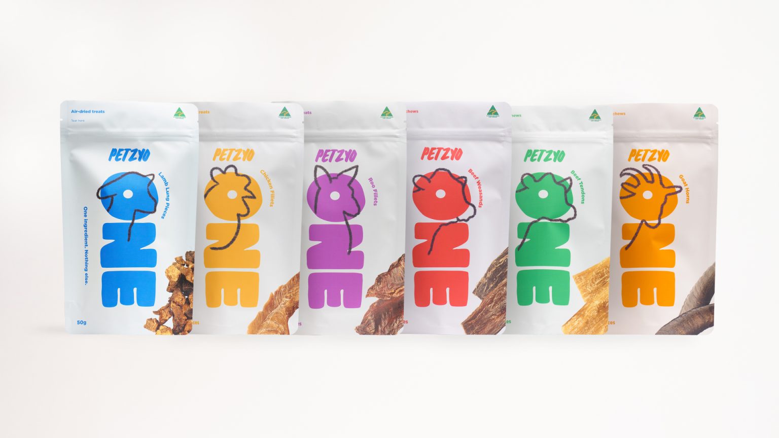

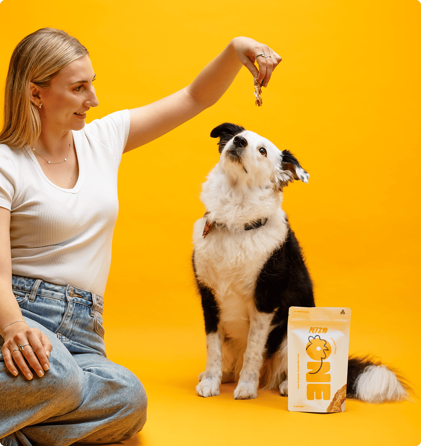
The brief was to design packaging for Petzyo ONE, a dog treat range from Petzyo, that celebrates the simplicity and transparency of single-ingredient treats. Built around simplicity with one ingredient and nothing else, the challenge was to communicate honesty, transparency and quality at a glance in a category often filled with vague ingredient listing and cluttered packaging.
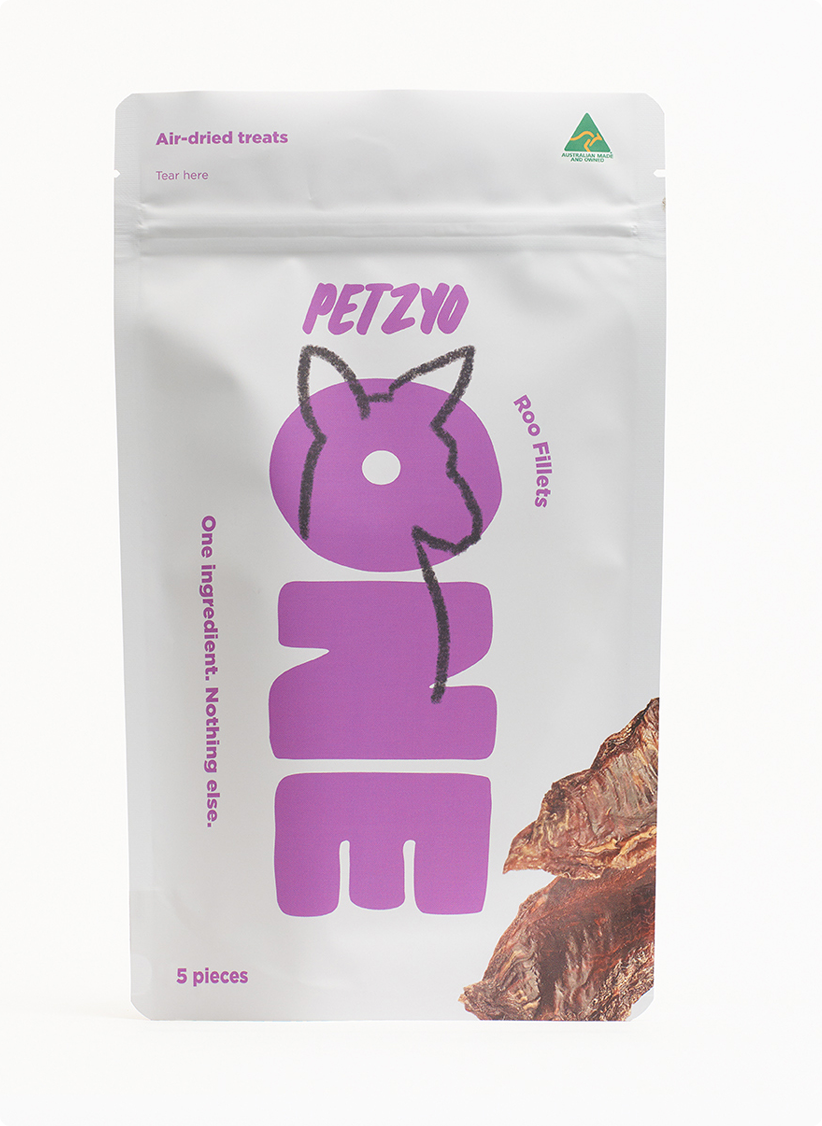
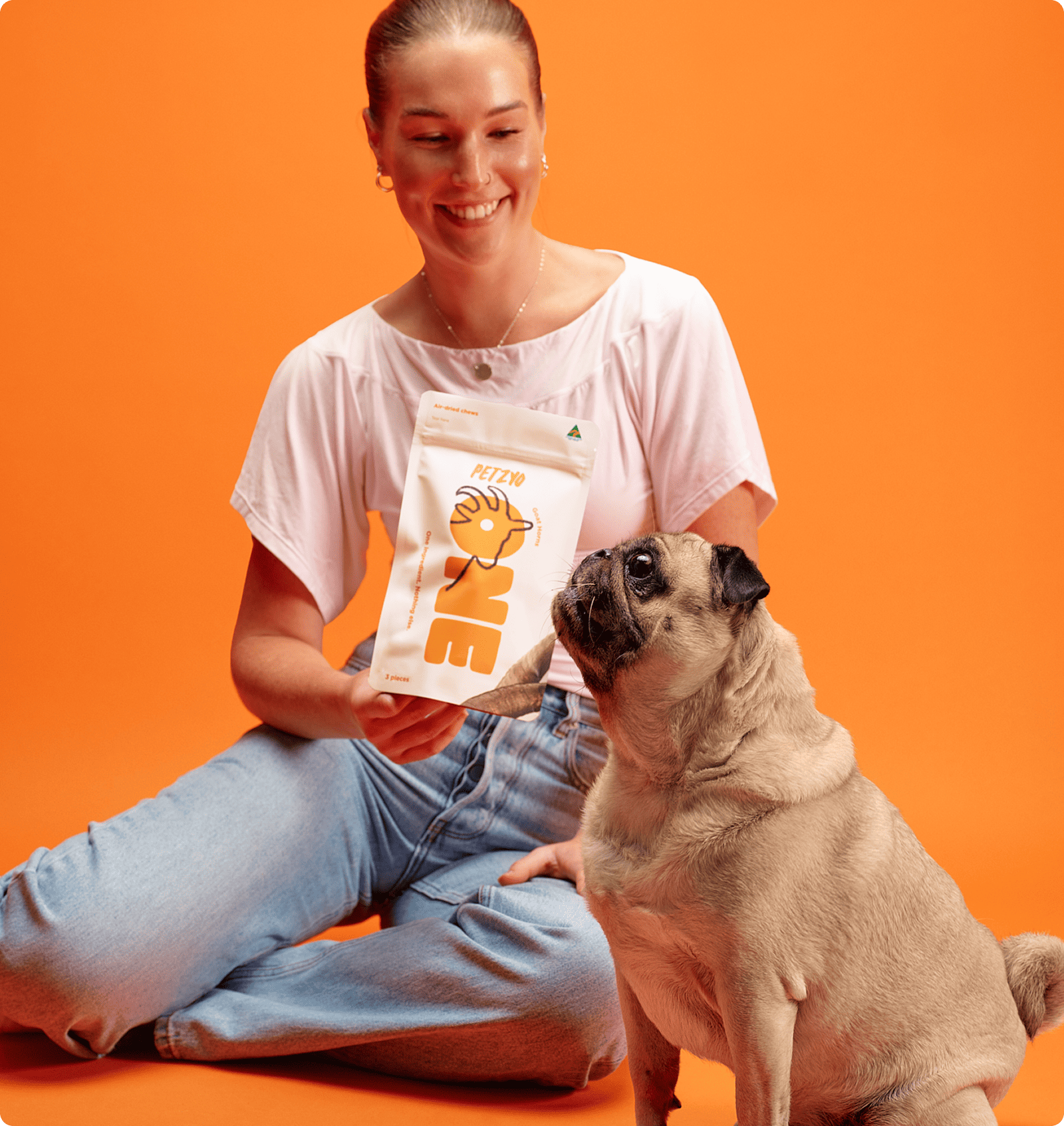
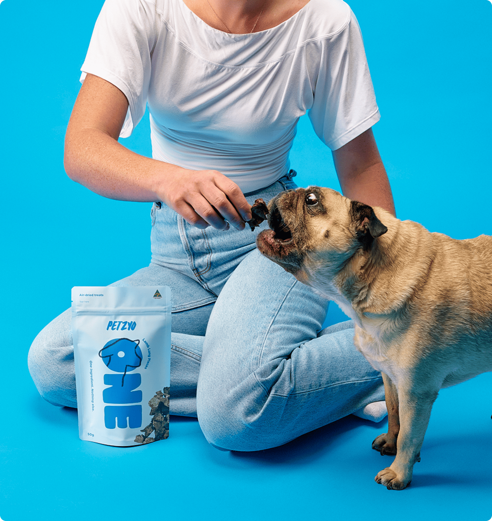
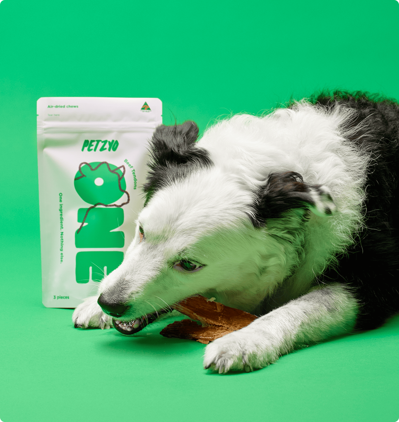
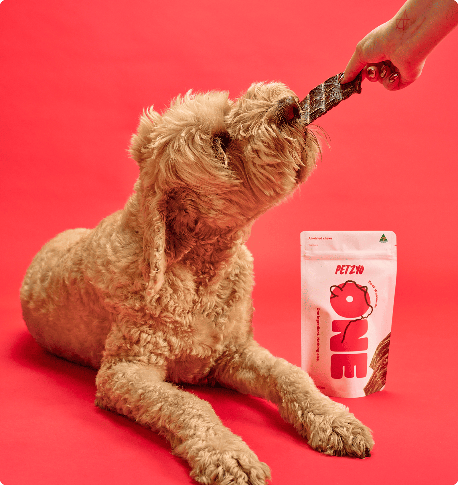
The concept centres on the idea of “ONE”. Each treat contains a single natural ingredient, and the design reflects this through a bold and minimal visual language. The oversized “ONE” typography acts as the core brand asset and creating strong shelf impact.
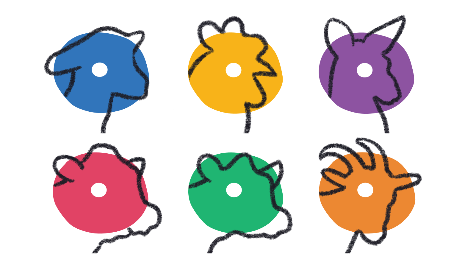
A vibrant colour system differentiates flavours while maintaining consistency across the range. A playful dog illustration is integrated into the typography, with the white “O” in “ONE” forming the animal’s eye. This understated design detail adds personality while maintaining a clean and highly recognisable layout.
The imagery introduces natural texture, adding depth to the design while reinforcing the product’s simplicity. By clearly showcasing the single ingredient, it helps consumers quickly understand what’s inside the pack in a busy retail environment, especially as other brands tend to over-communicate creating more visual noise.
“Ollie Round” is a bold, custom typeface designed to be eye-catching and stand out on shelf. Its rounded forms give it a friendly feel while ensuring strong visibility in a crowded retail space.



 Affogato Brand Design
 Backbar Studios
 hello ocean
 POSH FMCG BRANDING
 Luciana
 Valérie Colace
 marjusguza
 Z9BKAdsgn
 Lilith Sivolenko
 Daria Levina
 Masha Kulichkova
 monther al omari
 Yana Chernova
 Atiq Alam
 ezgidesignstudio
 Pips Marin
 Antonia Skaraki
 Ezi Brand Design
 Kanishka Chhajer
 Zachary Kent
 SOT B&D
 Normal studio
 Garry Veda