
Brand Philosophy:
Eldon Nutrition, a sub-line of Eldon Healthcare, focuses on health supplements designed to deliver scientifically reliable yet emotionally reassuring solutions for families. Research indicates that modern households prefer brands that feel both professional and approachable. Rooted in this insight, Eldon Healthcare shifts its tone from clinical to lifestyle-oriented, conveying that health is a feeling of being cared for.
Target Audience:
- Families aged 30–60 who prioritize preventive healthcare
- Key channels: pharmacies, clinics, and e-commerce platforms (Shopee / Lazada)
- Preference for packaging that is trustworthy, clean, and emotionally warm
Design Challenges:
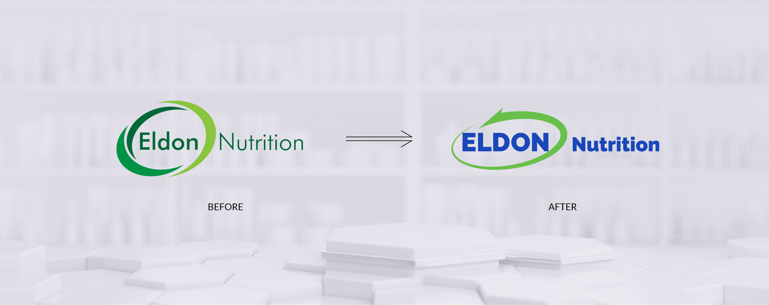
- Modernize legacy pharmaceutical visuals with a cohesive system
- Balance scientific credibility with approachability
- Build a scalable packaging system across categories
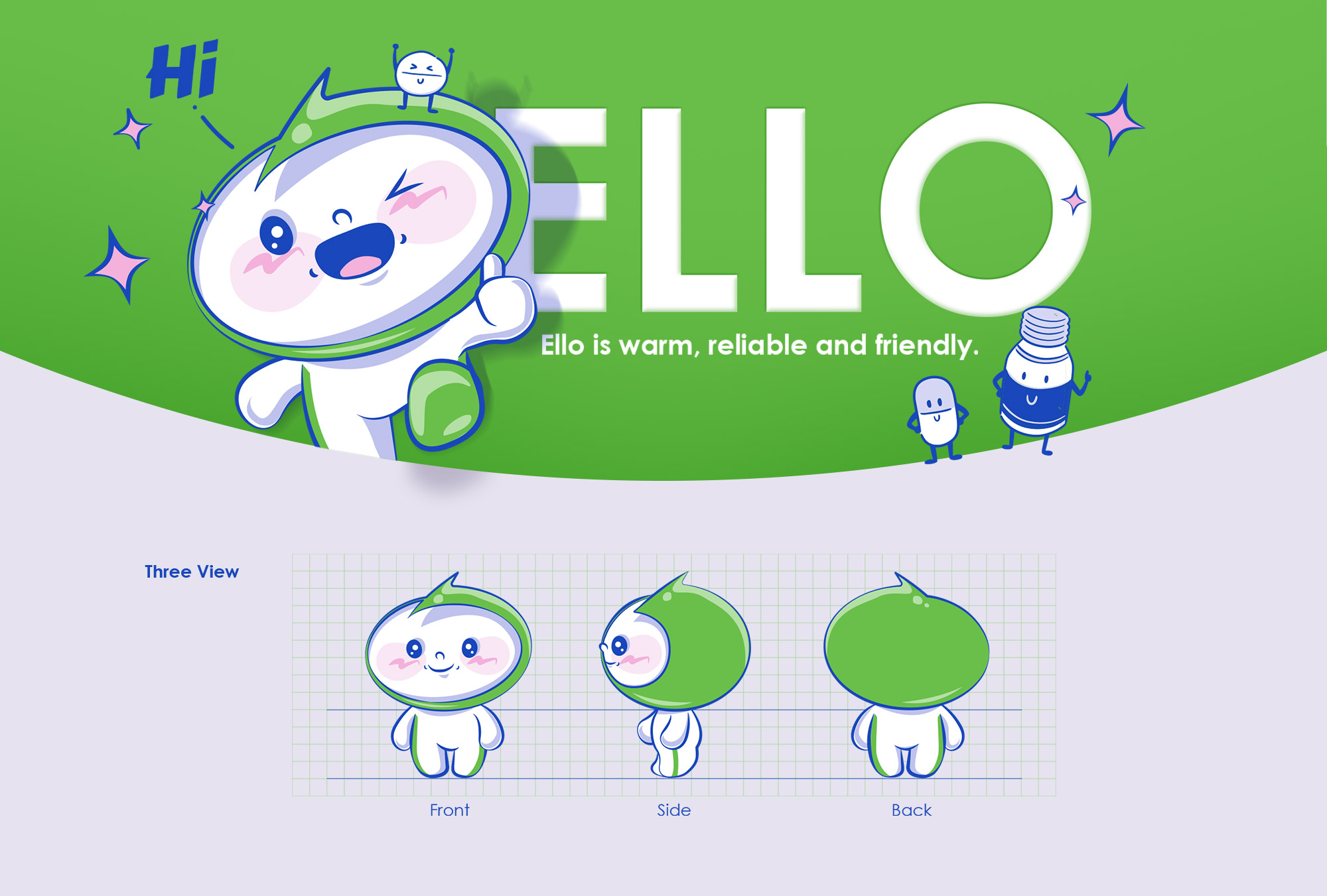
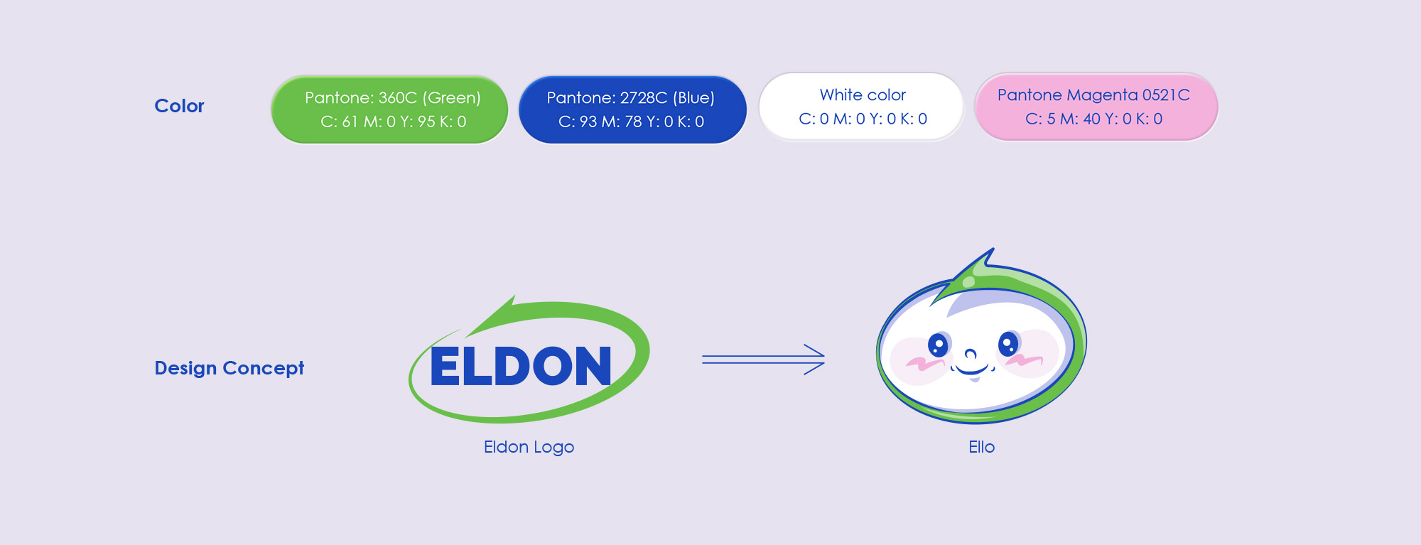
- Introduce a brand character to enhance relatability and differentiation
Design Solution:
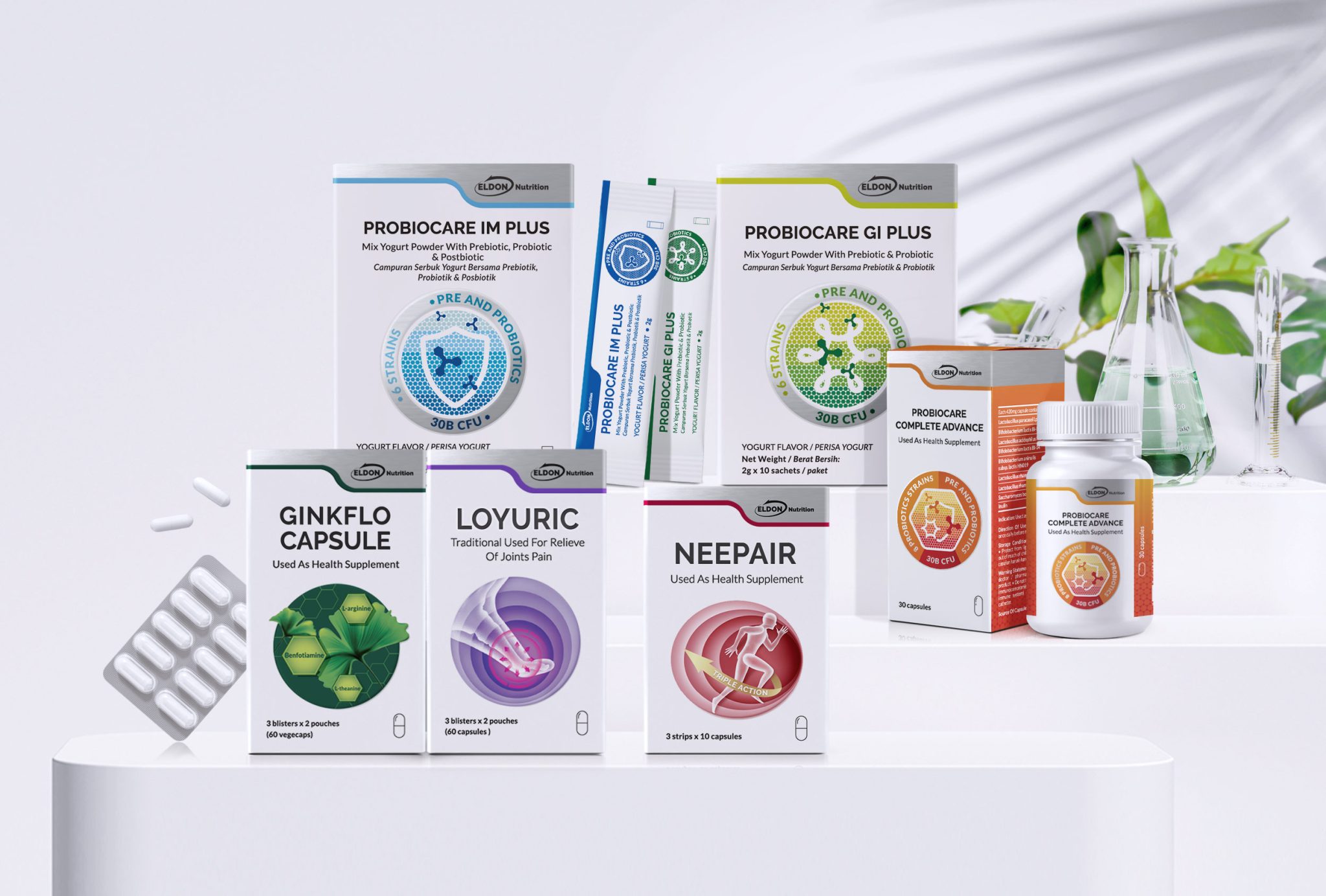
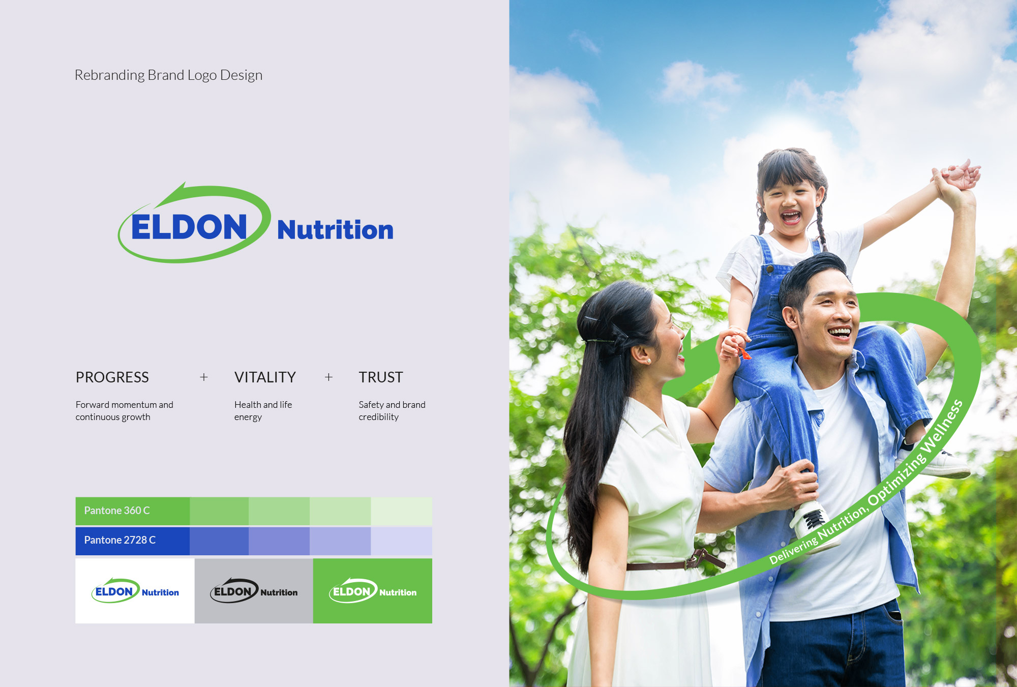
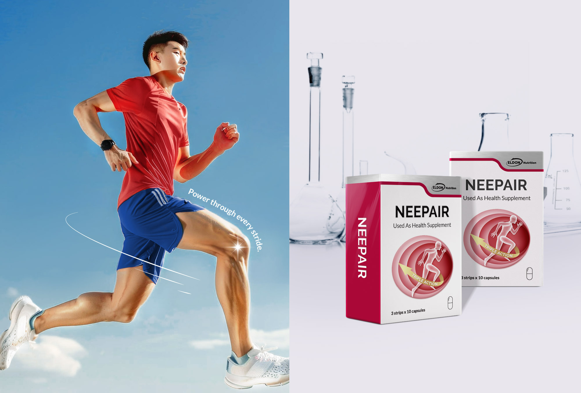
- Visual Language: A clean, spacious, and rounded design approach merges medical precision with a sense of warmth
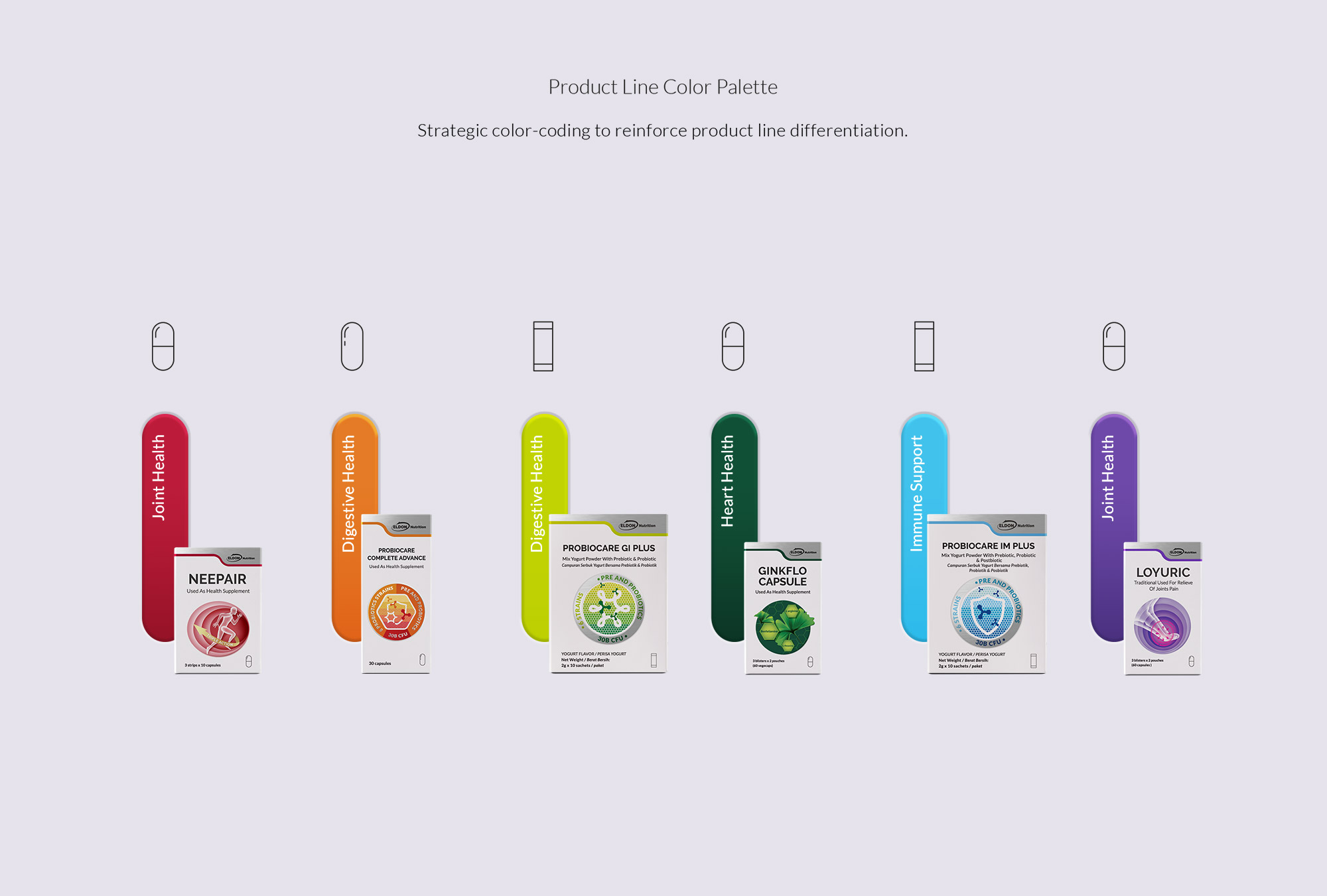
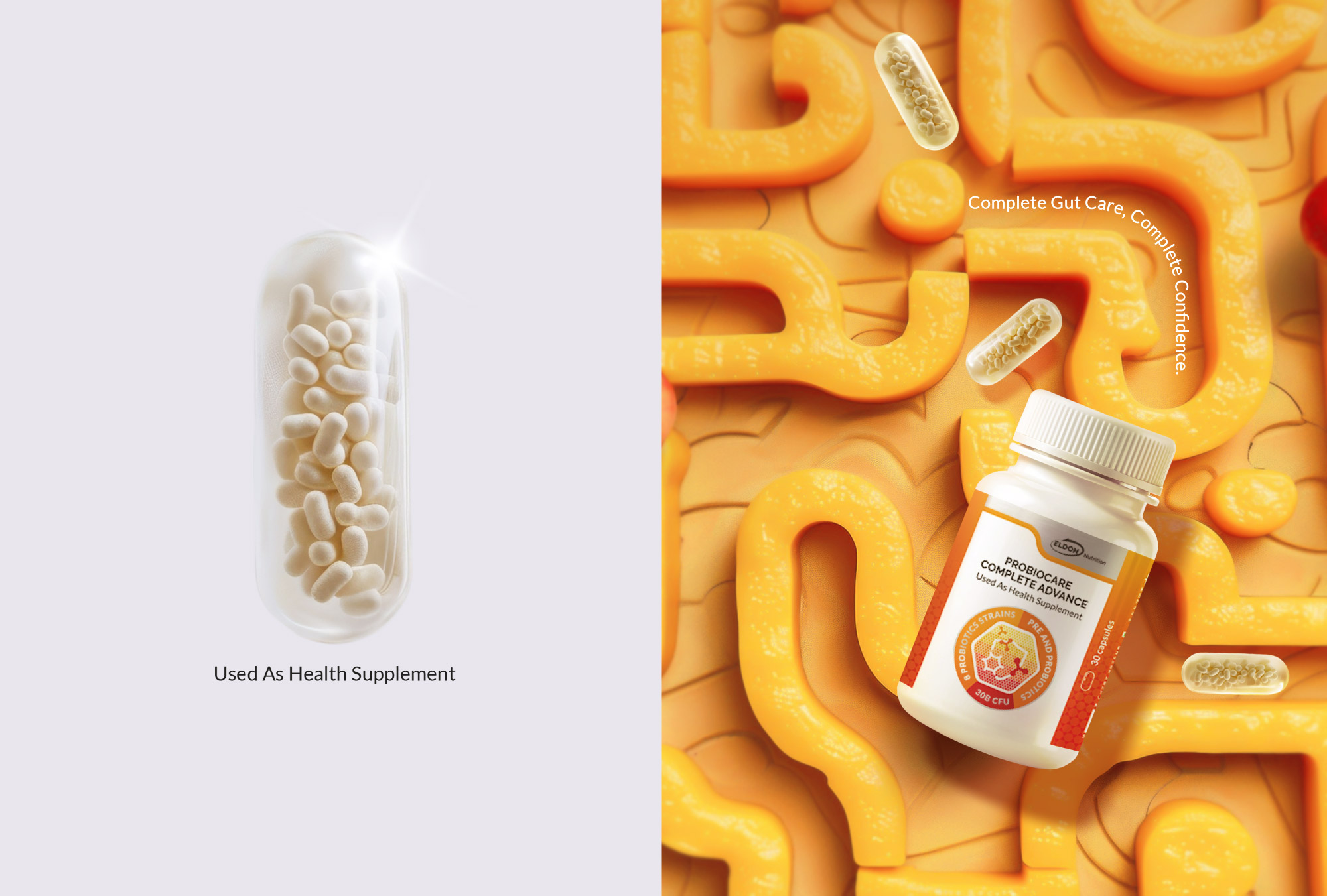
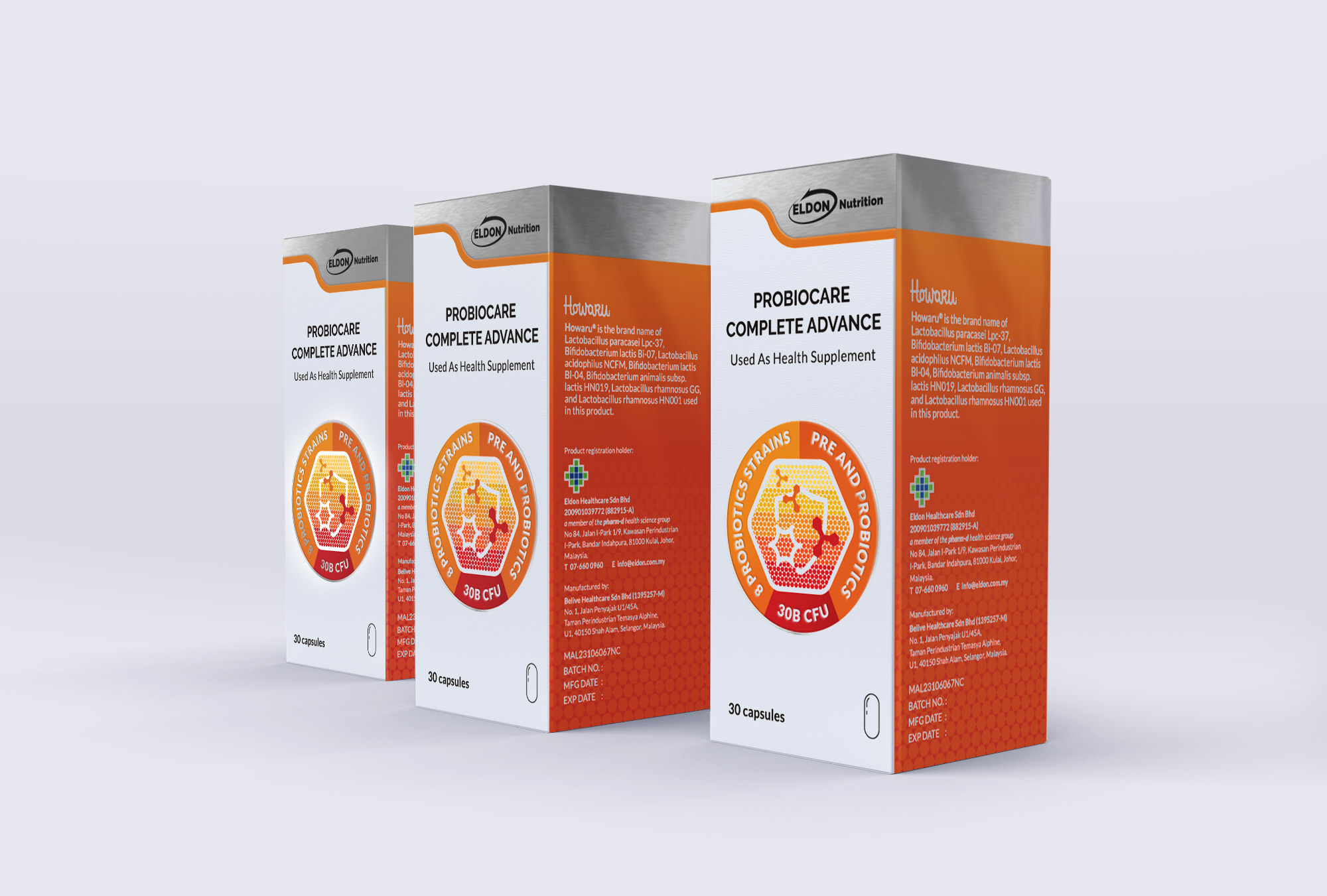
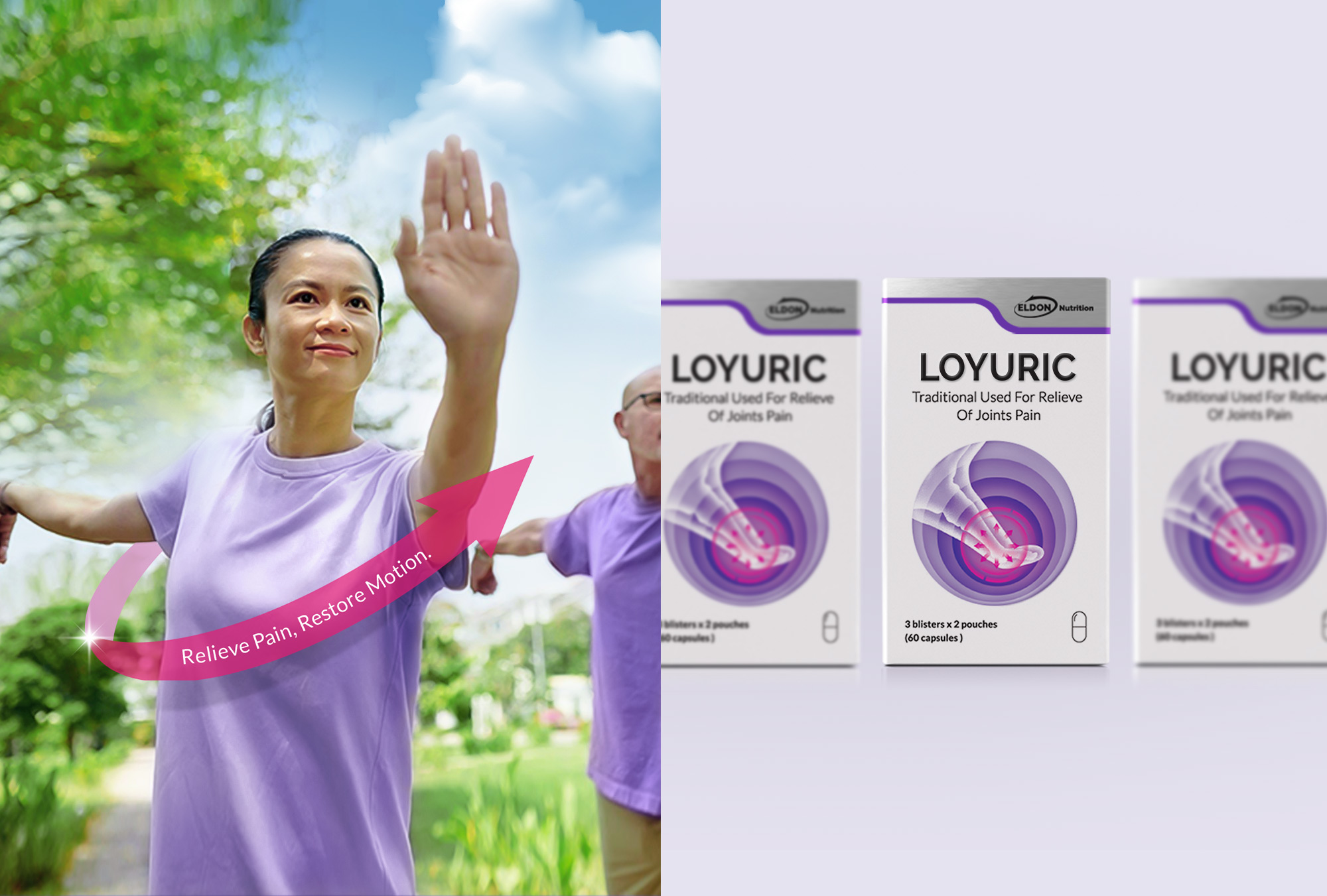
- Packaging Structure: A unified box system clearly differentiates functional categories, using color blocking and icons for quick recognition
- Typography: A modern sans-serif typeface ensures clarity and trust, optimized for both retail and digital environments
- Color System: Green and blue as core brand colors symbolize trust and balance, while functional accents—orange (joint), purple (uric acid), green (digestion), blue (immunity)—create a clear identification system
Project Summary:
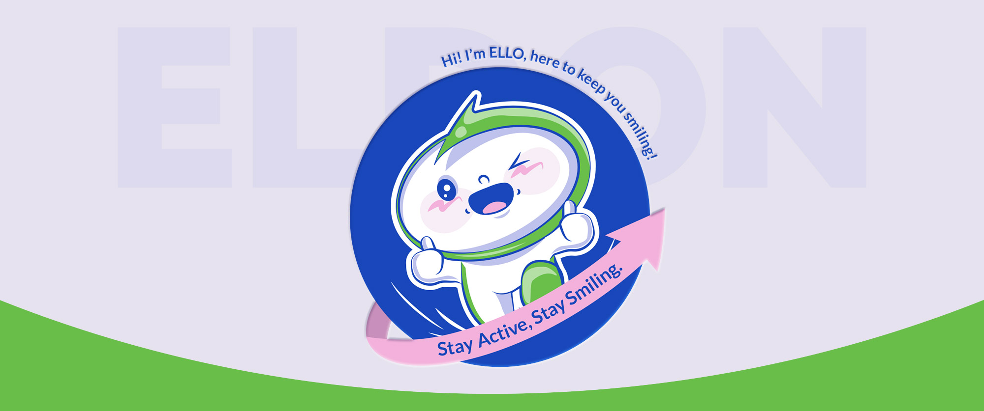
The rebranding of Eldon Healthcare reflects a new direction for health brands—grounded in science, expressed with warmth. From packaging to the ELLO mascot, every detail communicates a sense of care, transforming health from a functional benefit into a reassuring, protected experience.




 Lizaveta Kharitonyuk
 Bonsanco Creative Studio
 DesignRepublic
 GIRAFA STUDIO
 PiotrWisniewski
 Sophiagdotcom
 monther al omari
 CreativeWise
 Modern Theory
 SoreThumbStudio®
 Modern World Studio
 Palashcc
 Valérie Colace
 andreamarinnn
 Chochoi Creative
 Hi estudio
 bachir bachchar
 Aferdini
 AUN BRANDS
 vitoramockup
 InterWish
 ash123456
 Studiotaketwo